NFL Stories
 Arizona Cardinals
 Atlanta Falcons
 Baltimore Ravens
 Buffalo Bills
 Carolina Panthers
 Chicago Bears
 Cincinnati Bengals
 Cleveland Browns
 Dallas Cowboys
 Denver Broncos
 Detroit Lions
 Green Bay Packers
 Houston Texans
 Indianapolis Colts
 Jacksonville Jaguars
 Kansas City Chiefs
 Las Vegas Raiders
 Los Angeles Chargers
 Los Angeles Rams
 Miami Dolphins
 Minnesota Vikings
 New England Patriots
 New Orleans Saints
 New York Giants
 New York Jets
 Philadelphia Eagles
 Pittsburgh Steelers
 San Francisco 49ers
 Seattle Seahawks
 Tampa Bay Buccaneers
 Tennessee Titans
 Washington Commanders
 NBA Stories
 Atlanta Hawks
 Boston Celtics
 Brooklyn Nets
 Charlotte Hornets
 Chicago Bulls
 Cleveland Cavaliers
 Dallas Mavericks
 Denver Nuggets
 Detroit Pistons
 Golden State Warriors
 Houston Rockets
 Indiana Pacers
 LA Clippers
 Los Angeles Lakers
 Memphis Grizzlies
 Miami Heat
 Milwaukee Bucks
 Minnesota Timberwolves
 New Orleans Pelicans
 New York Knicks
 Oklahoma City Thunder
 Orlando Magic
 Philadelphia 76ers
 Phoenix Suns
 Portland Trail Blazers
 Sacramento Kings
 San Antonio Spurs
 Toronto Raptors
 Utah Jazz
 Washington Wizards
 MLB Stories
 Arizona Diamondbacks
 Atlanta Braves
 Baltimore Orioles
 Boston Red Sox
 Chicago Cubs
 Chicago White Sox
 Cincinnati Reds
 Cleveland Guardians
 Colorado Rockies
 Detroit Tigers
 Houston Astros
 Kansas City Royals
 Los Angeles Angels
 Los Angeles Dodgers
 Miami Marlins
 Milwaukee Brewers
 Minnesota Twins
 New York Mets
 New York Yankees
 Philadelphia Phillies
 Pittsburgh Pirates
 San Diego Padres
 San Francisco Giants
 Seattle Mariners
 St. Louis Cardinals
 Tampa Bay Rays
 Texas Rangers
 Toronto Blue Jays
 Washington Nationals
 NHL Stories
 Anaheim Ducks
 Boston Bruins
 Buffalo Sabres
 Calgary Flames
 Carolina Hurricanes
 Chicago Blackhawks
 Colorado Avalanche
 Columbus Blue Jackets
 Dallas Stars
 Detroit Red Wings
 Edmonton Oilers
 Florida Panthers
 Los Angeles Kings
 Minnesota Wild
 Montreal Canadiens
 Nashville Predators
 New Jersey Devils
 New York Islanders
 New York Rangers
 Ottawa Senators
 Philadelphia Flyers
 Pittsburgh Penguins
 San Jose Sharks
 Seattle Kraken
 St. Louis Blues
 Tampa Bay Lightning
 Toronto Maple Leafs
 Vancouver Canucks
 Vegas Golden Knights
 Washington Capitals
 Winnipeg Jets
 All Soccer Stories
 International Competitions
 UEFA Champions League
 Premier League
 Arsenal
 Aston Villa
 Bournemouth
 Brentford
 Brighton
 Chelsea
 Coventry City
 Crystal Palace
 Everton
 Fulham
 Hull City
 Ipswich Town
 Leeds United
 Liverpool
 Manchester City
 Manchester United
 Newcastle
 Nottingham Forest
 Sunderland
 Tottenham
 La Liga
 Serie A
 Bundesliga
 Ligue 1
 MLS
MLS All F1 Stories
 Alpine
 Aston Martin
 Audi
Audi Cadillac
 Ferrari
 Haas
Haas McLaren
 Mercedes
 Racing Bulls
 Red Bull Racing
 Williams
 NASCAR
New Era's 2026 NFL Sideline collection has a white version, and it is a completely different exercise from the primary caps we ranked last week. Same 9SEVENTY Stretch-Snap silhouette, same notched brim, but the formula flips: a white crown, a brim in the team's colour, and the logo rendered in its actual full colours rather than tonally.
That change fixes the single biggest problem with the primary set. When a logo sat on a crown in its own colour, it vanished. Tampa Bay's pirate flag was the worst hat in that collection for exactly that reason. On white it is one of the best things here.
But white creates a brand-new problem, and it decides the bottom of this list. A white crown punishes any team whose primary mark is white, silver or very light, because there is suddenly nothing behind it. Kansas City put a white arrowhead on a white hat. Philadelphia and Detroit both went with silver. Those three are the bottom of the ranking and none of them had to be.
We graded all 32, worst to first.
32. Kansas City Chiefs
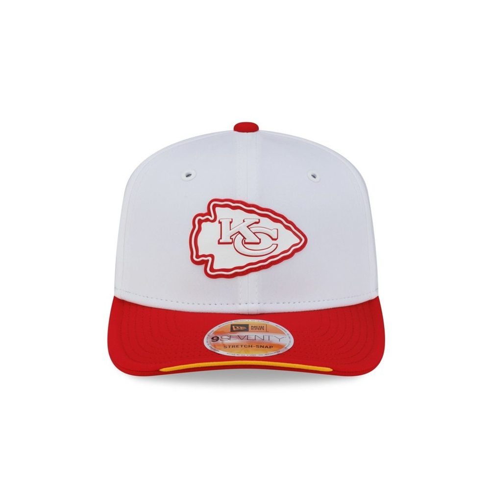 Image courtesy of New Era
A white arrowhead, outlined in red, on a white crown. That is the whole problem in one sentence. Kansas City's mark is one of the most recognisable in the league and it is the only logo in this set rendered in the same colour as the fabric behind it, so from any distance it disappears into the hat. The red brim is doing every bit of the work. Whatever the tonal caps got wrong last year, this manages to repeat on a white crown, which should have been the easiest canvas in the collection.
31. Philadelphia Eagles
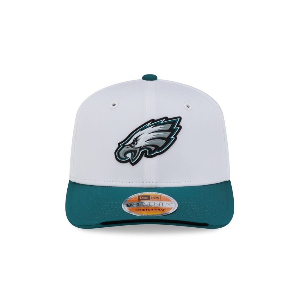 Image courtesy of New Era
The eagle head is rendered in silver and grey, which on a white crown means it has almost nothing to push against. You can see the shape if you look for it and it washes out completely at a glance. The teal brim is genuinely lovely and it is carrying the entire hat. Philadelphia had the option of the midnight green version of this mark and went with the one that vanishes.
30. Detroit Lions
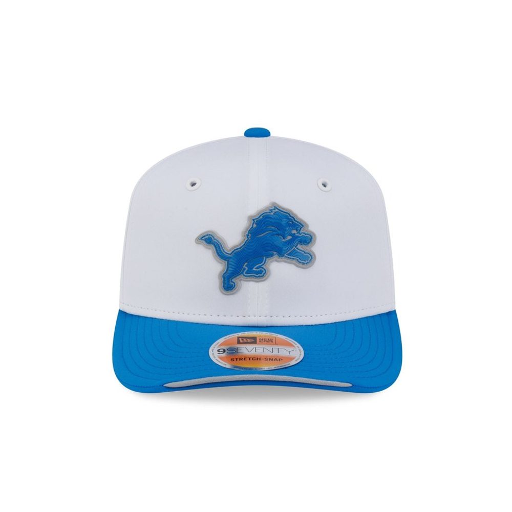 Image courtesy of New Era
Same failure as Philadelphia, for the same reason. The leaping lion is silver with a thin blue outline, and silver on white is not a contrast pairing, it is a suggestion. What makes this more frustrating is that Detroit's Honolulu blue is one of the best colours in the league and it is sitting right there on the brim, unused on the logo itself.
29. New York Jets
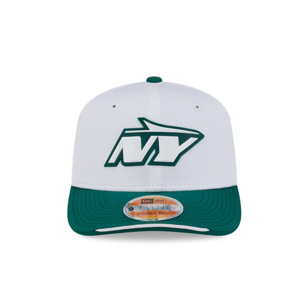 Image courtesy of New Era
The interlocking NY reads as a thin green outline rather than a solid mark, and thin outlines are exactly what a white crown punishes. There is not enough weight in the line to hold your eye. The green brim is a good colour and the hat is not unpleasant, it just does not have a focal point, which for a cap whose entire job is to show off one logo is a real miss.
28. Washington Commanders
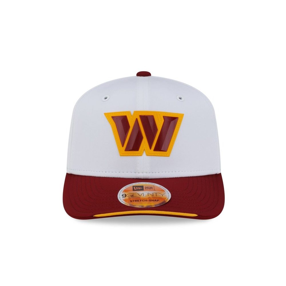 Image courtesy of New Era
Gold on white is a difficult combination and the W does not quite win it. The mark is bold enough in shape to survive, unlike the Chiefs or the Eagles, but the gold sits close enough in value to the white crown that the edges go soft. The burgundy brim is excellent and the contrast between it and the crown is the best thing here.
27. Dallas Cowboys
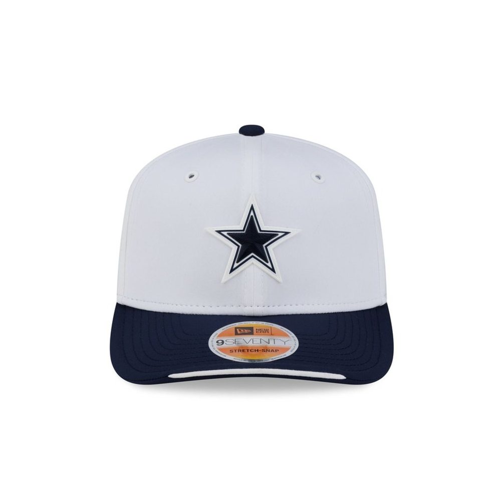 Image courtesy of New Era
A navy star on a white crown with a navy brim. It reads perfectly, and there is nothing else to say about it. Dallas have the simplest primary mark in the league and on a treatment built to showcase one logo that turns into a liability, because a five-pointed star is not a piece of design that rewards attention. Clean, correct, and the least interesting hat in the set to actually look at.
26. Minnesota Vikings
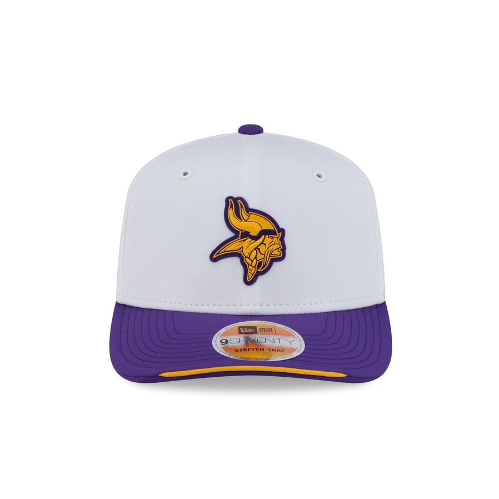 Image courtesy of New Era
The Norseman horn is a genuinely good mark and the purple and gold work well against white. The problem is scale. It is noticeably the smallest logo in the collection relative to the crown, so there is a lot of empty white above and around it and the hat reads as underfilled. The purple brim is strong. Size the mark up ten percent and this moves several places.
25. Tennessee Titans
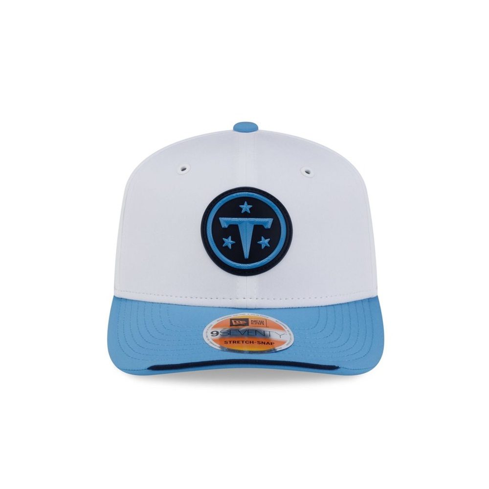 Image courtesy of New Era
The circled T in navy with the three stars is legible and well proportioned, and the powder blue brim is one of the nicer colour choices in the set. It is held back by the mark itself being quiet. Navy on white with a thin light blue ring is tidy rather than striking, and tidy is roughly where Tennessee lands most years.
24. Cleveland Browns
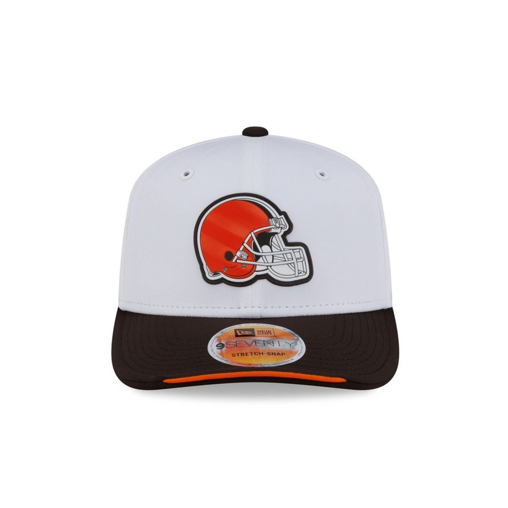 Image courtesy of New Era
The orange helmet reads beautifully against the white. The trouble is underneath it: brown is the hardest colour in the league to put next to white, and the brim goes muddy where every other team gets a clean colour block. Cleveland are stuck with this problem by name, and it is the one hat where the brim actively drags the crown down.
23. Indianapolis Colts
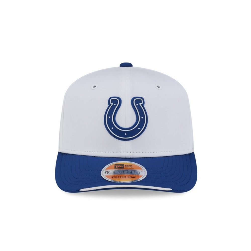 Image courtesy of New Era
Royal horseshoe, white crown, royal brim. It is clean, it is unmistakably Indianapolis, and it is about as safe as this collection gets. The horseshoe is an open shape so it lets a lot of white through, which keeps the hat feeling light. There is no flaw here and no ambition either.
22. Houston Texans
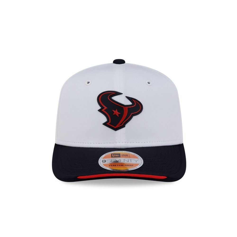 Image courtesy of New Era
The bull head in navy with the red star cut into it is a busier mark than most and the white crown gives it room to breathe. It works. The navy brim is right. What keeps it mid-table is that the red inside the bull is small enough that from a distance this reads as a navy blob, and navy on white is the most common pairing in the whole set.
21. Atlanta Falcons
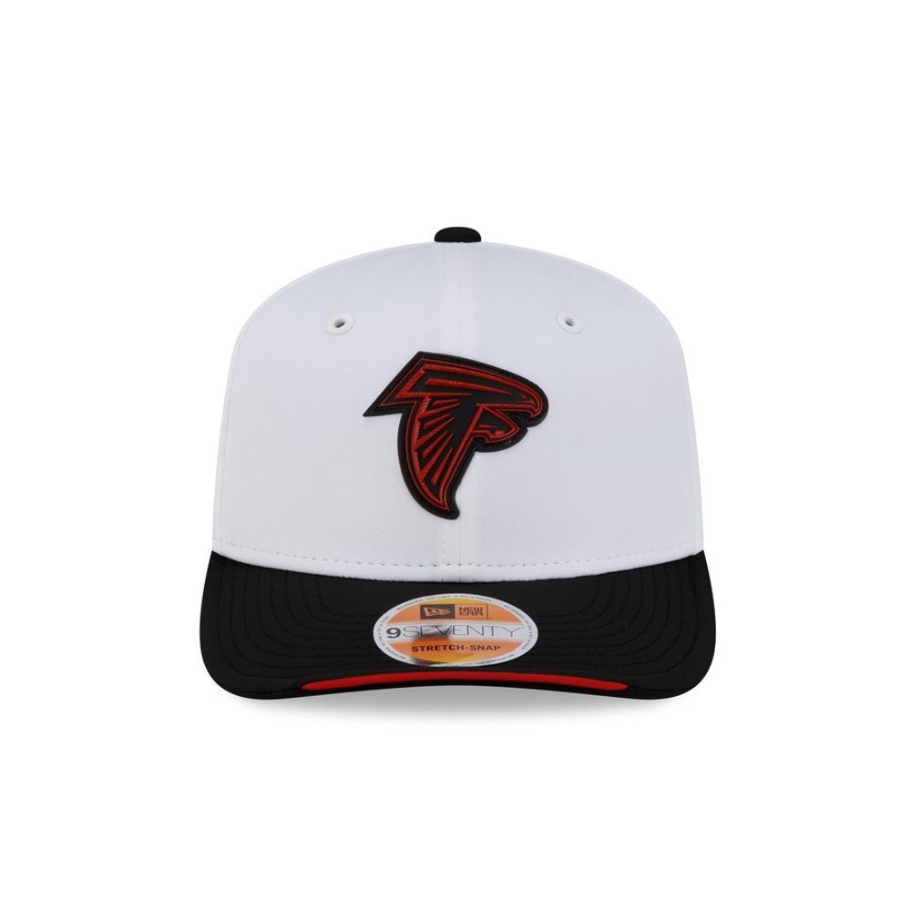 Image courtesy of New Era
The falcon in black with red detail is sharp against white, and the shape of the mark, that hard diagonal dive, gives the hat some movement most of these do not have. The black brim is the correct choice. It sits here rather than higher because the red is almost invisible at a glance and the hat effectively reads as black and white.
20. Arizona Cardinals
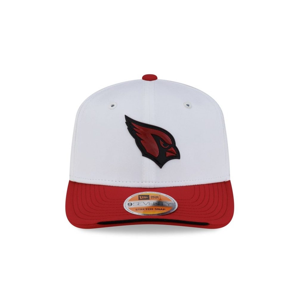 Image courtesy of New Era
The cardinal head in red on white with a red brim is a solid, honest execution. The mark has enough internal detail, the eye and the beak, to hold up under the raised rubber treatment, and the red is deep enough not to glow. Nothing is wrong. Nothing is memorable either, and matching the brim to the logo colour flattens it slightly.
19. Jacksonville Jaguars
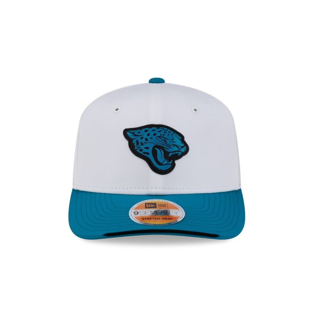 Image courtesy of New Era
Teal and gold on white is an underrated combination and the jaguar head has enough weight in the line to survive the treatment. The teal brim ties it together. It loses ground because the gold detail is fine enough to disappear, leaving a teal mark on white, which is pleasant but a long way short of what those two colours can do together.
18. New York Giants
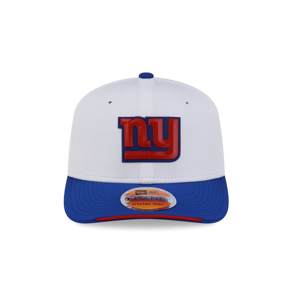 Image courtesy of New Era
The overlapping NY in red and blue is one of the better wordmarks in the league and this is the treatment it wants. Both colours are strong enough to hold against white, the red gives it a second layer that most of these hats do not have, and the royal brim finishes it. A genuinely good hat that a few teams above it only beat on distinctiveness.
17. Seattle Seahawks
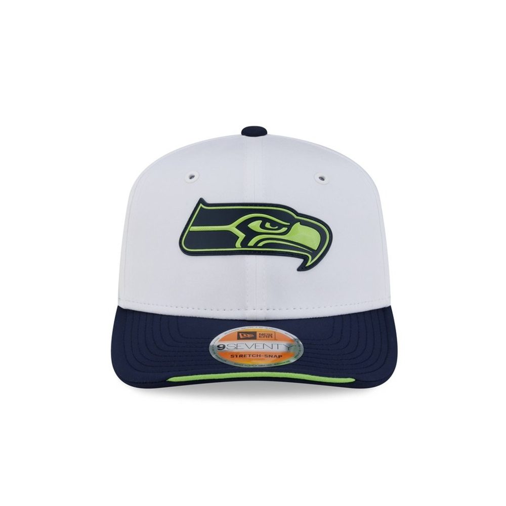 Image courtesy of New Era
The hawk head carries navy, action green and a pale grey in one mark, and against white all three separate properly, which is not a given with a logo this layered. The navy brim with the green underbrim sliver is the best use of a third colour in the collection. Slightly busy, and better for it.
16. Carolina Panthers
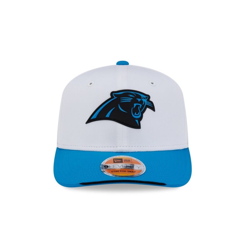 Image courtesy of New Era
The panther head in black with process blue detail is one of the sharpest marks in the league and it looks excellent on white. The process blue brim is unmistakably Carolina. It is a very good hat that stops just short of the top tier because black-on-white is a safe answer, and the blue in the logo is subtle enough that the colour story lives entirely in the brim.
15. New England Patriots
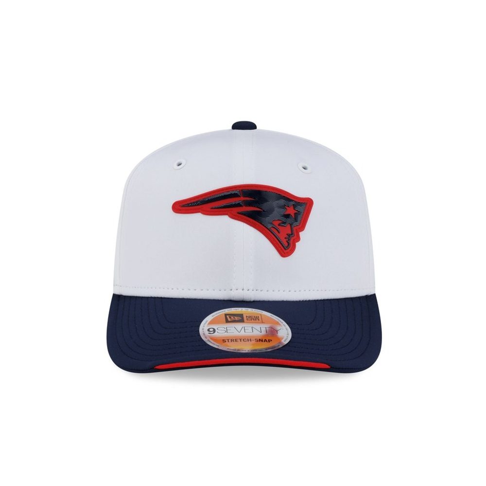 Image courtesy of New Era
The Flying Elvis in navy with the red streak is a busier mark than it gets credit for and the white crown separates its parts properly. Navy holds hard against white, the red gives it a second note, and the navy brim with the red underbrim sliver is a tidy finish. It is a good hat that lands mid-pack because navy-on-white is the default answer in this collection and New England did not do anything to stand out from it.
14. Baltimore Ravens
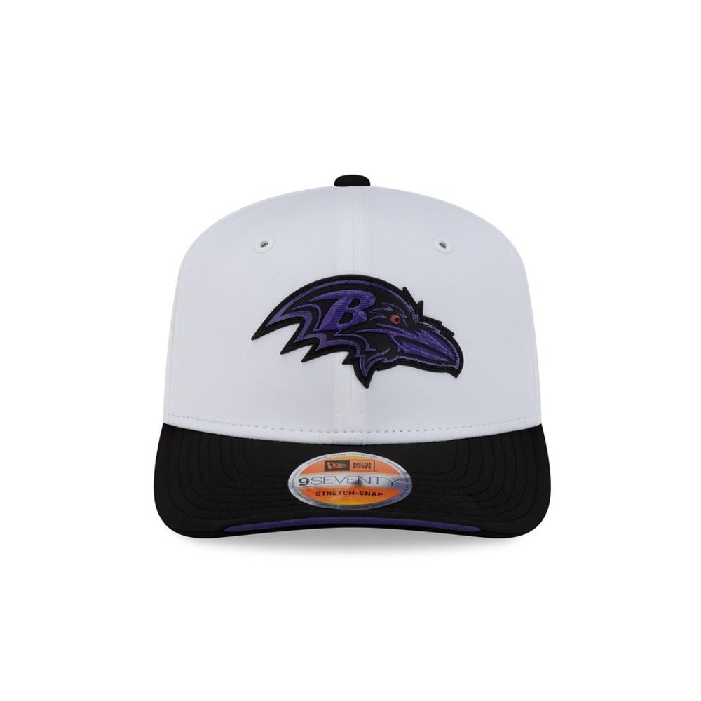 Image courtesy of New Era
Purple on white is a strong, slightly unusual pairing and the raven head has the internal detail to reward the raised treatment. The black brim grounds it. What holds it back a place or two is that the purple reads darker than it should against a bright white crown, so at a glance you register a dark mark rather than a purple one.
13. San Francisco 49ers
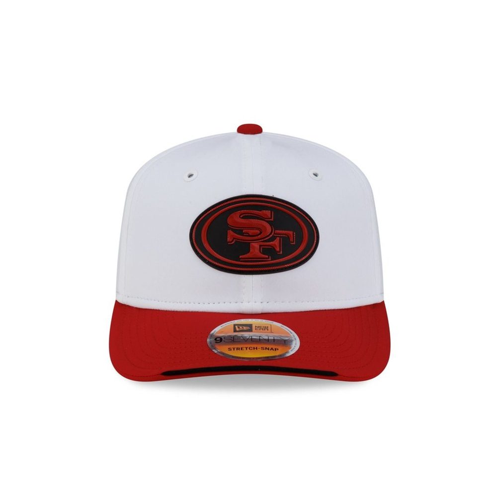 Image courtesy of New Era
The oval SF in red with the gold outline is a classic and it holds up. The gold does real work here, giving the red mark an edge so it does not sit flat on the white. Red brim to match. It is a very good, very expected execution of a very good, very expected logo.
12. Miami Dolphins
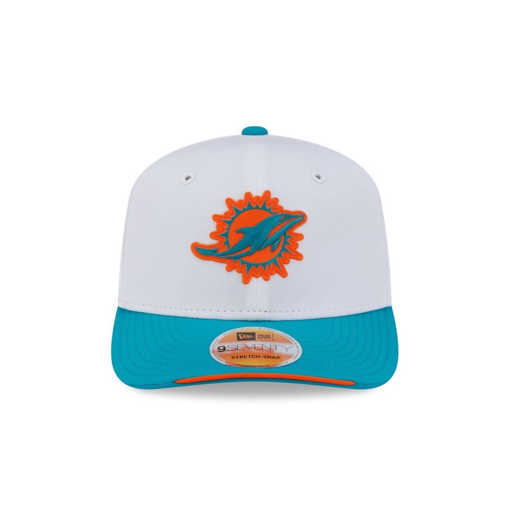 Image courtesy of New Era
One of the biggest improvements in the whole collection. On the tonal cap the dolphin got lost inside its own outline; here the orange sun and the aqua dolphin both have somewhere to go, and the white crown lets Miami's colour pair finally do what it should. The teal brim is excellent. Proof that the treatment, not the logo, was the problem last time.
11. Tampa Bay Buccaneers
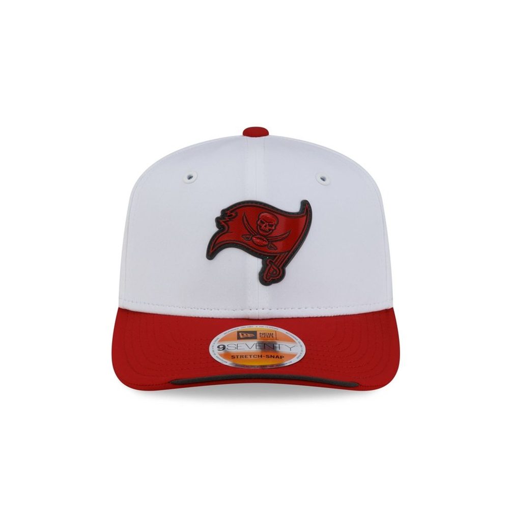 Image courtesy of New Era
The biggest jump of any hat here. Tampa's flag was a red smudge on a red crown in the primary set, the worst of the 32. On white the skull, the swords and the flag shape all separate cleanly and you can finally see one of the most distinctive marks in the league. Red brim, white crown, and a logo that gets to be a logo again.
10. Denver Broncos
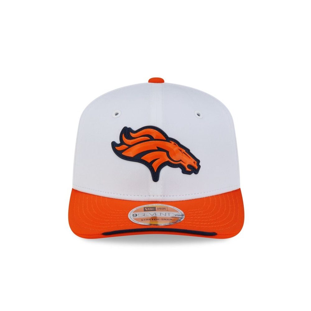 Image courtesy of New Era
The horse head in orange and navy is loud, detailed and completely legible against white, and the orange brim commits hard rather than hedging. This is what a white crown should do for a team with a strong two-colour mark: give both colours somewhere to breathe. The only thing keeping it out of the top five is that the orange brim is a lot of orange.
9. Los Angeles Rams
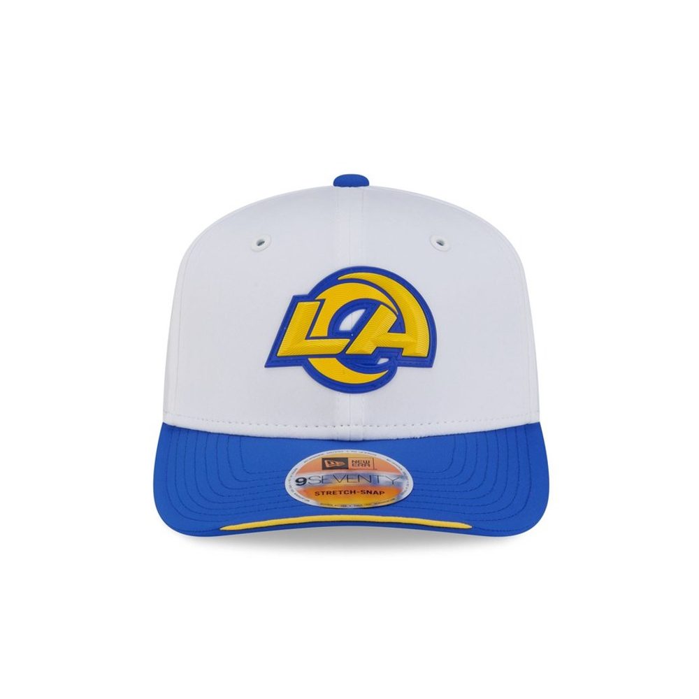 Image courtesy of New Era
The interlocking LA in gold with the blue horn is the best new mark of the last decade and it is excellent here. Gold against white would normally worry us, but the heavy blue outline solves it completely, which is exactly what Washington's W is missing. Royal brim. The Rams won the primary set and they are near the top again.
8. Buffalo Bills
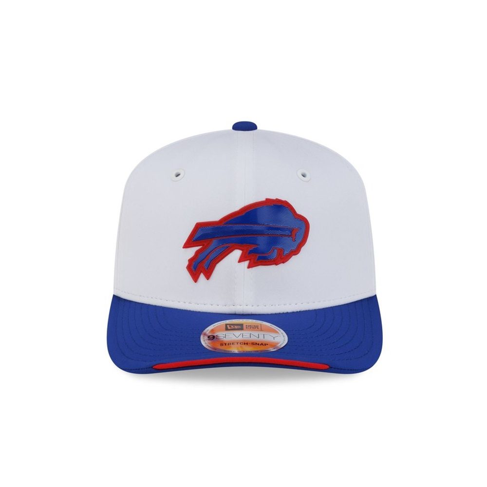 Image courtesy of New Era
All three Buffalo colours are present and all three are working. The red charging buffalo has real weight against the white, the royal brim gives the hat a foundation, and the red underbrim ties back to the mark. This is one of the few hats in the set where the crown, the logo and the brim are all doing something different and it still holds together.
7. Cincinnati Bengals
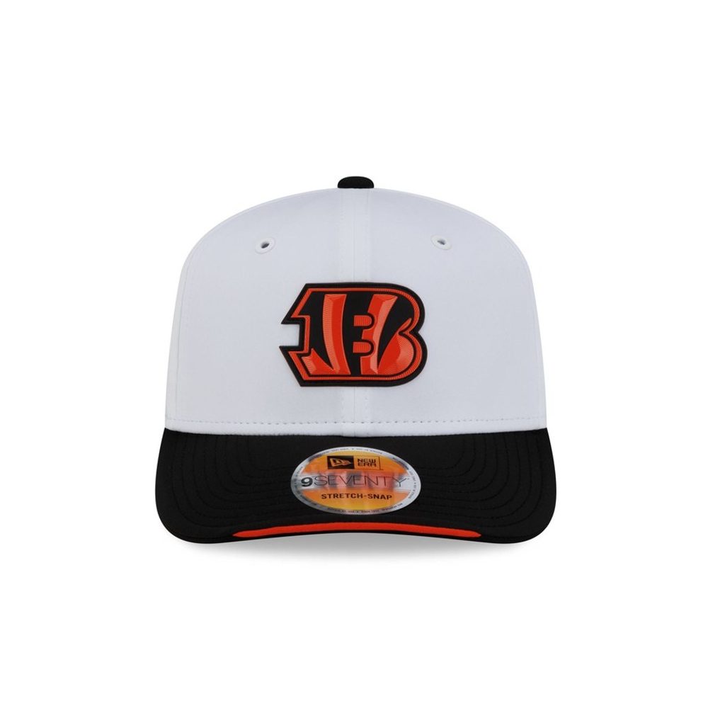 Image courtesy of New Era
The striped B is a genuinely strange logo and white is the background it has always wanted. The orange reads hot, the black tiger stripes inside it stay separate rather than merging into a blob, and the black brim frames the whole thing. Cincinnati's mark is built out of contrast and this is the first cap treatment in a while that lets it have some.
6. Chicago Bears
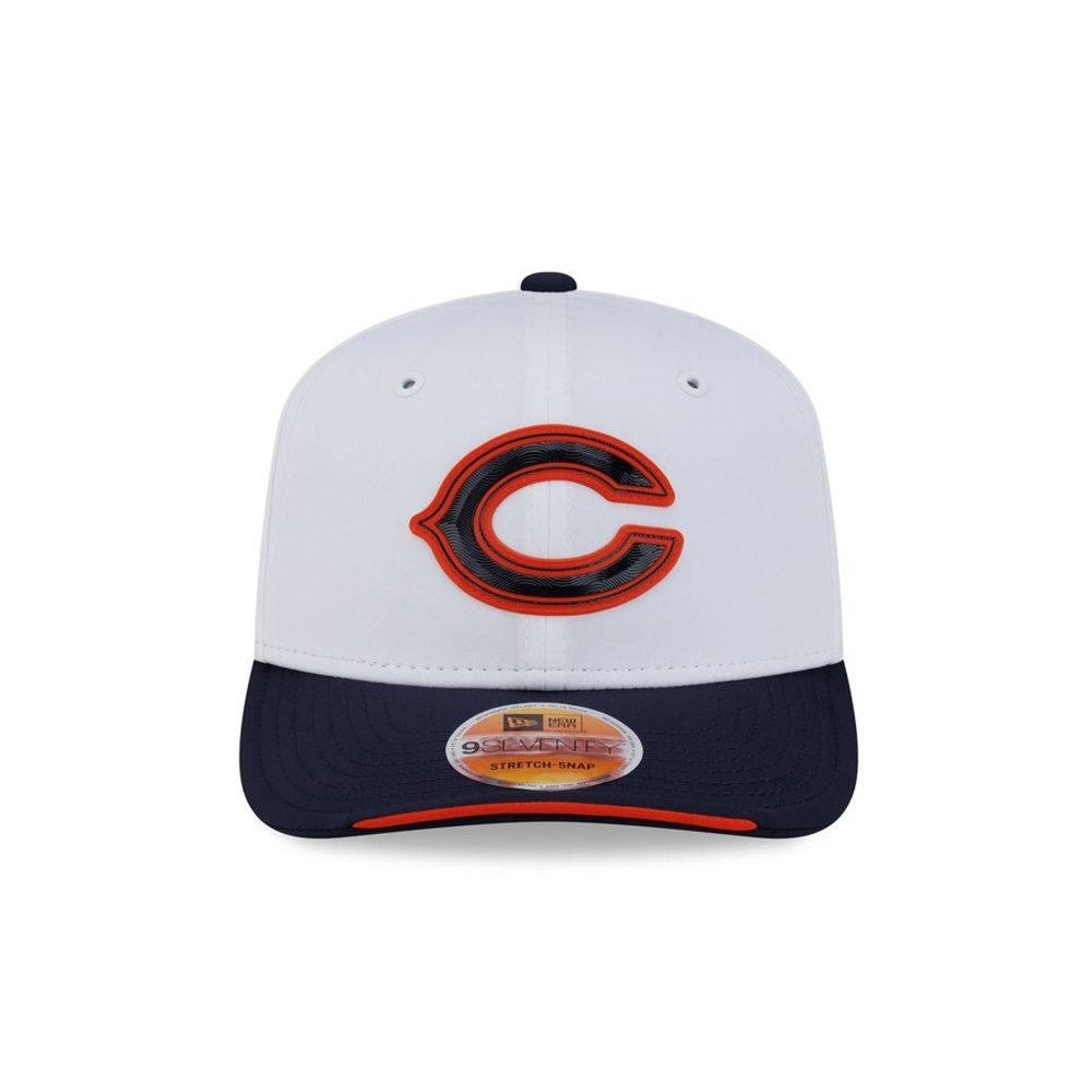 Image courtesy of New Era
The orange C with the navy outline against a white crown is close to perfect and it is a straight upgrade on the tonal version. Orange is Chicago's best colour and putting it on white is the simplest way to prove it. The navy brim is right. Just outside the top tier because a single letter, however well executed, gives you less to look at than the marks above it.
5. Las Vegas Raiders
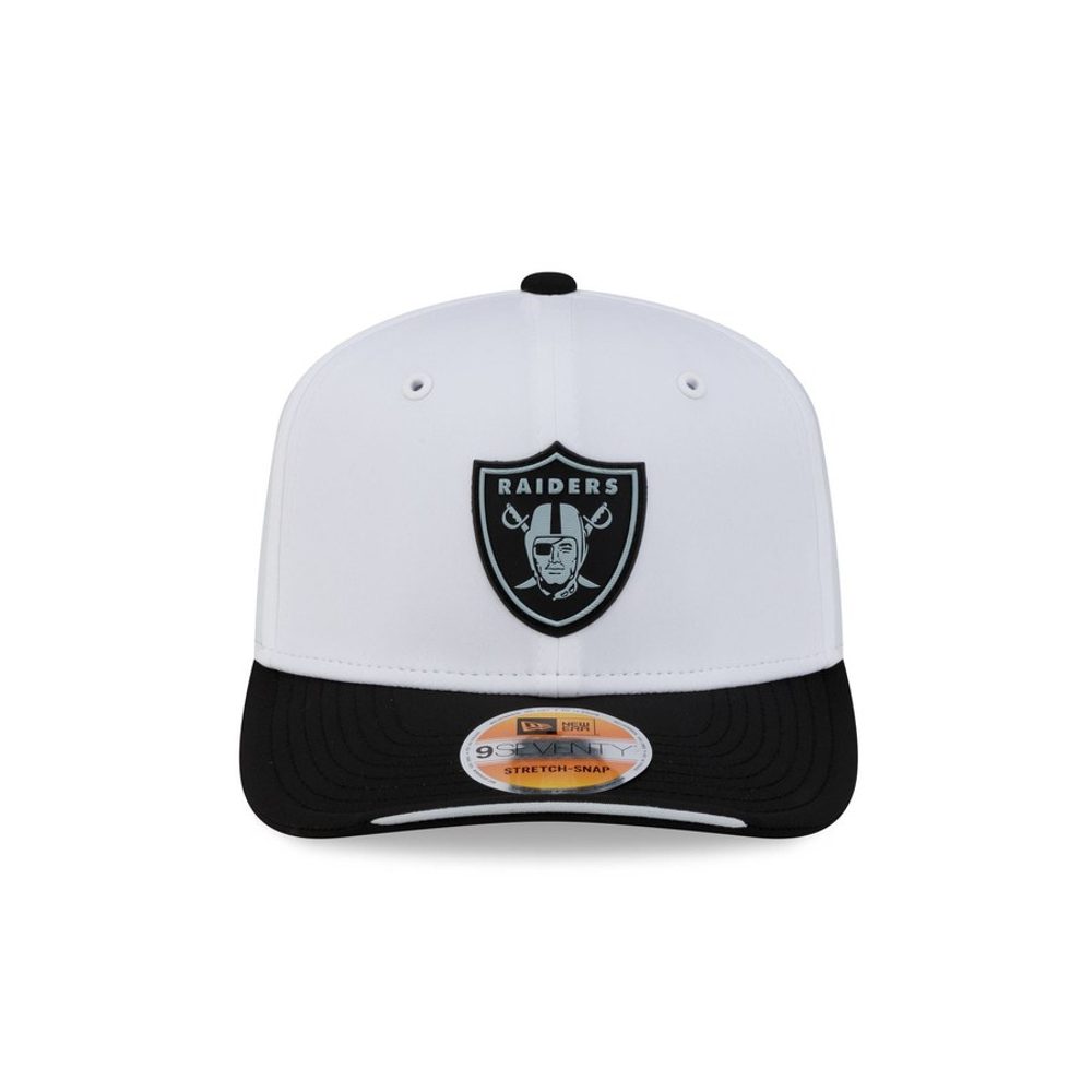 Image courtesy of New Era
The shield in black and silver is one of the great logos in sport and the white crown gives it maximum separation, which is more than the silver-heavy teams managed. Black brim, black button, nothing wasted. It sits just below the top four only because the Raiders' palette means white is the one colour that is not really theirs.
4. Green Bay Packers
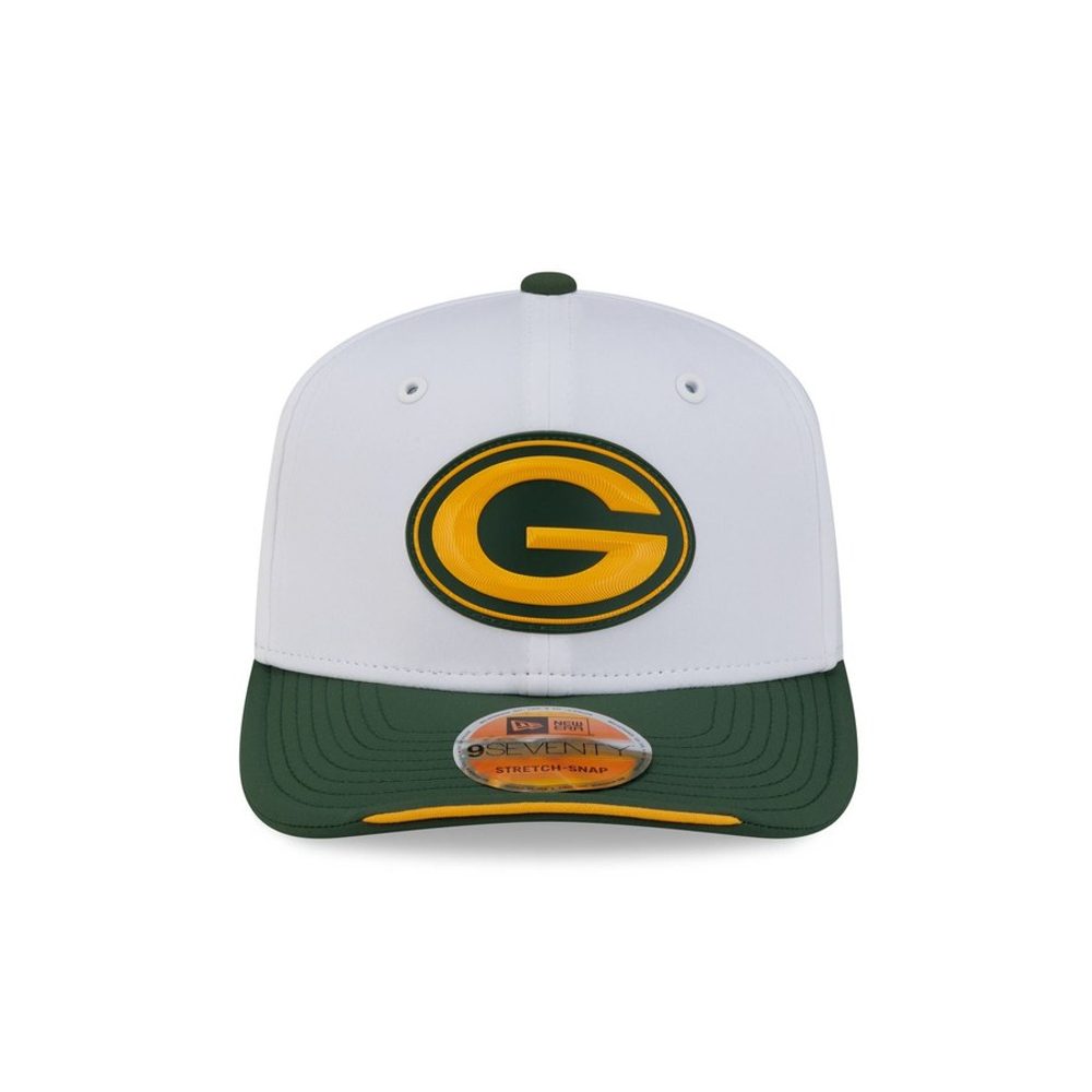 Image courtesy of New Era
The oval G in gold with the green surround is a mark designed for exactly this. Green Bay's problem on coloured crowns has always been that the G's gold ring loses its edge; on white the gold gets a hard boundary and the whole thing snaps into focus. The forest green brim is the best colour block in the collection. Classic in the way that word is supposed to mean.
3. New Orleans Saints
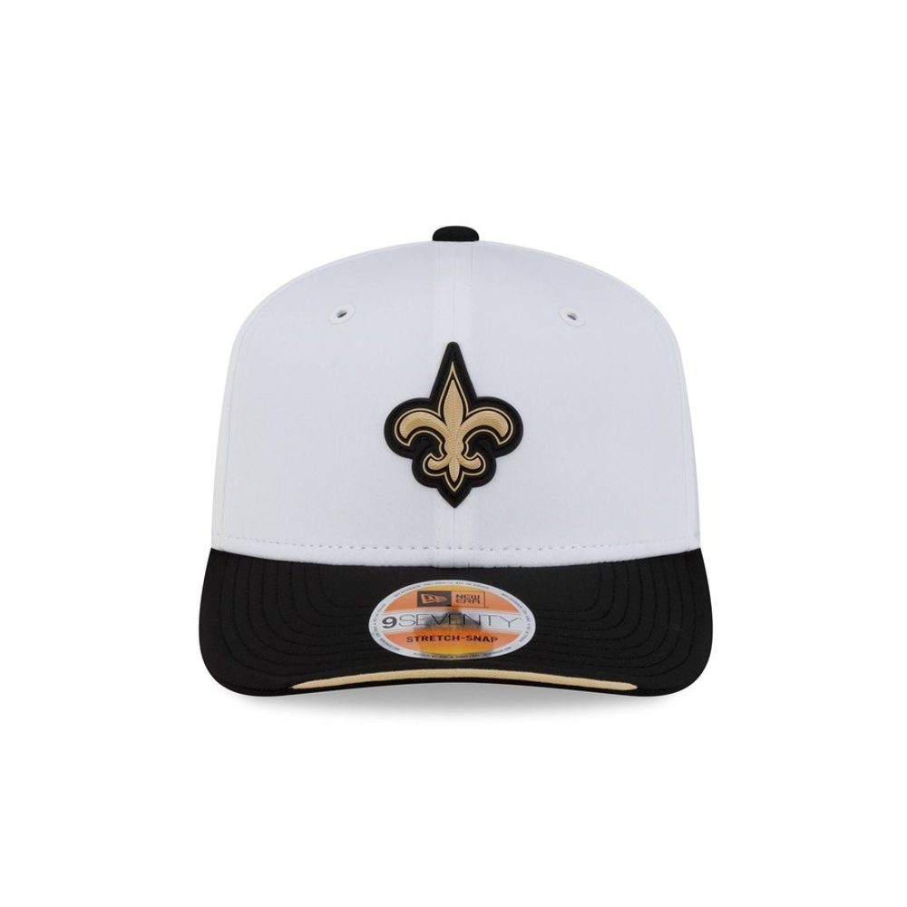 Image courtesy of New Era
Gold on white is the hardest brief in this set and the fleur-de-lis is the mark that solves it, because the shape is intricate enough that you read the outline before you read the fill. Add the black brim to frame the whole thing and this is the best gold-on-white execution anyone managed. Understated and genuinely beautiful.
2. Pittsburgh Steelers
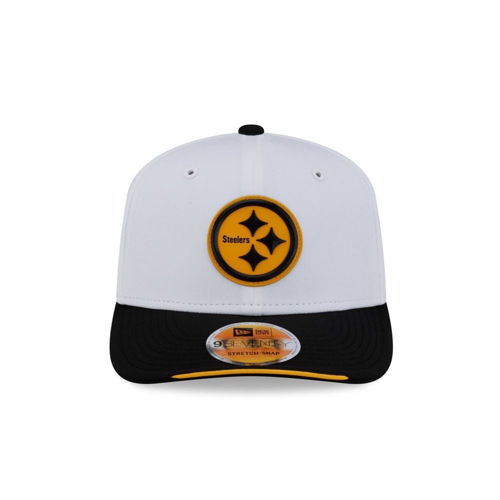 Image courtesy of New Era
The hypocycloids were drawn for a circle and a white crown gives them one. Yellow, red and blue on white inside a black ring, with the Steelers wordmark holding the middle, and every element is doing something. This is the most colour any hat in the collection manages without going busy, and the black brim keeps it anchored. The best-designed logo in the league on the treatment that suits it.
1. Los Angeles Chargers
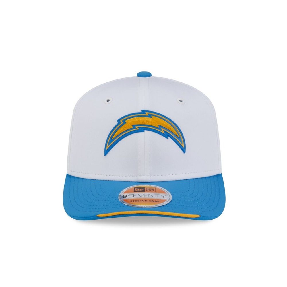 Image courtesy of New Era
The best hat in the collection. The powder blue bolt with the gold outline against a bright white crown is the single most striking thing New Era made this year, and it works for a specific reason: powder blue is a light colour that would normally struggle on white, and the gold edge gives it the boundary it needs. The powder blue brim ties back to the mark without repeating it flatly. Los Angeles have the best colour pair in football and this is the first cap in years that lets them use it.
What The White Caps Tell Us
Contrast beat colour, again. The four A grades all went to teams whose logo has a hard outline: the Chargers gold edge on the powder blue bolt, the Saints intricate fleur-de-lis, the Steelers black ring, the Packers gold boundary around the G. Every one of them gives the mark somewhere to end. The three worst hats are the three whose marks just fade out.
Gold on white is the hardest brief in the set, and it split the field completely. New Orleans and Green Bay solved it with an outline. Washington did not, and the W goes soft at the edges as a result. Same colour, same crown, opposite outcomes.
The tonal failures got fixed. Tampa Bay went from the worst hat in the primary collection to one of the best here, and Miami made almost the same jump. Neither team changed its logo. That is worth remembering the next time a cap gets called ugly, because the treatment does more of the work than the mark does.
The Bottom Line
The Chargers win, with the powder blue bolt and the gold outline on a bright white crown, the best cap New Era made this year. Pittsburgh, New Orleans and Green Bay are the other A grades. Kansas City finish last for putting a white arrowhead on a white hat, with Philadelphia and Detroit just above them for choosing silver. The collection averages a B, which is a full step better than the primary set.
For the rest of the collection, see our rankings of all 32 primary sideline hats and all 26 historic sideline hats. For uniforms, we are logging every NFL game combination this season.
Frequently Asked Questions
What are the 2026 NFL white sideline hats?
A white-crown version of New Era's 2026 NFL Sideline collection, built on the same 9SEVENTY Stretch-Snap silhouette as the primary caps. Each hat pairs a white crown with a brim in the team's colour and a raised logo rendered in the team's full colours rather than tonally.
Which 2026 NFL white sideline hat is the best?
The Los Angeles Chargers. The powder blue bolt with its gold outline against a bright white crown is the most striking cap in the collection, and the gold edge is what stops the light blue from washing out. It is one of four caps we graded an A, alongside Pittsburgh, New Orleans and Green Bay.
Which 2026 NFL white sideline hat is the worst?
Kansas City. The Chiefs arrowhead is rendered in white with a red outline on a white crown, so the logo effectively disappears into the hat. Philadelphia and Detroit are next worst, both for using silver marks that wash out against white.
How are the white sideline hats different from the primary ones?
The primary caps use a crown in the team's colour with the logo rendered tonally in the same colour family, which caused several marks to disappear. The white caps use a white crown with the logo in full colour, which gives almost every logo more contrast. Tampa Bay and Miami improved dramatically as a result.
How much are the 2026 NFL white sideline hats?
They are part of New Era's 9SEVENTY Stretch-Snap Sideline line, sold through New Era and Fanatics. Prices vary by retailer and change through the season, so check the current listing rather than relying on a figure here.
Do NFL teams actually wear the white sideline hats in games?
Yes. The Sideline collection is the on-field range coaches and players wear during games and on the sideline, and the white version is worn as an alternate to the primary colourway through the season.