NFL Stories
 Arizona Cardinals
 Atlanta Falcons
 Baltimore Ravens
 Buffalo Bills
 Carolina Panthers
 Chicago Bears
 Cincinnati Bengals
 Cleveland Browns
 Dallas Cowboys
 Denver Broncos
 Detroit Lions
 Green Bay Packers
 Houston Texans
 Indianapolis Colts
 Jacksonville Jaguars
 Kansas City Chiefs
 Las Vegas Raiders
 Los Angeles Chargers
 Los Angeles Rams
 Miami Dolphins
 Minnesota Vikings
 New England Patriots
 New Orleans Saints
 New York Giants
 New York Jets
 Philadelphia Eagles
 Pittsburgh Steelers
 San Francisco 49ers
 Seattle Seahawks
 Tampa Bay Buccaneers
 Tennessee Titans
 Washington Commanders
 NBA Stories
 Atlanta Hawks
 Boston Celtics
 Brooklyn Nets
 Charlotte Hornets
 Chicago Bulls
 Cleveland Cavaliers
 Dallas Mavericks
 Denver Nuggets
 Detroit Pistons
 Golden State Warriors
 Houston Rockets
 Indiana Pacers
 LA Clippers
 Los Angeles Lakers
 Memphis Grizzlies
 Miami Heat
 Milwaukee Bucks
 Minnesota Timberwolves
 New Orleans Pelicans
 New York Knicks
 Oklahoma City Thunder
 Orlando Magic
 Philadelphia 76ers
 Phoenix Suns
 Portland Trail Blazers
 Sacramento Kings
 San Antonio Spurs
 Toronto Raptors
 Utah Jazz
 Washington Wizards
 MLB Stories
 Arizona Diamondbacks
 Atlanta Braves
 Baltimore Orioles
 Boston Red Sox
 Chicago Cubs
 Chicago White Sox
 Cincinnati Reds
 Cleveland Guardians
 Colorado Rockies
 Detroit Tigers
 Houston Astros
 Kansas City Royals
 Los Angeles Angels
 Los Angeles Dodgers
 Miami Marlins
 Milwaukee Brewers
 Minnesota Twins
 New York Mets
 New York Yankees
 Philadelphia Phillies
 Pittsburgh Pirates
 San Diego Padres
 San Francisco Giants
 Seattle Mariners
 St. Louis Cardinals
 Tampa Bay Rays
 Texas Rangers
 Toronto Blue Jays
 Washington Nationals
 NHL Stories
 Anaheim Ducks
 Boston Bruins
 Buffalo Sabres
 Calgary Flames
 Carolina Hurricanes
 Chicago Blackhawks
 Colorado Avalanche
 Columbus Blue Jackets
 Dallas Stars
 Detroit Red Wings
 Edmonton Oilers
 Florida Panthers
 Los Angeles Kings
 Minnesota Wild
 Montreal Canadiens
 Nashville Predators
 New Jersey Devils
 New York Islanders
 New York Rangers
 Ottawa Senators
 Philadelphia Flyers
 Pittsburgh Penguins
 San Jose Sharks
 Seattle Kraken
 St. Louis Blues
 Tampa Bay Lightning
 Toronto Maple Leafs
 Vancouver Canucks
 Vegas Golden Knights
 Washington Capitals
 Winnipeg Jets
 All Soccer Stories
 International Competitions
 UEFA Champions League
 Premier League
 Arsenal
 Aston Villa
 Bournemouth
 Brentford
 Brighton
 Chelsea
 Coventry City
 Crystal Palace
 Everton
 Fulham
 Hull City
 Ipswich Town
 Leeds United
 Liverpool
 Manchester City
 Manchester United
 Newcastle
 Nottingham Forest
 Sunderland
 Tottenham
 La Liga
 Serie A
 Bundesliga
 Ligue 1
 MLS
MLS All F1 Stories
 Alpine
 Aston Martin
 Audi
Audi Cadillac
 Ferrari
 Haas
Haas McLaren
 Mercedes
 Racing Bulls
 Red Bull Racing
 Williams
 NASCAR
New Era's 2026 NFL Sideline collection is out, and the headline is that every team got the same treatment this year. One silhouette, the 9SEVENTY Stretch-Snap with the notched brim, one construction, and one idea: a crown in the team's primary color with a raised rubberized logo on the front and a thin sliver of a second color tucked under the brim.
It is a real step up from the busy embroidered sideline caps of the last few years. It is also a treatment that exposes a team's logo completely, because when everything else is stripped away the only thing left to look at is the mark on the front. Some teams have a mark built for that. Some very much do not.
We graded all 32, worst to first. One rule decided most of this list, and you will see it coming by about the fifth hat.
The Rule That Decides This Whole Ranking
Tonal is the defining choice of the 2026 collection, meaning the logo is molded in the same color as the crown it sits on, with a thin keyline around the edge for definition. When a team's logo is filled in its own crown color, it disappears. When it is given a genuinely different color, it sings.
That is nearly the entire ranking in one sentence. The bottom of this list is full of teams whose logos were painted the same shade as their hats, and the top is full of teams who used white, or gold, or a real second color. A few teams beat the pattern in both directions, and we will point those out as they come.
Counting down from 32.
32. Tampa Bay Buccaneers
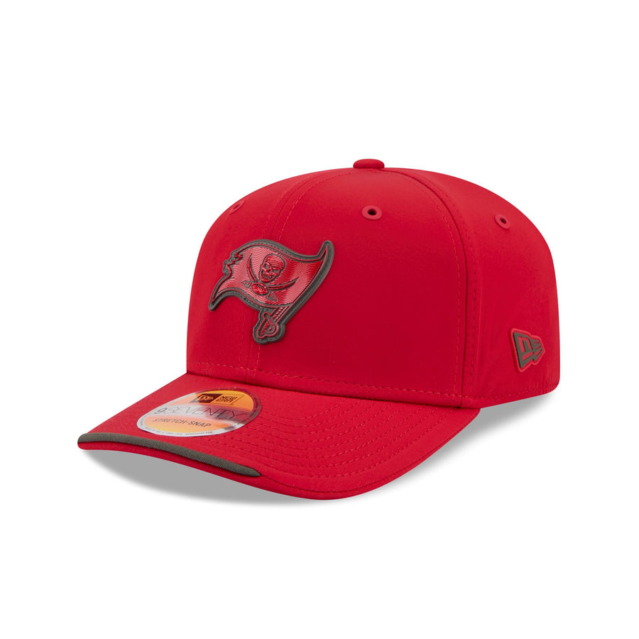 Image courtesy of New Era
Red crown, red flag, pewter outline. The Bucs logo is a pirate flag with a skull and crossed swords, and none of that survives when the whole thing is rendered in the same red as the fabric it sits on. From three feet away it is a smudge. Tampa has one of the most distinctive marks in the league and this is the one hat in the set that hides it completely.
31. Miami Dolphins
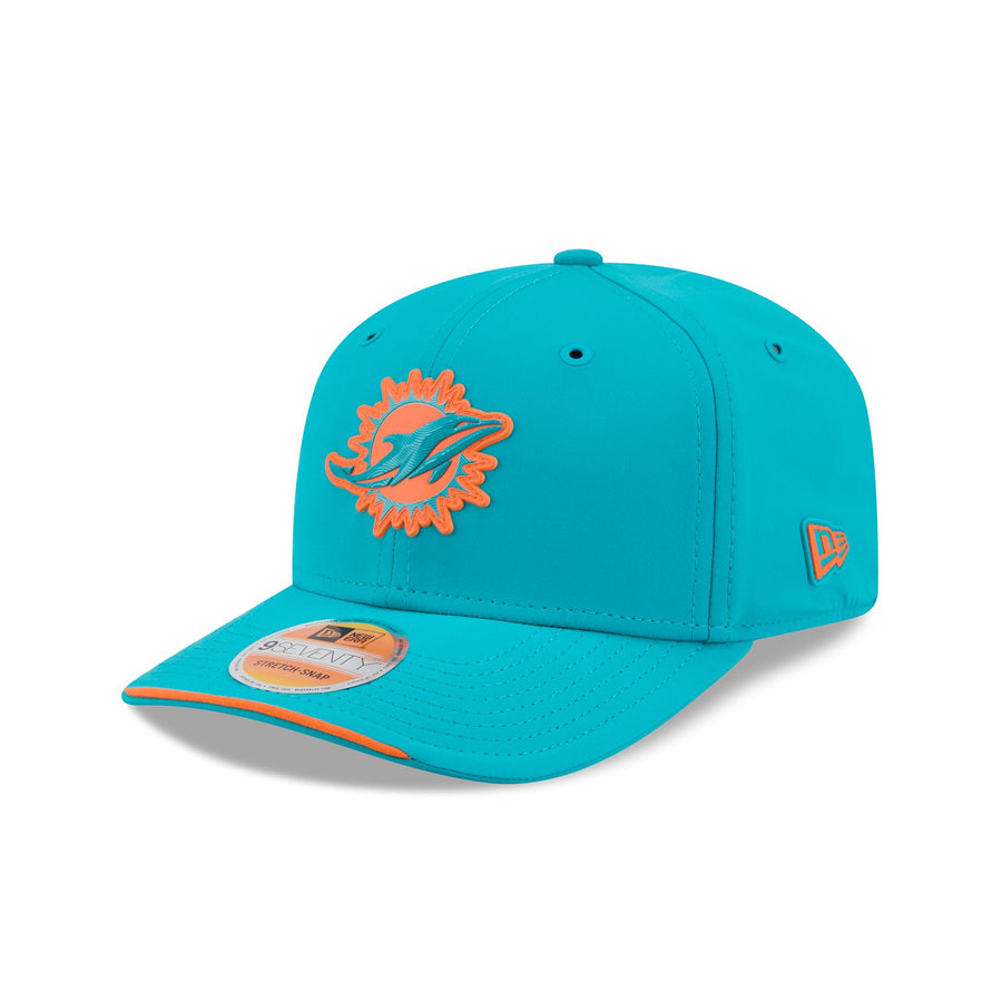 Image courtesy of New Era
Teal crown with the dolphin in orange, which sounds like it should work and does not. The orange is doing all the shouting while the dolphin itself gets lost inside its own outline, and the modern mark is too thin and too smooth to carry a raised rubber treatment. Miami owns the best color pair in the sport. This does very little with it.
30. Atlanta Falcons
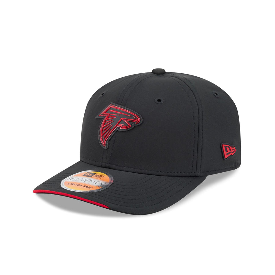 Image courtesy of New Era
Black crown, black falcon, red outline. Same problem as Tampa, and the falcon suffers more because it is an angular mark built from hard negative space. Fill that in with the crown color and the bird stops reading as a bird. The red keyline is the only thing keeping this from vanishing entirely, and a keyline is not a design.
29. Houston Texans
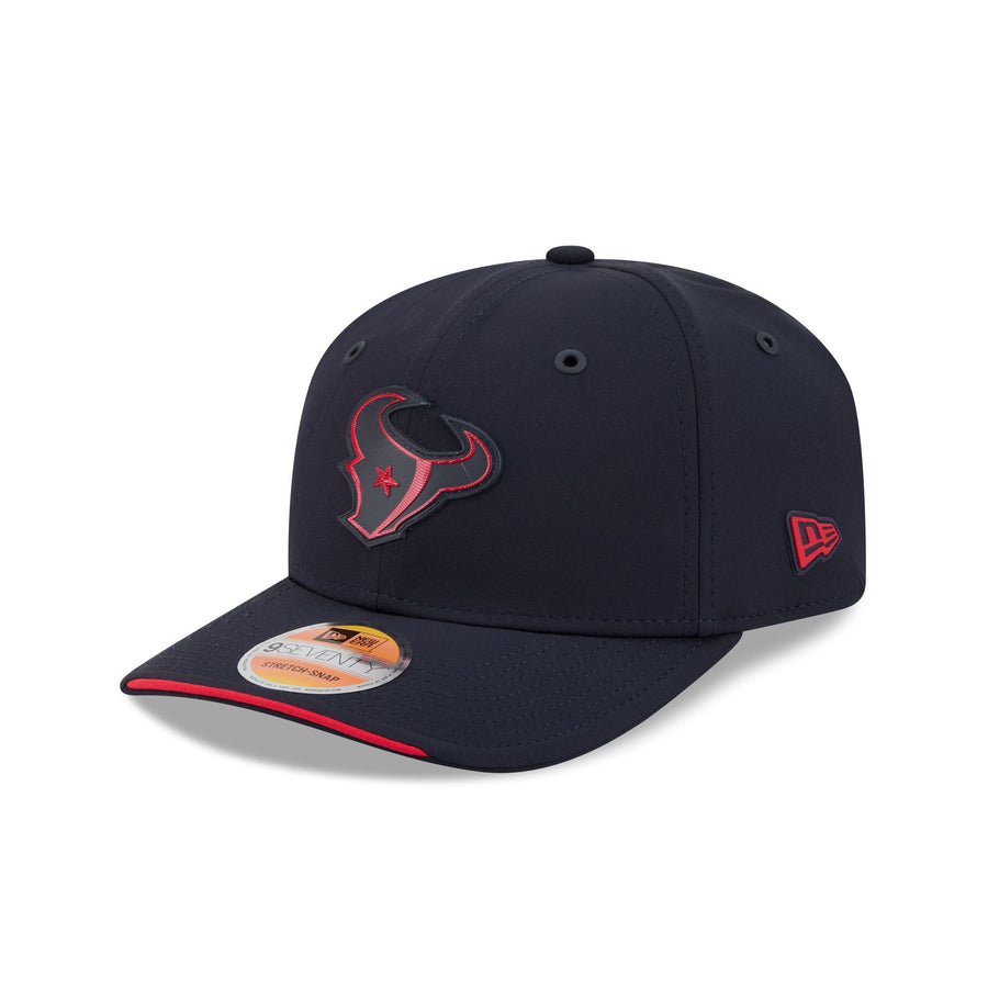 Image courtesy of New Era
Navy crown, navy bull, red trim. The Texans logo already leans hard on its inner detail, the star and the flag shapes inside the bull's head, and every one of those details is gone here. What is left is a silhouette. It is not offensive, it is just the least legible version of a logo that was not especially strong to begin with.
28. Baltimore Ravens
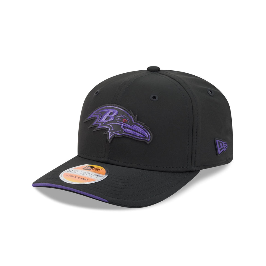 Image courtesy of New Era
Black crown with the raven head in purple. The contrast is technically there, but purple on black is the single hardest color pair in the league to read, and New Era gave it no help. The shield-and-B detail inside the head turns to mush. Baltimore's mark needs light behind it and this hat gives it none.
27. Arizona Cardinals
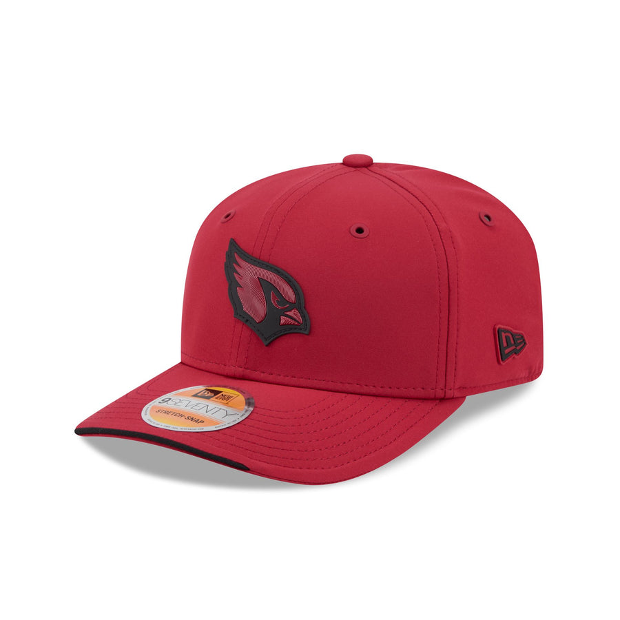 Image courtesy of New Era
Red crown, red cardinal, black outline. The cardinal head is a genuinely good logo with real personality in the eye and the beak, and all of that personality is flattened into a single tone. The black outline gives it an edge but nothing inside. This is the tonal treatment at its most pointless, applied to a mark that had plenty to say.
26. Washington Commanders
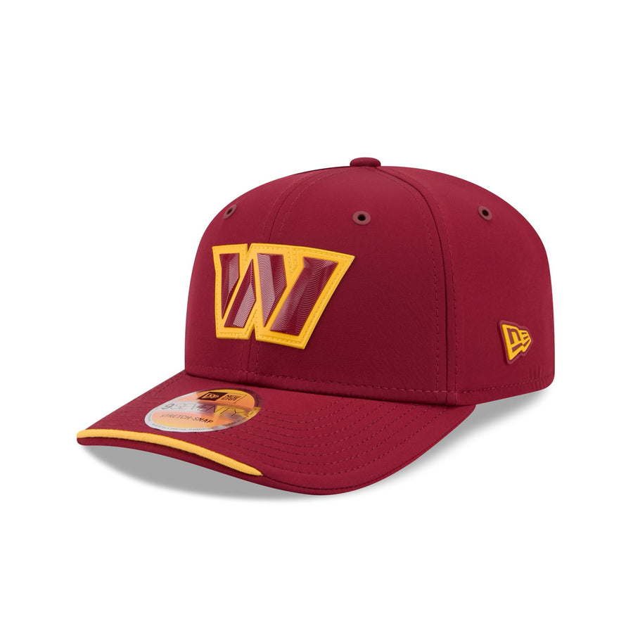 Image courtesy of New Era
Burgundy crown with the gold W. The contrast is fine, the execution is not. The W is filled burgundy inside a gold border, so it reads hollow, like an outline someone forgot to finish. Washington's W is already a thin mark, and hollowing it out leaves the front of this hat looking unresolved. The gold sliver on the brim is the best thing here.
25. San Francisco 49ers
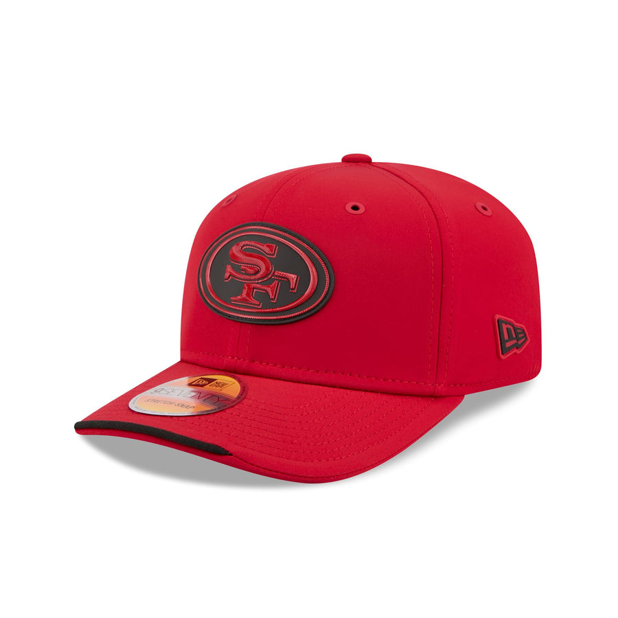 Image courtesy of New Era
Red crown with the SF oval in black and tonal red. San Francisco's oval is one of the great simple marks in football, and it lives on the contrast between the white oval and the red letters. Invert that, drop the white entirely, and you get a dark blob on a red hat. The craft is fine. The decision is wrong.
24. Cincinnati Bengals
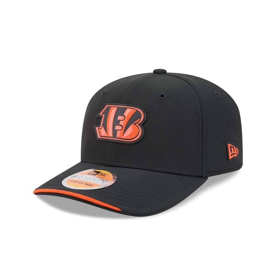 Image courtesy of New Era
Black crown, orange B with the tiger striping inside it. This one actually reads, and the orange is bright enough to carry across a room. It sits here because the striping detail that makes the Bengals B special gets compressed into the raised rubber and loses its bite. A good logo, competently handled, without much reason to reach for it.
23. New Orleans Saints
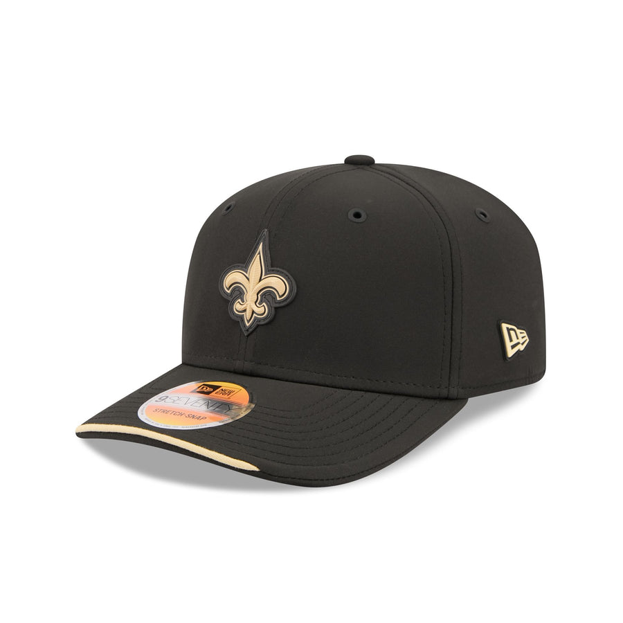 Image courtesy of New Era
Black crown, gold fleur-de-lis, gold sliver on the brim. Clean, correct, and completely expected. The fleur-de-lis is a shape that works at any size in any material, so it was always going to survive this treatment. The issue is that black and gold is the safest possible combination and New Orleans did nothing else with it. Nice hat. No idea in it.
22. Chicago Bears
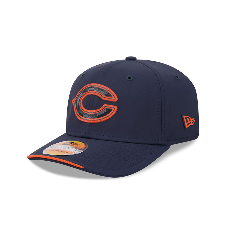 Image courtesy of New Era
Navy crown with the wishbone C filled navy and outlined orange. The C is the right mark to use and the orange keyline is the right accent, but filling the letter with the crown color means the shape only exists as a ring. Chicago's C should be solid orange. Half a decision away from being very good.
21. New England Patriots
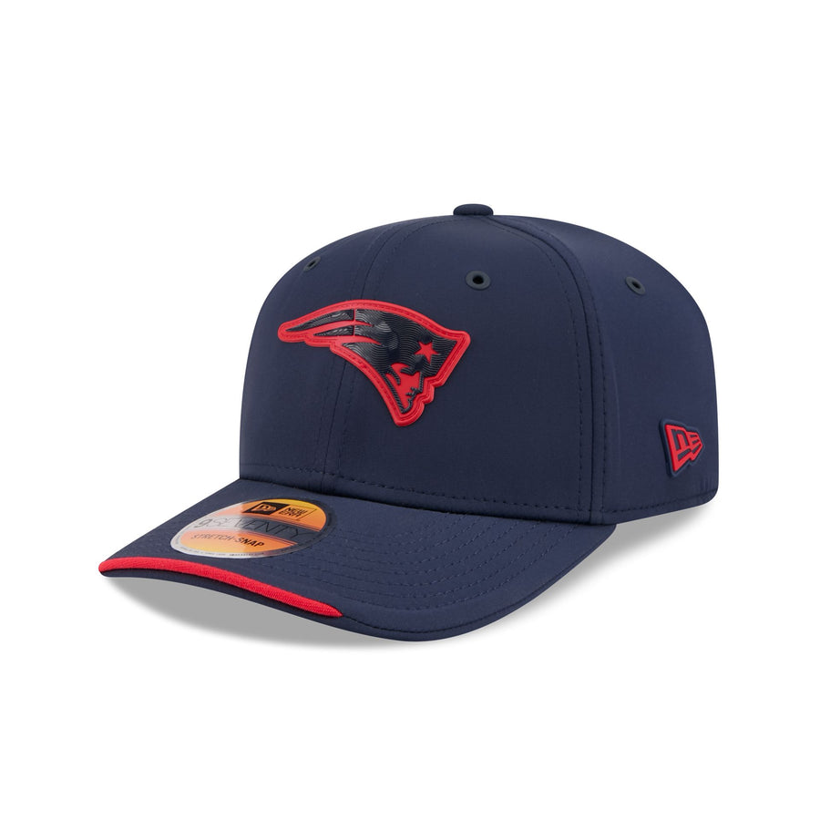 Image courtesy of New Era
Navy crown, navy Flying Elvis, red outline. The Patriots mark has a lot of internal geometry, the face, the star, the flowing hair, and the tonal fill smooths all of it into one shape. What saves it is that the silhouette itself is strong enough to survive. You know exactly what team this is from across a parking lot, which is more than Houston or Tampa can say.
20. Jacksonville Jaguars
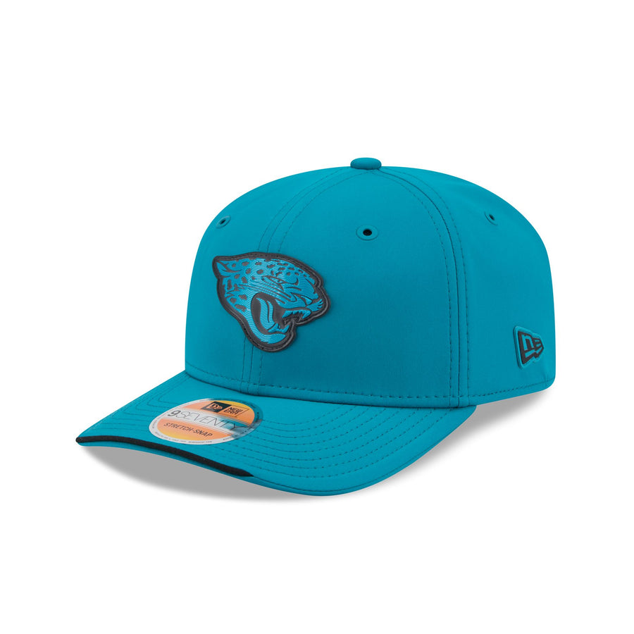 Image courtesy of New Era
Teal crown, tonal teal jaguar, black outline. The teal is a genuinely great color and the reason this ranks above the other tonal jobs is that the jaguar head is a chunky, high-contrast shape by nature, so it holds together even when it is filled in. Still, this is a hat carried entirely by its base color rather than anything on the front of it.
19. Buffalo Bills
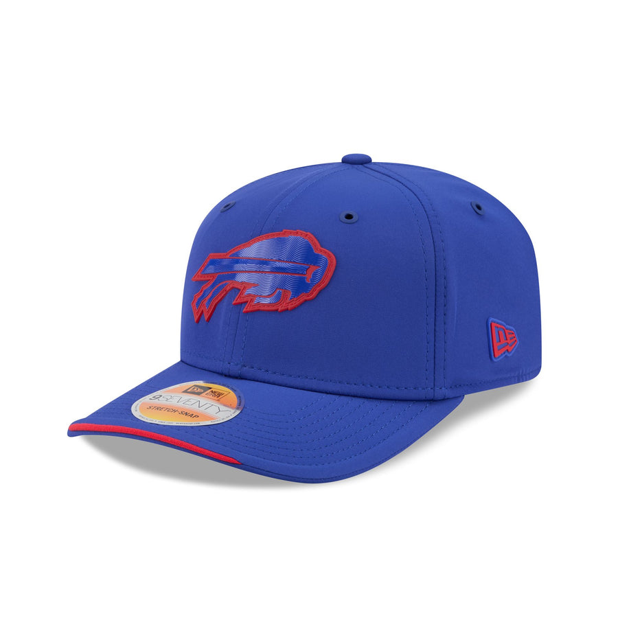 Image courtesy of New Era
Royal crown, tonal blue buffalo, red outline. The charging buffalo is one of the best logos in the league and it is at least still recognizable here, which puts it ahead of the outright failures. But the red is reduced to a keyline and a brim sliver, and Buffalo's whole visual identity is red and blue together. Half the palette is missing.
18. New York Giants
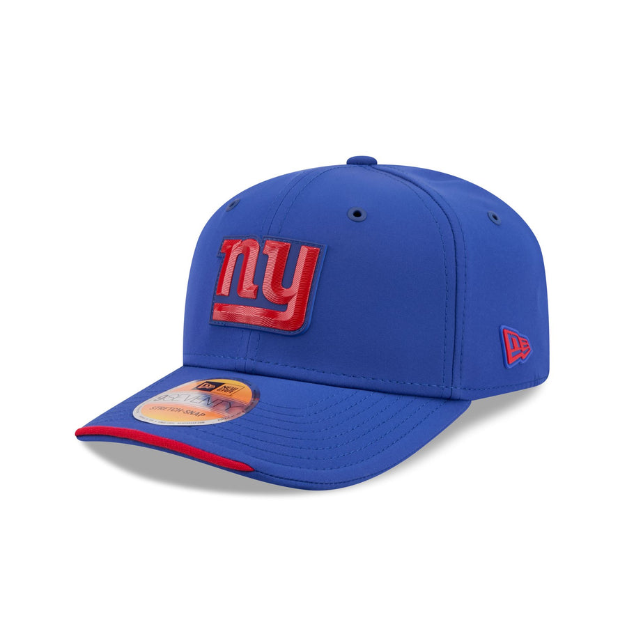 Image courtesy of New Era
Royal crown with the lowercase ny in red. Bright, legible, unmistakable, and it makes a clean case for what the tonal treatment should look like when the logo is a different color than the hat. It ranks here rather than higher because the lowercase ny is simply a less interesting mark than the block GIANTS the same team gets on its historic cap.
17. Los Angeles Chargers
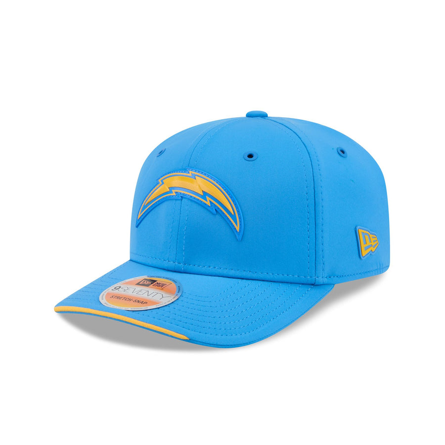 Image courtesy of New Era
Powder blue crown with the gold bolt. The bolt is the best pure shape in the NFL and powder blue is the best base color, so this should be a runaway. It is held back by the gold reading a little flat against the blue in this material, and by the bolt sitting slightly small on a very open crown. Good, and it should have been great.
16. Seattle Seahawks
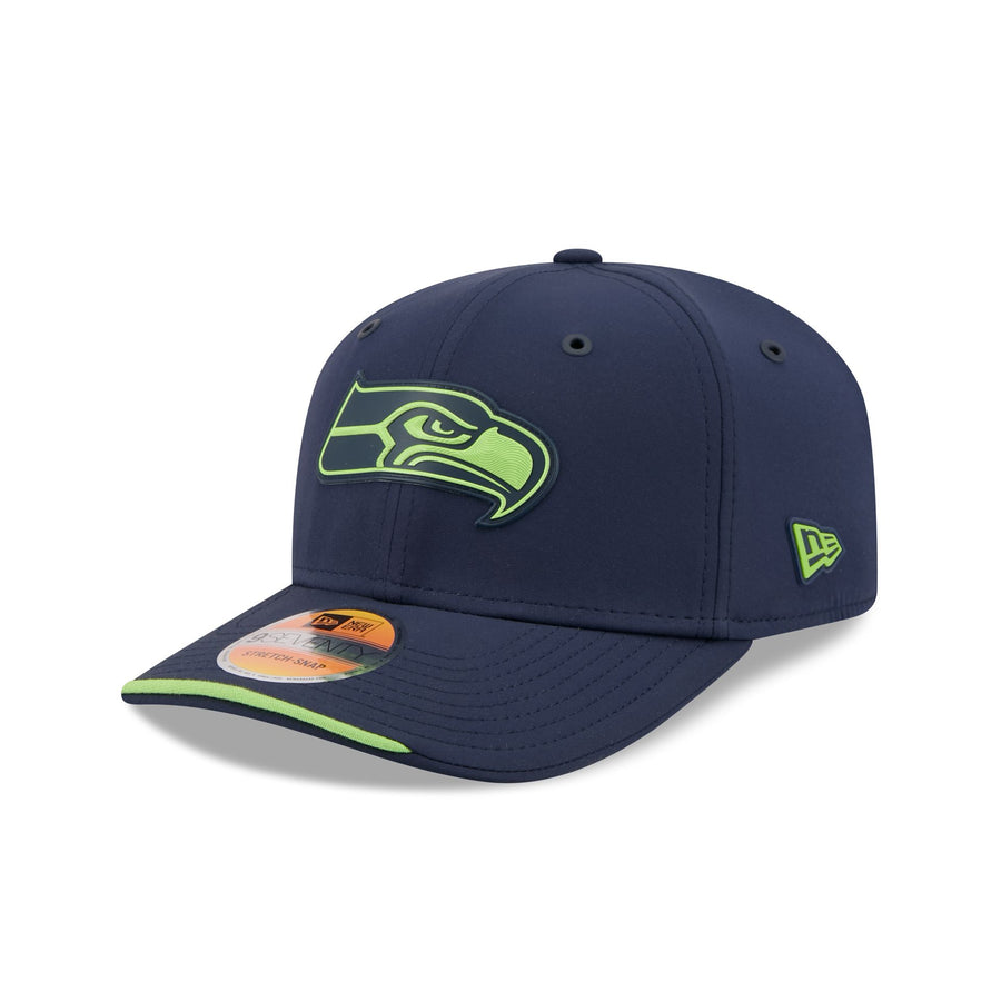 Image courtesy of New Era
Navy crown with the osprey in action green. High contrast, sharp edges, and the green pops exactly the way it is supposed to. The reason it does not climb higher is that the Seahawks head is a long horizontal mark and it looks stretched across the front panel here, with the green tipping slightly toward neon in the rubber.
15. Minnesota Vikings
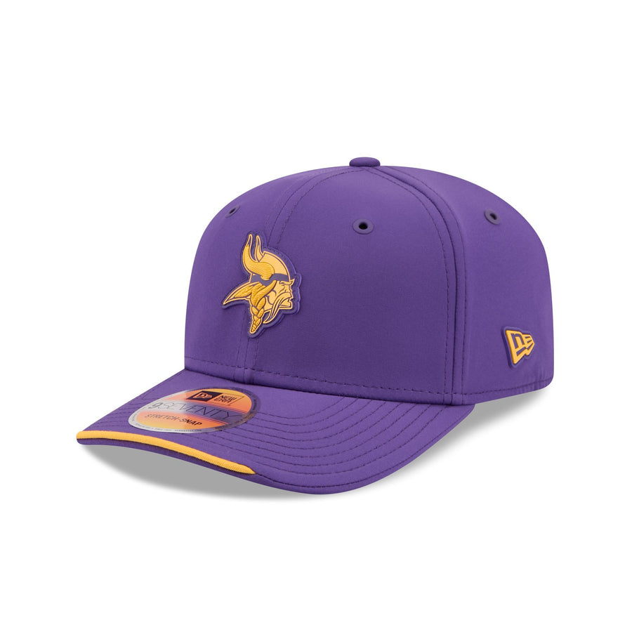 Image courtesy of New Era
Purple crown, gold Norseman, gold brim sliver. Legible and handsome, and purple and gold is a combination almost nobody else in football owns. It lands mid-table because the modern Norseman is a busy mark full of small internal shapes, and raised rubber is not the material to render a braided beard in. Compare it to the same team's historic cap and the gap is enormous.
14. Dallas Cowboys
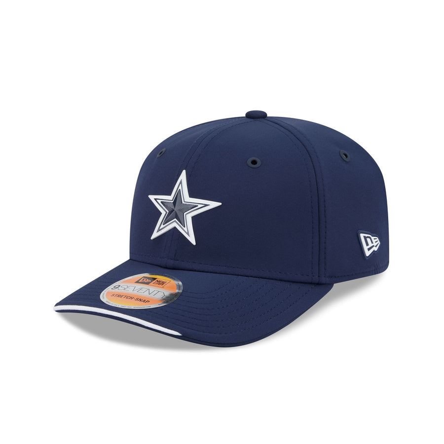 Image courtesy of New Era
Navy crown, navy star, white outline. The Cowboys star is the one logo in the league that arguably works better hollow, because the shape is so instantly readable that you do not need the fill. The white keyline is crisp and the navy is deep. It is restrained to the point of being a little boring, which is roughly the Cowboys' whole design philosophy.
13. Carolina Panthers
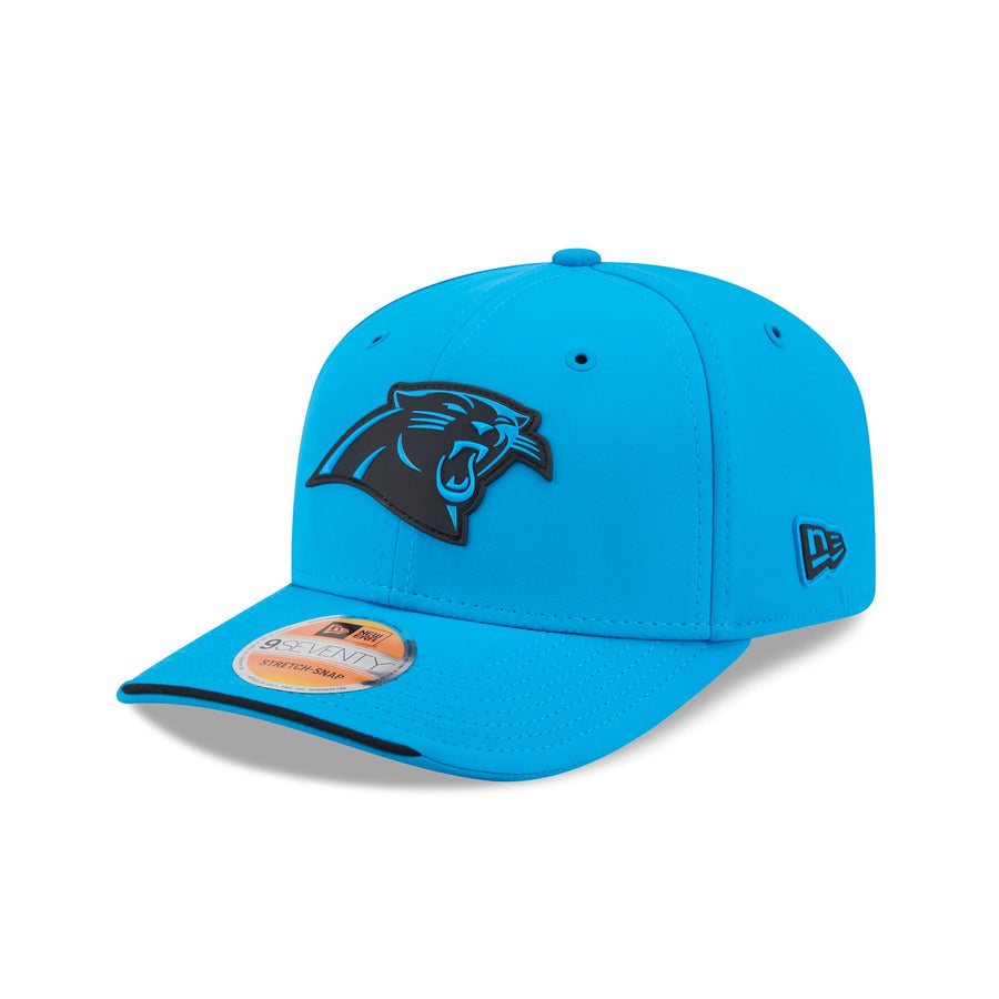 Image courtesy of New Era
Process blue crown with the panther head in black. That blue is the loudest base color in the collection and the black cat on top of it has real contrast and real snarl. It is a genuinely striking hat. What keeps it out of the top ten is that the black reads slightly heavy against such a bright blue, and Carolina's silver gets no look at all.
12. Las Vegas Raiders
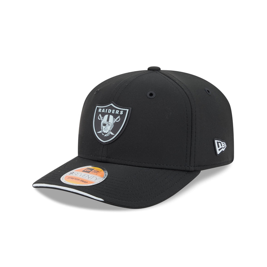 Image courtesy of New Era
Black crown, silver shield, white brim sliver. Exactly what it has to be, executed exactly the way it has to be executed. The Raiders shield is the rare logo that was already monochrome, so the tonal era does nothing to it either way. There is no risk here and no disappointment. It is the most Raiders possible outcome.
11. Cleveland Browns
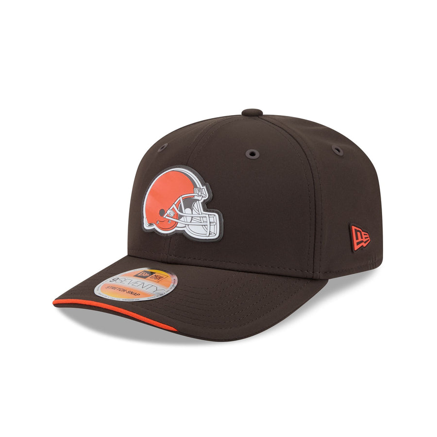 Image courtesy of New Era
Brown crown with the full-color orange and white helmet. One of only a handful of hats in the set that kept a multi-color logo, and it is better for it. The orange helmet against the brown crown has genuine warmth, and the white facemask gives the eye somewhere to land. Cleveland's brown is an underrated base color and this is the best use of it in years.
10. Pittsburgh Steelers
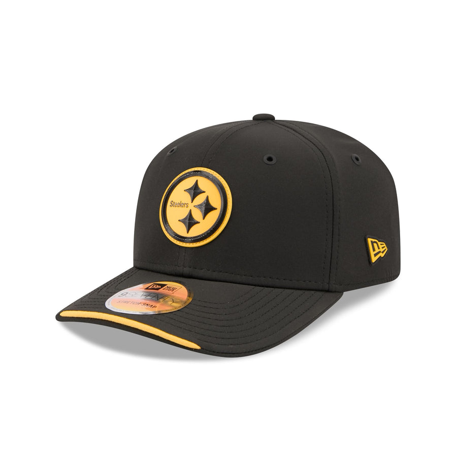 Image courtesy of New Era
Black crown with the hypocycloids in a solid gold circle. Filling the roundel with gold instead of leaving it black is the single best decision New Era made in the whole primary collection, because it turns a logo that normally disappears on black into the brightest thing on the hat. The Steelers logo has never looked better on a cap.
9. Green Bay Packers
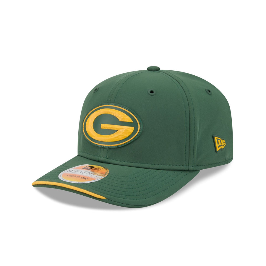 Image courtesy of New Era
Dark green crown, gold G, gold brim sliver. The G is the most efficient logo in American sports and it does not need help. Solid gold on that deep forest green is warm, classic, and completely legible from any distance. It is not doing anything clever, but the Packers have never needed to be clever. This is the hat a Packers fan would design.
8. Detroit Lions
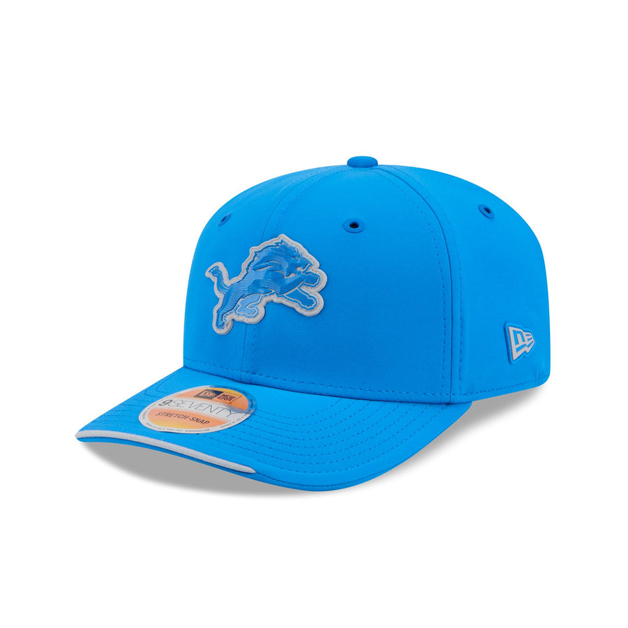 Image courtesy of New Era
Honolulu blue crown with the lion in tonal blue and a silver outline. Normally the tonal fill is the flaw, and here it almost is, but the Lions get rescued by their base color. Honolulu blue is bright enough that a tonal mark still separates from it, and the silver keyline does real work. It is the best-looking version of the treatment that hurt everyone else.
7. Indianapolis Colts
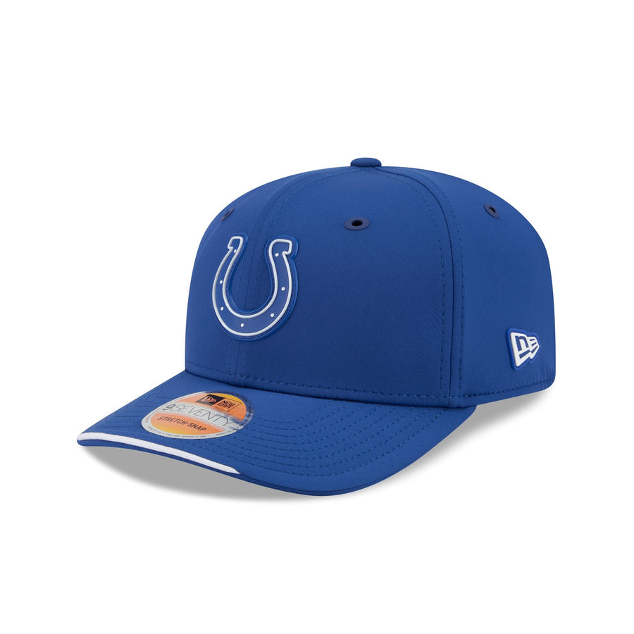 Image courtesy of New Era
Royal crown, tonal blue horseshoe, white outline. The horseshoe is already an outline, so filling it tonally costs nothing, and the white keyline makes it glow. This is the cleanest hat in the collection and possibly the most timeless. Indianapolis has the simplest logo in football and simplicity is exactly what this material rewards.
6. Denver Broncos
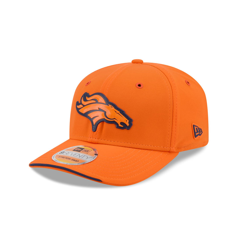 Image courtesy of New Era
Orange crown, tonal orange bronco, navy outline. Going orange rather than navy on the crown is the boldest base-color call any team made this year and it pays off completely. The hat is loud in the best way, the navy keyline holds the horse together, and it looks like nothing else in the league. Denver took the swing and landed it.
5. Tennessee Titans
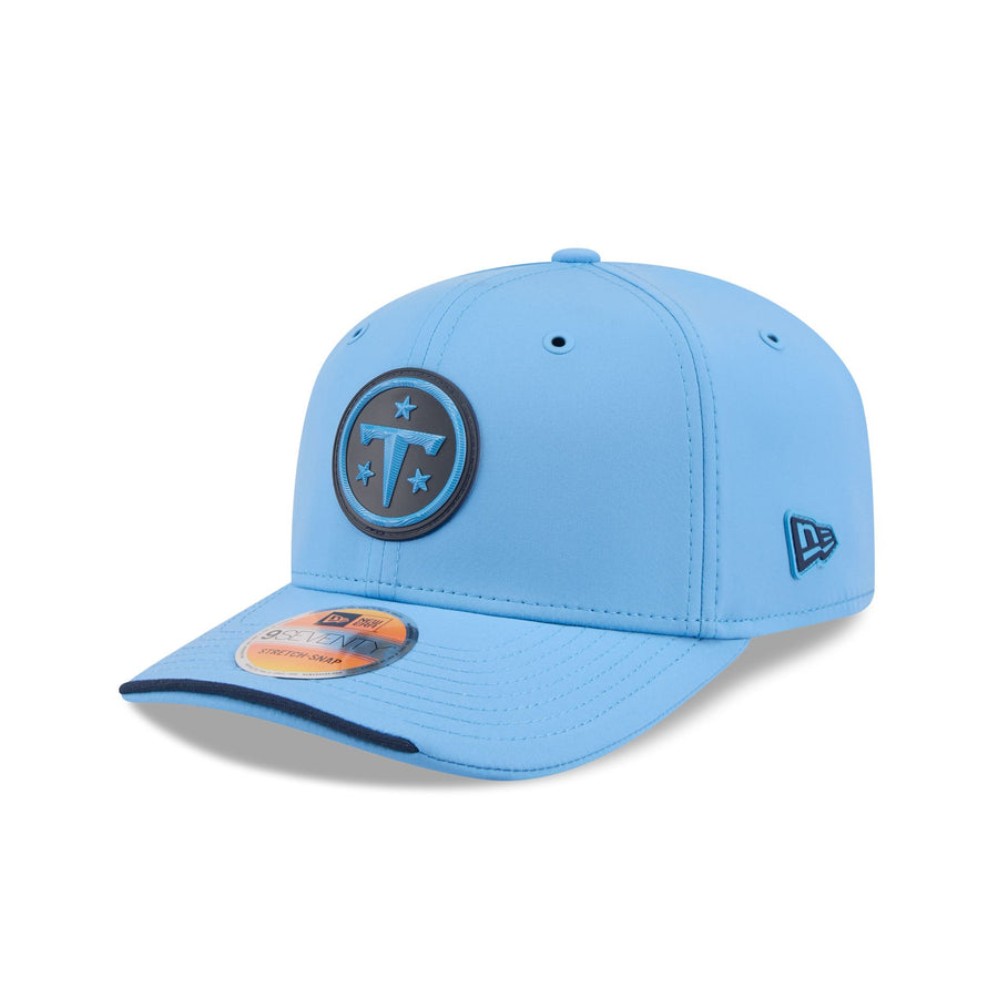 Image courtesy of New Era
Light blue crown with the navy circle T and its ring of stars. The Titans finally leaned into their light blue as a primary rather than an accent, and the navy roundel sits on it beautifully. The stars give the mark a border that most of these hats are missing, so it reads as a finished badge rather than a floating shape. Real improvement for a team that needed one.
4. Kansas City Chiefs
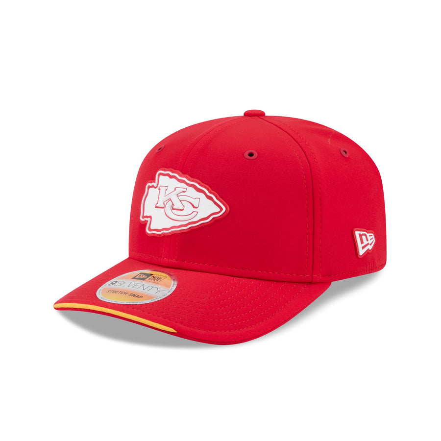 Image courtesy of New Era
Red crown, white arrowhead, gold sliver on the brim. White is the correct answer and almost nobody else in the collection used it. The arrowhead is bright, clean, and perfectly proportioned to the panel, and the gold edge on the brim is the one flourish it needs. Kansas City did the obvious thing and the obvious thing was right.
3. New York Jets
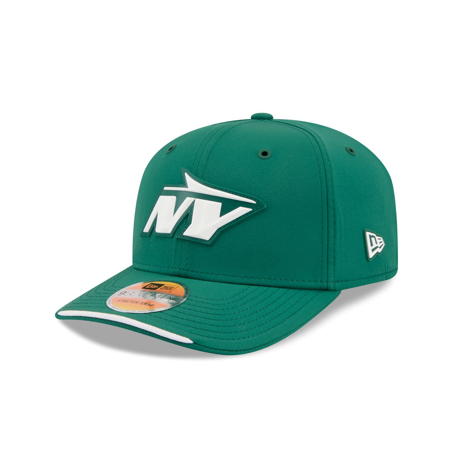 Image courtesy of New Era
Kelly green crown with the white NY jet mark. The highest-contrast hat in the entire set and the one that proves the point: give the logo its own color and the tonal era stops being a problem. The white is crisp against that deep kelly, the jet shape has real motion to it, and the whole thing looks like a team that knows what it owns.
2. Philadelphia Eagles
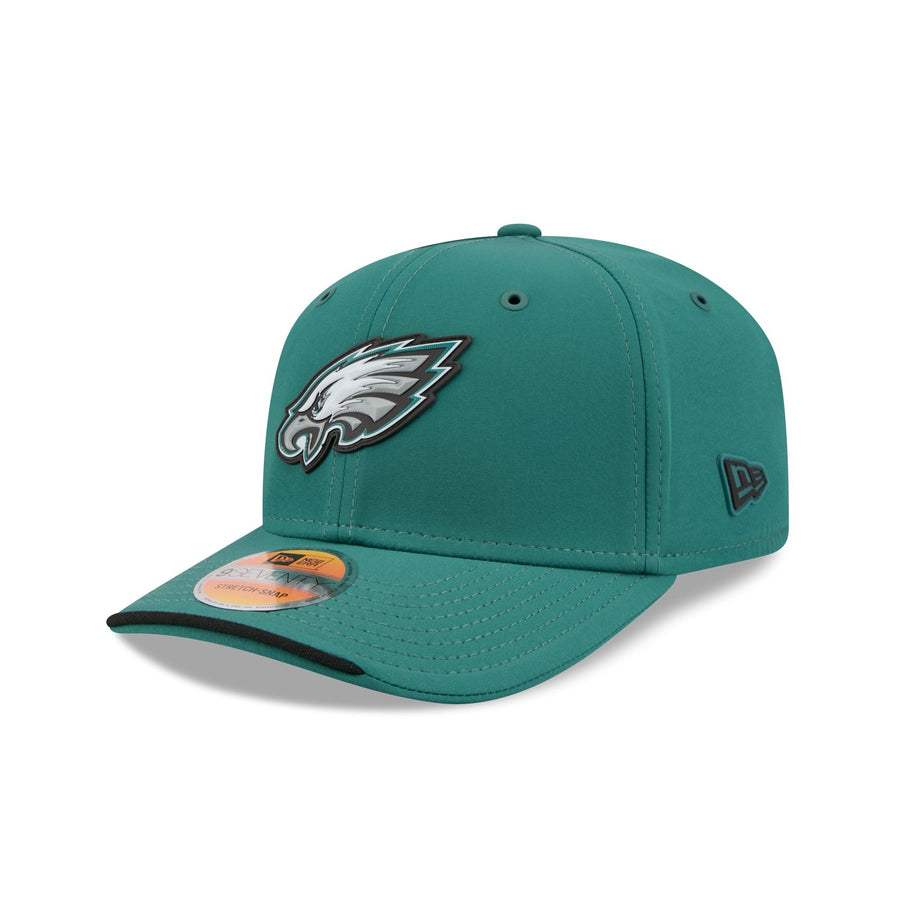 Image courtesy of New Era
Midnight green crown with the eagle head in full white, silver, and black. Philadelphia is one of the only teams that kept a genuinely multi-color logo, and next to 30 tonal hats it looks like a different tier of product. The eagle has depth, the midnight green is the best dark base in football, and the black brim sliver finishes it. Nearly perfect.
1. Los Angeles Rams
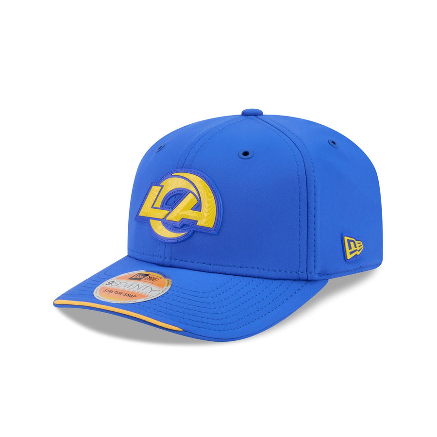 Image courtesy of New Era
Royal crown, gold LA horn, gold sliver on the brim. This is the best hat in the collection and it is not particularly close. The Rams horn is a single continuous stroke, which is exactly the kind of shape raised rubber was made for, and solid gold on royal blue is about as good as two colors get. Nothing is hidden, nothing is hollow, nothing is tonal for the sake of it. Every other team in this ranking should be looking at what Los Angeles did and asking why they did not just do that.
The Bottom Line
The 2026 Sideline collection is the best-constructed set New Era has made for the NFL in years, and the tonal-with-a-keyline formula genuinely looks premium in person. The problem is that it was applied to all 32 teams as a rule rather than a choice.
For teams whose logo is a bold silhouette or already an outline, the Colts, the Raiders, the Cowboys, it costs nothing. For teams whose logo lives on internal contrast, the Texans, the Falcons, the Cardinals, the Buccaneers, it removes the entire thing. The teams at the top of this list are almost all teams that broke the rule. The Rams went gold, the Jets went white, the Chiefs went white, Philadelphia kept its logo in full color, and Denver changed its crown color entirely.
The lesson is the same one uniform designers keep relearning. A house style is only a good idea if you are willing to break it for the teams it does not fit.
For the throwback versions of these same caps, which grade a full half-letter higher as a group, see our 2026 NFL historic sideline hat rankings. There is also a white-crown version of this exact collection, and it fixes the biggest problem on this list: every logo gets its real colours back, so the marks that vanished here suddenly work. Tampa Bay goes from last of 32 to one of the best. See all 32 white sideline hats ranked.
More NFL Uniform Coverage
- Grading Every 2026 NFL Draft Hat. The other big New Era drop of the year, including the hidden interior designs
- Every New NFL Alternate Helmet for 2026, Ranked. The shells these caps have to live next to on a sideline
- What Is the NFL Rivalries Uniform Program?. The league's newest alternate push, explained
- Why Monochrome NFL Uniforms Look Bad. The same tonal instinct that shaped these hats, applied to whole uniforms
Frequently Asked Questions
What is the best NFL sideline hat for 2026?
The Los Angeles Rams. We grade it an A and rank it first out of all 32. A royal blue crown with the LA ram horn in solid gold, it is the clearest, boldest use of the 2026 template in the league.
What hat do NFL teams actually wear on the sideline in 2026?
The New Era 9SEVENTY Stretch-Snap, identifiable by the notched front brim. Every team gets a primary version in team color, a white version, and most get a historic throwback version.
Why do the 2026 sideline hats all look the same?
New Era used one template across the league this year: a tonal crown in the team's primary color, a raised rubberized logo, and a contrasting sliver under the brim edge. The teams that stand out are the ones that gave their logo a genuinely different color from the crown.
What is the worst 2026 NFL sideline hat?
The Tampa Bay Buccaneers, which we grade a C-. A red flag logo on a red crown leaves the skull and crossed swords almost invisible, and the Dolphins finish just above it for similar reasons.
How many 2026 sideline hats did you grade?
All 32 primary caps, plus 26 historic throwback caps in a separate ranking. Only three primaries earned an A, and ten graded C+ or worse.