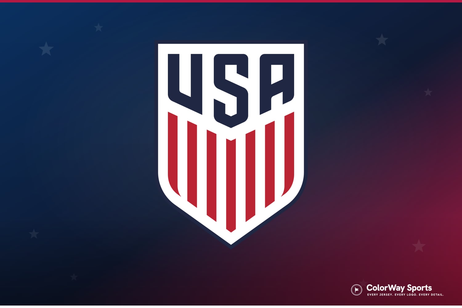
The US Soccer shield. Crest via U.S. Soccer, composite by ColorWay Sports
With the United States through to the knockout rounds on home soil, millions of people are looking closely at the USMNT jersey for the first time and asking the same questions. What does the crest actually show? Why is there no star above it when Brazil has five? And is this badge new? In this guide we walk through everything on the US Soccer crest, where it came from, what it replaced, and why the men's and women's teams wear the same shield with completely different hardware around it.
What the US Soccer Crest Actually Is
The badge on the USMNT's jersey and uniform is the United States Soccer Federation crest, introduced in 2016. It is a simple shield split into two zones: USA in bold letters across the top band, and vertical red stripes over white filling the rest of the shield below it.
The design choices are doing more work than they let on:
- The shield shape is the oldest move in the crest playbook, borrowed from heraldry, and it signals "national team" at a glance.
- The vertical stripes are the American flag's stripes turned on their end. The crest is essentially a compressed flag rather than a separate sports logo.
- The palette is strict flag navy, red, and white. No gold, no soccer ball, no eagle, no extra ornamentation.
- USA, not US Soccer, is the only text. On the world stage the shirt says the country's name, not the federation's.
That restraint is the whole idea. The crest is built to read as "American" before it reads as "soccer," and after a decade on the shirt it has become the most settled badge the program has ever worn.
Why There Are No Stars Above the USMNT Crest
The stars above a national team crest are World Cup titles, one per trophy. The United States men's team has never won a World Cup, so the men's shirt carries zero stars. That is the entire explanation. It is not a design oversight, and no federation is allowed to invent stars for style points.
The flip side is the fastest piece of trivia in American soccer: the USWNT wears four stars above the exact same crest, for the 1991, 1999, 2015, and 2019 Women's World Cup titles. Same shield, same colors, four gold stars on the women's shirt and none on the men's. If the men ever win a World Cup, a star gets added to the men's jersey before their next match, the same way Argentina added its third in 2022.
We broke down the full star system, including Uruguay's famous four-stars-for-two-titles exception, in our guide to what the stars on World Cup jerseys mean.
The Old Badge: What the 2016 Crest Replaced
From 1993 through 2015, US Soccer wore a very different logo: a rounded shield with a swooshing soccer ball, three stars across the top, and "US Soccer" lettering, all rendered in a heavier mid-90s style. The three stars on that logo were decorative, not title counts, which caused exactly the confusion you would expect.
The 2016 redesign stripped all of it out. The ball is gone, the decorative stars are gone, the italics are gone. What survived is the flag palette and the shield. It was a hard reset toward national identity first, sport second, and it is widely considered the best-received crest in the program's history. The 2026 World Cup is the first men's World Cup on home soil in the crest's lifetime, which is why it suddenly feels like it is everywhere.
What Else Is on the 2026 USMNT Jersey
The crest is only one piece of the shirt's front. At this World Cup the USMNT jersey also carries the tournament's official patches on the sleeves and, depending on the match, additional designations. We catalogued every single one, what it means, and where it sits in our full breakdown of the patches on the USMNT's 2026 World Cup jersey.
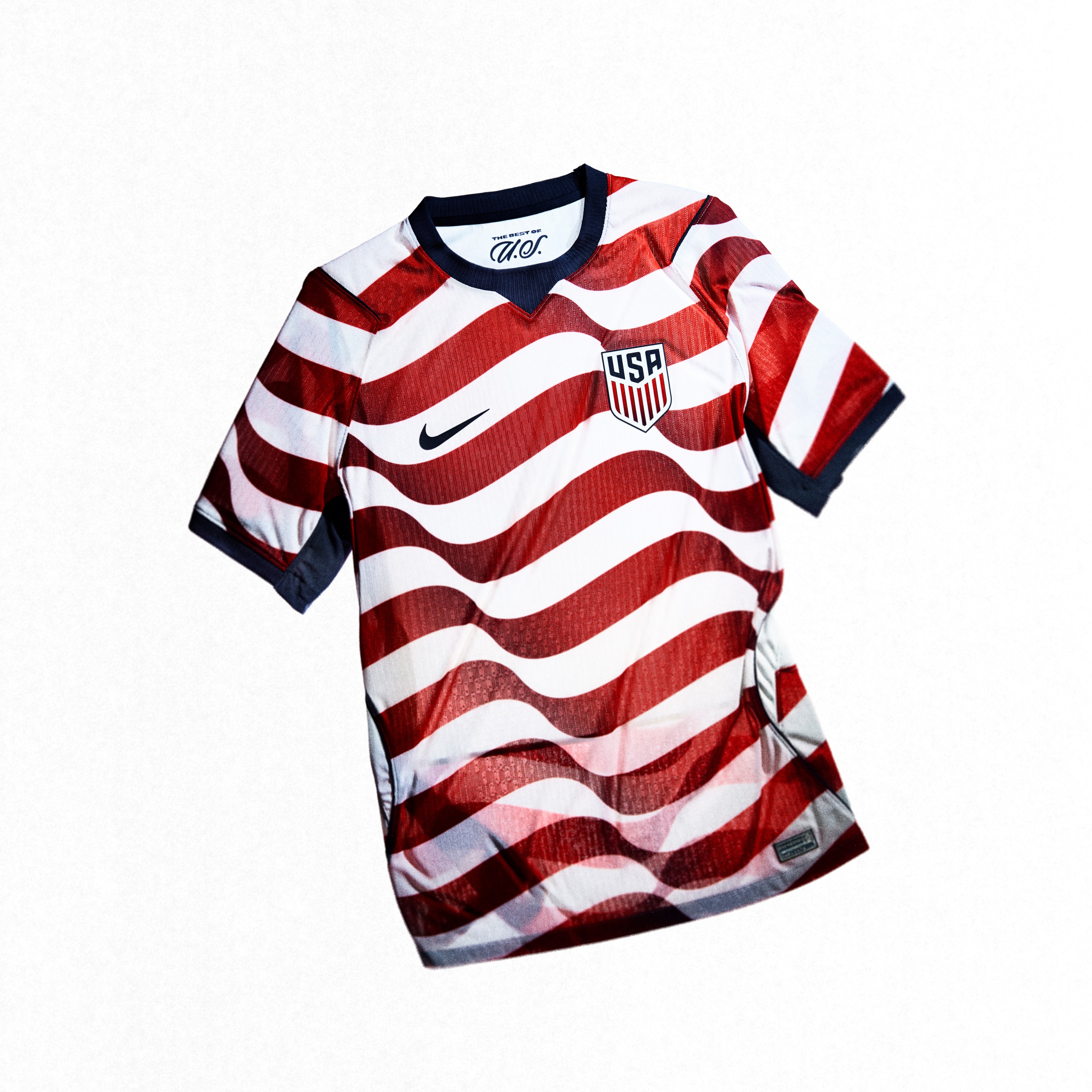
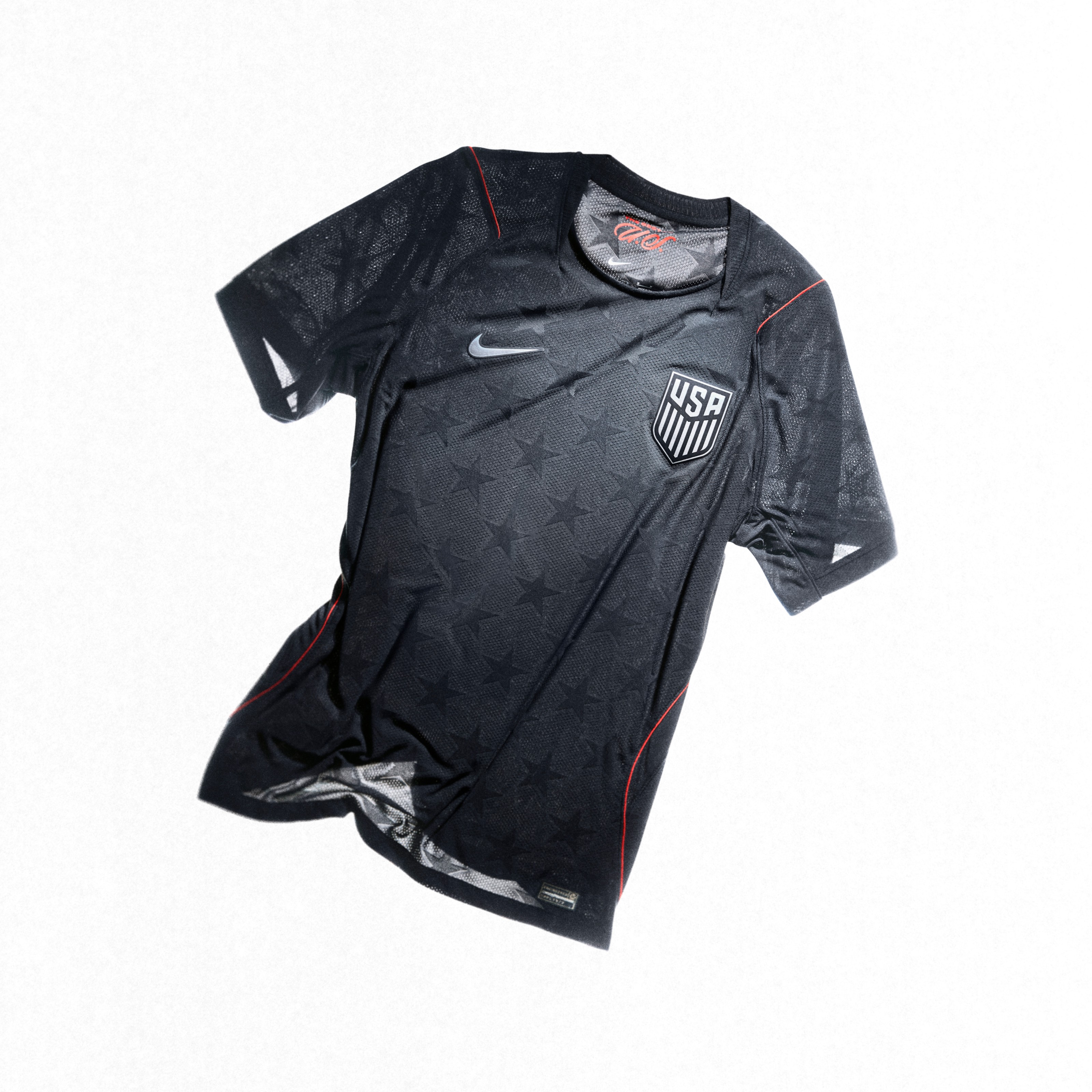
Both 2026 USMNT kits carry the same starless shield. Images via Nike / U.S. Soccer
As for how those shirts have looked in actual matches, the USMNT's red-and-white striped home landed one of the best grades of the knockout rounds in our live 2026 World Cup jersey tracker, where we grade every kit matchup of all 104 games.
Frequently Asked Questions
What does the USMNT crest mean?
The USMNT crest is the United States Soccer Federation shield, introduced in 2016. It shows USA in bold letters over vertical red-and-white stripes drawn from the American flag, inside a classic heraldic shield, in strict flag navy, red, and white. It is designed to function as a compressed American flag rather than a traditional soccer logo.
Why does the USMNT jersey have no stars?
Stars above a crest represent World Cup titles, and the US men's national team has never won a World Cup. The USWNT wears four stars above the same crest for its 1991, 1999, 2015, and 2019 Women's World Cup wins.
Why does the USWNT have 4 stars and the USMNT none?
Star counts are tracked separately for men's and women's national teams. The US women have won four Women's World Cups, so their shirt shows four stars. The men have not won a World Cup yet, so their version of the crest is bare.
When did US Soccer change its logo?
In 2016. The current shield replaced the 1993 logo, which featured a swooshing soccer ball and three decorative stars. The 2016 redesign removed the ball and the stars and reduced the badge to USA lettering and flag stripes inside a shield.
Did the three stars on the old US Soccer logo mean anything?
No. The three stars on the 1993 to 2015 logo were decorative and did not represent titles, which is one reason the redesign removed them. On modern crests, stars are reserved for World Cup championships.
Is the US Soccer crest new for the 2026 World Cup?
No. The crest has been on the shirt since 2016. The 2026 tournament is simply its biggest stage yet, the first men's World Cup in the United States since 1994, and the first ever with this badge on the host's jersey.
The Bottom Line on the USMNT Crest
The US Soccer badge is a flag folded into a shield: USA on top, stripes below, nothing else. The empty space above it is the honest part, zero stars until the men win a World Cup, while the women's four sit above the identical crest as a running reminder of the gap. It replaced a cluttered 90s logo in 2016, it has aged into the program's best badge, and this summer it is getting more close-up television time than any American crest ever has.