— (@jcam3795) April 2026
📸 @jcam3795 on X
We ranked the Orioles City Connect jersey in our full 2026 City Connect rankings post yesterday, and gave it a B-. Now we have a closer look at the jersey thanks to new photos showing up online, and we are keeping the grade exactly where it is.
ColorWay Sports may earn a commission on purchases, at no extra cost to you.
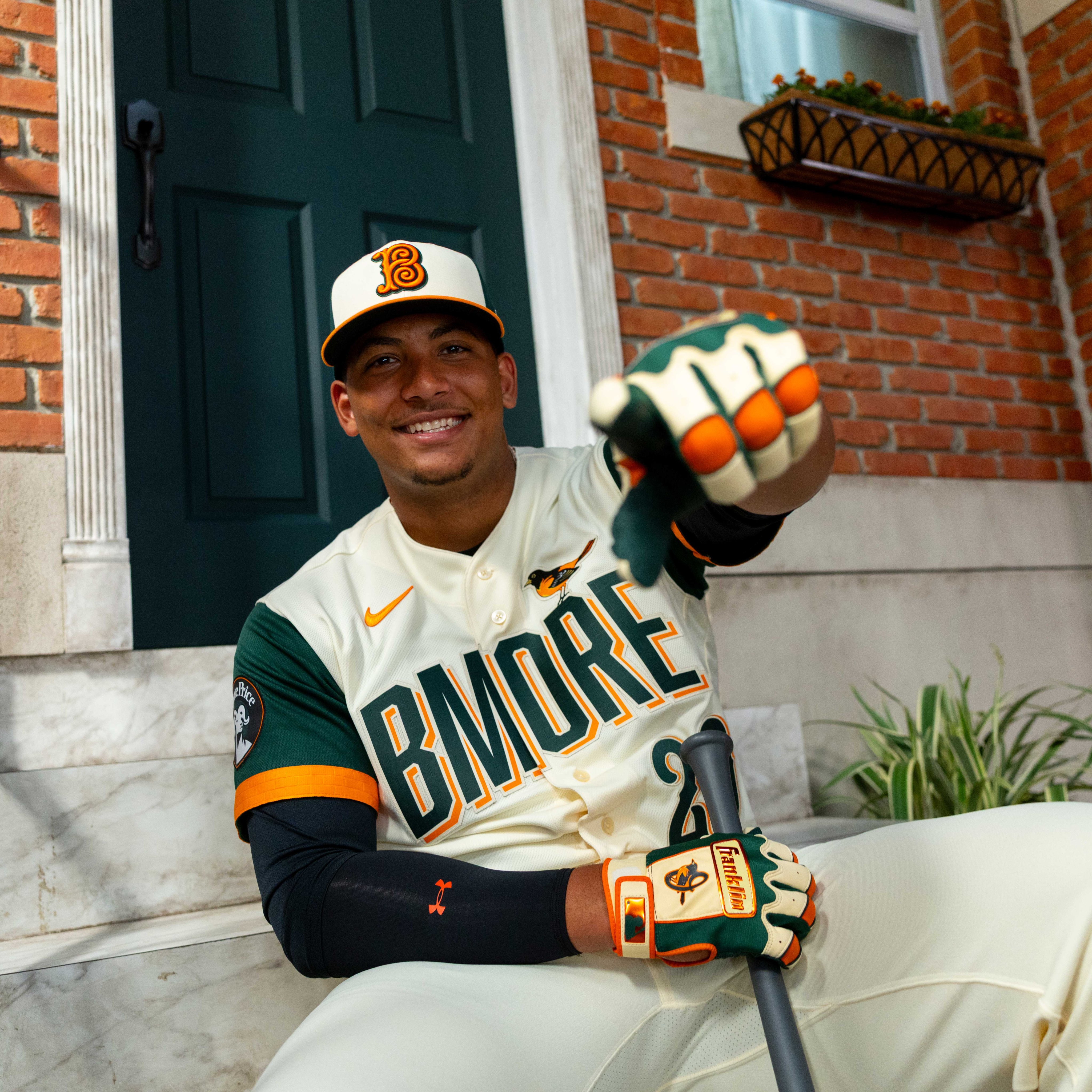
The Green is More Visible Than We Thought
The first leaked images made it hard to tell how much green was actually on this jersey. Now that we can see it on a hanger in full lighting, the dark green sleeves are way more prominent than the original photos let on. It is a bold choice for a team that has never worn green in any capacity, and we can see why some fans are split on it.
That said, we are not going to dock them for it. When a team steps outside its color scheme for a City Connect, it better look good, and this one does. The green works against the cream base without clashing, and the orange accents tie it back to the Orioles brand enough to keep it grounded.
Camden Yards Brick Lining
The detail we are most excited about is the brick pattern visible inside the collar. It is a direct reference to the Warehouse beyond the right field wall at Camden Yards, one of the most iconic backdrops in baseball. It is the kind of thing you would never notice on TV, but fans wearing the jersey will see it every time they put it on. That is what City Connects should be doing -- hiding local details in the fabric for the people who actually buy the thing.
The Full Design Breakdown
The jersey checks a lot of boxes:
- "BMORE" wordmark across the chest in dark green with orange outline. Bold, local, and unapologetic. Some fans think it belongs on a hoodie, not a game jersey. We get it, but it works.
- Oriole bird perched on the right chest, sitting on top of the number. Classic touch.
- "From the Stoop to the Yard" sleeve patch with the 410 area code. This is the kind of hyper-local reference that separates good City Connects from generic ones.
- Clock patch on the lower front, a nod to the scoreboard clock at Camden Yards.
- Cream base with green sleeves and orange piping. Clean combination even if the green is non-traditional.
- Brick pattern lining inside the collar/neck area. Camden Yards reference. Best hidden detail in the entire City Connect cycle.
The Grade
We like this jersey. We do not love it, and the green still feels like a reach for a team whose identity is built on orange, black, and white. But the local details are strong, the overall package is put together well, and the Camden Yards brick lining is the kind of creative detail we want to see more teams doing. We are staying at a B-.
For the full rankings of every City Connect jersey leaked so far this year, check out our 2026 MLB City Connect rankings.