📸 Baltimore Orioles
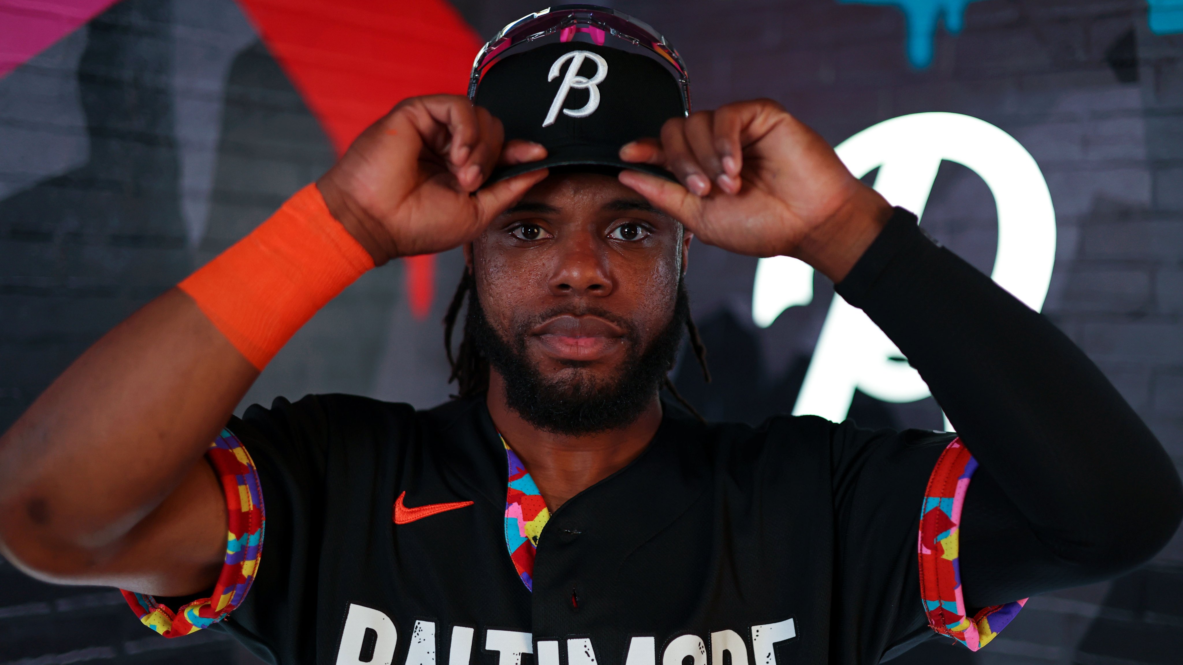
The Orioles officially revealed their City Connect 2.0 jersey for 2026, and it is a continuation of the black "Baltimore" design that first dropped in 2023. The original City Connect was one of the more unique designs in the league when it came out, and this updated version keeps the foundation intact while giving it a fresh look for this season.
ColorWay Sports may earn a commission on purchases, at no extra cost to you.
The Design
The jersey keeps the black base with "Baltimore" across the chest in a bold typeface inspired by the Globe Collection and Press at the Maryland Institute College of Art. The lettering has those subtle speckles and imperfections that represent the grit of the city and the local arts scene. It is a small detail that separates this from a generic black jersey.
The standout feature is still the colorful sleeve cuffs. The pattern is inspired by Baltimore's neighborhoods and was originally designed on the inside of the jersey, which was a first for an MLB team. The idea is that the grayscale exterior represents how outsiders see Baltimore, while the colorful interior represents what the city actually looks like to the people who live there. For the 2.0 version, that color pops even more on the sleeves with pinks, teals, purples, and reds all blending together.
The cap keeps the script "B" in white on black, with the colorful neighborhood pattern showing on the brim and inside. The sleeve patch reads "You Can't Clip These Wings," a line from Baltimore poet Kondwani Fidel that has become a rallying cry for the franchise.
What We Think
We like this jersey. The colorful sleeves are what make it work. Without them, this would just be another black jersey with a city name on it, and we generally do not love black jerseys as a concept. Too many teams use black as a crutch when they run out of ideas. But the Orioles earned it here because the color pattern gives the design a personality and a story that goes beyond just looking cool.
The "Baltimore" wordmark is strong. The arts-inspired font with the rough texture gives it character that most City Connects do not have. The neighborhood pattern is a genuinely creative concept that ties the uniform to the city in a way that feels earned, not forced.
Where it loses us slightly is the black base itself. We have always preferred when teams stay closer to their actual color scheme for alternates, and the Orioles' identity is built on orange, black, and white. The black is technically on-brand, but a jersey this creative deserves a more adventurous base color. Imagine this same sleeve pattern on an orange or cream jersey. That would push it to the next level.
Still, for what it is, this is one of the better City Connect designs in the league. The story is there, the details are there, and the colorful sleeves make it instantly recognizable. We are giving the City Connect 2.0 a B+.
How It Compares to the Original
The 2023 City Connect was the first version of this concept, and it landed well. The 2.0 does not reinvent the wheel. It keeps the same foundation and updates the details. If you liked the original, you will like this one. If you wanted something completely new, this is not that.
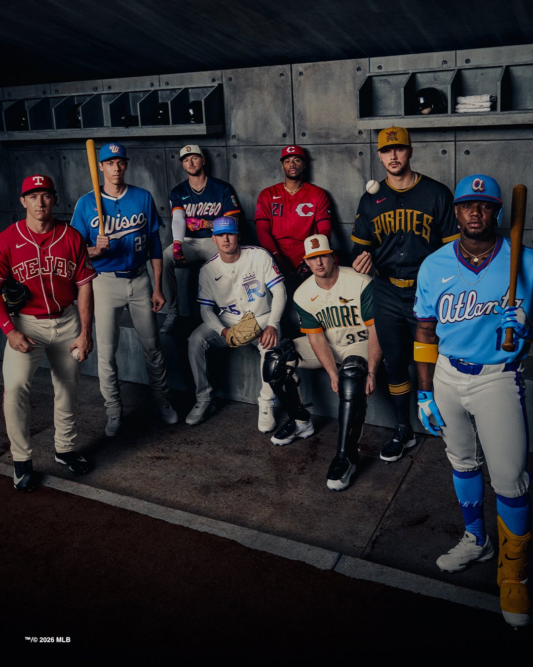
Nike is also dropping an Air Max 1 collab pack tied to the 2026 City Connect jerseys. The Orioles are one of eight teams getting a pair, alongside the Padres, Royals, Rangers, Pirates, Reds, Braves, and Brewers. All pairs retail for $150.
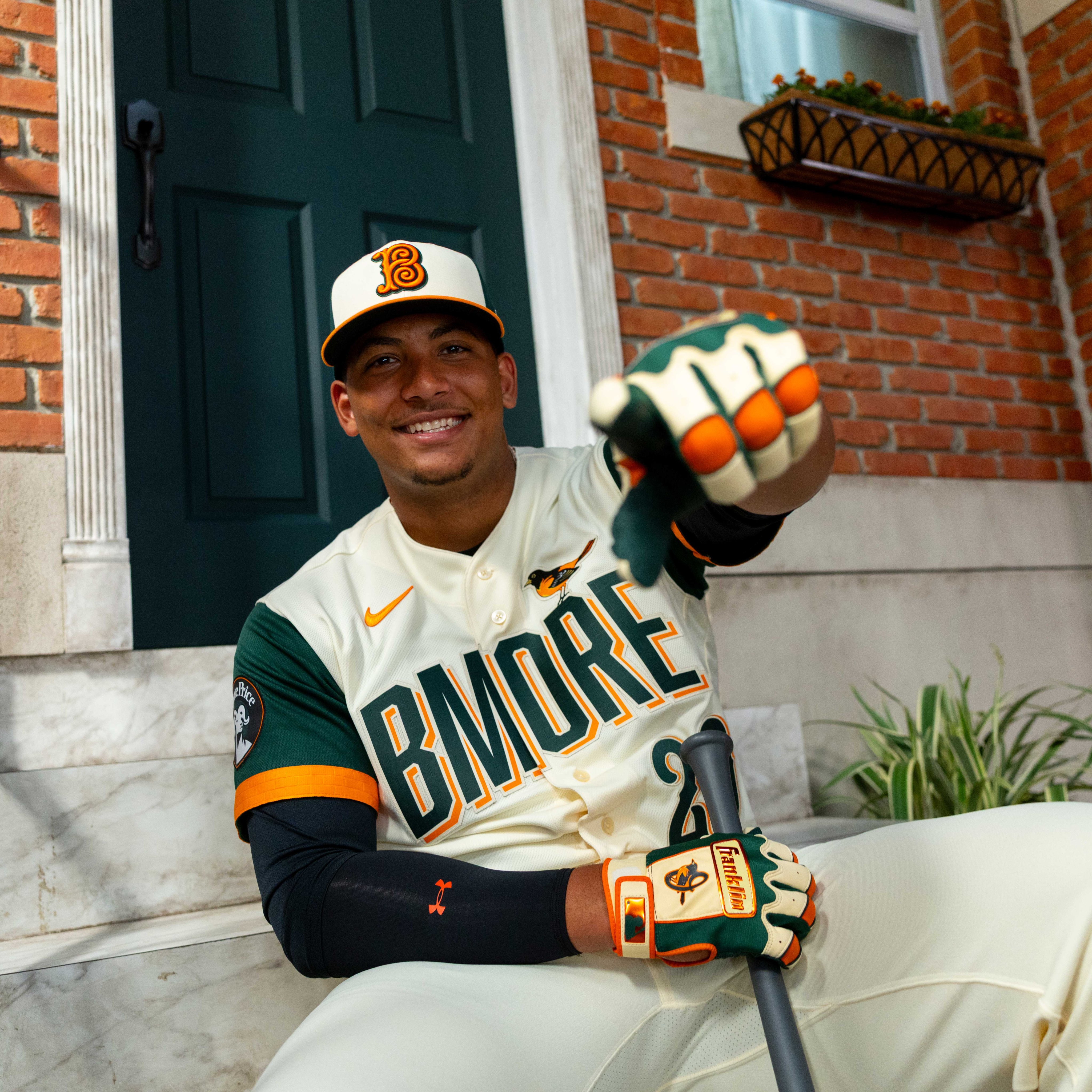
For a look at how the Orioles' new BMORE cream jersey stacks up, check out our Orioles BMORE City Connect post. And for the full rankings of every City Connect jersey this year, see our 2026 MLB City Connect rankings.
The original 2023 City Connect reveal.