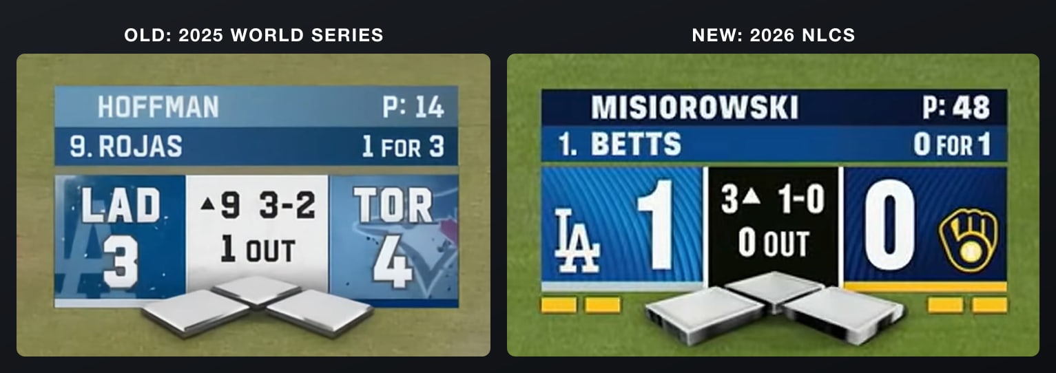
Old and new FOX MLB scorebugs via FOX Sports. 2026 screenshot via MLB on YouTube
Update (October 13): FOX debuted a new MLB scorebug for the NLCS on Sunday, October 11, and it is a step back. FOX drops from an A+ to a B+, tied with Netflix, but it keeps the No. 1 spot. Jump to the new FOX scorebug.
We ranked every local MLB broadcast scorebug for 2026 earlier today, and we promised a national broadcast edition. Here it is. Six networks now carry Major League Baseball nationally, and the gap between the best and worst scorebug is massive.
One note on ESPN: they have significantly reduced their number of nationally broadcast MLB games this season, and the ESPN scorebug shown below is from their 2025 broadcast.
Let's get into it, worst to first.
6. ESPN: F

ESPN MLB scorebug via ESPN (Yankees vs Dodgers, 2025)
This is the worst national scorebug in baseball by a wide margin. The entire thing is black. The only color on the screen comes from the batter and pitcher info bar at the top. The team logos are there but they feel like an afterthought against the dark background. There is no energy, no personality, and no sense that you are watching something special.
What makes this so frustrating is that ESPN knows how to make great scorebugs. Their NBA broadcast graphics are some of the best in sports. Monday Night Football has a scorebug that matches the prime-time energy of the broadcast. But their MLB presentation feels like it was designed by a completely different team that didn't get the memo.
It is hard not to wonder if this is a reflection of ESPN pulling back from baseball entirely. They have cut their MLB schedule down significantly, and the scorebug feels like it got the same treatment. Minimal effort, minimal investment, minimal result.
Grade: F
5. TNT/TBS: D-
2026 postseason update (October 5): TNT Sports has the American League this October. TBS, truTV and HBO Max carry both AL Division Series (White Sox vs Guardians and Yankees vs Rays, which started Saturday, October 3) and the ALCS. TNT debuted a new MLB scorebug for the ALDS, and it did not fix much.
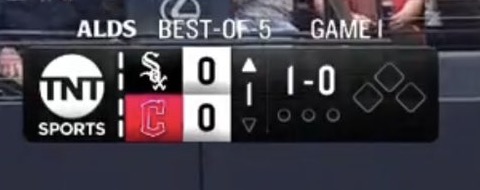
2026 TNT/TBS MLB scorebug via TNT Sports (ALDS Game 1, White Sox at Guardians)
The new one is a smaller black box: the TNT Sports logo, the two team logos and scores, the inning, the count, the outs and the bases. The "ALDS, Best-of-5, Game 1" line floats above the box on no background, with the words spaced out unevenly across the top. In the debut frame there is no batter bar at all, so there is no batting order spot for the hitter. The old version below at least showed it ("1. S. Ohtani").
Jake's Take
I absolutely hate it. I've always hated the broadcast. I think it's so bad, and the scorebug is terrible. They don't show what number in the batting order the player is at. The text isn't aligned. It's just really bad. It's cheap.
The new look does not move it up. TNT/TBS stays at No. 5 with a D-, and the original review of the old scorebug is below.

TNT/TBS MLB scorebug via TNT Sports (NLCS Game 4, 2025)
The TNT/TBS scorebug has carried National League postseason games in recent years, alternating conference coverage with Fox. And it does not deserve that stage. The whole thing is dark and muddy. The background is a deep charcoal that swallows the team logos and makes the score harder to read than it should be. The gold accents on the batter info give it a slight premium feel, but that is about the only positive thing we can say.
Watching the Dodgers' entire NL playoff run on this broadcast was painful from a visual standpoint. The scorebug set the tone for a broadcast that felt dark and boring from start to finish. Postseason baseball should feel electric. This felt like watching a game through a tinted window.
The "Game 4" and "LAD Leads 3-0" header at the top is fine for context, but the overall design just does not match the moment. When Ohtani is hitting two home runs in an NLCS game, the broadcast graphics should feel like they are keeping up with the action. This one didn't.
Grade: D-
4. NBC: C-

NBC national MLB scorebug via NBC Sports
NBC made its big return to Major League Baseball this season after being away from the sport for years. You would expect the scorebug to reflect that kind of comeback moment. Instead, they carried over what they already use on local broadcasts. If you watch Phillies games on NBC Sports Philadelphia, this national scorebug is going to look very familiar.
It is not ugly. It is just generic. The layout is clean enough, the font is readable, and the color blocking works. But for a national debut, there is nothing here that makes you feel like you are watching something bigger than a random Tuesday night game on a regional feed.
We wrote a full breakdown of the NBC scorebug earlier this season, and our take has not changed. It is a C- because it gets the job done but misses the opportunity to make a statement.
Grade: C-
3. Apple TV+: C

Apple TV+ MLB scorebug via Apple TV+ (Giants vs Dodgers, 2025)
The Apple TV+ scorebug is modern and sleek. It uses a frosted glass look with rounded corners that feels right at home on a streaming platform. The team logos are prominent, the score is easy to read, and the overall aesthetic is clean. The dark translucent background lets the game show through without the scorebug feeling heavy.
But that is kind of the whole problem. It feels too much like an iPhone notification. There is not enough baseball in it. No color from the teams, no texture, no broadcast energy. It is designed the way Apple designs everything, and while that works for a phone or a laptop, it can feel a little sterile for a live sporting event.
The pitcher and batter info is displayed cleanly at the bottom, and the base runners are clear. Functionally, it does everything right. It just does not have the personality that the best baseball scorebugs have. It is a solid C because the design is competent, but it needs more warmth.
Grade: C
2. Netflix: B+
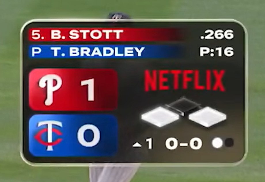
2026 Netflix MLB scorebug via Netflix (MLB at Field of Dreams, Phillies at Twins). Screenshot via MLB on YouTube
A lot of people hated the Netflix scorebug when it debuted. We actually liked it. Netflix stepped into live baseball for the first time and got it right. The scorebug has a rounded, app-like shape that feels modern without being distracting. The diamond graphic keeps the base-runner info integrated cleanly, and the whole thing stays out of the way while still giving you everything you need.
What separates Netflix from Apple TV+ is that Netflix's scorebug has a little more substance to it. The colors are richer, the layout is more balanced, and the transition graphics heading into commercial breaks carry the same design language. The whole broadcast package feels cohesive, like someone actually thought about how all the pieces fit together.
We did a full breakdown of the Netflix scorebug earlier this season. For a first attempt at live baseball, this was impressive.
Netflix redesigned its bug for the Field of Dreams game in August, with color-coded team chips and full-width batter and pitcher bars, and that version is the one shown above. It ties FOX at a B+, but it lands at No. 2. FOX's new NLCS bug was a step back, and its overall package still edges this one.
Grade: B+
1. FOX: B+
FOX's New NLCS Scorebug (October 2026)
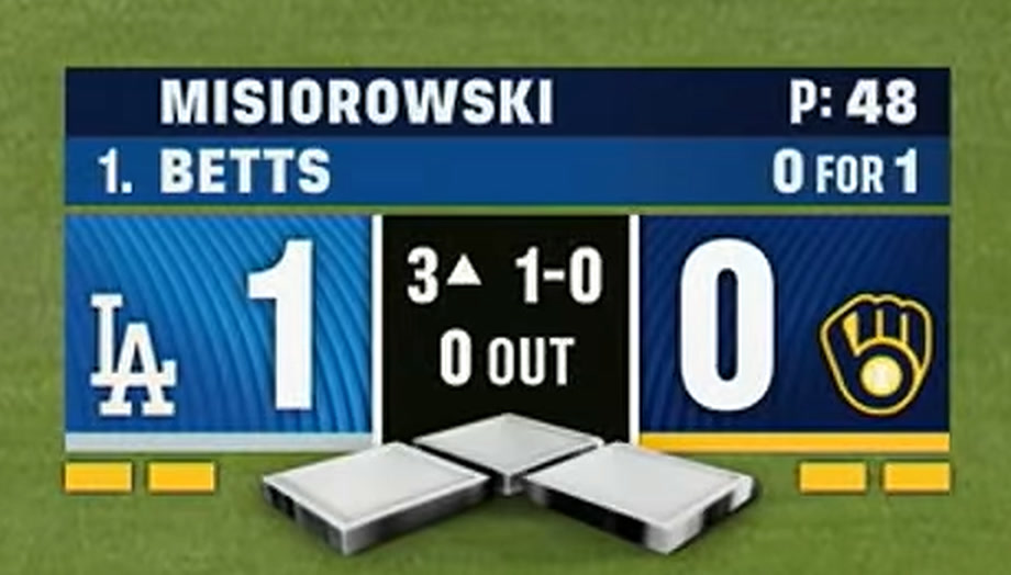
2026 FOX MLB scorebug via FOX Sports (NLCS Game 1, Dodgers at Brewers). Screenshot via MLB on YouTube
FOX debuted a new MLB scorebug on Sunday, October 11, for Game 1 of the NLCS, a 2-1 Brewers win over the Dodgers in Milwaukee. FOX announced it on X during the game.
Here is the old one next to the new one.
Old (2025 World Series) and new (2026 NLCS Game 1) FOX MLB scorebugs via FOX Sports. 2026 screenshot via MLB on YouTube
The old bug put the team abbreviation (LAD, TOR) over a big faded team logo that filled each side, with the score underneath and a white center panel. The new one drops the abbreviations and the big background logos. Each side now has a small team logo next to a much bigger score on a striped team color block, and the center panel with the inning, count and outs is black. The pitcher and batter bars on top and the 3D bases underneath carried over, and there are now small yellow markers under each team block.
ColorWay Sports Grade
B+
Jake's Take
It's not terrible, but I'm very disappointed in the change. The sections where the team names and team logos go got significantly worse, with the logos smaller, and I don't like that black space in the middle now either.
It is still clean and easy to read, which is why it lands at a B+ and not lower. But the team color identity that made the old one great is weaker now, so FOX drops from an A+ to a B+. It still holds on to No. 1, and we explain the tiebreak below.
FOX's Old Scorebug (2025 World Series)

Old FOX MLB scorebug via FOX Sports (2025 World Series)
This was the best national scorebug in baseball, and it was not close. The design is colorful, clean, and perfectly balanced. Each team gets its own color block with the logo, the score is massive and easy to read from across the room, and the inning, count, and outs are all laid out logically in the center panel.
The base-runner diamond sits right in the middle where your eye naturally goes. The pitcher info and batter info with their batting average sit above the main scorebug in a translucent bar that adds context without adding clutter. Everything has a place. Nothing feels crammed or forced.
What made FOX the clear number one was the color. The team color blocks on each side give the scorebug instant identity. You can glance at the screen for half a second and know exactly who is playing. That is what a great scorebug does. Compare that to ESPN or TNT where everything is dark and you have to actually search for the team logos.
FOX had been the gold standard for MLB scorebugs for a while, and this is the version it used until the 2026 NLCS. That is the bug we originally graded an A+.
Netflix also sits at a B+ now, and FOX keeps the top spot. The change was a disappointment, but the overall package still edges Netflix: the 3D bases, the pitcher and batter bars on top and how easy the whole thing is to read from across the room. A worse FOX scorebug is still the best one on national TV, just barely.
Grade: B+ (new 2026 NLCS scorebug)
The Full Rankings
Bonus: What American Networks Could Learn From Japan
Before we wrap this up, take a look at what Nippon Professional Baseball does with their scorebugs in Japan:
That Rubik's Cube style scorebug is one of the most creative things we have seen in any sport. The 3D rotating design packs an incredible amount of information into a small space while still looking visually interesting. It is bold, it is different, and it makes every American national scorebug look boring by comparison.
We are not saying FOX or Netflix needs to copy this exactly, but the idea of making the scorebug something visually engaging rather than just a static box is worth thinking about. MLB broadcasts in the US have been stuck in the same layout philosophy for years. Japan is proving there is a way to make scorebugs a part of the entertainment, not just a necessary overlay. American networks should be paying attention.
Frequently Asked Questions
What is the best national MLB scorebug in 2026?
FOX, with a B+. FOX was No. 1 with an A+ until it debuted a new scorebug for the 2026 NLCS. The new bug drops to a B+, tied with Netflix, but FOX keeps the top spot because its overall package (the 3D bases, the pitcher and batter bars and how easy it is to read) still edges Netflix.
Is the Netflix MLB scorebug better than FOX's?
Not quite. Both get a B+ from us in 2026. Netflix's redesigned bug from the Field of Dreams game is clean and colorful, but FOX's overall package still edges it, even after FOX's disappointing NLCS change. FOX is No. 1 and Netflix is No. 2.
Did FOX change its MLB scorebug?
Yes. FOX debuted a new MLB scorebug on October 11, 2026, in Game 1 of the NLCS between the Dodgers and Brewers. It replaces the team abbreviations and big background logos with small team logos and bigger scores, and the center panel is now black. We grade it a B+, down from the A+ we gave the old one, and it is still No. 1.
Why did FOX change its scorebug for the NLCS?
FOX has not given a public reason beyond announcing it as a "New scorebug for the NLCS!" on its MLB account. It rolled the new design out at the start of the NLCS, the biggest stage FOX has had this season before the World Series.
What channel is the NLCS on?
The 2026 NLCS between the Brewers and Dodgers is on FOX and FS1. Games 1 and 2 aired on FOX, Games 3 through 6 are scheduled for FS1, and a Game 7 would air on FOX and FS1. The ALCS between the Guardians and Rays is on TBS and truTV, with streaming on HBO Max.
What is the worst national MLB scorebug in 2026?
ESPN, with an F. The all-black design has almost no team color. TNT/TBS is right above it at No. 5 with a D-.
Did TBS change its MLB scorebug for the 2026 playoffs?
Yes. TNT Sports debuted a new, smaller scorebug for the 2026 ALDS. It is still a dark box, and the round and game info floats above it on no background. We still grade it a D-.
What MLB playoff games are on TBS in 2026?
TBS, truTV and HBO Max carry the 2026 American League Division Series (White Sox vs Guardians and Yankees vs Rays) and the American League Championship Series. Fox and FS1 have the National League side and the World Series.
Why does the TBS scorebug not show the batting order?
In the debut frame of the new 2026 TNT/TBS scorebug there is no batter bar, so the hitter's spot in the lineup is not shown. The old TNT version did show it, for example "1. S. Ohtani" in the 2025 NLCS.
The Bottom Line on National MLB Scorebugs
The gap at the top closed in October. Netflix proved that a streaming platform can make a quality scorebug if they actually put the effort in, and FOX's new NLCS bug dropped it into a tie with Netflix at a B+. FOX still holds No. 1 on the strength of its overall package. Apple TV+ and NBC are fine but forgettable. And TNT/TBS and ESPN are dragging down the viewing experience for some of the biggest games on the baseball calendar.
If you want to see how the local broadcast scorebugs stack up, check out our full ranking of every MLB local TV scorebug for 2026.
All scorebug screenshots captured from broadcast footage for editorial review purposes.