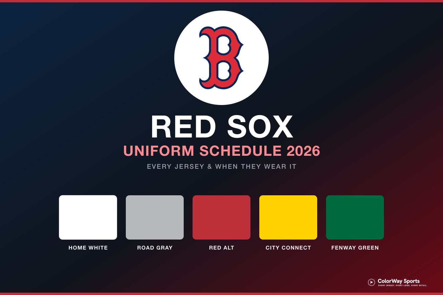
The Boston Red Sox carry five jerseys in 2026, and the gap between the best and worst uniform in that closet is enormous. Two of them are among the cleanest looks in baseball. Two of them are ideas we like a lot more in theory than on the field. And the one jersey Boston should never have taken out of the rotation is not in the closet at all anymore, which remains the single most annoying thing about this team's uniform program.
Looking for dates? Here is the full 2026 Boston Red Sox uniform schedule, with every jersey and when it is worn.
Here is every Red Sox jersey for 2026, ranked worst to first and graded.
5. Fenway Green City Connect
The concept is genuinely great. Build a uniform around the Green Monster, the most famous wall in American sports, and you have a City Connect with a real reason to exist. Most City Connects reach for an abstraction. This one reaches for a physical object every Red Sox fan can picture instantly.
The problem is that the Green Monster is a backdrop, not an outfit. Green works on that wall because it is the thing everything else is framed against. Put it on nine players and the frame becomes the picture, and the picture is a lot of green with nowhere for the eye to rest. It photographs flat, it fights with the grass, and it makes Fenway look smaller on television rather than bigger.
We would happily hang this jersey on a wall. We just do not think it belongs on the field, and every time Boston wears it on a Friday night at home the broadcast gets worse, not better.
4. Yellow City Connect
The "Marathon" kit earns more goodwill than the green one, and it deserves it. The yellow and blue come straight from the Boston Marathon, the jersey honors a day the city owns, and the meaning behind it is real rather than manufactured. As a gesture, it is one of the better City Connect ideas in the league.
As a baseball uniform, it is still a lot of yellow. Boston's identity is red and navy, and the marathon palette shares nothing with it, so the Saturday home games where this comes out look like a different franchise borrowed Fenway for the afternoon. There is a version of this concept that works as a patch, a cap, or a one-day special. A full jersey in heavy rotation is not it.
We like that they made it. We like it less every time they wear it, and that is the whole problem with this tier of the closet.
3. Road Gray
Now we are in the good half of the closet, and the drop-off between fourth and third is a cliff. Boston's road gray is the classic version of a road gray: the arched red "BOSTON" wordmark across the chest, navy trim holding it together, and nothing else asking for attention.
What makes it work is the whole package rather than the jersey on its own. The navy cap with the red B sits on top of it perfectly, the socks logo carries down the sleeve, and the red and navy hold together from the cap to the cuffs the way a uniform is supposed to. Red on gray reads from the upper deck and from a phone screen, and there is no gimmick anywhere in it to date the thing.
It sits at three rather than higher only because the home white does the same job with a script instead of block letters, and that script is the single most recognizable piece of design this franchise owns.
2. Home White
The home white is the uniform the franchise is actually built around, and it has barely needed to change in decades. The red "Red Sox" script with the navy outline, the hanging socks logo on the sleeve, red and navy piping doing exactly as much as it needs to and no more.
What separates it from the road gray is the script and the setting. White at Fenway in the afternoon, navy cap with the red B, socks logo on the sleeve, and that hanging "Red Sox" script across the chest is one of the best-looking frames in baseball. This is the jersey that shows up in every photo people keep, and it is the reason the classic Boston look has never needed a redesign.
It sits at second only because there is one Boston jersey with more personality, and we are about to get to it.
1. Red Alternate
The best jersey the Red Sox own, and the only one in the closet that earns an A-plus. Boston in full red is loud in the way a team called the Red Sox should be loud, and it is the rare alternate that feels more like the franchise than the primary uniforms do.
Everything about it is deliberate. The red is deep enough to avoid looking like a practice top, the navy outline keeps the wordmark from bleeding into the fabric, and the whole thing photographs beautifully under lights on a Friday road game. When Boston walks out in this, the broadcast gets better instantly.
If you asked us to pick one uniform to represent this franchise to somebody who had never watched baseball, it would not be the pinstripe-adjacent home white. It would be this.
The Navy Alternate: Bring It Back, Boston
Here is the part that will start an argument, and it should.
The Red Sox used to wear a navy alternate, and it was outstanding. Deep navy, red script, the same restraint that makes the home white work but with a color that actually belonged to the franchise rather than a marathon or a wall. It was the perfect third jersey: distinct from the whites and grays, unmistakably Boston, and it never needed a storytelling campaign to justify itself.
It is gone. In its place, Boston runs two City Connects that between them account for both of the bottom slots on this list.
Put plainly: if the navy alternate were still in the rotation, it would be sitting right at the top of this ranking next to the red. It was that good. Instead the Red Sox retired a jersey that needed no explanation and replaced it with two that require a paragraph each.
There is a version of this closet with the home white, the road gray, the red alternate, and the navy alternate, and it is one of the three or four best uniform sets in Major League Baseball. That version is not the one Boston is wearing.
Every Red Sox Jersey in 2026, at a Glance
1. Red Alternate — A+ · Friday road games
2. Home White — A · most home games
3. Road Gray — A · most away games
4. Yellow City Connect — C · Saturday home games
5. Fenway Green City Connect — C- · Friday home games
For exactly which day each of these comes out, our Red Sox uniform schedule maps the full 2026 rotation, and the Red Sox uniform calendar shows every jersey they have actually worn this season, day by day.
Frequently Asked Questions
How many jerseys do the Red Sox have in 2026?
The Boston Red Sox carry five jerseys in 2026: the home white, the road gray, the red alternate, the yellow "Marathon" City Connect, and the Fenway Green City Connect.
What is the best Red Sox jersey?
The red alternate is the best Red Sox jersey in 2026. It grades out at an A+ for us, ahead of the home white and road gray, which both earn an A.
Do the Red Sox still have a navy alternate jersey?
No. Boston retired its navy alternate, and it is not part of the 2026 rotation. It remains a popular jersey with fans, and if it were still in the closet it would rank near the top of this list.
Why do the Red Sox have two City Connect jerseys?
Boston has both the yellow "Marathon" City Connect, built on the blue and yellow of the Boston Marathon, and the Fenway Green City Connect, built on the color of the Green Monster. The yellow one came first and the green one joined the rotation as a second City Connect look.
When do the Red Sox wear the yellow jersey?
The Red Sox wear the yellow Marathon City Connect on Saturday home games in 2026. The Fenway Green City Connect comes out on Friday home games, and the red alternate is the Friday road jersey.
What color are the Red Sox home uniforms?
The Red Sox home uniform is white with the red "Red Sox" script outlined in navy, red and navy piping, and the hanging socks logo on the sleeve.
The Bottom Line on the Red Sox Jersey Rankings
Boston's uniform closet is a story of two halves. The red alternate, home white, and road gray are as good as this sport gets, three uniforms that need no explanation and have not needed one in decades. The two City Connects are good ideas that we like more as concepts than as things nine players actually wear, and the green one in particular does the broadcast no favors.
The fix is not complicated, either. Bring back the navy alternate, move the City Connects to occasional one-offs instead of weekly fixtures, and the Red Sox go from a team with two great uniforms and two awkward ones to a team with one of the best sets in baseball.
Jersey images via @RedSox. ColorWay Sports is an independent design site and is not affiliated with, endorsed by, or sponsored by Major League Baseball or any of its clubs.