NFL Stories
 Arizona Cardinals
 Atlanta Falcons
 Baltimore Ravens
 Buffalo Bills
 Carolina Panthers
 Chicago Bears
 Cincinnati Bengals
 Cleveland Browns
 Dallas Cowboys
 Denver Broncos
 Detroit Lions
 Green Bay Packers
 Houston Texans
 Indianapolis Colts
 Jacksonville Jaguars
 Kansas City Chiefs
 Las Vegas Raiders
 Los Angeles Chargers
 Los Angeles Rams
 Miami Dolphins
 Minnesota Vikings
 New England Patriots
 New Orleans Saints
 New York Giants
 New York Jets
 Philadelphia Eagles
 Pittsburgh Steelers
 San Francisco 49ers
 Seattle Seahawks
 Tampa Bay Buccaneers
 Tennessee Titans
 Washington Commanders
 College Football Stories
 SEC
SEC Big Ten
 ACC
ACC Big 12
 Pac-12
 American Conference
 Mountain West
 Sun Belt
 MAC
MAC Conference USA
 FBS Independents
 NBA Stories
 Atlanta Hawks
 Boston Celtics
 Brooklyn Nets
 Charlotte Hornets
 Chicago Bulls
 Cleveland Cavaliers
 Dallas Mavericks
 Denver Nuggets
 Detroit Pistons
 Golden State Warriors
 Houston Rockets
 Indiana Pacers
 LA Clippers
 Los Angeles Lakers
 Memphis Grizzlies
 Miami Heat
 Milwaukee Bucks
 Minnesota Timberwolves
 New Orleans Pelicans
 New York Knicks
 Oklahoma City Thunder
 Orlando Magic
 Philadelphia 76ers
 Phoenix Suns
 Portland Trail Blazers
 Sacramento Kings
 San Antonio Spurs
 Toronto Raptors
 Utah Jazz
 Washington Wizards
 MLB Stories
 Arizona Diamondbacks
 Atlanta Braves
 Baltimore Orioles
 Boston Red Sox
 Chicago Cubs
 Chicago White Sox
 Cincinnati Reds
 Cleveland Guardians
 Colorado Rockies
 Detroit Tigers
 Houston Astros
 Kansas City Royals
 Los Angeles Angels
 Los Angeles Dodgers
 Miami Marlins
 Milwaukee Brewers
 Minnesota Twins
 New York Mets
 New York Yankees
 Philadelphia Phillies
 Pittsburgh Pirates
 San Diego Padres
 San Francisco Giants
 Seattle Mariners
 St. Louis Cardinals
 Tampa Bay Rays
 Texas Rangers
 Toronto Blue Jays
 Washington Nationals
 NHL Stories
 Anaheim Ducks
 Boston Bruins
 Buffalo Sabres
 Calgary Flames
 Carolina Hurricanes
 Chicago Blackhawks
 Colorado Avalanche
 Columbus Blue Jackets
 Dallas Stars
 Detroit Red Wings
 Edmonton Oilers
 Florida Panthers
 Los Angeles Kings
 Minnesota Wild
 Montreal Canadiens
 Nashville Predators
 New Jersey Devils
 New York Islanders
 New York Rangers
 Ottawa Senators
 Philadelphia Flyers
 Pittsburgh Penguins
 San Jose Sharks
 Seattle Kraken
 St. Louis Blues
 Tampa Bay Lightning
 Toronto Maple Leafs
 Vancouver Canucks
 Vegas Golden Knights
 Washington Capitals
 Winnipeg Jets
 All Soccer Stories
 International Competitions
 UEFA Champions League
 Premier League
 La Liga
 Serie A
 Bundesliga
 Ligue 1
 MLS
MLS All F1 Stories
 Alpine
 Aston Martin
 Audi
Audi Cadillac
 Ferrari
 Haas
Haas McLaren
 Mercedes
 Racing Bulls
 Red Bull Racing
 Williams
 NASCAR
via MLB
The Wild Card Series starts today, and every team still playing is wearing the 2026 postseason cap patch on the side of its New Era cap. Take a good look at it, because you have seen it before. MLB is using the same MLB postseason logo for the third straight October, and that felt like the right moment to go back and rank every one of them.
MLB posted its own history of the postseason mark last year, 15 logos in a row from 2011 on:
We added 2026 and graded all 16. Our rules were simple. Color and personality win. A playoff patch lives on a cap or a sleeve for a few weeks, so it has to read at small size, but it also has to make October feel different from the regular season. The logos that did that, 2011, 2019 and 2022, sit at the top. The ones that could be any month of the year sit at the bottom, and the three-year repeat from 2024 to 2026 costs the current design a lot.
A quick bit of history before the countdown. From 2013 through 2019, every playoff team wore the postseason logo as a sleeve patch on its jerseys. Since 2020 the postseason patch has been cap-only, stitched on the right side of the New Era on-field cap. The two pennant winners then switch to a World Series cap patch and add a small World Series chest patch for the Fall Classic. For what teams are wearing this year, see our 2026 MLB postseason uniforms guide, the playoff helmet and Strauss logo breakdown, and the game-by-game MLB uniform tracker.
We are counting down from 16 to 1, worst to best.
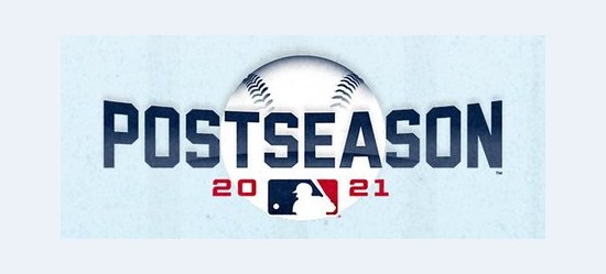
16. 2021 MLB Postseason Logo
ColorWay Sports Grade
F
via MLB
The one we cannot get behind. The 2021 logo is a navy POSTSEASON wordmark with a white baseball peeking up from behind the letters and the year split around the MLB silhouette underneath. That is it. There is no color beyond navy and a sliver of red, the ball reads as a gray smudge at cap-patch size, and the whole thing looks like a placeholder someone forgot to replace. A postseason logo has one job, which is to make October feel different from the other six months, and this one feels like a regular season graphic with a baseball clip-art layer. It is the only logo on the board that we would call lifeless. F.
15. 2026 MLB Postseason Logo
ColorWay Sports Grade
D+
via MLB
Here is the 2026 MLB postseason logo, and if it looks familiar, that is the problem. It is the same serif POSTSEASON wordmark MLB introduced in 2024, the same MLB logo floating on top, the same thin gold rules, with a gold 2026 swapped in underneath. This is the third straight October with the same design. The league confirmed it in its own 2026 postseason schedule graphic:
Nothing about the mark is broken. It is clean, it reads on a cap, and the beveled lettering still looks expensive. But the entire appeal of a postseason logo is that each year gets its own, and three straight years of the same design is honestly disappointing. The 2026 postseason cap patch sits on the right-wear side of every playoff team's New Era cap, the same spot it has lived since 2020. New Era put the 2026 postseason side patch 59FIFTY on sale on September 15, 2026, before a single playoff spot was clinched.
The 2026 bracket: the Wild Card Series presented by AbbVie runs September 29 to October 1, the ALDS presented by Booking.com runs October 3 to 10 and the NLDS runs October 3 to 9, the NLCS runs October 11 to 19, the ALCS runs October 12 to 20, and the World Series presented by Capital One runs October 23 to 31. D plus, and the plus is for the craft, not the idea.
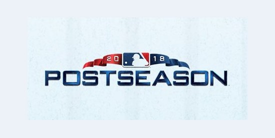
14. 2018 MLB Postseason Logo
ColorWay Sports Grade
D+
via MLB
The 2018 logo drapes a red, white and blue bunting ribbon over a flat navy POSTSEASON wordmark, with the year and MLB logo tucked into the ribbon. Bunting is a real piece of October, since every ballpark hangs it on the rails for the playoffs, so the idea is sound. The execution is not. The ribbon is thin and fussy, the wordmark is the plainest type MLB used in the whole run, and on a jersey sleeve the bunting shrinks into a squiggle. This was the sleeve patch that year, worn by every playoff club from 2013 through 2019, and it is the weakest of that sleeve era. D plus.
13. 2025 MLB Postseason Logo
ColorWay Sports Grade
C-

via MLB
2025 is the 2024 logo with the year changed. Same serif wordmark, same gold rules, same MLB logo on top. It made history in the least exciting way possible: 2025 was the first time MLB ever carried a postseason logo over from one year to the next. It gets a C minus because the base design is still fine. One repeat we could forgive as a budget year. The design did not change, but our patience started to.
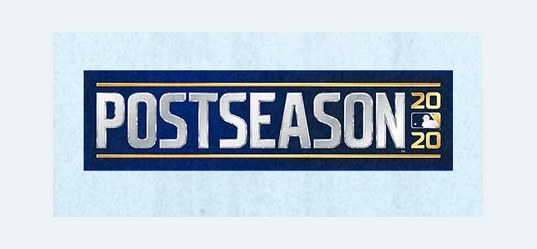
12. 2020 MLB Postseason Logo
ColorWay Sports Grade
C-
via MLB
The 2020 logo is a silver POSTSEASON wordmark trapped inside a navy rectangle, with the year stacked 20 over 20 at the right edge. It is tidy and it is cold, which fits the season: a 60-game year, an expanded 16-team field, and a bubble October in mostly empty stadiums. It was also the first year the playoff patch moved off the jersey sleeve and onto the side of the cap, where it has stayed ever since. As a mark it is a box with a word in it. C minus.
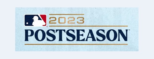
11. 2023 MLB Postseason Logo
ColorWay Sports Grade
C
via MLB
The 2023 logo puts a gold 2023 beside the MLB logo on top and a navy POSTSEASON wordmark below, underlined in gold. It is the transition logo: it previews the serif type and gold accents that would lock in the following year, but it has not figured out how to arrange them yet, and the top row looks crowded. Perfectly readable, perfectly forgettable. C.
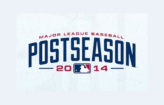
10. 2014 MLB Postseason Logo
ColorWay Sports Grade
C
via MLB
The 2014 logo is all type: Major League Baseball in a small red arc, then a tall, condensed, slightly arched navy POSTSEASON, then 20 and 14 split around the MLB logo. The condensed letters have some old ballpark scoreboard energy, and we like that it commits to one idea. But it is navy, red and white with nothing seasonal about it, and it sits on a sleeve looking like a road jersey wordmark. C.
9. 2024 MLB Postseason Logo
ColorWay Sports Grade
C+

via MLB
We want to be fair to 2024, because on its own it is a good logo. MLB's postseason identity that year was built by Fanbrandz with SKYE Design, with custom beveled lettering called Flare Extended and a color system that steps up by round, so the look gets richer as the field shrinks toward the World Series. The serif wordmark has real weight and the gold rules give it a trophy-case feel. The problem is not 2024. The problem is that it became the first of a three-year run, and that repeat drags it down in hindsight. C plus.
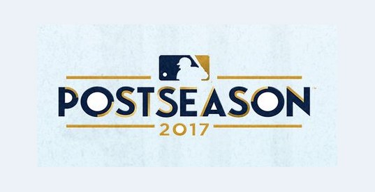
8. 2017 MLB Postseason Logo
ColorWay Sports Grade
C+
via MLB
The 2017 logo is navy with gold rules and a gold year, with the MLB silhouette on top. It is basically the blueprint for the 2024 design seven years early, and it is a little warmer than the one that copied it. It is classy, it read well on the sleeve that October, and it does not make much of an impression. C plus.
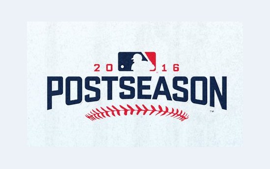
7. 2016 MLB Postseason Logo
ColorWay Sports Grade
B-
via MLB
The 2016 logo takes a simple navy POSTSEASON wordmark and runs a curved row of red baseball stitches under it. That one detail does a lot. It says baseball without a single extra shape, it gives the patch a smile, and the red pops against a white home sleeve. The same seam idea showed up on that year's World Series mark, and it made for a nice matched set in the Cubs and Cleveland October. B minus.
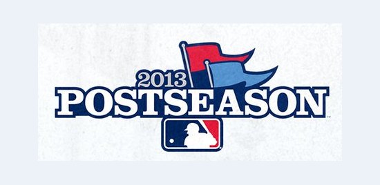
6. 2013 MLB Postseason Logo
ColorWay Sports Grade
B-
via MLB
2013 opened the sleeve-patch era, when every playoff team wore the postseason logo on its jersey, and it was a good one to start with. Two pennant flags, one red and one light blue, fly off the year above a navy POSTSEASON wordmark. Pennants are the most October object there is, since that is literally what the teams are playing for, and the light blue is a rare color on this board. It is a little clip-art in the flags, which keeps it at a B minus.
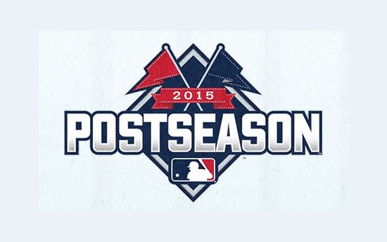
5. 2015 MLB Postseason Logo
ColorWay Sports Grade
B
via MLB
The 2015 logo builds a baseball diamond, navy with a silver border, lays the POSTSEASON wordmark across the middle, and plants two crossed red pennant flags at the top point. It feels like a badge you earn, which is exactly what a playoff patch should feel like. The flags repeat the 2013 idea but they work better here because the diamond gives them something to stand on. Solid, balanced and very readable on a sleeve. B.
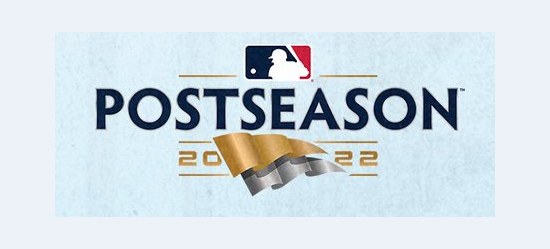
4. 2022 MLB Postseason Logo
ColorWay Sports Grade
B+
via MLB
We like 2022 a lot. The wordmark is standard navy, but the year is split around a waving gold and silver pennant, and that pennant is the whole show. It is metallic, it has motion, and it is the prize the teams are chasing. It is also the one Capital One era logo that gets the balance right: premium without feeling stiff. Color and personality, even in a small dose, win every time on this list. B plus.
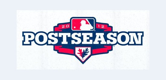
3. 2012 MLB Postseason Logo
ColorWay Sports Grade
B+
via MLB
The 2012 logo is a red and navy shield with the POSTSEASON wordmark across it and a small oak leaf sitting in the point at the bottom. That leaf matters. It carries the fall theme over from 2011, the same way the World Series marks of that era leaned on the Fall Classic idea, and it gives a pretty standard crest a reason to exist in October. The red and navy are loud in a good way. B plus.
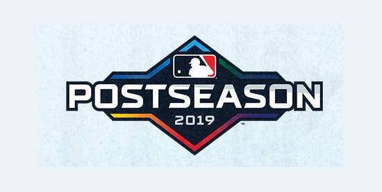
2. 2019 MLB Postseason Logo
ColorWay Sports Grade
A-
via MLB
The 2019 logo is a black diamond with a rainbow gradient running along its bottom edge, a white POSTSEASON wordmark across the middle, and the year underneath. Nothing else in the history of these marks looks like it. The black is bold, the rainbow edge gives it color without cluttering the shape, and it was the last postseason logo worn on jersey sleeves before the patch moved to the cap in 2020. It went out with a bang. A minus.
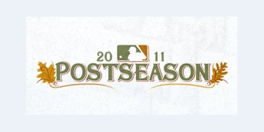
1. 2011 MLB Postseason Logo
ColorWay Sports Grade
A
via MLB
The best MLB postseason logo of the last 16 years is the one that tried the hardest to be different. The 2011 mark sets POSTSEASON in gold and olive, frames it with sprigs of autumn leaves on each side, and tucks the MLB logo between the 20 and the 11 on top. It is the only postseason logo that looks like fall. No navy, no red, no generic sports type, just the colors of October in the Northeast. It came from the same Fall Classic thinking that gave us the 2011 World Series logo, which we still call the best of that era in our World Series logo history. It has color, it has personality, and fifteen years later it still looks like nothing else. A.
The 2026 World Series Logo
ColorWay Sports Grade
B-
via MLB
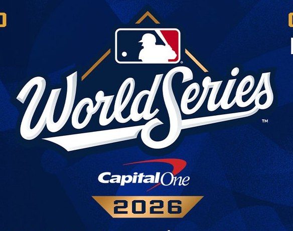
The two teams that survive to the end will trade the postseason patch for this one. The 2026 World Series logo keeps the cursive World Series script that came back in 2025, the classic lineage of the script MLB used from 1987 to 2000. The MLB logo sits on top of a gold diamond outline, Capital One sits under the script as the presenting sponsor, and a gold 2026 banner closes it out.
We love the script. It is the best lettering MLB has put on a championship mark in two decades. We do not love that this is essentially a copy of 2025, which makes it the first back-to-back World Series repeat since 1998 and 1999. Great script, same problem as the postseason logo. B minus. For every Fall Classic mark since 1986, see our World Series logo history.
Frequently Asked Questions About MLB Postseason Logos
What is the best MLB postseason logo?
We rank the 2011 MLB postseason logo as the best, with an A. It sets POSTSEASON in gold and olive and frames it with autumn leaves, which makes it the only postseason logo that actually looks like fall. The 2019 black diamond with a rainbow edge (A minus) and the 2022 gold and silver pennant (B plus) round out our top tier.
What is the worst MLB postseason logo?
The 2021 postseason logo is the worst in our ranking, with an F. It is a plain navy wordmark with a baseball rising behind it, no real color, and nothing that says October. The 2018 bunting ribbon and the 2026 repeat tie for the next spot up at D plus.
Is the 2026 MLB postseason logo the same as 2025?
Yes. The 2026 MLB postseason logo is the same serif POSTSEASON wordmark with gold rules that MLB introduced in 2024 and carried over in 2025, with the year changed to 2026. That makes 2026 the third straight postseason with the same design. MLB's own 2026 postseason schedule graphic shows it.
Where is the 2026 postseason cap patch?
The 2026 postseason cap patch is on the right-wear side of the New Era on-field cap for every playoff team. New Era released the 2026 postseason side patch 59FIFTY caps on September 15, 2026. The two World Series teams switch to a World Series cap patch for the Fall Classic.
Do MLB teams wear a postseason patch on their jerseys?
Not anymore. From 2013 through 2019, every playoff team wore the postseason logo as a jersey sleeve patch. Since 2020 the playoff patch has been cap-only. The two pennant winners do add a small World Series chest patch to their jerseys for the Fall Classic.
Who designed the current MLB postseason logo?
The postseason identity MLB introduced in 2024 was built by Fanbrandz with SKYE Design. It uses custom beveled lettering called Flare Extended and a color system that steps up by round as the playoffs go on. MLB has used the same design in 2024, 2025 and 2026.
When is the 2026 MLB postseason?
The 2026 Wild Card Series presented by AbbVie runs September 29 to October 1. The ALDS presented by Booking.com runs October 3 to 10 and the NLDS runs October 3 to 9. The NLCS runs October 11 to 19 and the ALCS runs October 12 to 20. The World Series presented by Capital One runs October 23 to 31.
Is the 2026 World Series logo new?
Barely. The 2026 World Series logo keeps the cursive World Series script, gold diamond, Capital One and gold year banner from 2025. It is the first back-to-back World Series logo repeat since 1998 and 1999. We gave it a B minus: we love the script and dislike the repeat.
The Bottom Line
Sixteen years of MLB postseason logos tell a clear story. When the league took a swing, with the autumn leaves in 2011, the oak leaf shield in 2012, the rainbow diamond in 2019 and the gold pennant in 2022, it made marks people still remember. When it played it safe, it got 2018, 2020 and 2021. The 2024 design is a well-made logo, but running it three straight years turns a postseason identity into a template with a date field, and that is a real letdown for the most important month of the baseball calendar. We would take one bold swing that misses over a third year of the same patch. Here is hoping 2027 brings back some color.