NFL Stories
 Arizona Cardinals
 Atlanta Falcons
 Baltimore Ravens
 Buffalo Bills
 Carolina Panthers
 Chicago Bears
 Cincinnati Bengals
 Cleveland Browns
 Dallas Cowboys
 Denver Broncos
 Detroit Lions
 Green Bay Packers
 Houston Texans
 Indianapolis Colts
 Jacksonville Jaguars
 Kansas City Chiefs
 Las Vegas Raiders
 Los Angeles Chargers
 Los Angeles Rams
 Miami Dolphins
 Minnesota Vikings
 New England Patriots
 New Orleans Saints
 New York Giants
 New York Jets
 Philadelphia Eagles
 Pittsburgh Steelers
 San Francisco 49ers
 Seattle Seahawks
 Tampa Bay Buccaneers
 Tennessee Titans
 Washington Commanders
 NBA Stories
 Atlanta Hawks
 Boston Celtics
 Brooklyn Nets
 Charlotte Hornets
 Chicago Bulls
 Cleveland Cavaliers
 Dallas Mavericks
 Denver Nuggets
 Detroit Pistons
 Golden State Warriors
 Houston Rockets
 Indiana Pacers
 LA Clippers
 Los Angeles Lakers
 Memphis Grizzlies
 Miami Heat
 Milwaukee Bucks
 Minnesota Timberwolves
 New Orleans Pelicans
 New York Knicks
 Oklahoma City Thunder
 Orlando Magic
 Philadelphia 76ers
 Phoenix Suns
 Portland Trail Blazers
 Sacramento Kings
 San Antonio Spurs
 Toronto Raptors
 Utah Jazz
 Washington Wizards
 MLB Stories
 Arizona Diamondbacks
 Atlanta Braves
 Baltimore Orioles
 Boston Red Sox
 Chicago Cubs
 Chicago White Sox
 Cincinnati Reds
 Cleveland Guardians
 Colorado Rockies
 Detroit Tigers
 Houston Astros
 Kansas City Royals
 Los Angeles Angels
 Los Angeles Dodgers
 Miami Marlins
 Milwaukee Brewers
 Minnesota Twins
 New York Mets
 New York Yankees
 Oakland Athletics
 Philadelphia Phillies
 Pittsburgh Pirates
 San Diego Padres
 San Francisco Giants
 Seattle Mariners
 St. Louis Cardinals
 Tampa Bay Rays
 Texas Rangers
 Toronto Blue Jays
 Washington Nationals
 NHL Stories
 Anaheim Ducks
 Boston Bruins
 Buffalo Sabres
 Calgary Flames
 Carolina Hurricanes
 Chicago Blackhawks
 Colorado Avalanche
 Columbus Blue Jackets
 Dallas Stars
 Detroit Red Wings
 Edmonton Oilers
 Florida Panthers
 Los Angeles Kings
 Minnesota Wild
 Montreal Canadiens
 Nashville Predators
 New Jersey Devils
 New York Islanders
 New York Rangers
 Ottawa Senators
 Philadelphia Flyers
 Pittsburgh Penguins
 San Jose Sharks
 Seattle Kraken
 St. Louis Blues
 Tampa Bay Lightning
 Toronto Maple Leafs
 Utah Hockey Club
 Vancouver Canucks
 Vegas Golden Knights
 Washington Capitals
 Winnipeg Jets
 All Soccer Stories
 International Competitions
 UEFA Champions League
 Premier League
 La Liga
 Serie A
 Bundesliga
 Ligue 1
 MLS
MLS All F1 Stories
 Alpine
 Aston Martin
 Audi
Audi Cadillac
 Ferrari
 Haas
Haas McLaren
 Mercedes
 Racing Bulls
 Red Bull Racing
 Williams
 NASCAR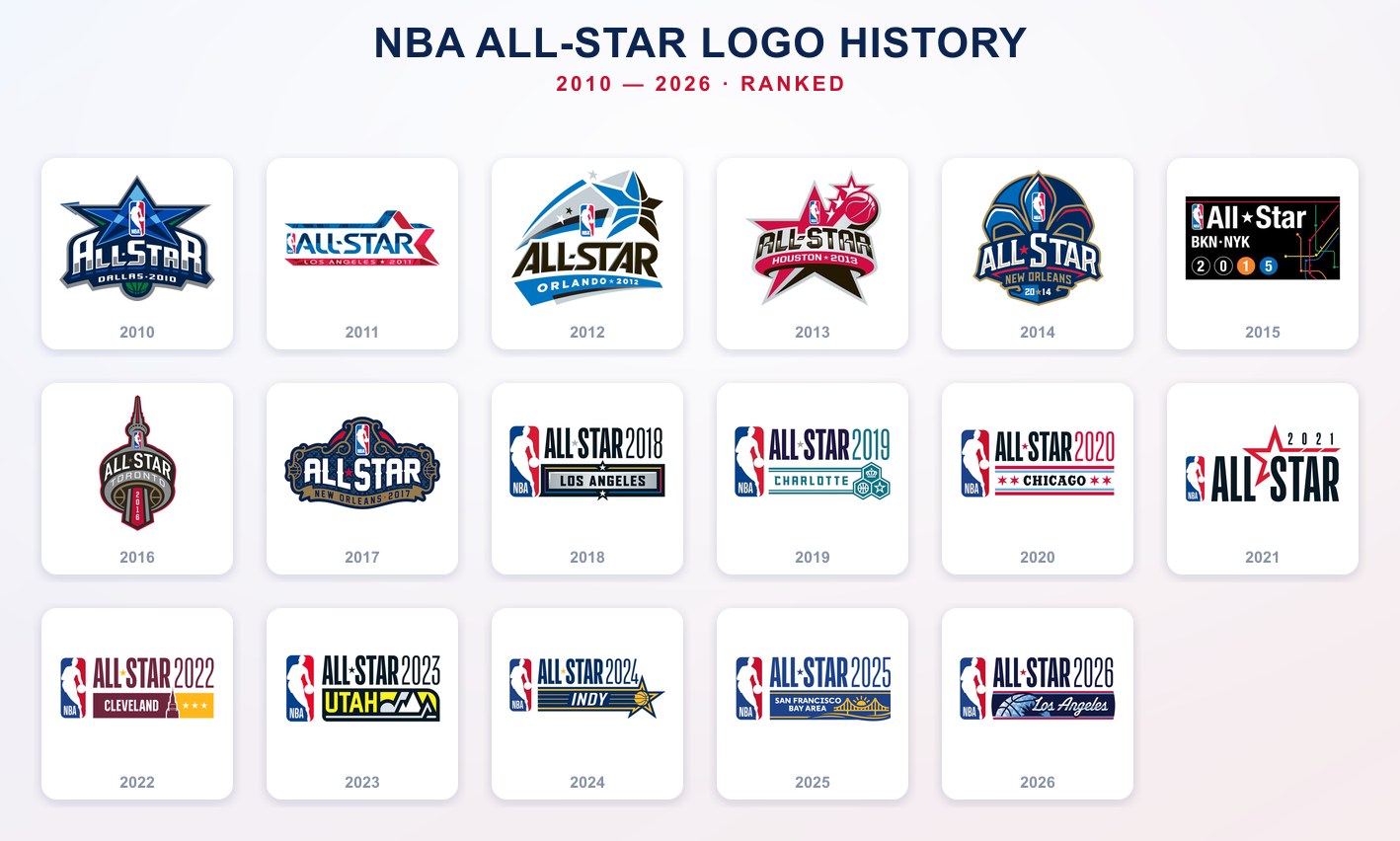
The NBA All-Star logo used to be one of the best assignments in sports design. Every year the league tore the whole thing up and built a brand-new, one-of-a-kind crest around the host city, and from 2010 to 2017 that produced a genuinely fun run of logos. Then in 2018 the league got lazy, dropped a single flat template on the whole thing, and has run essentially the same logo with a different city name ever since.
We graded all seventeen of them from 2010 to 2026. Below is every logo in the classic bespoke era graded one by one, and the case for why the entire modern template era earns an F. For the rest of the league's championship branding, see our NBA Finals logo history and World Series logo history breakdowns.
Era 1 · 2010 to 2017 · A Different Logo Every Year
This is the good era, the stretch where the league still treated the All-Star logo like a bespoke emblem and built something new for every city. Not all of them land, but the ambition is the whole point, and the best of them are the reason we wish the NBA still did it this way. Here is every logo from the classic era, graded.
Dallas 2010
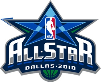
The Dallas star badge is awesome, and it is the best logo of the entire stretch. The blue star, the basketball worked into the crest, the depth and the shading, it all comes together into a mark that feels like a real event. This is exactly the kind of thing the league should still be making, and it is the high point of the whole run.
Los Angeles 2011
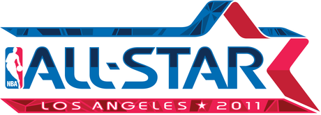
The Los Angeles mark is fine. The red and blue arrows give it a little motion and it reads cleanly enough, but there is nothing here that grabs you the way the best crests in this era do. A perfectly solid B.
Orlando 2012
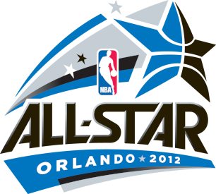
Orlando's swoosh-star has some energy to it and the blue is sharp, but it leans hard on the gradient-and-bevel look that dates it right to 2012. It is fine, and it lands a notch back at a B-.
Houston 2013
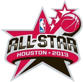
Houston is not good. The red-and-black star with the basketball is busy and a little muddy, and it never quite comes together into one clean idea. It is the weakest of the early group, and it gets a C+.
New Orleans 2014
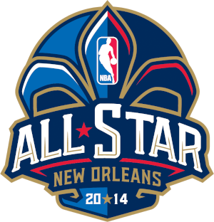
The 2014 New Orleans fleur-de-lis crest is fine. It is clearly local and it has a nice shape to it, but it is doing a lot at once and it does not quite earn its detail. A B-.
New York 2015
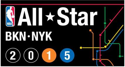
The New York subway-map idea is clever on paper, but in practice it is fine and not super memorable. It reads a little busy and a little dark, and it does not stick with you the way you would expect a New York All-Star logo to. A B.
Toronto 2016
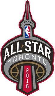
Toronto tucking the whole badge into a CN Tower silhouette is cool, and it is the first All-Star Game held outside the United States. The problem is it is not flashy enough. The idea is better than the execution, which plays it a little too quiet. A B.
New Orleans 2017
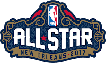
The second New Orleans crest, the wrought-iron gate, is the most overdone of the bunch. It is fussy, hard to read at a glance, and it is the low point of the classic era. A C.
Era 2 · 2018 to 2026 · The Lazy Template Era
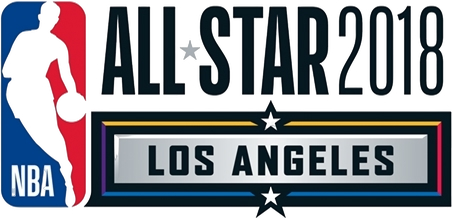
2018
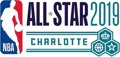
2019
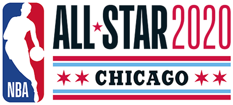
2020
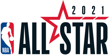
2021
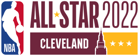
2022
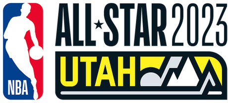
2023
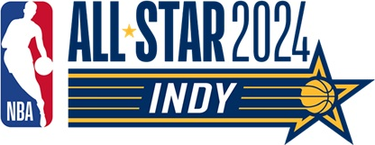
2024
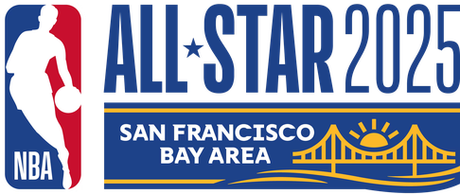
2025
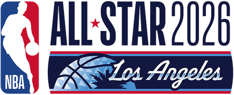
2026
In 2018 the NBA gave up. Instead of designing a unique logo for each host city the way it had for years, the league settled on one flat template and has run it ever since: the logoman on the left, "ALL-STAR" and the year in the same block type, the city name on a strip underneath, and one small graphic doing the identifying. Cover the wordmark on half of these and you would have no idea what city you are looking at.
That is why the entire modern era gets an F. It is not that any single one of these is offensively ugly, it is that the league stopped trying. The whole appeal of the All-Star logo was that it was a one-off, a real design built for one city for one weekend, and the template threw all of that away for something you could knock out in an afternoon. A couple of them at least push the local element, Chicago in 2020 with the four red stars off the city flag and Indianapolis in 2024 with the checkered racing star, but even the good ideas are trapped inside the same lazy lockup. We hate the way they do it now, full stop, and we want the bespoke crests back.
The Best and Worst NBA All-Star Logos
The best is easy: Dallas 2010, the only logo in the whole run we would call awesome, and the clearest argument for the old way of doing things. The classic era backs it up with a stack of solid B-level crests in Los Angeles, New York, and Toronto.
The worst is not a single logo, it is a whole approach: every mark from 2018 on, the interchangeable template that turned a great annual design tradition into a fill-in-the-blank exercise. If we have to pick the low point of the good era, it is the overcooked New Orleans 2017 gate at a C.
The Bottom Line on the NBA All-Star Logo History
For years the NBA built a brand-new All-Star logo from scratch for every host city, and even the misses were interesting. Dallas 2010 is the peak, an awesome badge that still holds up, and the rest of the 2010 to 2017 run is a genuinely fun stretch of bespoke design.
Then 2018 happened, and the league swapped all of that creativity for a single flat template it has recycled ever since. It is cleaner, it is more consistent, and it is completely soulless, which is why we give the entire modern era an F. The blueprint for fixing it is sitting right there in the classic era. Build a real logo for every city again.
Frequently Asked Questions
What is the best NBA All-Star logo?
Dallas 2010. We grade it an A-, the highest mark of the 2010 to 2026 run. The blue star badge with the basketball worked into the crest is the best example of the bespoke era, when the league still designed a unique logo for every host city.
Why does the NBA All-Star logo get an F for recent years?
Because since 2018 the league has used one flat template for every host city instead of designing a new logo each year. It is the logoman, "ALL-STAR," the year, and the city name in the same lockup every time, with only a small graphic changing. We grade the entire 2018 to 2026 template era an F for abandoning the bespoke, city-specific crests that made the older logos great.
When did the NBA All-Star logo change styles?
In 2018. From 2010 to 2017 each logo was a unique, ornate city crest. Starting with Los Angeles 2018 the league adopted the flat horizontal template it still uses today.
How many NBA All-Star logos are there from 2010 to 2026?
Seventeen, one for each year and host city, from the Dallas 2010 star badge through the Los Angeles 2026 mark.