NFL Stories
 Arizona Cardinals
 Atlanta Falcons
 Baltimore Ravens
 Buffalo Bills
 Carolina Panthers
 Chicago Bears
 Cincinnati Bengals
 Cleveland Browns
 Dallas Cowboys
 Denver Broncos
 Detroit Lions
 Green Bay Packers
 Houston Texans
 Indianapolis Colts
 Jacksonville Jaguars
 Kansas City Chiefs
 Las Vegas Raiders
 Los Angeles Chargers
 Los Angeles Rams
 Miami Dolphins
 Minnesota Vikings
 New England Patriots
 New Orleans Saints
 New York Giants
 New York Jets
 Philadelphia Eagles
 Pittsburgh Steelers
 San Francisco 49ers
 Seattle Seahawks
 Tampa Bay Buccaneers
 Tennessee Titans
 Washington Commanders
 College Football Stories
 SEC
SEC Big Ten
 ACC
ACC Big 12
 Pac-12
 American Conference
 Mountain West
 Sun Belt
 MAC
MAC Conference USA
 FBS Independents
 NBA Stories
 Atlanta Hawks
 Boston Celtics
 Brooklyn Nets
 Charlotte Hornets
 Chicago Bulls
 Cleveland Cavaliers
 Dallas Mavericks
 Denver Nuggets
 Detroit Pistons
 Golden State Warriors
 Houston Rockets
 Indiana Pacers
 LA Clippers
 Los Angeles Lakers
 Memphis Grizzlies
 Miami Heat
 Milwaukee Bucks
 Minnesota Timberwolves
 New Orleans Pelicans
 New York Knicks
 Oklahoma City Thunder
 Orlando Magic
 Philadelphia 76ers
 Phoenix Suns
 Portland Trail Blazers
 Sacramento Kings
 San Antonio Spurs
 Toronto Raptors
 Utah Jazz
 Washington Wizards
 MLB Stories
 Arizona Diamondbacks
 Atlanta Braves
 Baltimore Orioles
 Boston Red Sox
 Chicago Cubs
 Chicago White Sox
 Cincinnati Reds
 Cleveland Guardians
 Colorado Rockies
 Detroit Tigers
 Houston Astros
 Kansas City Royals
 Los Angeles Angels
 Los Angeles Dodgers
 Miami Marlins
 Milwaukee Brewers
 Minnesota Twins
 New York Mets
 New York Yankees
 Philadelphia Phillies
 Pittsburgh Pirates
 San Diego Padres
 San Francisco Giants
 Seattle Mariners
 St. Louis Cardinals
 Tampa Bay Rays
 Texas Rangers
 Toronto Blue Jays
 Washington Nationals
 NHL Stories
 Anaheim Ducks
 Boston Bruins
 Buffalo Sabres
 Calgary Flames
 Carolina Hurricanes
 Chicago Blackhawks
 Colorado Avalanche
 Columbus Blue Jackets
 Dallas Stars
 Detroit Red Wings
 Edmonton Oilers
 Florida Panthers
 Los Angeles Kings
 Minnesota Wild
 Montreal Canadiens
 Nashville Predators
 New Jersey Devils
 New York Islanders
 New York Rangers
 Ottawa Senators
 Philadelphia Flyers
 Pittsburgh Penguins
 San Jose Sharks
 Seattle Kraken
 St. Louis Blues
 Tampa Bay Lightning
 Toronto Maple Leafs
 Vancouver Canucks
 Vegas Golden Knights
 Washington Capitals
 Winnipeg Jets
 All Soccer Stories
 International Competitions
 UEFA Champions League
 Premier League
 La Liga
 Serie A
 Bundesliga
 Ligue 1
 MLS
MLS College Basketball Stories
 All F1 Stories
 Alpine
 Aston Martin
 Audi
Audi Cadillac
 Ferrari
 Haas
Haas McLaren
 Mercedes
 Racing Bulls
 Red Bull Racing
 Williams
 NASCAR
This is the ColorWay Sports NFL uniform rankings for 2026: every NFL team's jersey and uniform closet, graded and counted down from worst to best. We run this every year, and it is the one ranking on this site we treat as the record. We went team by team through all thirty-two closets, home sets, road sets, alternates and throwbacks, and put a letter grade on each one. Only one team failed. Three reached an A, and the team at the top is the one everybody already expects, with two complaints about it we do not hear made often enough.
A note on how we grade. This is about the uniform as a piece of design: the colours, how they are used, the helmet, the pants, and whether the whole thing holds together on a broadcast. Winning is not supposed to matter and we will admit up front that it creeps in anyway, which is a bias worth naming rather than hiding.
32. New Orleans Saints · F
For contrast, this is the era we are comparing against.
The Saints have been our least favourite uniform in the league for a long time, and it comes down to how the pieces are put together rather than the palette. The contrasting collar on the black jersey is too big and it cuts the whole thing in half. Black and gold is a genuinely great colour pair. New Orleans just does not use it correctly, the alternates do not help, and something changed when Nike took over that the Reebok-era Drew Brees sets did not have. Those popped. These do not. Full disclosure: it is harder to love a uniform on a team that is not winning, and the NFC South as a whole is our least favourite division on this list.
31. Jacksonville Jaguars · C
The logo on the side of the jersey does not work and it has not for years. The white set is essentially black with a few shades of teal thrown in, which wastes the best asset the franchise has. Jacksonville owns one of the coolest colour stories and one of the coolest names in the NFL and the uniform does almost nothing with either. The Maurice Jones-Drew era sets were better. This is a long way below what it could be.
30. Arizona Cardinals · C+
The Cardinals have no identity in this uniform. The 2023 refresh was a real attempt, and we would rather a team try than not, but the sets it replaced at least stood for something. The oversized ARIZONA across the chest of the red jersey and the odd silver lining on the road set are the two details we would change first. Simple is fine. We like simple. This reads as unfinished rather than restrained.
29. Cleveland Browns · C+
Lower than most of this list and higher than most people would put them, and both of those are deliberate. We respect the Browns for refusing to chase the times. The sleeve stripes are clean, the whole thing is simple, and Cleveland is not trying to blow anyone away, which is its own kind of identity. The brown jersey is the weak point and the white is noticeably cleaner. Plenty of people would grade this well below a C+. We think it is an honest, tidy uniform that knows exactly what it is.
28. Atlanta Falcons · B-
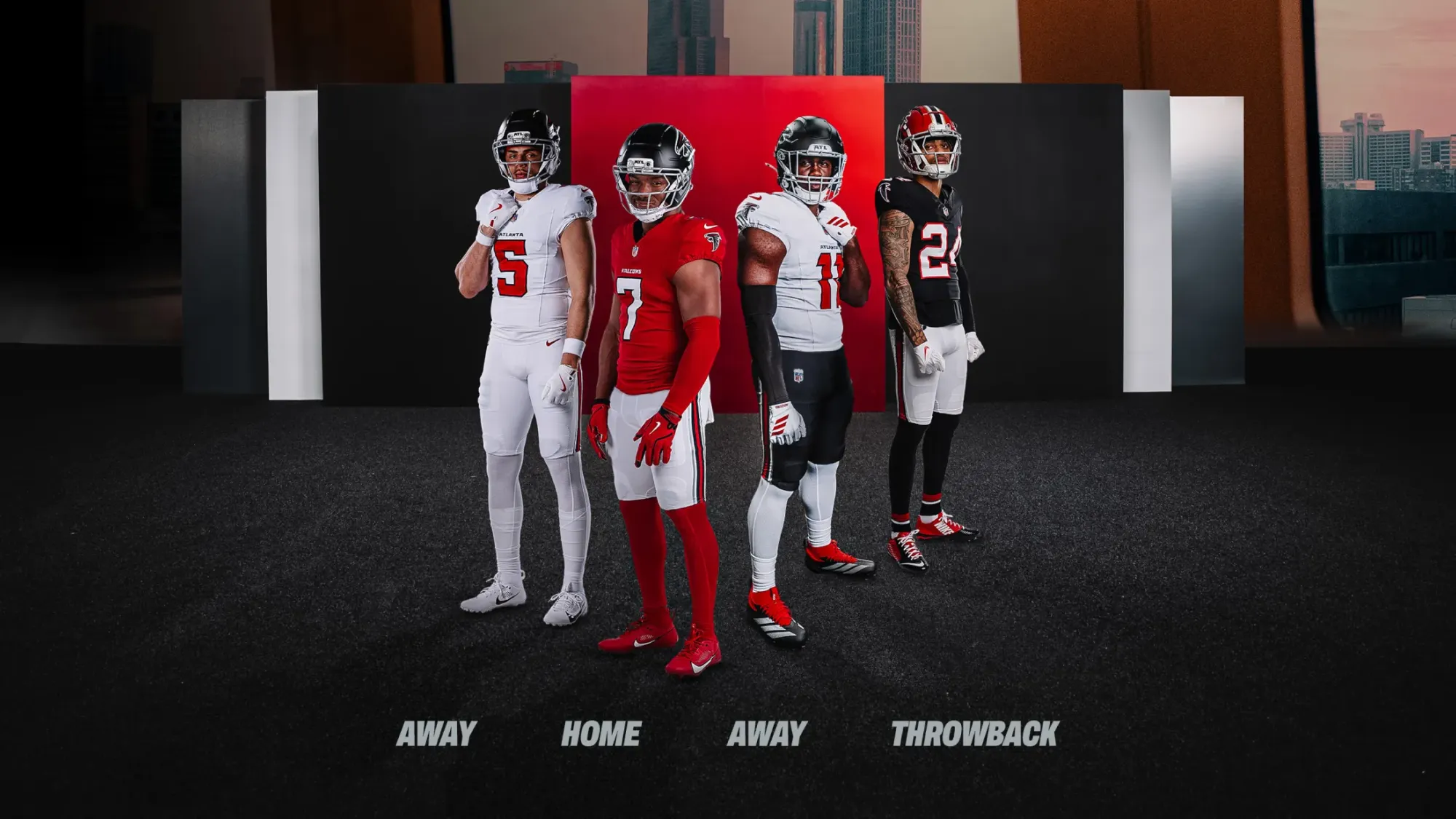
via Atlanta Falcons
The more time we spend with the new Falcons set the more it looks like the old Falcons set. It is fine. It is also boring, and it does not pop off the screen the way a rebrand should. Atlanta had licence to reach for something fun, the throwbacks prove they know how, and instead they played it safe. The helmet is the piece we like least.
27. Denver Broncos · B-
Denver could have been so much better than this. The throwback with the lighter orange and lighter blue is the good version of this franchise's identity. The current colours and the busy collar are not, and there is simply too much going on. A few years ago the Broncos would have been near the top of a list like this. They have slid, and it is a design problem rather than a colour problem.
26. Houston Texans · B-
Genuinely one of the better rebrands in recent memory. Houston used to own the worst uniform in the NFL and now they do not, which is real progress. The numbers pop far better than the old set and the near-black navy works. This year's jersey patch also sits well. And yet something about it still does not get us excited when they come on screen. Better than the Broncos, probably better than the Falcons, clearly behind the Panthers. Improved, not arrived.
25. Miami Dolphins · B-
Truly disappointing, and the only reason it stays in the B range at all is the colour. Aqua and orange is a spectacular palette and the current home and away sets are out of date. The throwbacks are excellent and they are the direction Miami should be running toward: the throwback colours, the throwback dolphin. What is on the field now is fine and it should be so much more than fine.
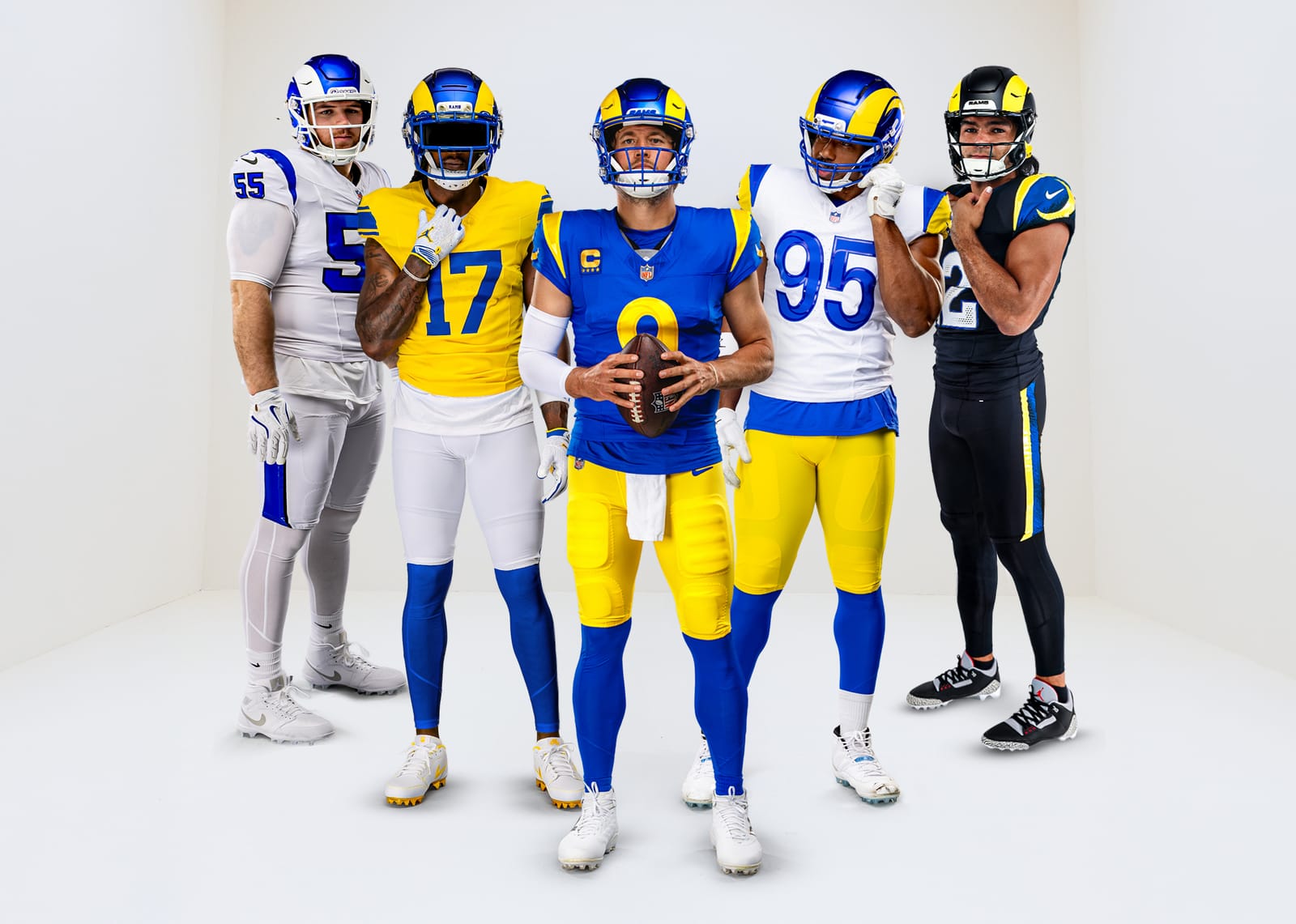
24. Los Angeles Rams · B-
via Los Angeles Rams
This one is partly nostalgia and we will own that. The old royal and yellow, with a helmet colour that deliberately did not match the jersey, was a better idea than what replaced it, and the navy and bronze Seattle-era sets were better too. The primary white is genuinely good. The primary home jersey is the problem, which is a bad place to have your problem. We like the Rams on the road and we do not like them at home.
23. Carolina Panthers · B-
Carolina has one of the best colours in the league and a uniform that does not deserve it. They finally fixed the shoulder logo and the numbers that were far too small, so this is better than it was. It still does not pop. Everything here is a notch below where the palette says it should be, and that gap is the whole grade.
22. Las Vegas Raiders · B
Everyone loves the Raiders uniform. We think it is fine. It is classic and the silver and black is untouchable in theory, but something is missing in practice, and it has not looked the same under Nike as it did before. A B is a good grade. It is also lower than the reputation, and we think the reputation is doing some of the work here.
21. Indianapolis Colts · B
Simple and better than expected. The Colts sit in roughly the same category as the Titans, a bit plainer, and they carry it off. It is easy on the eye and there are pieces we would sharpen, but there is nothing here that offends. A little below Tennessee for us.
20. New England Patriots · B
New England took a step back when the post-Brady rebrand promoted an alternate to primary. We like it. We do not love the stripe, which is enormous, and years on it still reads as an alternate rather than a base uniform. The logo is excellent and so is the helmet. The colours are too dark for us, and we would take the old Pat Patriot helmet back tomorrow.
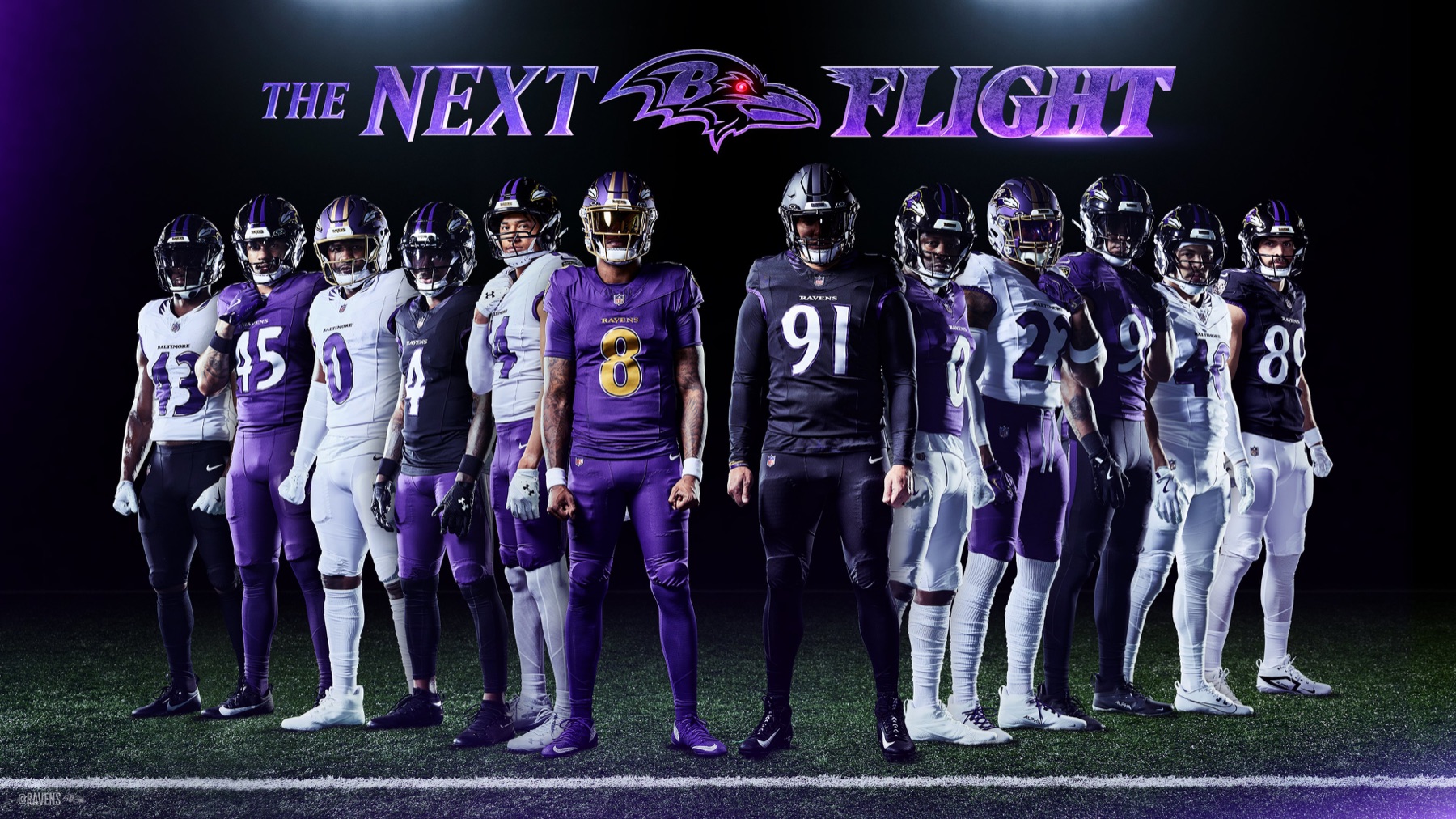
19. Baltimore Ravens · B
via Baltimore Ravens
The tough one. We like the Ravens uniform and we always have, and that is exactly why the new set is a letdown. Purple is a fantastic thing to own in a league full of navy, and Baltimore had a chance to do something real with it. Instead they played it safe and changed the collar. The result reads a little gimmicky, which is not what we wanted from a set this overdue.
18. Tennessee Titans · B
Seen on the field rather than in the reveal images, the new Titans set is nice. It also does not pop the way we wanted it to. We are early with these and they may grow on us, but Tennessee had a real chance to do something fun and chose the safe version. The colours are good. The ambition is not.
17. Seattle Seahawks · B
Great colours, dated execution. The royal blue throwback is better than anything in the current set, which is the clearest possible signal that a refresh is overdue. Seattle is not doing anything wrong here. They are just wearing a uniform that belongs to a previous decade.
16. Tampa Bay Buccaneers · B
A B here is not a knock. We like what Tampa does, and the creamsicle throwbacks pull the whole grade up. The pewter is a genuinely distinctive colour and the helmet shade is good. The palette overall is not our favourite and the set does not pop off the screen, which is what keeps it here rather than higher.
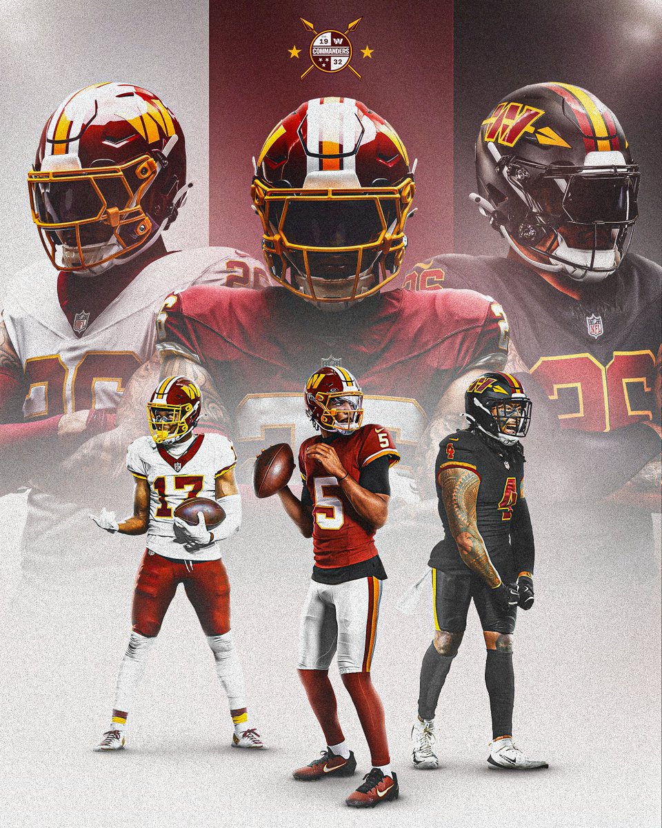
15. Washington Commanders · B+
via Washington Commanders
Washington is moving in the right direction and this year's set is the proof. The franchise used to own a genuinely incredible uniform, and if that were still what they wore this would be an A or better. The helmet is what holds it back. Fix the helmet and this jumps several places, because everything below the neck is already one of the better sets in the league.
14. New York Jets · B+
A good set. The colours work, the helmet is strong, the facemask colour is right, and almost nobody else in the league is using green. The white collar is the piece we go back and forth on, because it is a nice detail that occasionally reads loud. Simple and well made, just not quite at the level of the other B+ sets here.
13. San Francisco 49ers · B+
Classic, permanent, and correctly left alone. San Francisco does not chase trends and that restraint is the right instinct for a franchise this old. The colours are not our favourite in the league, which is the only thing keeping this out of the A tier, but this is a uniform that will look right in fifty years.
12. Cincinnati Bengals · B+
One of the best closets in the NFL. The Bengals and the Chargers led the generation of teams that stripped the jersey back and let one strong idea carry it, and here that idea is the stripes. The white out is excellent and the helmet is one of the coolest in the sport. What keeps Cincinnati out of the A tier is history rather than design: this identity is still young, and the very top of this list is occupied by uniforms that have earned decades.
11. Buffalo Bills · A-
Bottom of the A- tier, and there for a reason. The colours pop and Buffalo does red, white and blue better than anyone in the league except the Giants. The new Nickel City set is the miss, and we are not fond of it at all. But the core uniform is clean and loud in the right way, and the palette does most of the heavy lifting.
10. Philadelphia Eagles · A-
Philadelphia handles its colours as well as anyone. The only thing keeping this from climbing is that the set runs a little dull for us. The wordmark addition this year is a nice touch and we like what they did with it. An A- is a very good grade and this earns it comfortably.
9. Kansas City Chiefs · A-
A rival, and a very good uniform. The Chiefs feel like an NFL uniform in a way that is hard to manufacture, and the conference patch sits beautifully. What we appreciate most is the restraint: home and away and nothing else. The hint of yellow is judged well, never overdone. Teams that keep it this simple almost always age better than the ones that do not.
8. Detroit Lions · A-
Really nice, and a notch behind the Packers and Vikings in a division where that is no insult. The colours are strong. The silver is the sticking point: we like the colour and not entirely the way it is used. A slightly more throwback direction would push Detroit up this list quickly.
7. Pittsburgh Steelers · A-
The helmet alone is worth the grade. A logo on one side only is the kind of thing no design committee would approve today, and it is the single most distinctive piece of equipment in the league. The colours all live in that mark. This is a classic, underrated uniform that simply looks like football.
6. Minnesota Vikings · A-
The NFC North is our favourite division on this list and Minnesota is a big reason why. The colour work is excellent, the schemes are considered, the matte helmet is a genuinely good call, and the throwback is superb. Every time the Vikings come on screen the uniform looks expensive. That is the whole job.
5. Dallas Cowboys · A-
This grade is almost entirely about the pants. The white jersey over those silver-blue trousers is our favourite pant in the NFL and it is not close. Nobody else runs a colour like that, and almost nobody takes the chance on a pant that does not match anything else in the uniform. We do not love the navy jersey at home or on the road. We love those pants enough to carry the whole set into the A tier.
4. Green Bay Packers · A-
An all-time home uniform. The detail we love most is that Green Bay never chased the modern skin-tight cut, so you can still see the mesh and the pad lines underneath, and the jersey still looks like a football jersey. The yellow helmet is a brave piece of equipment that a hundred other teams would have talked themselves out of. This is one of the sets we are always glad to see.
3. Chicago Bears · A
Some of the cleanest uniforms in the NFL and the best in an already strong division. The GSH memorial stripe on the sleeve is the detail that makes it, a piece of franchise history worn permanently on the jersey rather than trotted out for one game a year. This is what an NFL uniform is supposed to look like, and we have admired it since we were young.
2. New York Giants · A
We have always loved this one. The blue is right, the white is right, and the helmet is about as clean as a helmet gets. There is nothing here we would change and nothing here that needed changing in the first place. It sits just outside the very top, which says more about the standard than about the Giants.
1. Los Angeles Chargers · A
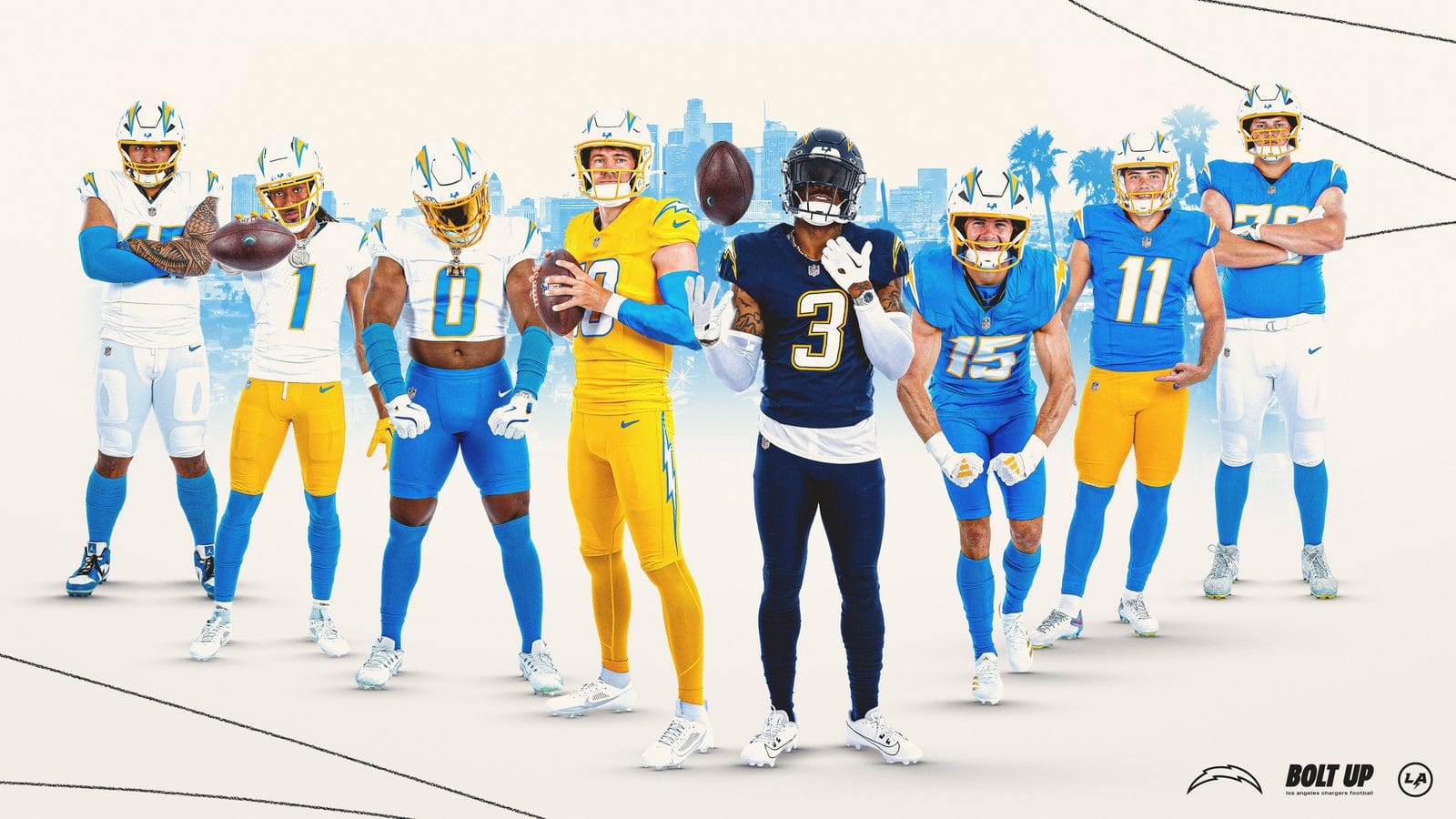
The full Chargers closet, via Los Angeles Chargers. Note the gold jersey pairs with white pants in 2026, not the gold-on-gold shown here.
This is the shade we mean. The Chargers powder blue of the Philip Rivers era, next to what they wear now.
Our favourite team, and the uniform most people already call the best in the league. We agree, with two complaints we do not hear enough people make. First: the powder blues are not powder any more. They are not close, and they are nowhere near what they were in the Philip Rivers era. That colour was the whole point. Second: the Super Chargers set needs white pants, and the current pairing wastes it. The Chargers take chances, they are genuinely known for their uniforms, and that is worth a great deal. All of which is why this is an A and not an A+. There is a version of this uniform that is the best in sports and a couple of colour and pant decisions are standing between them and it.
The Bottom Line
The NFC North is the strongest division in the league by uniform, with the Bears at an A and the Packers, Vikings and Lions all landing at A-. The NFC South is the weakest by a distance. The Saints are the only F on the board, and Atlanta and Carolina sit in the bottom ten with them. Tampa Bay is the lone exception and the only NFC South team in the top half.
Three teams reached an A and none reached an A+, which is the honest summary of where the league is. The Chargers are the best uniform in football and are still leaving something on the table, between a powder blue that is no longer powder and a Super Chargers set crying out for white pants. The Giants and Bears got there by never needing a rescue in the first place.
The most improved is Houston, which has climbed from the worst uniform in the league to a respectable B-. The biggest missed opportunity is Baltimore, which had a chance to do something real with the best colour in the sport and changed the collar instead.
For more, see our 2026 NFL uniform schedule guide for when each team wears what, and every MLB uniform ranked.
Frequently Asked Questions
What is the best NFL uniform in 2026?
The Los Angeles Chargers, graded A. The powder blue home set is the best-looking uniform in the league, though the current powder blue is noticeably darker than the shade the Chargers wore in the Philip Rivers era.
What is the worst NFL uniform in 2026?
The New Orleans Saints, the only F on our board. Black and gold is a great colour pair, but the oversized contrasting collar cuts the jersey in half and the set has not looked right since the Reebok era.
Which NFL division has the best uniforms?
The NFC North. The Bears earned an A and the Packers, Vikings and Lions all landed at A-, making it the only division without a single team below the A- tier.
Which NFL team improved the most?
The Houston Texans. Their rebrand took them from what we considered the worst uniform in the league to a B-, with numbers that read far better and a near-black navy that works.
Did any NFL team get an A+?
No. Three teams reached an A, the Chargers, Giants and Bears, but none earned an A+ in 2026.