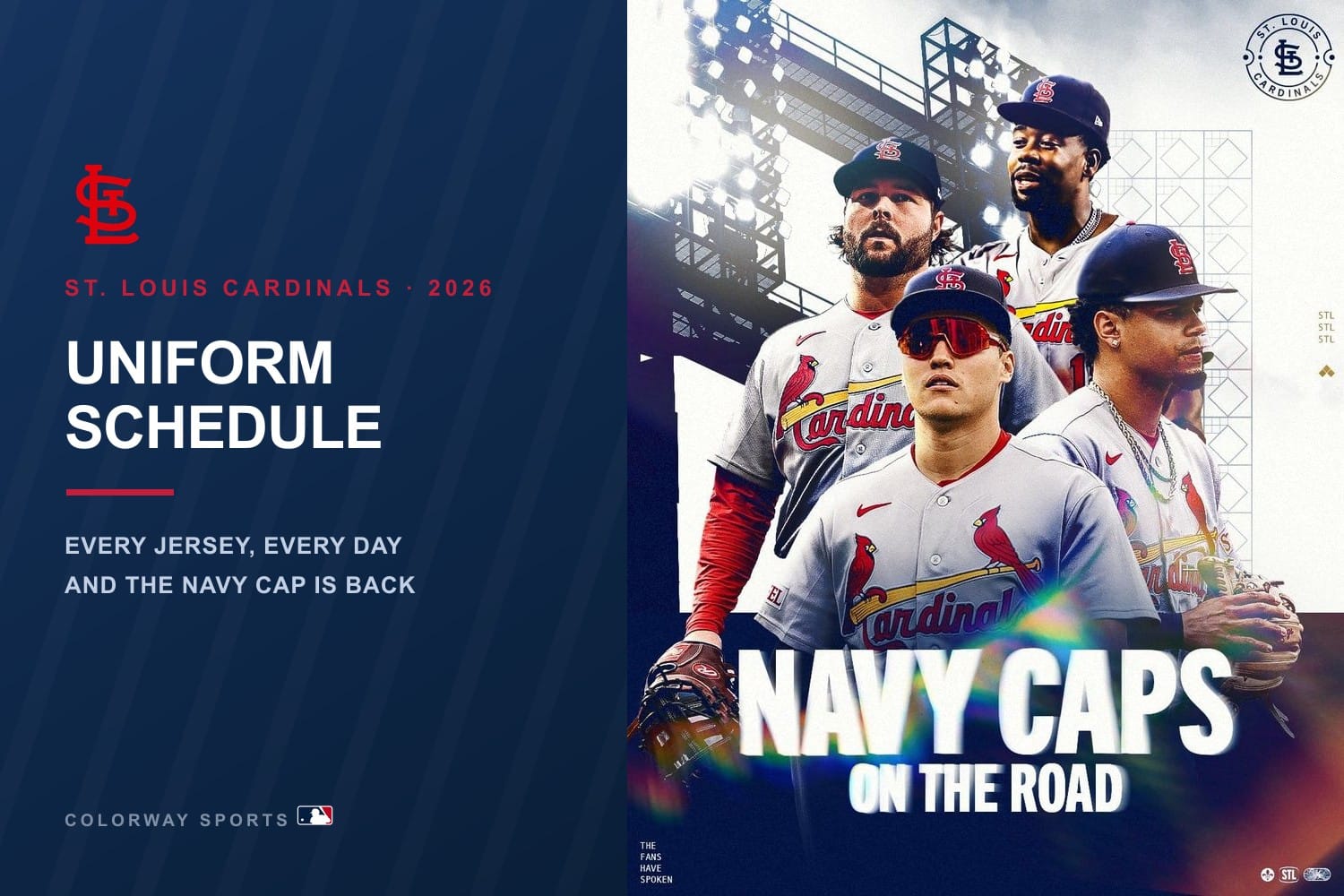
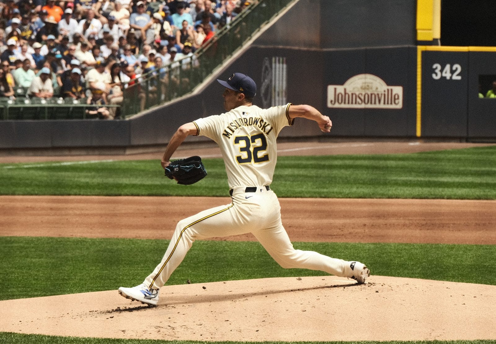
We spent this season grading every uniform in Major League Baseball one team at a time, jersey by jersey, worst to first. That work is finished. All 30 teams, 143 jerseys, every one of them carrying a letter grade we had to defend in its own post.
This is where the best of them meet. The order below is pulled straight from those team-by-team grades rather than assembled from memory, which means a few results surprised us and we left them alone anyway. Only 26 jerseys in the entire sport earned an A or better, and that is the list. We are counting down from 26 to the single best uniform in baseball.
The 26 Best Uniforms in Baseball, Counting Down
Every jersey below graded an A or an A+ in its own team ranking. Nothing here was promoted or demoted to make the list flow better. Where two jerseys share a grade, we broke the tie the same way we would if they were hanging next to each other in a clubhouse.
26. Nationals Navy Alternate
The best jersey Washington owns, and part of that is design and part is memory. The "Nationals" script looks stranded on a white shirt, but on a navy base it finally has something to push against, and the red-and-white lettering glows under the lights. Same wordmark, right base, completely different jersey. Full list in our Nationals jersey rankings.
25. Blue Jays Royal-Blue Alternate
Here is the twist that defines Toronto's closet: the alternate is really the default. The royal blue was the Blue Jays' most-worn uniform in 2025 by a wide margin, at home and on the road. Most clubs treat a colored alternate as a treat. Toronto made theirs the house style, and it earns the promotion.
24. Cardinals Cream Alternate
The standout of the entire standard set. The "St. Louis" script, a vintage Musial-era feel, and restored braid piping that makes it sing up close. Reserved for Saturday home games, and it reads completely differently in natural daylight than the home white does, which is exactly why one designated day a week works.
23. Brewers Powder Blue Road
The big move of 2026. Milwaukee retired the road grays outright and made powder blue the primary road uniform, reviving what the franchise wore from 1970 into the mid-1980s. Navy block "Milwaukee" outlined in gold, and the navy cap with the yellow front panel and ball-in-glove crest is the piece that seals it. It is also the only genuinely great uniform the Brewers own, which is its own story in our Brewers jersey rankings.
22. Mariners City Connect (Rush-Blue)
One of only two City Connects in the entire program we grade this high. Seattle is still wearing the royal blue set it debuted in 2023, and it is stuffed with real history: gold "Seattle" lettering from the 1969 Pilots, a drop shadow nodding to the 1955 Rainiers, black pants for the 1940s Steelheads, and the old trident on the cap. That is a lot of references, and the reason it works is that none of them fight.
21. Orioles Home White
This one is all about the hat. The "Orioles" script in orange and black, paired with the white-front cap topped by the smiling cartoon Oriole Bird, one of the most beloved marks in sports. The clean white lets the script and that cap do the work, and it never gets old. There is nothing here we would touch.
20. Blue Jays Powder-Blue Alternate
The one fans actually buy. Toronto's modern version is a soft sky-blue top with navy-white-navy serifed split lettering, a nod to the powder blues the club wore on and off since 1977. It got a national spotlight during the 2025 World Series run, which only cemented it. It edges the royal because it does everything the royal does and then adds history and warmth.
19. Red Sox Road Gray
The classic version of a road gray. Arched red "BOSTON" across the chest, navy trim holding it together, nothing else asking for attention. What makes it is the whole package: the navy cap with the red B, the socks logo down the sleeve, red and navy holding together from cap to cuff. Red on gray reads from the upper deck and from a phone screen.
18. Mets Home White Pinstripes
One of the most recognizable home uniforms in the National League, and the Mets are smart to leave it almost entirely alone. Blue pinstripes, the gently angled blue "Mets" script, orange trim, and the cap with the interlocking orange NY. It is the correct, classic, cannot-mess-it-up look. We like it a lot without quite loving it, which is the only thing keeping it out of the very top.
17. Yankees Home Pinstripes
The most iconic uniform in American sports, and it earns the word. No player name, no chest wordmark, no secondary logo, just pinstripes and the interlocking NY over the heart. The genius is subtraction: almost every design decision the Yankees have made in a century has been to leave something off. It lands seventeenth because we are grading jerseys, not legacies, and sixteen of them are simply better looking. The discipline behind it is its own story in our Yankees jersey rankings.
16. Dodgers Road Gray
One of the best road uniforms in baseball and not particularly close. Same royal script the team has run for generations, same red number underneath, same clean gray. Show it to someone from 1975 or 2005 or today and none of them could date it. Royal on gray holds its edge under every kind of light, and the red number keeps the front from going cold.
15. Cardinals Home White
The one you picture when you think of St. Louis baseball. Two cardinals perched on the yellow bat, the red script sitting perfectly against clean white, and not one thing about the jersey we would change. It is a top-five uniform in the sport on its own merits. The grade comes down to the cap: with the classic navy "StL" it is an A+, and the inconsistency there is the only reason it is not higher on this list.
14. White Sox Black Alternate
One of the best dark uniforms in baseball. Black with the diagonal silver "SOX" script, black cap, usually over the white pinstriped pants. Black is the hardest base color to make work because it flattens on camera and swallows detail, and this jersey solves it the only way that works, which is by putting almost nothing on it. Thirty-plus years on, nothing about it has aged.
13. Red Sox Home White
The uniform the franchise is actually built around. The red "Red Sox" script with the navy outline, the hanging socks on the sleeve, piping doing exactly as much as it needs to and no more. White at Fenway in the afternoon with the navy cap and that script across the chest is one of the best-looking frames in baseball.
12. Tigers Navy Road Alternate
Unveiled alongside the orange in February 2026 and a knockout in its own right. Script "Detroit" in orange with white trim on navy, built on the 1984 template with the V-neck collar, cuff striping, and roundel sleeve patch. The throwback detailing gives it a genuine sense of occasion instead of feeling bolted on.
11. Marlins Teal Throwback
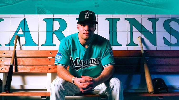
Image via Miami Marlins
Teal Sundays, in the exact 1993 shade, with the block "MARLINS" wordmark and its swoosh underline and white pants so the teal does all the talking. That teal is one of the great colors in baseball history, specific enough that you can date it to the year, and nobody else in the sport is anywhere near it. Worth knowing: this is not the Caribbean blue alternate, which Miami has not worn once in 2026.
10. Athletics Kelly Green Alternate
The fan favorite and the closest thing this franchise has to a hard rule. Bright kelly with gold "Athletics" lettering, straight from the Charlie Finley era, owner of Friday home games since Green Friday began in 2018. It survived the move to Sacramento intact with only the wordmark swapped, which tells you how much equity is in it.
9. Tigers Orange Home Alternate
For the first time in 126 years the Tigers are wearing orange in regular-season games, and they nailed it. The Old English D stays put in navy trimmed white, the V-neck collar and three-color sleeve striping pull from the 1984 champions, and a new navy cap with an orange brim finishes it. For a franchise this traditional to break out orange at all is a swing. See the rest in our Tigers jersey rankings.
8. Braves Powder Blue City Connect
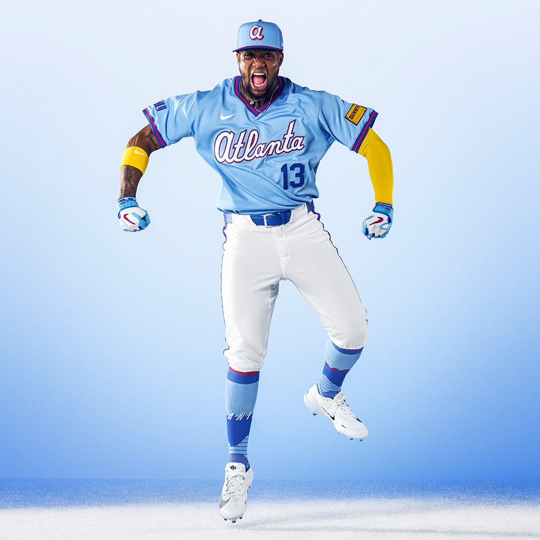
Image via Atlanta Braves
The best City Connect the program has produced, and it is not close. Almost every City Connect invents a wordmark, a palette, and a mascot nobody asked for, and the result could belong to any city with the same nickname. This one reaches into Atlanta's own closet and pulls out the road powder blues of the 1980s, the uniform the whole country watched on TBS, and builds it as a V-neck pullover. The rare City Connect that is not a marketing exercise. See how it topped our Braves jersey rankings.
7. Red Sox Red Alternate
The rare alternate that feels more like the franchise than the primary uniforms do. Boston in full red is loud in the way a team called the Red Sox should be loud. The red is deep enough to avoid looking like a practice top, the navy outline keeps the wordmark from bleeding into the fabric, and it photographs beautifully under lights. When Boston walks out in this, the broadcast gets better instantly. Full order in our Red Sox jersey rankings.
6. Angels Throwback White
The best jersey the Angels own and it is not close. A white V-neck pullover with red and navy striping at the collar and cuffs, "Angels" in the block-serif lettering of the California Angels era with a halo ringing the A, red numbers, and the state of California on the sleeve inside a gold halo. The V-neck pullover cut is the foundation, a silhouette almost nobody wears anymore, and it instantly separates this from the button-front sameness of the modern league.
5. Mariners Northwest Green Alternate
The crown jewel, and one of the best alternates in all of baseball. Saltwater teal that has been in the Mariners' DNA since the 1993 rebrand, "Mariners" across the chest in silver with navy trim, and the single most distinctly Seattle color anyone owns in sports. It pulls double duty on select Saturday home games and as the road contrast look, so it stays in heavy circulation instead of getting buried.
4. Mets Black Alternate
There is something timeless and effortlessly cool about the Mets in black. The blue-and-orange wordmark pops harder against the dark base than anywhere else in the closet, and the black cap finishes it perfectly. It earns the A+ because it does what only the best uniforms do, which is make you want to see it. Top to cap in black, the Mets look as good as any team in baseball.
3. Cubs Home Pinstripes
White with royal pinstripes, the red bullseye roundel on the left chest, and the blue cap with the red C. The bullseye is the whole thing, one of the greatest logos in the sport, the enclosed C wrapping UBS inside a ring of blue and red, and putting it on the chest instead of a wordmark is exactly the right call. The Cubs have run this template since pinstripes arrived at Wrigley in 1957 and there has never been a reason to touch it.
2. Phillies Cream Alternate
Quite possibly the prettiest jersey in baseball. Cream is warmer than white and softer than tan, and it makes the red script look richer than the same script does on bright white. It is the difference between a uniform that looks new and one that looks like it has always existed. The blue cap with the red brim is what completes it. Philadelphia wore cream as its primary home look from 1946 to 1949 and brought it back in 2008.
1. Dodgers Home White
The best jersey in baseball, and we do not think it is especially close. Clean white, the royal blue "Dodgers" script arced across the chest, and the red number sitting right underneath it. That red number is the detail that makes the whole thing, a touch almost nobody else in the sport uses, and it turns what could be a plain white jersey into something instantly, unmistakably the Dodgers. The blue is the right blue, warm and bright rather than navy. The script has a genuine hand-drawn slant, one of maybe three chest marks in the sport with real personality. Los Angeles has had the discipline to leave it alone for decades, which is the hardest thing in design: to be perfect and know better than to touch it. It anchors our Dodgers jersey rankings.
The Full Top 26 MLB Uniforms of 2026, at a Glance
Every jersey that earned an A or better, in order, out of the 143 we graded across all 30 MLB teams.
1. Dodgers Home White · A+
2. Phillies Cream Alternate · A+
3. Cubs Home Pinstripes · A+
4. Mets Black Alternate · A+
5. Mariners Northwest Green Alternate · A+
6. Angels Throwback White · A+
7. Red Sox Red Alternate · A+
8. Braves Powder Blue City Connect · A+
9. Tigers Orange Home Alternate · A
10. Athletics Kelly Green Alternate · A
11. Marlins Teal Throwback · A
12. Tigers Navy Road Alternate · A
13. Red Sox Home White · A
14. White Sox Black Alternate · A
15. Cardinals Home White · A
16. Dodgers Road Gray · A
17. Yankees Home Pinstripes · A
18. Mets Home White Pinstripes · A
19. Red Sox Road Gray · A
20. Blue Jays Powder-Blue Alternate · A
21. Orioles Home White · A
22. Mariners City Connect (Rush-Blue) · A
23. Brewers Powder Blue Road · A
24. Cardinals Cream Alternate · A
25. Blue Jays Royal-Blue Alternate · A
26. Nationals Navy Alternate · A
What 143 Grades Actually Told Us
Grading a whole league at once surfaces things you cannot see one team at a time.
Great uniforms are rarer than they feel. Out of 143 jerseys, 26 earned an A or better. That is roughly one in six. Most of what teams wear on a given night is perfectly fine and completely forgettable, and the honest middle of this league is a B.
The City Connect program is the single biggest drag on baseball's wardrobe. The 29 City Connects we graded average out to a C. Everything else in the sport averages a B+. That gap is not close, and it is the clearest finding in the whole dataset. Nine jerseys graded D+ or worse, and eight of the nine are City Connects. Only two City Connects cracked the A tier at all: the Braves' powder blue and the Mariners' rush-blue, and both did it the same way, by reaching into the team's real history instead of inventing a theme. We ranked the program against itself in our City Connect rankings, where a good City Connect can still be a mediocre jersey.
Two jerseys failed outright. The Blue Jays' "Night Mode" City Connect and the White Sox' red City Connect are the only F grades in the series.
The Red Sox have the strongest closet in baseball. Three of Boston's five uniforms graded A or better, more than any other club. The Mariners have the best closet by average grade, helped by having no true weak link. At the other end, the Reds are the only team in the league without a single jersey above a B.
The best new idea of 2026 was old. Nearly every uniform that graded well this year is a revival: Detroit's orange and navy off the 1984 template, Milwaukee's powder blue road set from 1970, Atlanta's TBS-era powder blue, the Angels' California-era V-neck, Miami's 1993 teal. The teams that went looking through their own closets beat the teams that went looking for a concept, every single time.
The Bottom Line
The top of baseball's uniform hierarchy splits into two camps. There is the timeless group, led by the Dodgers' home whites and the Cubs' pinstripes and the Yankees' interlocking NY, uniforms that win by never changing and by having the discipline not to. And there is the revival group, led by the Braves' powder blue and the Phillies' cream and Detroit's orange, uniforms that win by digging into a team's own history and pulling out something better than what it wears every day.
What almost nothing at the top has in common is invention. Of the 26 uniforms on this list, we count exactly zero that were designed from scratch as a modern concept. That is the whole lesson of grading 143 jerseys. Baseball is a sport with a century of good ideas already sitting in storage, and the teams that look there keep winning.
The Dodgers sit at number one because they do the hardest thing in design, which is to be perfect and know better than to touch it.
How We Built This Ranking
Every uniform here comes from our team-by-team jersey rankings, where we grade each club's looks worst to first and explain every grade. This master list gathers the highest grades across all 30 teams and stacks them against one another, so a jersey's place here matches the grade it earned in its own post. No jersey was moved up or down to make the list read better.
All 30 team rankings: Angels, Astros, Athletics, Blue Jays, Braves, Brewers, Cardinals, Cubs, Diamondbacks, Dodgers, Giants, Guardians, Mariners, Marlins, Mets, Nationals, Orioles, Padres, Phillies, Pirates, Rangers, Rays, Red Sox, Reds, Rockies, Royals, Tigers, Twins, White Sox, Yankees.
Frequently Asked Questions
What is the best MLB uniform in 2026?
The Dodgers' home whites. We grade them an A+ and rank them first out of all 143 jerseys we graded. Clean white with the royal blue "Dodgers" script and a red number on the front, it is the standard we measure the rest of the sport against.
How many MLB uniforms did you grade?
143 jerseys across all 30 teams, an average of about five per club. Only 26 of them earned an A or better.
What is the best City Connect uniform?
The Braves' powder blue City Connect, which we grade an A+ and rank eighth overall, comfortably the highest of any City Connect. It revives Atlanta's 1980s TBS-era road powder blues instead of inventing a theme, and it is the best thing the program has produced.
What is the worst MLB uniform in 2026?
Two jerseys graded an F: the Blue Jays' "Night Mode" City Connect and the White Sox' red City Connect. Eight of the nine lowest-graded uniforms in the league are City Connects.
Are City Connect uniforms actually bad?
As a group, yes. The 29 City Connects we graded average a C, while everything else in baseball averages a B+. The exceptions are the two that dig into real team history, Atlanta's powder blue and Seattle's rush-blue.
Which team has the best uniforms overall?
The Red Sox have the most jerseys graded A or better, with three of their five. The Mariners have the highest average grade across their whole closet.
What is the best MLB jersey of 2026?
The Dodgers' home white jersey. It is the only uniform we grade a perfect A+ and rank first overall, ahead of the Phillies cream alternate and the Cubs home pinstripes.
Which MLB team has the best home uniform?
The Dodgers, whose home whites rank first overall. The Cubs home pinstripes, Cardinals home white, Red Sox home white, Mets home pinstripes, and Orioles home white all also finished inside our top 21.
What is the best throwback uniform in baseball?
The Angels throwback white, which we grade an A+ and rank sixth. The Marlins 1993 teal throwback is next at eleventh, and the Tigers build both of their top jerseys on a 1984 throwback template.
What is the best powder blue uniform in MLB?
The Braves powder blue City Connect at eighth overall, followed by the Blue Jays powder blue alternate at twentieth and the Brewers powder blue road at twenty-third.
What is the best road uniform in MLB?
The Dodgers road gray, which we grade an A and rank sixteenth. The Red Sox road gray at nineteenth and the Brewers powder blue road at twenty-third are the other road looks in our top 26.
Which MLB teams have the most uniforms in the top 26?
The Red Sox lead with three: the red alternate, the home white, and the road gray. The Dodgers, Mets, Cardinals, Tigers, Mariners, and Blue Jays each place two.
How is this ranking decided?
It is built entirely from our team-by-team jersey rankings, where we grade every uniform a club wears from worst to first. This list gathers every jersey that earned an A or better across all 30 teams and stacks them against each other, so a jersey's place here matches the grade it earned in its own post.