NFL Stories
 Arizona Cardinals
 Atlanta Falcons
 Baltimore Ravens
 Buffalo Bills
 Carolina Panthers
 Chicago Bears
 Cincinnati Bengals
 Cleveland Browns
 Dallas Cowboys
 Denver Broncos
 Detroit Lions
 Green Bay Packers
 Houston Texans
 Indianapolis Colts
 Jacksonville Jaguars
 Kansas City Chiefs
 Las Vegas Raiders
 Los Angeles Chargers
 Los Angeles Rams
 Miami Dolphins
 Minnesota Vikings
 New England Patriots
 New Orleans Saints
 New York Giants
 New York Jets
 Philadelphia Eagles
 Pittsburgh Steelers
 San Francisco 49ers
 Seattle Seahawks
 Tampa Bay Buccaneers
 Tennessee Titans
 Washington Commanders
 NBA Stories
 Atlanta Hawks
 Boston Celtics
 Brooklyn Nets
 Charlotte Hornets
 Chicago Bulls
 Cleveland Cavaliers
 Dallas Mavericks
 Denver Nuggets
 Detroit Pistons
 Golden State Warriors
 Houston Rockets
 Indiana Pacers
 LA Clippers
 Los Angeles Lakers
 Memphis Grizzlies
 Miami Heat
 Milwaukee Bucks
 Minnesota Timberwolves
 New Orleans Pelicans
 New York Knicks
 Oklahoma City Thunder
 Orlando Magic
 Philadelphia 76ers
 Phoenix Suns
 Portland Trail Blazers
 Sacramento Kings
 San Antonio Spurs
 Toronto Raptors
 Utah Jazz
 Washington Wizards
 MLB Stories
 Arizona Diamondbacks
 Atlanta Braves
 Baltimore Orioles
 Boston Red Sox
 Chicago Cubs
 Chicago White Sox
 Cincinnati Reds
 Cleveland Guardians
 Colorado Rockies
 Detroit Tigers
 Houston Astros
 Kansas City Royals
 Los Angeles Angels
 Los Angeles Dodgers
 Miami Marlins
 Milwaukee Brewers
 Minnesota Twins
 New York Mets
 New York Yankees
 Philadelphia Phillies
 Pittsburgh Pirates
 San Diego Padres
 San Francisco Giants
 Seattle Mariners
 St. Louis Cardinals
 Tampa Bay Rays
 Texas Rangers
 Toronto Blue Jays
 Washington Nationals
 NHL Stories
 Anaheim Ducks
 Boston Bruins
 Buffalo Sabres
 Calgary Flames
 Carolina Hurricanes
 Chicago Blackhawks
 Colorado Avalanche
 Columbus Blue Jackets
 Dallas Stars
 Detroit Red Wings
 Edmonton Oilers
 Florida Panthers
 Los Angeles Kings
 Minnesota Wild
 Montreal Canadiens
 Nashville Predators
 New Jersey Devils
 New York Islanders
 New York Rangers
 Ottawa Senators
 Philadelphia Flyers
 Pittsburgh Penguins
 San Jose Sharks
 Seattle Kraken
 St. Louis Blues
 Tampa Bay Lightning
 Toronto Maple Leafs
 Vancouver Canucks
 Vegas Golden Knights
 Washington Capitals
 Winnipeg Jets
 All Soccer Stories
 International Competitions
 UEFA Champions League
 Premier League
 Arsenal
 Aston Villa
 Bournemouth
 Brentford
 Brighton
 Chelsea
 Coventry City
 Crystal Palace
 Everton
 Fulham
 Hull City
 Ipswich Town
 Leeds United
 Liverpool
 Manchester City
 Manchester United
 Newcastle
 Nottingham Forest
 Sunderland
 Tottenham
 La Liga
 Serie A
 Bundesliga
 Ligue 1
 MLS
MLS All F1 Stories
 Alpine
 Aston Martin
 Audi
Audi Cadillac
 Ferrari
 Haas
Haas McLaren
 Mercedes
 Racing Bulls
 Red Bull Racing
 Williams
 NASCAR
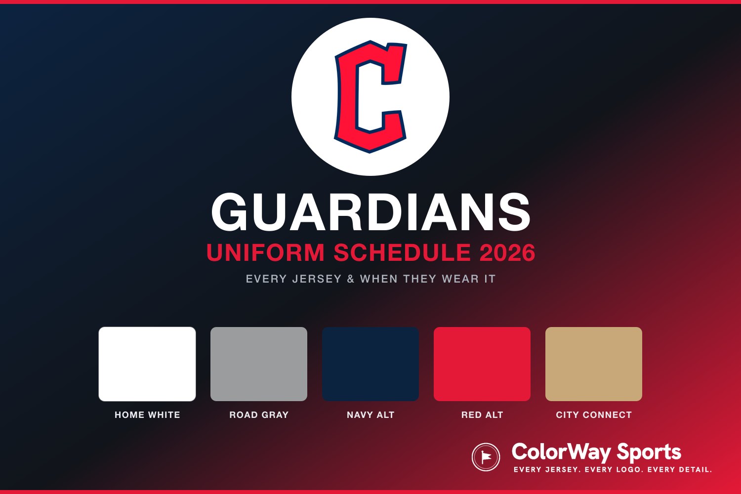
Cleveland is four years into building an identity from scratch, and the 2025 refresh is where it started to click. Straighter script on the whites, the Bridge Print font drawn from the Hope Memorial Bridge, and a navy alternate that threw out its wordmark entirely. What emerges from ranking the closet is a clear rule: the more this team trusts a single strong graphic, the better it looks, and the more it explains itself, the worse. Here is every Cleveland Guardians jersey and uniform for 2026, ranked worst to first and graded.
5. "CLE" City Connect
Unveiled in May 2024 and built entirely around the Guardians of Traffic, the eight art-deco statues on the Hope Memorial Bridge that gave the franchise its name. The navy base is textured to mimic the weathering of the Berea sandstone the statues are carved from, an art-deco "CLE" sits stacked across the chest in a layered font meant to look chiselled, intricate braiding runs down the jersey and pants echoing the pylon detailing, the pants are sandstone tan, and the socks carry a sketch of a Guardian holding a bat. It owns Friday home games.
It grades a C+, the lowest mark in this closet, and the problem is that every single one of those details is trying to tell you something. Textured fabric, chiselled lettering, side braiding, tan pants, illustrated socks — five separate ideas, all referencing the same bridge, none given room to land. The research is genuinely good and the sandstone concept is clever on paper. On the field it reads as clutter, and the stacked "CLE" ends up competing with the braiding instead of anchoring the uniform. Cleveland has a fantastic logo and a strong font, and this is the one jersey that hides both.
4. Home Whites
The home white carries "Guardians" arched across the chest in red script outlined in navy, with red-navy-red piping on the collar and sleeves. The 2025 refresh levelled the script from its old upward slant to a straight horizontal line and gave it a dedicated cap: red crown, navy bill, navy "Diamond C," worn only with the whites.
It grades a B-. Straightening that script was the right call and the piping is nicely judged, so this is a cleaner uniform than the one it replaced. What keeps it low is that "Guardians" is a hard word to put on a chest. It is long, it has no natural nickname, and a scripted version of it stretched across a white jersey is more lettering than shape. The cap is the best part of the whole set, which is not really a compliment to the jersey. Perfectly decent, and the least memorable thing Cleveland wears.
3. Road Grays
On the road it is a gray set with "Cleveland" across the chest in the Bridge Print font, a typeface drawn directly from the Hope Memorial Bridge, rendered in red with matching trim, the same red-navy-red piping as the home set, and the navy cap with the red "Diamond C."
It grades a B and beats the home whites for one reason: "Cleveland" is a much better word than "Guardians," and Bridge Print is a much better font than the script. The squared-off, slightly architectural lettering gives the road set a character the whites do not have, and it does the bridge reference in one confident move rather than the five the City Connect attempts. This is the quiet proof that Cleveland's rebrand works. The city name in the city's own font, and nothing else needed.
2. Red Alternate
The red alternate is the splash of colour the staff reaches for across a homestand. Red base, "Guardians" across the chest, navy-white-navy piping on the collar and sleeves, navy cap. The 2025 refresh swapped its chest lettering from a cursive script to the squared-off Bridge Print font, the same typeface the road grays use.
It grades a B and edges the grays on the strength of that font swap. Bridge Print does something for "Guardians" that the old script could not: the squared, architectural letterforms give a long, awkward word structure and weight, so it reads as a mark rather than a sentence. On red, with the navy trim holding it together, it is the best the team name has ever looked on a jersey. It sits below the navy only because it is still asking a wordmark to carry the chest, and Cleveland has something better for that job.
1. Navy Alternate
The 2025 overhaul gave the navy the biggest change of any jersey in the closet. Cleveland pulled the "Cleveland" wordmark off the chest entirely and replaced it with a large red "Diamond C," the franchise's primary logo, blown up and centred on a navy base with red-white-red piping and the navy cap. No fixed day, it is the dark road look the staff reaches for when the matchup calls for it.
It grades an A-, the best thing Cleveland owns, and it wins by subtraction. Every other jersey in this closet is trying to solve the problem of putting a long team name on a chest. This one refused to play, threw the words away, and let the logo be the whole uniform. The Diamond C is a genuinely excellent mark, sharp and geometric and unmistakable, and blown up at chest scale in red on navy it hits from any seat in the building. It is also the exact opposite instinct to the City Connect: one idea, executed at full size, with nothing else competing. Four years into a rebrand, this is the jersey that finally looks like a team that knows who it is.
Every Guardians Jersey in 2026, at a Glance
1. Navy Alternate — A- · manager's choice, mostly road
2. Red Alternate — B · manager's choice, mostly home
3. Road Grays — B · most away games
4. Home Whites — B- · most home games
5. "CLE" City Connect — C+ · Friday home games
For which look comes out on which day, the Guardians uniform schedule maps the full 2026 rotation, and the Guardians uniform calendar shows every jersey they have actually worn this season, game by game. If you want the same treatment for the rest of the division, we have ranked every Tigers jersey, every Twins jersey, and every White Sox jersey, and the full 2026 City Connect ranking puts the "CLE" kit against all 29 other clubs.
The Bottom Line on the Guardians Jersey Rankings
Every jersey in this closet is wrestling with the same problem, which is that "Guardians" is a difficult word to put across a chest. It is long, it does not shorten, and it has no history behind it to lend it weight. The ranking is basically a scoreboard of how well each uniform copes.
The whites cope worst, stretching a script version of it across a white base and finishing as the least memorable thing here. The grays sidestep it by using "Cleveland" instead, in a font borrowed from the city's own bridge, and immediately look better. The red alternate splits the difference and wins by putting the team name in that same architectural font, which finally gives it some structure.
Then the navy just deletes the problem. No wordmark, one enormous red Diamond C, done. It is the boldest thing Cleveland has done since the rebrand and comfortably its best uniform.
Which leaves the City Connect, doing the opposite of all of it: five bridge references stacked on one jersey when the road grays prove a single one is plenty. Cleveland's rebrand is working. It works every time the team says less.
Frequently Asked Questions
What is the best Guardians jersey for 2026?
We rank the navy alternate No. 1 with an A-. The 2025 overhaul removed the "Cleveland" wordmark entirely and replaced it with a large red "Diamond C" centred on the chest, and letting the logo carry the whole jersey is the most confident thing the franchise has done since the rebrand.
How many uniforms do the Guardians have in 2026?
Five: the home whites, the road grays, the red alternate, the navy alternate, and the "CLE" City Connect.
What is the Guardians City Connect uniform?
The "CLE" bridge kit, unveiled in May 2024 and built around the Guardians of Traffic statues on the Hope Memorial Bridge. It has a navy base textured to mimic Berea sandstone, an art-deco stacked "CLE" on the chest, braiding down the sides, sandstone tan pants, and socks with a Guardian statue holding a bat. It is worn on Friday home games. We grade it a C+.
What is the Diamond C on the Guardians jerseys?
It is Cleveland's primary logo, a squared-off "C" set inside a diamond. It appears on the caps across the rotation and, since the 2025 refresh, takes up the entire chest of the navy alternate in red, replacing the wordmark that used to sit there.
What font do the Guardians use on their jerseys?
Bridge Print, a squared, architectural typeface drawn from the Hope Memorial Bridge. It carries "Cleveland" on the road grays and, since 2025, "Guardians" on the red alternate, replacing the cursive script that jersey used to wear.