The Atlanta Braves have spent forty years building a uniform identity around one idea: the script, the tomahawk, navy and red, do not touch it. It is one of the most stable looks in baseball and it has aged better than almost anything else from its era.
Looking for dates? Here is the full 2026 Atlanta Braves uniform schedule, with every jersey and when it is worn.
Then in April they put out a powder blue City Connect and quietly made the best uniform they own.
That is the tension running through this closet. Four of these five jerseys are arrangements of a theme the Braves have been playing since 1987, and they range from very good to genuinely flat. The fifth steps outside the palette entirely, and it is not close.
There is also a uniform missing from this list. The Braves still sell it, it used to have a standing weekly slot, and as far as we can tell they have not put it on once all season. That one is at the bottom.
Here is every Braves jersey and uniform for 2026, ranked worst to first and graded.
5. Red Alternate
The problem is the script. Atlanta's "Braves" wordmark is navy with a white outline, and that combination was drawn to sit on white and on gray, where navy is the darkest thing in the frame and every letter cuts clean. Drop it onto red and the value gap collapses. Navy and red are both dark, both saturated, and the thin white outline ends up doing all the work of separating them.
Look at what happens to the tomahawk. On the home whites that logo is the sharpest graphic in the uniform. On the red it becomes a red-on-red shape held together by an outline, and from the upper deck or a center field camera it goes soft.
None of that makes it a bad jersey. The navy piping down the placket and around the sleeves is correct, the proportions are right, and red is a real Braves color rather than a costume the way half the league's alternates are. A red jersey with that script on it still looks like Atlanta from the first glance.
It lands where it lands because it is the one uniform in this closet that makes the team's best graphic slightly harder to read instead of easier. It ties with the navy on grade, and the navy edges it on the tiebreak below.
4. Navy Alternate
Graded dead even with the red, and it takes the higher slot for one structural reason: navy is already the anchor of this identity. The cap is navy. The script is navy. The piping is navy. Putting the whole jersey in it reads as the team turning up its own volume rather than reaching for a color it has to justify.
That also caps how far it can climb. The navy is the safest thing the Braves could possibly have done with an alternate slot, and safe is exactly what it looks like on a Wednesday night. It photographs well, it never embarrasses itself, and it is almost impossible to feel strongly about. When a franchise owns lettering this good, an alternate should be doing more than changing the background behind it.
Worth noting it turns up less often than the red does, and on the evidence of this season it is the closest thing Atlanta has to a jersey held in reserve.
3. Road Gray
The road set flips the home formula and gets a better result than it usually gets credit for. "Atlanta" runs across the chest in red script with a navy outline, the tomahawk sits underneath, and the whole thing is warmer and louder than the navy-first home look.
Red script on gray is a harder trick than it sounds. Red tends to go orange under stadium lights and muddy under an overcast sky, and the navy outline is what stops it, giving every letter a hard edge no matter what the light is doing. It is the same fix the Phillies use on their road grays, and it works for the same reason.
It sits third because a road gray is supposed to sit third. The job is to let the home team's colors carry the frame while still looking like yourself, and Atlanta does that with a script most franchises would trade for. This is the jersey the Braves have worn more than any other in 2026, and it never once looks like a placeholder.
2. Home White
This is the Braves. White jersey, navy "Braves" script trimmed in red, the tomahawk underlining the wordmark, navy piping running the placket and sleeves, navy cap with the lowercase a. Essentially unchanged since 1987, and there is a reason nobody has been tempted to redraw it.
The script is the whole thing. It has a genuine hand-lettered slant, the crossbar of the A sweeps under the word, and the tail of the s kicks up to meet the tomahawk, so the wordmark and the logo read as one graphic instead of two elements stacked together. Almost no other team in baseball has a chest mark that resolves that cleanly. The Dodgers do. The Tigers do. That is roughly the list.
The tomahawk underline is also the rare piece of secondary art that earns its place. It gives the eye somewhere to land beneath the script and it fills horizontal space a shorter word would leave awkward.
It stops short of the top because it is white, and white is the most crowded category in the sport. Thirty teams own a good home white. What keeps this one in the conversation is the drawing, not the concept, and the drawing is superb.
1. Powder Blue City Connect
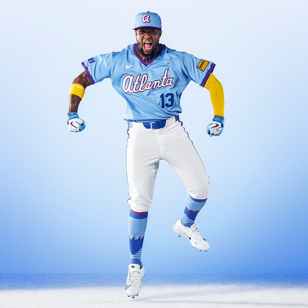
Image via Atlanta Braves
The best thing the Braves wear, and one of the two or three best City Connects Nike has made. We graded it an A+ when it was officially unveiled in April and a full season of seeing it on the field has not moved us off that.
Start with what it is not. Almost every City Connect in the program invents a wordmark, a palette, and a mascot nobody asked for, and the result could belong to any city with the same nickname. This one reaches into Atlanta's own closet and pulls out the road powder blues of the 1980s, the uniform the entire country watched on TBS every night because the Braves were the only team you could reliably find on television. It is not a costume of Atlanta. It is the actual reason a generation outside Georgia became Braves fans.
The construction does real work. This is a V-neck pullover with red, white, and blue striping around the collar and sleeve cuffs, and that silhouette is the fastest way to signal a decade. A modern button-front in the same color would read as a powder blue jersey. This reads as 1982.
The script sells it. "Atlanta" is drawn in white with a red outline and a royal blue edge behind it, so a single wordmark carries three separate values against the light blue base. That is why it stays legible from any camera in the park while a flat one-color script on powder blue would wash straight out. The ATL sleeve patch borrowing the old TBS logo rewards the people who get it without confusing the people who do not, and the powder blue cap with the red lowercase a finishes it.
The one thing it does that no other Braves uniform manages is change the picture. Four jerseys in this closet are navy-and-red arrangements of the same idea. This one walks onto the field and the broadcast looks different, and it does it without borrowing a single thing from outside the franchise. That is the whole assignment, and Atlanta is the only team that has fully solved it.
Where Did the Cream Alternate Go?
Here is the jersey missing from this list.
The Braves cream alternate is a 1966 throwback to the franchise's first season after the move from Milwaukee, with the "Braves" script in red instead of navy and no tomahawk beneath it. It has been one of the most popular things they own for years, it is the look plenty of people would name if you asked for the prettiest jersey in the closet, and you can still buy one today. It sits on the shelf at every major retailer as a current Braves alternate.
We cannot find it on the field in 2026.
Our daily uniform tracker logs what all thirty clubs actually wore, game by game, and across every Braves game we have logged this season the cream has not appeared once. The detail that makes that hard to dismiss: the cream is supposed to be the Sunday home look, and on Sunday, July 19, at home against the Rangers, Atlanta wore the standard home whites. That is precisely the slot the cream is meant to occupy, and it went to a different jersey.
There is a second reason nobody has raised an alarm about this, and it is the more interesting one. Atlanta's cream is barely warmer than its white. Put the two side by side on a hanger and the difference is obvious. Put one of them on a player under stadium lights, on a broadcast feed, at thirty yards, and it mostly reads as a white jersey with red lettering. Compare that to the Phillies, whose cream is warm enough that nobody watching could mistake it for their home whites. If the Braves quietly stopped wearing theirs, the honest answer is that a lot of people would never notice, and that is at least as much a comment on the jersey as it is on the fans.
One Sunday is not proof, and we are not calling it retired. But combined with a search that turns up no 2026 photograph of the Braves in cream at all, the likeliest explanation is that it has dropped out of the rotation this year, whatever the team store still says. We are not going to rank a jersey we cannot show you wearing.
If it turns up, we will slot it in. The Braves uniform calendar is where it would show first.
Every Braves Jersey in 2026, at a Glance
1. Powder Blue City Connect — A+ · Saturday home games
2. Home White — A- · most home games
3. Road Gray — B+ · away games
4. Navy Alternate — B · select weeknights
5. Red Alternate — B · select weeknights
Unranked: Cream Alternate — still sold, not seen on the field in 2026
For which look comes out on which day, the Braves uniform schedule maps the 2026 rotation, and the Braves uniform calendar shows every jersey they have actually worn this season, game by game. If you want the same treatment for the rest of the league, we have ranked every Phillies jersey and every White Sox jersey too, and the full 2026 City Connect ranking puts Atlanta's powder blue against all 29 other clubs.
The Bottom Line on the Braves Jersey Rankings
Atlanta owns one of the best-drawn chest marks in baseball and has been smart enough to leave it alone for forty years. The home white and the road gray are both good uniforms because that script is a good piece of lettering, and the two colored alternates land level with each other, both good without being essential, for the same underlying reason: putting a dark script on a dark jersey gives away some of the contrast that makes the wordmark work everywhere else.
The cream, which used to be the answer to that problem, appears to have quietly left the rotation.
And then there is the powder blue, the rare City Connect that is not a marketing exercise. It is a franchise remembering the years it was on everyone's television and putting that back on the field, and it is comfortably the best uniform the Braves own.
Frequently Asked Questions
How many jerseys do the Braves have in 2026?
Five in active rotation: the powder blue City Connect, the home white, the road gray, the navy alternate, and the red alternate. A cream alternate is still sold at retail but has not appeared on the field in our 2026 tracking.
What is the best Braves jersey?
We rank the 2026 powder blue City Connect first and grade it an A+. It revives the 1980s TBS-era road powder blues, uses a V-neck pullover cut with red, white, and blue collar striping, and carries an ATL sleeve patch modeled on the old TBS logo.
What do the Braves 2026 City Connect uniforms look like?
A powder blue V-neck pullover with "Atlanta" in white script outlined in red and royal blue, red and blue striping at the collar and sleeve cuffs, white pants, a powder blue cap with a red lowercase a, and an ATL sleeve patch drawn from the TBS Superstation logo. They are worn for Saturday home games at Truist Park.
Do the Braves still wear the cream uniforms?
Not so far in 2026. The cream 1966 throwback is still sold as a current alternate, but it has not shown up in any Braves game we have logged this season, including the home Sunday of July 19, when Atlanta wore the standard home whites instead.
Why is the Braves red alternate ranked last?
It grades a B, level with the navy, so last here is a narrow call rather than a knock. The tiebreak is contrast: the "Braves" script is navy with a white outline, and navy on red leaves very little separation, so the script and the tomahawk both soften at distance in a way they do not on white or gray.
What jersey are the Braves wearing today?
Our MLB daily uniform tracker logs what the Braves and all 29 other clubs actually wore in every game, updated every morning, and the Braves uniform schedule maps which jersey is planned for each day.