Credit: Buffalo Bills
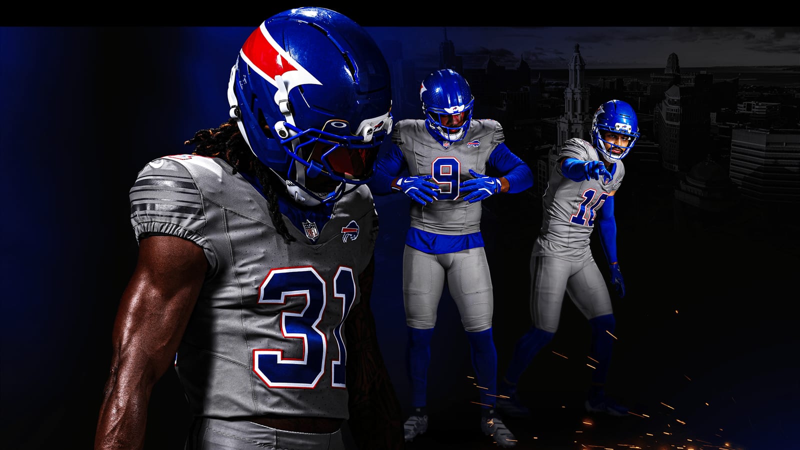
The Buffalo Bills finally pulled the wraps off their new "Nickel City" alternate uniform, and if you have been following ColorWay Sports, this look should seem awfully familiar. We were one of the first outlets to break down the gray Bills alternate when it leaked back in the spring, and this is almost exactly what we told you it would be. The gray jersey is here, the monochrome is here, and there is one big surprise that changes the whole conversation: the helmet.
We Called This One
Back in April we published a first look at the leaked gray Bills alternate and gave it an F. At the time we honestly hoped it was a fake, because a straight gray-on-gray Bills uniform strips out everything that makes this brand pop. Well, it was real. The leak was accurate down to the blue collar and the tonal sleeve stripes.
But the official reveal added something the leak never showed us in full, and it is the reason this uniform is not an F anymore.
The Charge Helmet Is the Star
Credit: Buffalo Bills
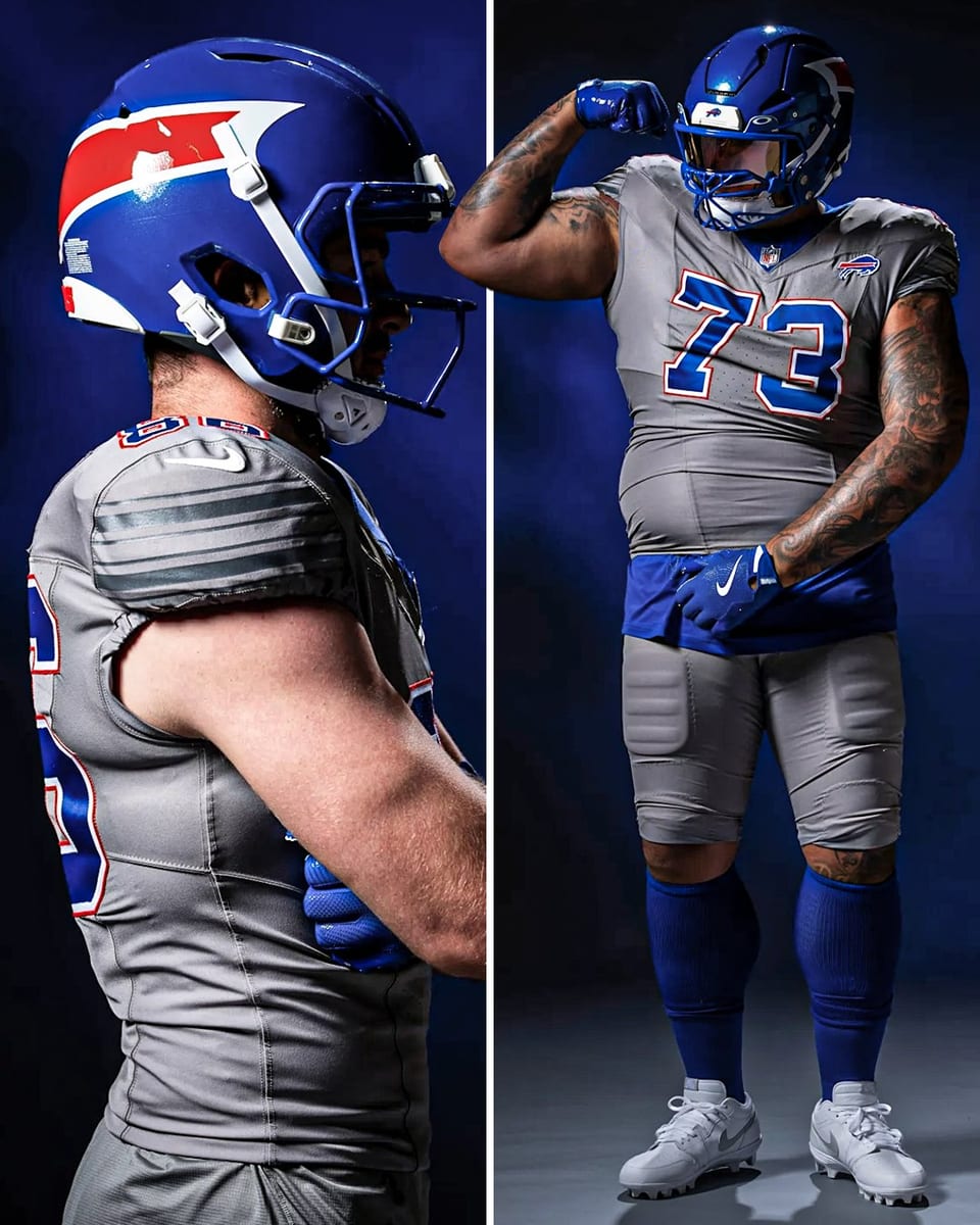
This is the part we love. The "Charge Helmet" takes the charging buffalo and actually brings it to life. The horn, the eye, and the charge streak all live on a deep blue shell with a micro-metallic flake finish and metallic blue accents. In person it catches the light and looks genuinely mean, which is exactly what an alternate helmet should do.
It is a smart piece of design because it leans into the Bills' best asset, that royal blue, instead of running away from it. If the rest of the uniform had this much confidence, we would be having a very different conversation. The helmet alone is an A.
Nickel Gray: A Good Story, a Washed-Out Jersey
Credit: Buffalo Bills
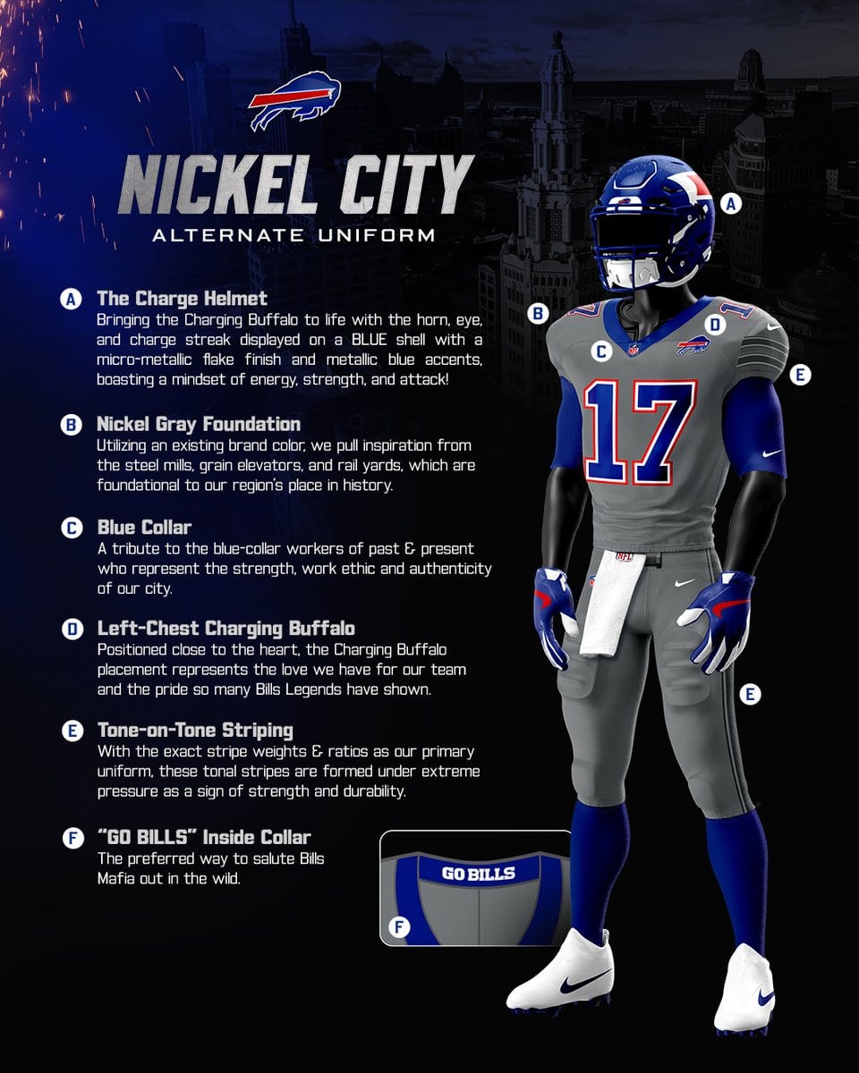
Give the Bills credit for the storytelling. The "Nickel Gray" base is pulled from the steel mills, grain elevators, and rail yards that built the region, and the whole thing is a tribute to Buffalo's blue-collar identity. The "GO BILLS" jock tag inside the collar is a fun touch, and the left-chest charging buffalo placement is a nice nod to wearing the team over your heart.
The concept is great. The execution on the jersey is where it loses us. Gray is a brand color for the Bills, sure, but a full gray base washes out the red and blue that give this team its entire visual identity. On a white or royal jersey those blue numbers snap. On gray they just sit there, and from the upper deck or on a TV broadcast the contrast disappears.
The Monochrome Problem
Regular readers know the drill, and so does anyone who has heard us talk uniforms: we are not fans of head-to-toe monochrome, and we are not fans of gray jerseys. This look is both. Gray jersey, gray pants, tone-on-tone striping that matches the primary uniform's ratios but ghosts into the fabric so it reads as blank from a distance. When you commit to a single muted tone across the whole body, you lose the layering and contrast that makes a football uniform look powerful on the field.
The blue socks and the blue helmet are doing a lot of heavy lifting to keep this from being a total gray blob. Break the monochrome, even with blue pants, and the whole thing would climb a full grade.
What Works and What Doesn't
Overall Grade
The Charge helmet is one of the best alternate helmets in the NFL, and it pulls this whole set up from where the leaked jersey landed. But we grade the full package, and the monochrome gray body is still the same washed-out look we were skeptical of in the spring. Fantastic helmet, forgettable jersey. That nets out to a C+.
The Bottom Line on the Bills Nickel City Uniforms
The Bills nailed the concept and nailed the helmet. The Nickel City alternate has a real story behind it and one of the coolest lids in the league. If they had paired that helmet with a uniform that actually used Buffalo's red and blue, this would be a top-tier alternate. Instead, the gray-on-gray jersey mutes everything that makes the Bills the Bills. Great helmet, good story, gray jersey we could do without.
Frequently Asked Questions
What are the Buffalo Bills Nickel City uniforms?
The Nickel City uniform is a new gray alternate the Bills unveiled for the 2026 season. It features a "Nickel Gray" jersey and pants inspired by Buffalo's steel mills and rail yards, tone-on-tone striping, and a new blue "Charge" helmet with the charging buffalo brought to life.
When did the Bills reveal the Nickel City alternate?
The Bills officially revealed the Nickel City alternate uniform in July 2026. ColorWay Sports first broke down the gray jersey when it leaked in April 2026, and the official version matched that leak closely.
What grade did ColorWay Sports give the Bills Nickel City uniform?
We gave it a C+. The Charge helmet is a standout and one of the best alternate helmets in the NFL, but the monochrome gray jersey washes out the Bills' signature red and blue, which holds the overall look back.
What is the Charge helmet?
The Charge helmet is a deep blue shell with a micro-metallic flake finish that displays the charging buffalo's horn, eye, and charge streak. It is the highlight of the Nickel City set and the main reason the uniform grades above the leaked jersey we reviewed in the spring.
Why does ColorWay Sports dislike the gray jersey?
Gray is a Bills brand color, but a full gray base with gray pants and tone-on-tone striping mutes the red and blue that define the team's identity. The monochrome look also flattens the on-field contrast, so the numbers and logo do not pop the way they do on the white or royal blue uniforms.