NFL Stories
 Arizona Cardinals
 Atlanta Falcons
 Baltimore Ravens
 Buffalo Bills
 Carolina Panthers
 Chicago Bears
 Cincinnati Bengals
 Cleveland Browns
 Dallas Cowboys
 Denver Broncos
 Detroit Lions
 Green Bay Packers
 Houston Texans
 Indianapolis Colts
 Jacksonville Jaguars
 Kansas City Chiefs
 Las Vegas Raiders
 Los Angeles Chargers
 Los Angeles Rams
 Miami Dolphins
 Minnesota Vikings
 New England Patriots
 New Orleans Saints
 New York Giants
 New York Jets
 Philadelphia Eagles
 Pittsburgh Steelers
 San Francisco 49ers
 Seattle Seahawks
 Tampa Bay Buccaneers
 Tennessee Titans
 Washington Commanders
 College Football Stories
 SEC
SEC Big Ten
 ACC
ACC Big 12
 Pac-12
 American Conference
 Mountain West
 Sun Belt
 MAC
MAC Conference USA
 FBS Independents
 NBA Stories
 Atlanta Hawks
 Boston Celtics
 Brooklyn Nets
 Charlotte Hornets
 Chicago Bulls
 Cleveland Cavaliers
 Dallas Mavericks
 Denver Nuggets
 Detroit Pistons
 Golden State Warriors
 Houston Rockets
 Indiana Pacers
 LA Clippers
 Los Angeles Lakers
 Memphis Grizzlies
 Miami Heat
 Milwaukee Bucks
 Minnesota Timberwolves
 New Orleans Pelicans
 New York Knicks
 Oklahoma City Thunder
 Orlando Magic
 Philadelphia 76ers
 Phoenix Suns
 Portland Trail Blazers
 Sacramento Kings
 San Antonio Spurs
 Toronto Raptors
 Utah Jazz
 Washington Wizards
 MLB Stories
 Arizona Diamondbacks
 Atlanta Braves
 Baltimore Orioles
 Boston Red Sox
 Chicago Cubs
 Chicago White Sox
 Cincinnati Reds
 Cleveland Guardians
 Colorado Rockies
 Detroit Tigers
 Houston Astros
 Kansas City Royals
 Los Angeles Angels
 Los Angeles Dodgers
 Miami Marlins
 Milwaukee Brewers
 Minnesota Twins
 New York Mets
 New York Yankees
 Philadelphia Phillies
 Pittsburgh Pirates
 San Diego Padres
 San Francisco Giants
 Seattle Mariners
 St. Louis Cardinals
 Tampa Bay Rays
 Texas Rangers
 Toronto Blue Jays
 Washington Nationals
 NHL Stories
 Anaheim Ducks
 Boston Bruins
 Buffalo Sabres
 Calgary Flames
 Carolina Hurricanes
 Chicago Blackhawks
 Colorado Avalanche
 Columbus Blue Jackets
 Dallas Stars
 Detroit Red Wings
 Edmonton Oilers
 Florida Panthers
 Los Angeles Kings
 Minnesota Wild
 Montreal Canadiens
 Nashville Predators
 New Jersey Devils
 New York Islanders
 New York Rangers
 Ottawa Senators
 Philadelphia Flyers
 Pittsburgh Penguins
 San Jose Sharks
 Seattle Kraken
 St. Louis Blues
 Tampa Bay Lightning
 Toronto Maple Leafs
 Utah Mammoth
 Vancouver Canucks
 Vegas Golden Knights
 Washington Capitals
 Winnipeg Jets
 All Soccer Stories
 International Competitions
 UEFA Champions League
 Premier League
 La Liga
 Serie A
 Bundesliga
 Ligue 1
 MLS
MLS College Basketball Stories
 All F1 Stories
 Alpine
 Aston Martin
 Audi
Audi Cadillac
 Ferrari
 Haas
Haas McLaren
 Mercedes
 Racing Bulls
 Red Bull Racing
 Williams
 NASCAR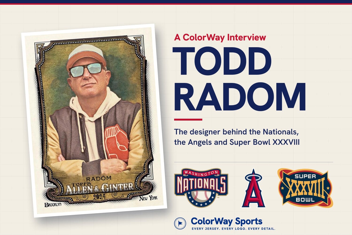
Card and logos via Todd Radom (toddradom.com)
If you have watched a Nationals game, an Angels game, or Super Bowl XXXVIII in 2004, you have seen Todd Radom's work. He designed the Washington Nationals identity, the Los Angeles Angels identity, the Houston Astros' navy and orange refresh (in collaboration with Fanbrandz), the World Baseball Classic logo, the Super Bowl XXXVIII logo (2004), the 2009 NBA All-Star Game logo, the 2014 and 2016 MLB All-Star Game logos, the Lakers' 60th anniversary logo, and the look of Ice Cube's BIG3 league. He is also an author: his newest book, The Ballpark and Beyond, an illustrated celebration of 150 years of baseball history, came out in May 2026. He also wrote Winning Ugly, a visual history of baseball's strangest uniforms, and co-wrote Fabric of the Game on the history of the hockey sweater. After our conversation with Orlando Magic CMO Shelly Wilkes on how NBA uniforms get made, we wanted the designer's side of the story. Todd was kind enough to sit down with us and walk through how a team identity actually gets made, and where he thinks sports design is heading.
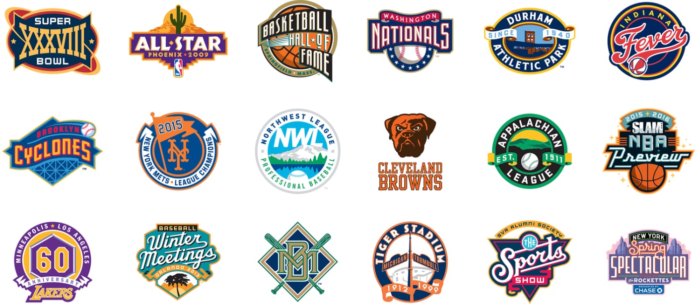
via Todd Radom (toddradom.com)
There Was No Such Thing as Sports Design When He Started
Radom graduated from the School of Visual Arts in New York in 1986, where he studied design alongside advertising, fine art and photography. He came from a creative family ("it's in the genes for sure," he told us) and had been drawn to logos and branding from an early age. The problem was that the job he wanted did not exist yet.
"When I graduated college in 1986, there was no formal sports design at that point," he said.
That changed fast. A few years later, he explained, "licensing was exploding." Expansion teams were coming online, teams were relocating, and there was "this great confluence occurring between hip hop and rap and popular culture" that pushed leagues to market to younger fans in a way they never had. "There was an enormous need for art at that point in time," he said. In the early 1990s the NBA, Major League Baseball and the NHL opened their first creative services departments. The NFL, in his words, "was way ahead of the curve, as they are in most things in terms of marketing."
His first professional team job was for a minor league club, the Knoxville Smokies (the franchise later became the Tennessee Smokies and went back to the Knoxville name in 2025). It was done the old way: "old fashioned, pre-digital methods," as he put it. Cutting, pasting and drawing by hand.
He has been on his own ever since. Radom opened his own studio in 1990, and when we asked whether he had a team behind the big projects, the answer was no. "In terms of actually doing the creative, I have worked by myself, for myself, for 36 years now."
The Nationals Logo Was Designed in About a Month, on a Laptop
The Nationals identity is the project fans ask him about most, and the story behind it is unlike any other rebrand in baseball.
The Montreal Expos were moving to Washington, the first MLB relocation since the Senators left for Texas after the 1971 season. The club was owned by Major League Baseball itself, and there was no playbook. Radom first met with a colleague at MLB during the ALCS in October 2004. "I embarked upon the Nationals brand during the World Series in Boston, on a laptop," he said. The new identity was unveiled less than a month later.
"There's no model for this in baseball," he said. "A very quick process, a very unusual process."
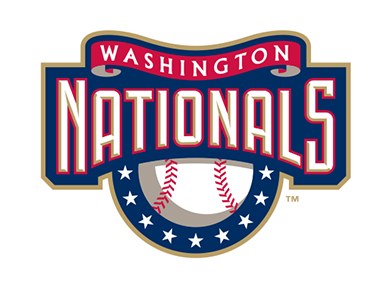
The original Washington Nationals logo. via Todd Radom (toddradom.com)
The name itself was the hardest part. "What is a National?" he asked. A team called the Eagles can put an eagle on its cap. "Nationals did not lend itself to something that was easily depicted," he said. His answer was to lean on color and type: "Red, white, blue, the colors of the national pastime and of the nation's capital, and a typographic approach that could be stacked out for uniforms and other things."
Where the Curly W Came From
We had to ask about the curly W, and whether it had any connection to the very similar Walgreens W. It does not. The curly W came from the Washington Senators, the last club to play in D.C.
The push to bring it back came from the top. Commissioner Bud Selig, Radom said, "was rather taken with that curly W, being a guy of an age who remembered the Washington Senators." Radom noted the irony that it was the mark of a club that had failed and left town, which is not something you would usually want to pick up on. "But that's the way it happened," he said. Two decades later, the curly W is one of the most recognizable caps in the sport.
MLB ran the approvals and steered the project through the league's internal process. The creative work was his.
How the Angels Got Their Halo Back
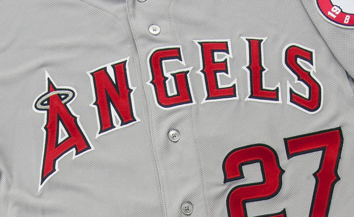
The Angels rebrand, which debuted for the 2002 season, came out of a very different moment. Radom described late-1990s sports logos as an era of excess. He has real affection for them ("they were charming, full of personality, and I would prefer to get back to that in a certain way"), but he was honest about the problems.
"There's no denying the fact that there were too many colors, too many outlines, too many snarling animals, too much of the sameness," he said. "And chasing trends."
The Angels wanted to get back to basics, and Radom's approach was to find what the team had lost. "Quite often a team will lose its visual DNA, and you've got to get back to it to tap into something that's going to resonate with the fans," he said. In Anaheim, that DNA was sitting in the parking lot: the giant Big A sign with the halo on top, which the team's branding had thrown aside.
Then there was the market. The Dodgers own blue in Los Angeles, so the answer was simple. "How do you differentiate yourself in that huge market? You go the opposite of blue," he said. "Coke is red, Pepsi is blue."
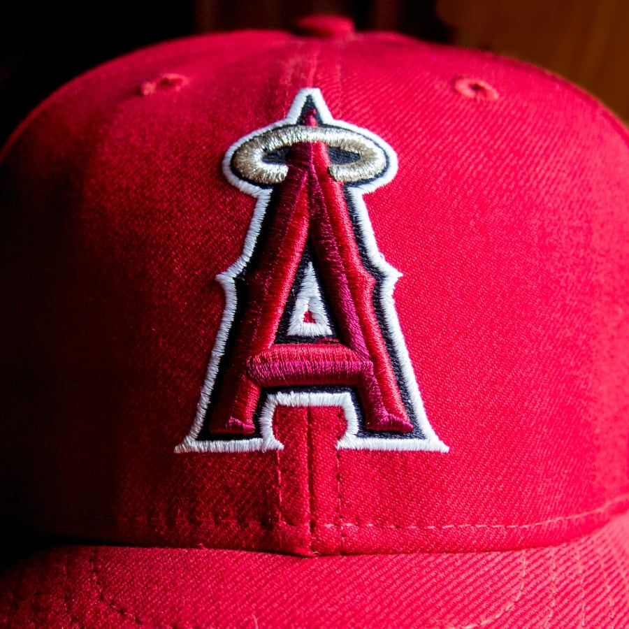
via Todd Radom (toddradom.com)
The result was a more traditional look "without being doctrinaire and super traditional," and it has lasted for more than two decades. The Angels also won the World Series in its first season. "I had nothing to do with that," Radom said, "but I'll take whatever credit I can take."
He also sees the Angels mark as an early step in a trend that may have gone too far since. "It was at the forefront of a movement toward simplifying our sports logos that maybe has swung all the way out there by now," he said. "But in 2001, going into 2002, it was kind of a radical rethinking."
via Todd Radom (toddradom.com)
The Astros Went Back to Navy and Orange
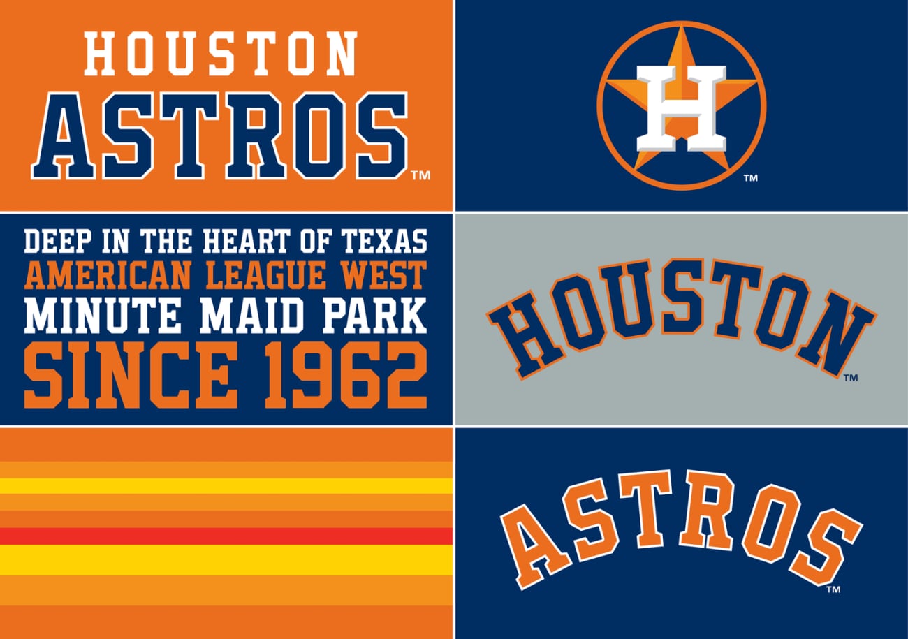
Radom's work goes well beyond the two clubs we talked about on the call. In 2012 he worked on the Houston Astros' visual refresh, a collaboration between Radom and the design agency Fanbrandz, together with MLB, as the team changed owners and prepared to move from the National League to the American League for 2013. The answer was a return to navy blue and orange, the colors the franchise wore as the Colt .45s in 1962, in the Astrodome, and through its "tequila sunrise" years until 1993.
The centerpiece was a cleaned-up version of the club's original H-star cap logo, rebuilt for the digital age, and the batting practice jerseys carried a subtle nod to the rainbow stripes. Four seasons later, the Astros won the first World Series in franchise history in that look.
The Astros H-star, a collaboration with Fanbrandz. via Todd Radom (toddradom.com)
The full Astros identity, including the tequila sunrise stripes. via Todd Radom (toddradom.com)
The World Baseball Classic
Radom also designed the identity for the World Baseball Classic, the international tournament first played in 2006: the four-color pinwheel wrapped around a baseball globe. For the 2017 tournament he added a set of host city logos for Guadalajara, Los Angeles, Miami, San Diego, Seoul and Tokyo.
The World Baseball Classic logo. via Todd Radom (toddradom.com)
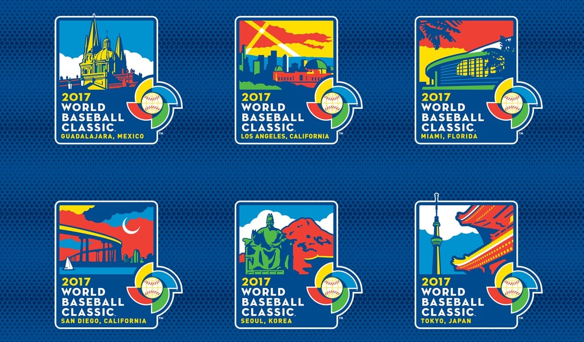
Host city logos for the 2017 World Baseball Classic. via Todd Radom (toddradom.com)
"We Are at Peak Uniform"
We asked Radom about something we hear from readers all the time: NBA logos in particular seem to be getting simpler, flatter and more alike, with everyone moving toward the same ball-silhouette look. His answer went bigger than logos.
"The emphasis is on the uniforms. We are at peak uniform," he said. "All of the creative energy that's being poured into what was traditionally building team brands, with all these robust secondary logos and all these other assets, is now pretty much exclusively poured into uniforms."
Full rebrands, where a team tears its identity down and starts over, have become rare. "We don't have teams that are doing global rebrands for the most part," he said, "and the creativity is lacking, I would say."
What gets lost is the system thinking that used to define a great identity. Radom has always built brands from the primary logo outward: how it works on a uniform, how it pairs with secondary marks, and how it holds up at every size. "How does it reduce to the size of an avatar? We have lost that in favor of uniform churn," he said. "I think we're in a weird place right now. And hopefully we can come out the other side to something that's a little bit deeper and more meaningful."
We will admit the uniform churn is good for our business, since we track every one of them. But we are traditionalists at heart, and we agree with him.
Why Championship Logos All Look the Same Now
After our call, we followed up with a question we forgot to ask: why do the logos for the Super Bowl, World Series, NBA Finals and Stanley Cup Final seem to follow the same league template every year instead of being unique?
"A few things are at play here," Radom told us. "Whereas the NHL and NBA employ a truly templated approach, the NFL's previously rigid template has given way to more expressive, more colorful, and more location-based logos in recent years. MLB's current World Series look is a good one, rooted in tradition, but contemporary and flexible."
The business side matters too. "Pairing these marks with sponsors is a challenge," he said, "and it's fair to say that our collectively diminished attention spans demand a repetitive approach, pounding home visual impressions with discipline."
What the NHL Does Well
Radom pointed to the NHL as a league that handles its logos well. "I think the NHL does a really pretty terrific job," he said.
His reason is practical. On a hockey sweater, the logo is huge and front and center, so it has to work. Compare that to an NFL helmet, where the logo gets "violated by various shapes and contours" and jammed into a curved space.
The NFL, he noted, very rarely changes its logos at all. Even a recent update like the Rams' was "heavily based on where they've been for 75 years," which he meant as a compliment: painting around the edges rather than starting from scratch.
The Super Bowl XXXVIII Logo, the Celebration Logos and the BIG3
Asked which project he is proudest of, Radom said he is proud of all of them, while admitting "some succeed better than others, some have aged better than others."
The Super Bowl XXXVIII logo, for the February 2004 game in Houston, stands out. "It's the biggest one-day sporting event on the face of the earth," he said, "and the impressions that are attached to that image are just wildly off the charts." Unlike a team identity, a Super Bowl logo is designed to come and go, and getting it right for one enormous day is its own challenge.
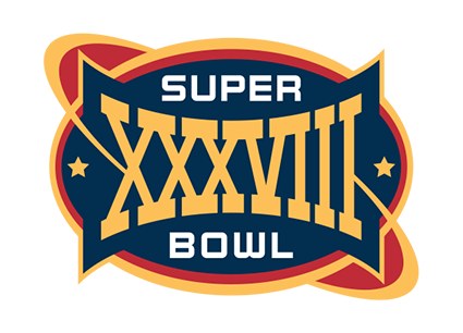
The Super Bowl XXXVIII logo (2004). via Todd Radom (toddradom.com)
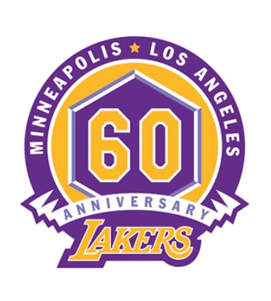
His portfolio is also full of celebration logos: the Red Sox and White Sox 100th seasons, the Mariners' and Royals' 40th anniversaries, the Mets' 50th, the Twins' 50th and 60th seasons, the Marlins' 25th, the Rockies' and the Orlando Magic's 20th, and the Lakers' 60th anniversary logo, which ties the franchise's Minneapolis and Los Angeles eras together.
via Todd Radom (toddradom.com)
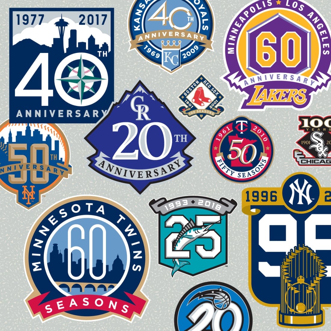
A sampling of Radom's anniversary logos. via Todd Radom (toddradom.com)
He also loves his work with the BIG3, Ice Cube's three-on-three league, which he has worked with since its launch in 2017. "An unusual opportunity to be part of something from the ground up," he said. "They said it couldn't be done, but I'm very proud to have been a part of that since day one."
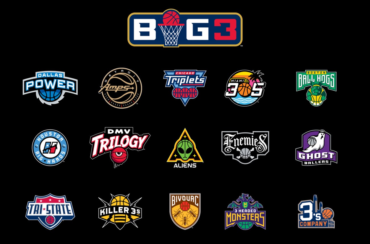
via Todd Radom (toddradom.com)
The Bottom Line
Todd Radom's career covers the entire history of sports design as a profession, from cutting and pasting minor league logos by hand to building a major league identity on a laptop in less than a month. His view of where things stand is clear: the creativity that used to go into deep, lasting team brands now goes into a constant stream of new uniforms, and the logos are suffering for it. He hopes sports finds its way back to something deeper. Our thanks to Todd for his time, his stories and his candor. You can see more of his work at toddradom.com, and his books, including his newest, The Ballpark and Beyond, plus Winning Ugly and Fabric of the Game, are well worth a read for anyone who loves this stuff.
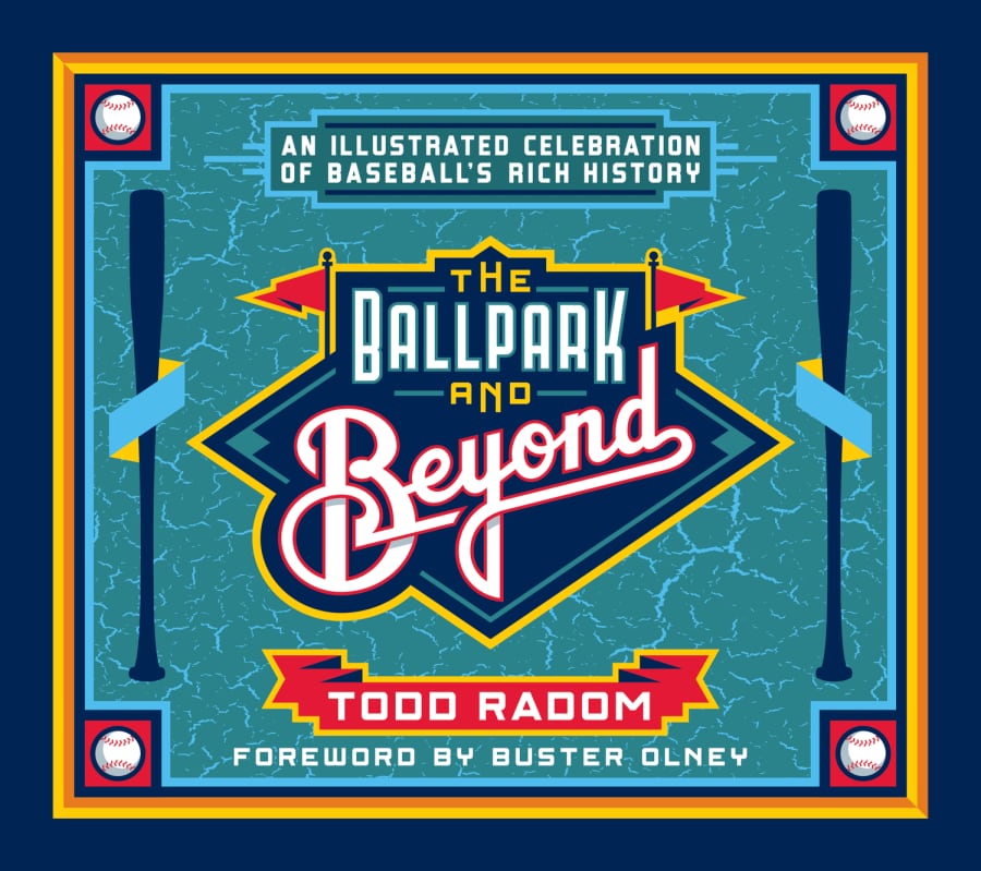
His newest book, The Ballpark and Beyond (2026). via Todd Radom (toddradom.com)
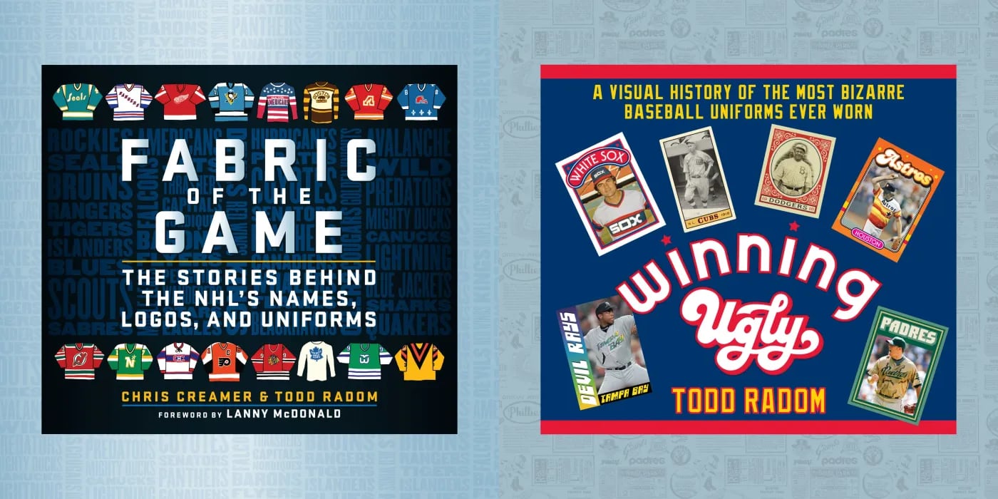
His books, Fabric of the Game (with Chris Creamer) and Winning Ugly. via Todd Radom (toddradom.com)
Frequently Asked Questions
Who designed the Washington Nationals logo?
Todd Radom designed the Washington Nationals identity in 2004, working with Major League Baseball, which owned the club at the time. He started the work during the 2004 World Series on a laptop, and the identity was unveiled less than a month later. He built it around red, white and blue and a stacked typographic approach, because the name "Nationals" was hard to depict as an image.
Where did the Nationals curly W come from?
The curly W came from the Washington Senators, the last MLB club in Washington before the Nationals. According to designer Todd Radom, then-commissioner Bud Selig was taken with the curly W because he remembered the Senators, and it was brought back for the new team. It has no connection to the Walgreens W.
Who designed the Los Angeles Angels logo?
Todd Radom designed the Angels identity that debuted for the 2002 season, the same year the Angels won the World Series. He brought back the halo from the Big A sign outside the stadium and chose red to stand apart from the Dodgers' blue in the Los Angeles market.
Who designed the Super Bowl XXXVIII logo?
Todd Radom designed the official logo for Super Bowl XXXVIII (2004), played in Houston on February 1, 2004, when the Patriots beat the Panthers. He calls the Super Bowl "the biggest one-day sporting event on the face of the earth."
Why do sports logos all look the same now?
Designer Todd Radom says sports are at "peak uniform": the creative energy that used to go into full team brands, with deep sets of secondary logos, now goes almost entirely into new uniforms. Very few teams do full rebrands anymore, and he says the creativity in logos is lacking as a result.
Why do championship logos all look the same now?
According to Todd Radom, the NHL and NBA use a truly templated approach for their championship marks, while the NFL's once-rigid Super Bowl template has given way to more expressive, colorful and location-based logos in recent years. He calls MLB's current World Series look "rooted in tradition, but contemporary and flexible." Pairing the marks with sponsors is a challenge, and he says shorter attention spans reward a repetitive approach that drives home the same visual impression.
Who designed the Houston Astros logo?
The Astros' 2012 visual refresh was a collaboration between Todd Radom and the design agency Fanbrandz, working with MLB, ahead of the team's 2013 move to the American League. It restored navy blue and orange and refined the club's original H-star cap logo. The Astros won their first World Series in that identity in 2017.
Who designed the World Baseball Classic logo?
Todd Radom designed the World Baseball Classic identity, the four-color pinwheel around a baseball globe. He also created host city logos for the 2017 tournament.
Who designed the Lakers 60th anniversary logo?
Todd Radom designed the Lakers' 60th anniversary logo, which reads "Minneapolis" and "Los Angeles" around a purple and gold 60 to honor both eras of the franchise.
Who is Todd Radom?
Todd Radom is a sports graphic designer based on the East Coast who has run his own studio since 1990. He graduated from the School of Visual Arts in New York in 1986. His work includes the Washington Nationals and Los Angeles Angels identities, the Houston Astros refresh (with Fanbrandz), the World Baseball Classic logo, the Super Bowl XXXVIII logo (2004), the 2009 NBA All-Star Game logo, the 2014 and 2016 MLB All-Star Game logos, the Lakers' 60th anniversary logo, and the BIG3 basketball league. His books include The Ballpark and Beyond (2026) and Winning Ugly, and he co-wrote Fabric of the Game.