Nevada has a new look for the first time in a generation. The University of Nevada, Reno unveiled a new brand on Tuesday, October 20, 2026, at its State of the University address, held inside the brand-new $28 million Wolf Pack Fieldhouse right after its ribbon cutting. Two marks lead it: the Interlocked UN, which replaces the block N as the university's primary logo, and the Nevada Wolf, which replaces the Sport Wolf that has been the athletic department's main logo since 2002. Four days later the UN was already on the football helmets for the 28-13 Homecoming win over San José State.
The headline detail is the one everyone is sharing: the new wolf hides an "N" in its ear. We looked closely. Here is every new mark, the old ones they replace, and a letter grade for each, including one we think Nevada got wrong.
Quick Answers
- When did Nevada reveal its new logos? Tuesday, October 20, 2026, at the State of the University address in the new Wolf Pack Fieldhouse.
- What are the new logos? The Interlocked UN (primary university logo, replacing the block N) and the Nevada Wolf (the spirit logo, replacing the Sport Wolf). A set of supporting wolves comes with them: a running wolf called the Alphie mark and three "Regal Trio" marks.
- Is there really a hidden N? KOLO reported an N hidden in the wolf's ear. It is the white zig-zag notch cut into the ear. You will not see it unless someone tells you.
- Is the new logo on the football helmet? Yes. The Interlocked UN debuted on Nevada's helmets on Saturday, October 24, a 28-13 Homecoming win over San José State at Mackay Stadium.
- Who designed it? R&R Partners, a Nevada agency, worked with the university over an 18-month process.
- Our overall grade: C+. One smart primary mark with a rival problem, one safe refresh sold as something new, and a supporting cast that looks like a stock illustration.
The New Interlocked UN
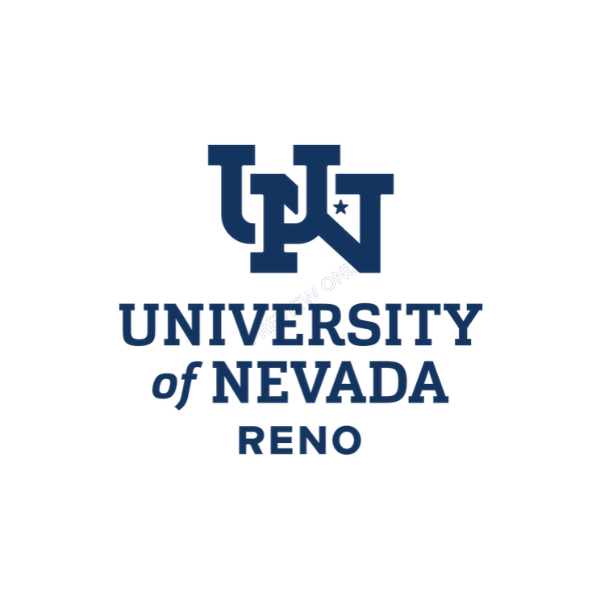
The new Interlocked logo, via the University of Nevada, Reno
The university's new primary logo is a U and N woven together in navy slab-serif letters, with a small star in the counter of the N. The university says it replaces the block N and that the letters come from the University seal and its historic typography.
The clever part is in the negative space. Where the U and N overlap, the shapes form a silhouette of the state of Nevada, with the long northwest-to-southeast diagonal running through the N. The star sits where Reno sits on a map, and it is a nod to the star on the Nevada state flag. The university published a construction graphic that walks through all three pieces:
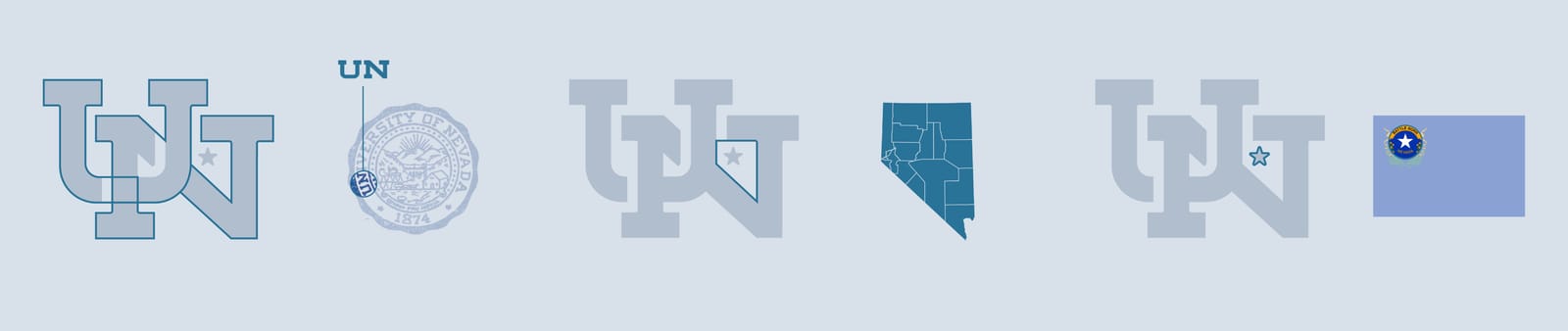
Left to right: the UN on the 1874 seal, the state shape inside the letters, the flag star marking Reno. Via the University of Nevada, Reno
Grade: B-
On paper this is the best idea in the whole rebrand. Hiding the state inside the monogram is the kind of detail people screenshot and share, and pulling the UN off the seal gives it real roots instead of a focus-group origin story. Sandoval's pitch, per KOLO, was that no other school would be confused with it.
Two problems keep it out of the A range. First, the state shape only works up close. On a helmet from the stands, it is an interlocked U and N, full stop. Second, and bigger: UNLV wore an interlocking "UN" first. More on that below. An in-state rival's old helmet logo is the last thing a flagship wants its new primary mark compared to, and the comparison is already coming.
The New Nevada Wolf
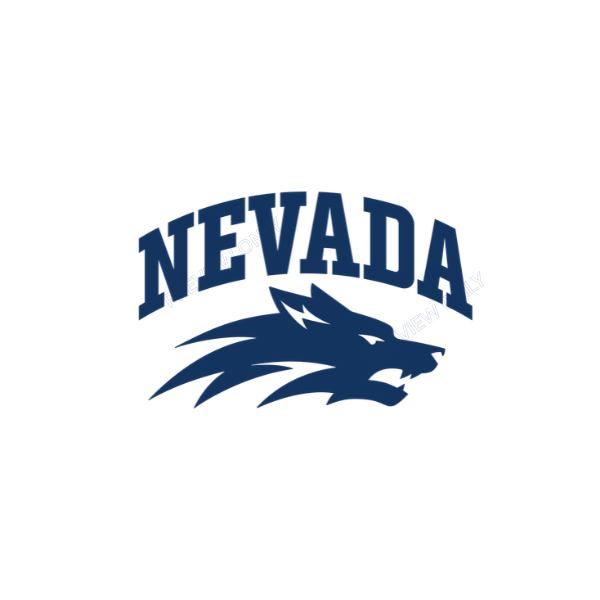
The new Nevada Wolf, via the University of Nevada, Reno
The Nevada Wolf is the new spirit logo, and the university's own release calls it the mark "formerly known as the Sport Wolf." That tells you what kind of change this is. It is still an arched NEVADA over a snarling wolf head with streaks of fur trailing to the left. Athletic director Stephanie Rempe put it plainly to Nevada Sports Net: "obviously this is an evolution."
What changed:
- The wordmark. NEVADA is now set in a narrower, sharper collegiate block letter with notched serifs, replacing the old wider letters.
- The head. The wolf is more compact and angular, with a slit white eye and a cleaner open mouth. The old version's curling swoosh under the jaw is gone, replaced by three spiky streaks.
- The ear. A white zig-zag notch cut into the ear. That is the "hidden N."
President Brian Sandoval told Nevada Sports Net the university went through about 30 versions, and that the final wolf was drawn by an artist, not made with AI.
The hidden N in the ear
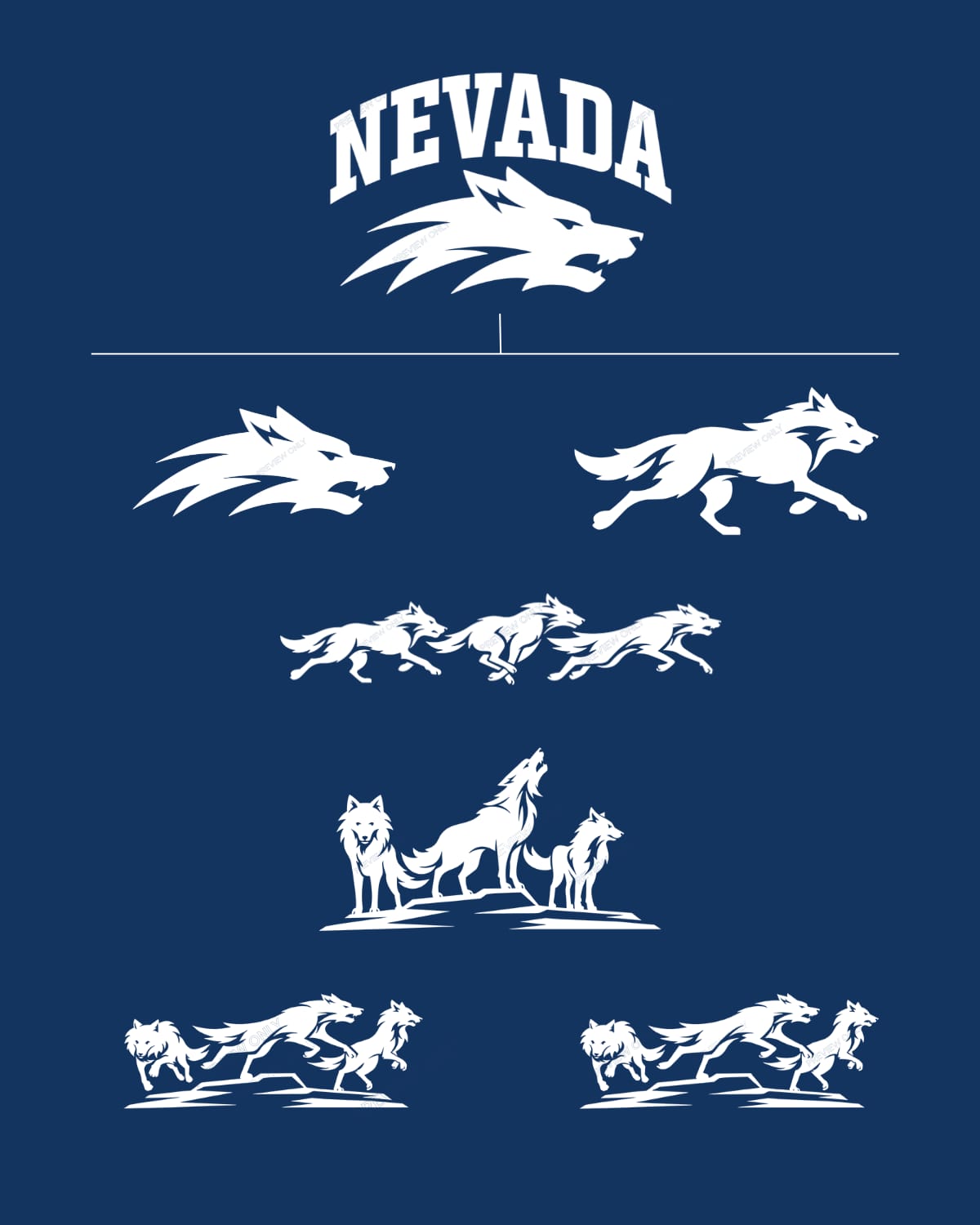
The full Nevada Wolf system. Top: the Nevada Wolf. Second row: the wolf head alone and the Alphie mark. Below: the three Regal Trio marks. Via the University of Nevada, Reno
Look at the wolf head in the second row, left. Inside the pointed ear is a white cutout that zigs down, steps back, and zigs again. KOLO and FOX5 reported that this is an N hidden in the ear. Read it on its side and you can see two diagonal strokes joined like the letter.
Honestly, it reads as a lightning bolt first. The university's own release does not mention it. A hidden letter you have to be told about is a fun trivia answer, not a design feature, and it is nowhere near as good as the state hidden in the UN.
Grade: C+
The new wolf is cleaner than the old one, the new letters are better, and losing the swoosh under the jaw helps. It will look fine on a basketball jersey and great on a hat. But this was sold as the first new athletic look in nearly 25 years, and it is a redraw of the 2002 logo. If you held the two up at the end of a hallway, most fans could not tell you which is which. Safe, competent, forgettable.
The Alphie Mark and the Regal Trio
The rebrand also adds a family of full-body wolves for spirit use. The university's tagline for the new identity is "Two Logos. One Pack." The single running wolf is the Alphie mark. The Regal Trio comes in three versions, running, leaping and standing, and the three wolves have names: Wolfie Jr., Luna and Alphie. All of them are in the system graphic above.
Alphie grade: B-
The running wolf is the most athletic thing in the package. It has motion, a clear silhouette, and it will work as a sleeve logo or a field-turf mark. It is generic, though. Swap the color and it could belong to any wolf team in the country.
Regal Trio grade: D
This is the miss. Three detailed, realistic wolves, one howling on a rock, read like a stock illustration, a souvenir throw blanket, or an outdoor gear brand. They have too much fur detail to survive small sizes, and the standing version is basically the classic "wolves howling at the moon" T-shirt minus the moon. The names are a nice touch for kids' events. As logos they do not belong next to the UN.
Old vs. New
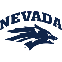
Old Sport Wolf via Nevada Athletics; new Nevada Wolf via the University of Nevada, Reno
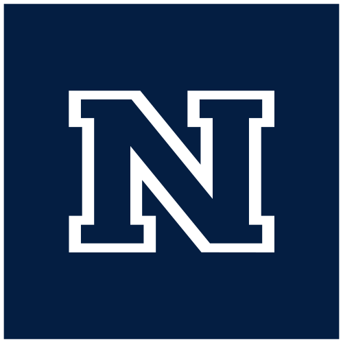
Both via the University of Nevada, Reno
The Sport Wolf debuted in 2002 and was the athletic department's primary logo for more than 20 years. Put next to its replacement, the family resemblance is obvious: same arch, same snarl, same streaks. The new one is tighter and sharper, and the old one's wide letters and jaw swoosh now look very early 2000s.
The block N is the bigger change. It was simple and strong, but Nevada Sports Net reported the feedback on it was that it did not set the school apart, and a block N could be anyone's N. Going from that to a monogram with the state hidden inside is a real upgrade in meaning. Whether it is an upgrade in looks depends on how you feel about the next section.
The UNLV Problem
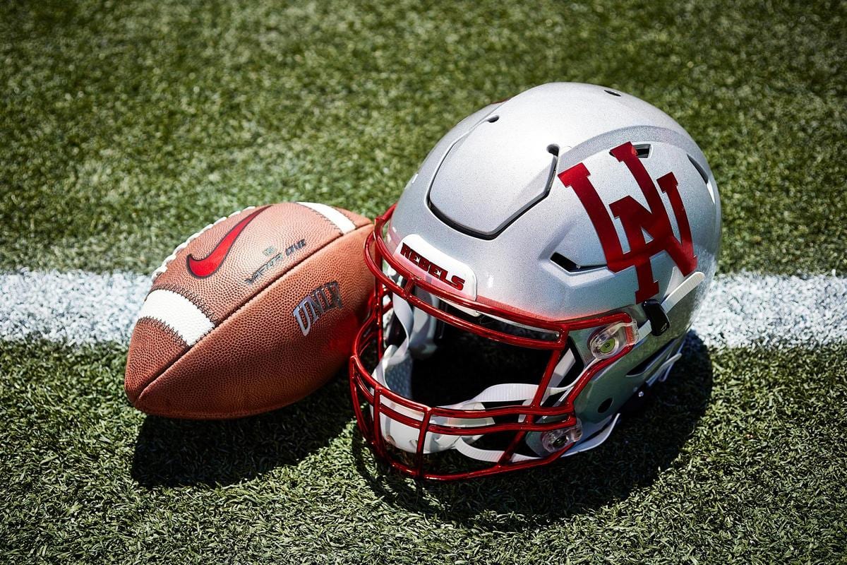
UNLV's 2019 throwback helmet, via UNLV Athletics
Nevada's new primary logo is an interlocking U and N. UNLV's football team wore an interlocking "UN" on its helmets from 1969 to 1972, a red block-letter mark designed by Bill Ireland, the first head coach in UNLV history. UNLV brought it back on a silver throwback helmet for its 2019 season opener against Southern Utah, its farewell season at Sam Boyd Stadium.
The two marks are not the same. Nevada's is navy, slab-serif, built on the state shape and the 1874 seal, and Nevada's own seal carries a UN. But the first reaction from a lot of fans in Las Vegas is going to be "that's ours," and in a rivalry that plays for a cannon, that is not a small thing. If you want the Rebels side of the state, the UNLV 2026 uniform schedule has every look they have worn this year.
The Helmet Debut vs. San José State
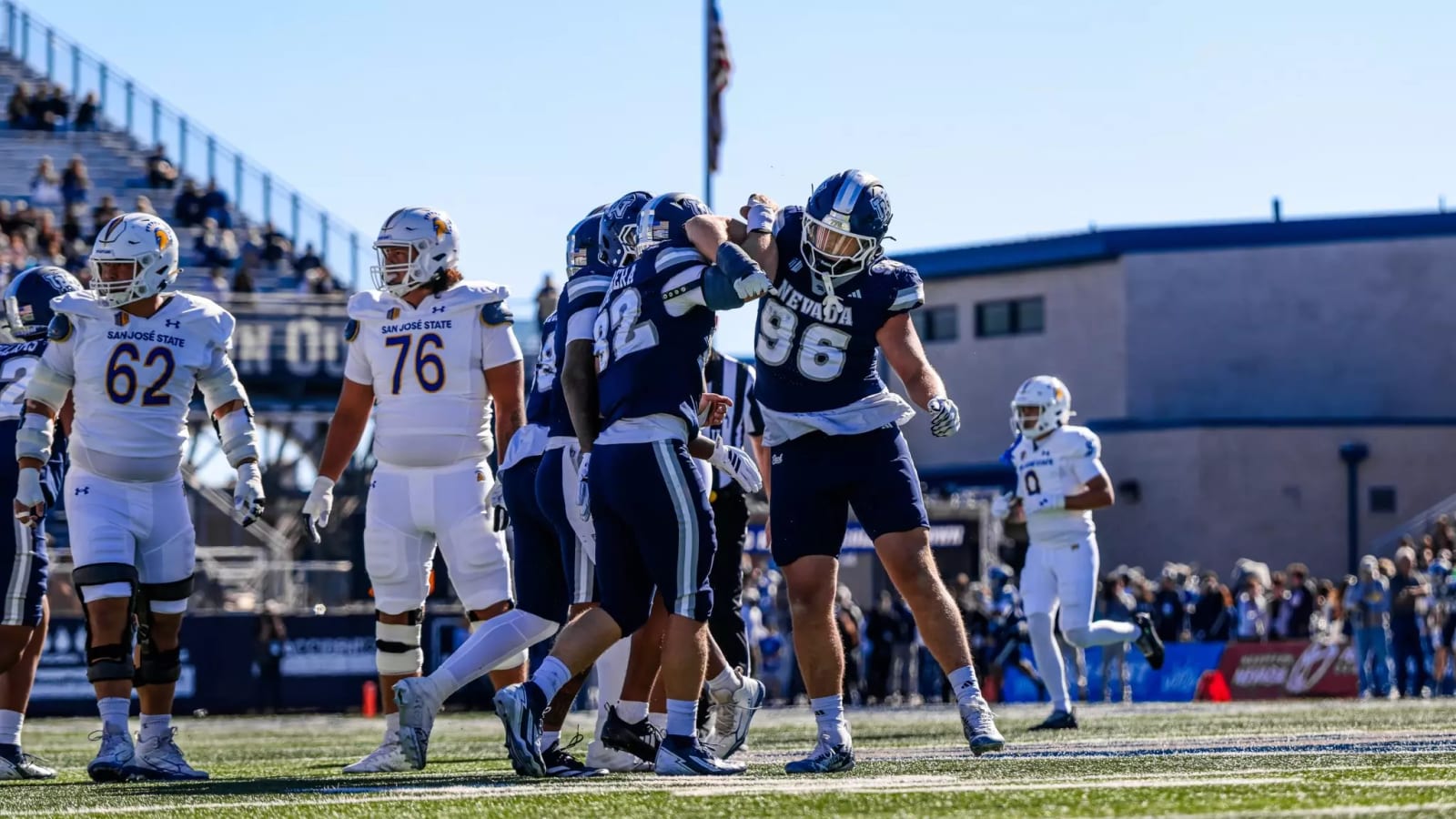
The Interlocked UN on the helmet side (No. 96, right) in the win over San José State. Via Nevada Athletics
Rempe told Nevada Sports Net the new logo would be on the football helmets that Saturday, and it was. Nevada's game photos from the October 24 Homecoming game show the Interlocked UN on the side of the navy helmet, worn with the navy jersey and navy pants. The Wolf Pack won 28-13 at Mackay Stadium, holding San José State to 204 total yards.
Notice which mark went on the helmet: the UN, not the wolf. For football, the new primary logo is the letters.
Helmet grade: B
On the field, the UN with its light outline reads well against navy, much better than a detailed wolf would at that size. It is also, from a distance, exactly the kind of interlocked-letter helmet UNLV wore. Good look, complicated history.
What Comes Next
The university calls this a multi-year rollout. High-visibility items such as recruitment materials and digital pieces change first, and old logos get replaced in normal replacement cycles rather than all at once. On the athletic side, Rempe told Nevada Sports Net that cheerleaders already have shirts with the new logo, that the men's and women's basketball teams will get uniforms with it, and that anything not yet printed or embroidered this year will carry it. She also said the UN would work well on all uniforms. A university brand campaign, "Where World Changers Get to Work," starts in January 2027.
The Grades
| Mark | Grade | Why |
|---|---|---|
| Interlocked UN | B- | State hidden in the letters is great; UNLV wore an interlocking UN first |
| Nevada Wolf | C+ | Cleaner redraw of the 2002 Sport Wolf, not a new idea |
| Hidden N in the ear | C- | Reads as a lightning bolt until someone tells you |
| Alphie running wolf | B- | Most athletic mark in the set, but generic |
| Regal Trio | D | Stock-art wolves on a rock |
| UN on the football helmet | B | Reads well on the field |
| Overall | C+ | One smart mark, one safe one, too much clip art |
The Bottom Line
Nevada's rebrand gets one big thing right: the Interlocked UN has a real story, with the state shape and the Reno star hidden inside letters taken from the 1874 seal. The new Nevada Wolf is a tidy redraw of the Sport Wolf, and its hidden N is more headline than design. The Regal Trio should stay on T-shirts. And the UN has a rival-shaped asterisk next to it. Tell us we're wrong: is the UN a smart flagship mark or a UNLV throwback in navy?
Frequently Asked Questions
What is Nevada's new logo?
Nevada has two new primary logos as of October 20, 2026: the Interlocked UN, a navy U and N woven together with a star, which is the university's primary logo, and the Nevada Wolf, an arched NEVADA over a wolf head, which is the spirit logo used heavily by athletics.
When did Nevada unveil its new logos?
Tuesday, October 20, 2026, at the University of Nevada, Reno's State of the University address, held in the new Wolf Pack Fieldhouse right after its ribbon cutting.
Where is the hidden N in the new Nevada Wolf logo?
In the ear. The white zig-zag notch cut into the wolf's pointed ear forms the N, according to KOLO's report on the unveiling. It is easier to see on its side, and it looks a lot like a lightning bolt.
What is hidden in the new Nevada UN logo?
The outline of the state of Nevada. Where the U and N interlock, the negative space forms the state's silhouette, and a star marks where Reno sits, borrowed from the star on the Nevada state flag.
What happened to the Nevada Sport Wolf logo?
It is being replaced. The Sport Wolf debuted in 2002 and was the athletic department's primary logo for more than 20 years. The university now calls the redesigned version the Nevada Wolf. Old logos will be phased out over several years as items are replaced.
Is Nevada getting rid of the block N?
Yes, as the primary university logo. The university's announcement says the Interlocked logo replaces the block N.
Did Nevada football wear the new logo?
Yes. The Interlocked UN debuted on Nevada's navy football helmets on Saturday, October 24, 2026, in a 28-13 Homecoming win over San José State at Mackay Stadium.
Who designed Nevada's new logos?
R&R Partners, a Nevada agency, chosen after a national search that drew more than 30 agencies. The process took about 18 months. President Brian Sandoval said the wolf was drawn by an artist, not with AI.
What are the names of the three wolves in Nevada's Regal Trio?
Wolfie Jr., Luna and Alphie. The Regal Trio comes in running, leaping and standing versions, and the single running wolf is called the Alphie mark.
Didn't UNLV use an interlocking UN logo?
Yes. UNLV football wore a red interlocking "UN" on its helmets from 1969 to 1972, designed by first head coach Bill Ireland, and brought it back on a silver throwback helmet for its 2019 season opener. Nevada's new UN is a different design, in navy with a slab serif and the state shape inside, but the comparison is unavoidable.
Will Nevada basketball wear the new logo?
Athletic director Stephanie Rempe told Nevada Sports Net that both the men's and women's basketball teams will get uniforms with the new logo.
What is the Wolf Pack Fieldhouse?
Nevada's new $28 million indoor practice facility, which opened with a ribbon cutting on October 20, 2026, the same day as the logo reveal.
Sources: University of Nevada, Reno (brand announcement and logo images), University of Nevada, Reno (R&R Partners, process), Nevada Sports Net, KOLO, Nevada Athletics (game recap and photo), UNLV Athletics (1969-72 UN helmet). Logos are trademarks of their schools and are shown for news commentary.