The 2026 World Series starts Friday, October 23 in Milwaukee, and it is a matchup of two franchises that have spent decades fighting with their own logos. The Brewers threw away the best logo in baseball in 1994 and spent 26 years getting it back. The Rays threw away the Devil Rays in 2008 and are now, one jersey at a time, sneaking the Devil Rays look back in.
Here is every Rays and Brewers logo ever, in order, with what each one meant, and our picks for the best and the worst logo each team has ever worn. Some of these takes will make people mad. Good.
Quick Answers
- Best Brewers logo: the ball-in-glove (1978-1993, back since 2020). Not close.
- Worst Brewers logo: the barley "M" era (2000-2019). Yes, worse than "Motre Bame."
- Best Rays logo: the 1998 Devil Rays rainbow. It was mocked in 1998. It was right.
- Worst Rays logo: the 2008 "Rays" diamond. The most successful era in team history wore the most forgettable logo.
- Did the Rays rebrand back to the Devil Rays? No. The name is still the Rays and no rebrand has been announced. The uniforms are a different story: see our full breakdown.
The Brewers Logo History
1969: The Seattle Pilots (The Logo Milwaukee Inherited)
The Brewers were born in Seattle. The Seattle Pilots played exactly one season, 1969, before going bankrupt. In the spring of 1970, a bankruptcy judge cleared the sale of the team to Bud Selig's group, and the club moved to Milwaukee less than a week before Opening Day. There was no time to order new uniforms, so the team took the Pilots' blue-and-gold jerseys, removed the Seattle markings and sewed BREWERS across the front. The outline of the old Pilots logo was still visible.
That accident is why the Brewers are blue and gold today. Selig had planned to switch to navy and red, the colors of the old minor league Brewers, but the team kept the Pilots' palette and never let it go.
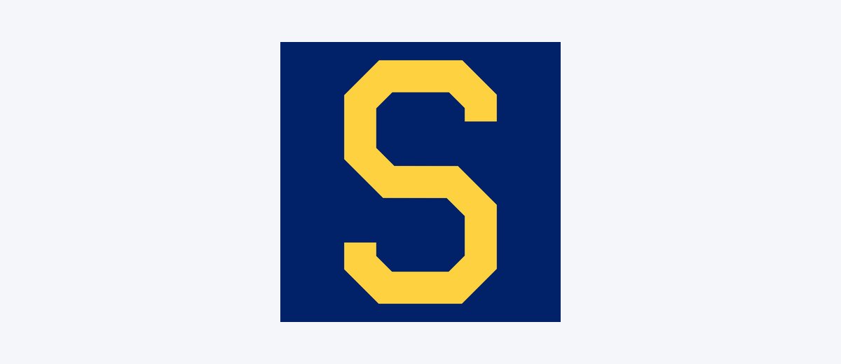
The 1969 Seattle Pilots cap logo. Logo: Wikimedia Commons (public domain)
1970-1977: The Barrel Man
The Brewers' first logo was the Barrel Man, a cartoon ballplayer with a beer barrel for a body, borrowed from the minor league Milwaukee Brewers, who had used him since at least the 1940s. The caps of the era wore a block "M," and in 1974 the road cap picked up a yellow front panel. Bernie Brewer, the mustached mascot, arrived in 1973.
The Barrel Man never really went away. His circular lettering is built into the team's current primary logo, and in 2026 a new "Fielding Barrelman" patch showed up on the Wisco City Connect.
1978-1993: The Ball-in-Glove
In 1977 the Brewers held a public contest to replace the Barrel Man, and roughly 2,000 entries came in. The winner was Tom Meindel, an art history student at the University of Wisconsin-Eau Claire. His design hid a lowercase "m" and "b" inside the shape of a baseball glove, with the ball sitting in the pocket. Meindel was paid $2,000 and, by every account, never received a royalty.
The ball-in-glove debuted in 1978 with pinstripes at home and the first "Milwaukee" script on a road jersey, and it was the logo on the caps for the 1982 American League pennant, Robin Yount's first MVP season and the Brewers' only World Series until this one.
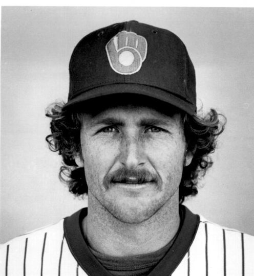
Robin Yount in the ball-in-glove cap, 1982. Photo: Wikimedia Commons (public domain)
1994-1999: The Industrial Stamp ("Motre Bame")
For their 25th season in Milwaukee, the Brewers blew it all up. The ball-in-glove was retired and replaced by an interlocking "M" and "B" set on a pair of crossed bats and a diamond, designed to look like an industrial stamp. Royal blue became navy, yellow became metallic gold, and forest green was added, the first time green had ever appeared in franchise history.
The navy, gold and green with heavy block letters looked so much like Notre Dame that fans nicknamed it "Motre Bame." In 1997 the caps switched to a plain "M," and in 1998 the Brewers moved from the American League to the National League wearing this look.
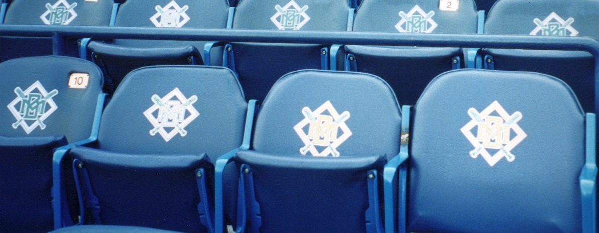
The 1994-1999 logo on County Stadium seats, 2000. Photo: Barrel Man Sammy / CC BY-SA 2.0
2000-2019: The Barley "M"
The Brewers rebranded again for 2000, timed for the opening of Miller Park. Green was dropped, a flowing "Brewers" script went across the chest, and the cap got a script "M" underlined by a head of barley, a nod to the city's brewing history. The primary logo was designed by McDill Design of Milwaukee with MLB Creative Services. A 1999 crane collapse delayed Miller Park to 2001, so the new look debuted in County Stadium's final season.
This was the logo of Prince Fielder, Ryan Braun and CC Sabathia's 2008 playoff run, and it was never loved. Fans kept asking for the glove. The team kept giving it to them in small doses: "Retro Sundays" in 2006, then a navy alternate in 2016 paired with a ball-in-glove cap. From 2017 to 2019 the navy alternates were worn more often than the home whites and road grays. The team was voting with its feet.
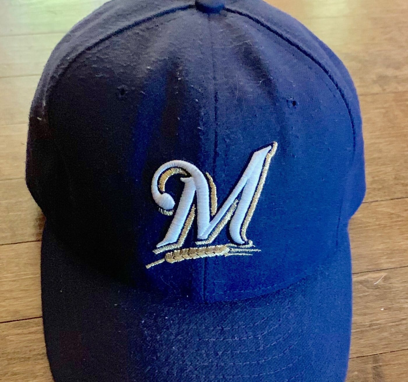
The script "M" with barley, the 2000-2019 cap logo. Photo: Lightburst / CC BY-SA 4.0
2020-Today: The Ball-in-Glove Comes Home
On November 18, 2019, the Brewers unveiled a rebrand they called "Glove Story." The design firm RARE Design, hired in 2017, landed on the obvious answer: bring back the ball-in-glove. The modernized version is the centerpiece of everything, with the circular lettering from the old Barrel Man around it on the primary logo. Metallic gold became mustard gold, royal blue came back for the first time since 1993, and the home uniform turned cream as a nod to Milwaukee's "Cream City" nickname.
In 2026 the Brewers went one step further back and replaced their road grays with powder blue, the color they wore from 1970 into the mid-1980s. Both of their regular caps, the all-navy home cap and the gold-paneled road cap, carry the ball-in-glove.
Every Brewers jersey and when they wear it is in our Brewers uniform schedule, and we graded all five in our Brewers jerseys ranked.
Our Take: The Best and Worst Brewers Logos
Best: The Ball-in-Glove
It is the best logo in baseball, and we will argue that with any Yankees fan. A student drew the team's initials, the shape of the sport and a hidden trick into one mark that works on a pin or a billboard. Nothing in MLB does three jobs at once that cleanly.
Worst: The Barley "M" (2000-2019)
Most people will say "Motre Bame." We disagree. The 1994 stamp at least had an idea, Milwaukee as a factory town, and it looks better every year. The barley "M" was a beer-label script that could have belonged to any team in any city, and it lasted 20 years because nobody could make the case for it, only against it. By the end, the Brewers were wearing their ball-in-glove alternate more than the uniforms built around it. That is the verdict.
The Rays Logo History
1998-2000: The Devil Rays Rainbow
Tampa Bay was awarded its franchise in March 1995. The first choice of name was "Sting Rays," but a winter league team in Hawaii already had it, so ownership went with the Devil Rays. When the team debuted in 1998, it looked like nothing else in baseball: "Devil Rays" at home and "Tampa Bay" on the road in a purple-to-blue-to-green-to-yellow gradient, with a devil ray swooping under the lettering.
The caps were just as odd. The intended caps were black with the devil ray and no letters at all, but for most games the team wore an all-black alternate with a smaller ray and the letters "TB." A black alternate jersey with the rainbow lettering arrived in 1999.
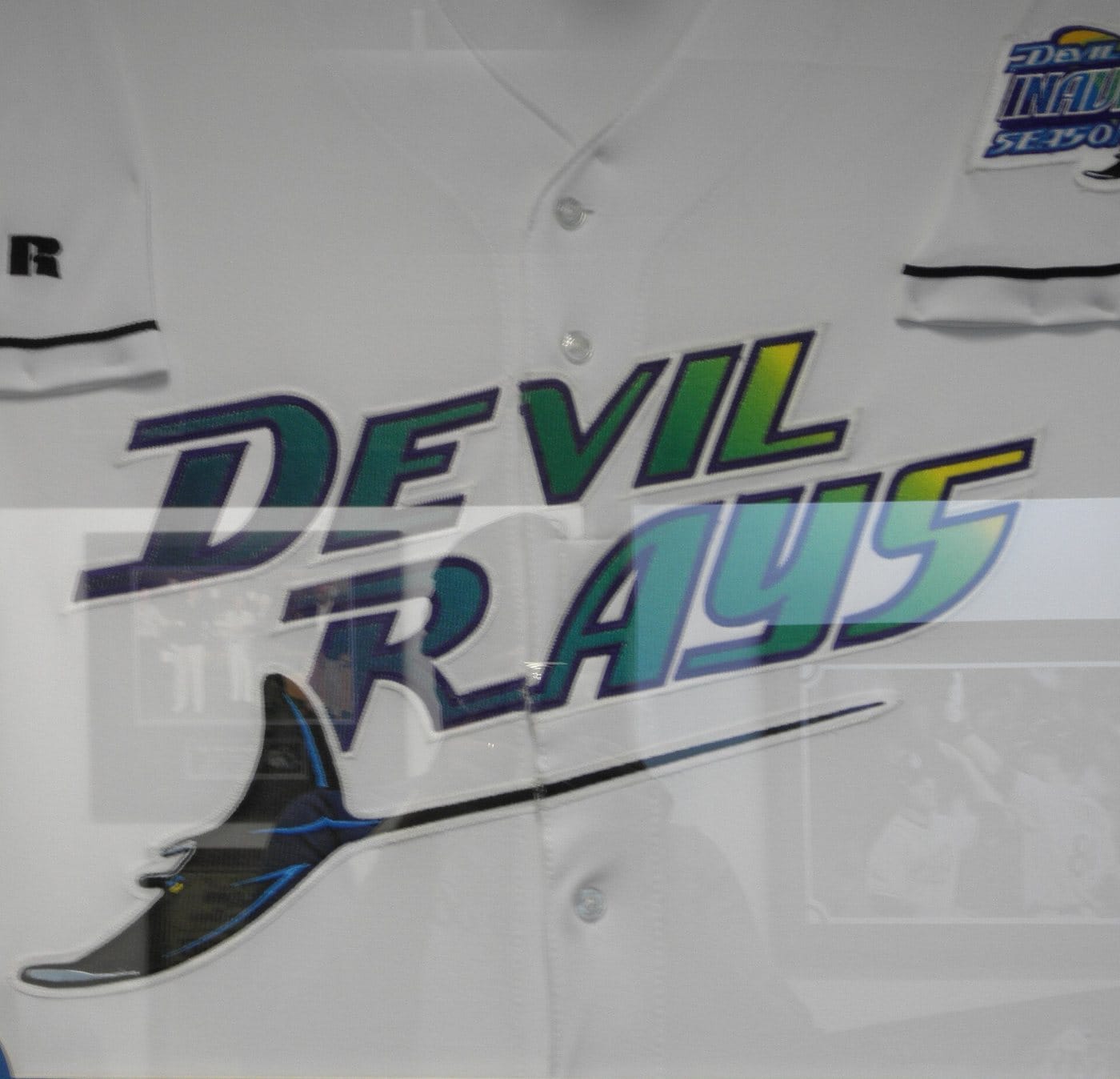
An inaugural-season Devil Rays home jersey, worn 1998-2000. Photo: Zeng8r / CC BY-SA 3.0
2001-2007: The Green Devil Rays
In 2001 the rainbow was gone. Purple was pushed aside for green and black, the lettering got a new font, and the home jersey shortened to just "Rays" while the road kept "Tampa Bay." In 2005 the team leaned even harder into green: a sleeveless home jersey over green undershirts, green caps, and a long-tailed ray under the "Rays" on the chest. These were the losing years, and nobody misses them.
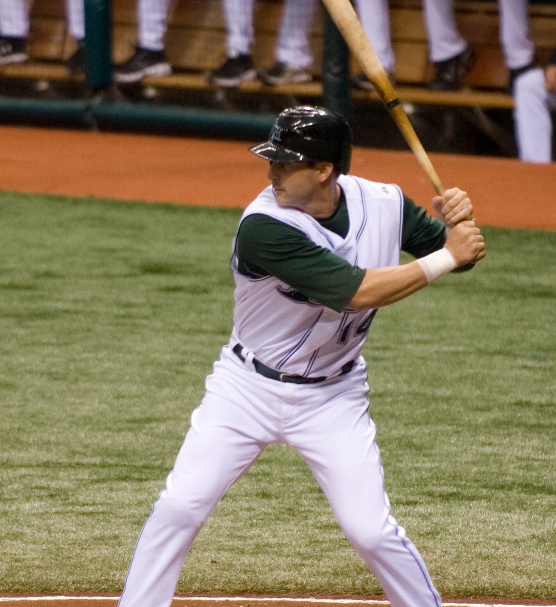
Greg Norton in the green-era Devil Rays home look, 2007. Photo: mark6mauno / CC BY 2.0
2008: "Devil" Is Dropped, the Sunburst Arrives
On November 8, 2007, the team made it official: the Devil Rays were now the Rays. Principal owner Stuart Sternberg said the change gave the organization an identity. Green and black were replaced by navy and light (Columbia) blue, and the new logo was "Rays" in navy with a light blue shadow and a yellow sunburst on the "R." The name now meant rays of Florida sunshine as much as the fish. A devil ray patch stayed on the sleeve.
For the primary logo, that wordmark sat inside a baseball diamond. Then the 2008 Rays went from last place to the American League pennant.
2019-Today: The Diamond Goes, the Sunburst Stays
Around 2019, the Rays dropped the diamond from the primary logo and made the sunburst "Rays" wordmark the main mark, with the diamond kept as an alternate. The navy cap with the white "TB" has been the everyday cap since 2008.
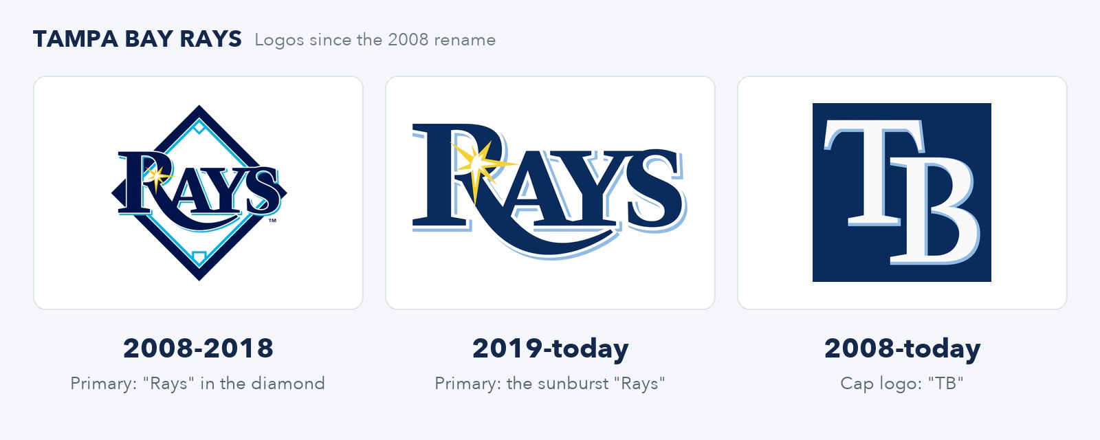
Logos: Wikimedia Commons (public domain): diamond, wordmark, TB cap
2009-2026: The Devil Rays Creep Back
The Rays first wore the 1998 rainbow throwback in 2009, then again for the franchise's 20th anniversary in 2018. In 2023, for the 25th anniversary, it joined the regular rotation and became the Friday home look. The 2024 "Grit x Glow" City Connect put "Tampa Bay" back across the chest using the old 1998-2000 road lettering. And on September 21, 2026, the Rays revealed a new gray road uniform with TAMPA BAY in the original rainbow gradient, with a navy version of the 1998 "TB" cap logo.
To be clear: the team is still the Rays, and no rebrand has been announced. The home white still has the sunburst. But the Rays won the pennant in the Devil Rays throwback, and they will wear TAMPA BAY in the rainbow in Milwaukee on Friday. We break down the whole thing in Are the Rays becoming the Devil Rays again?, and every Rays jersey and date is in our Rays uniform schedule.
Our Take: The Best and Worst Rays Logos
Best: The 1998 Devil Rays Rainbow
In 1998 people laughed at it as too loud and too minor league. Twenty-eight years later the team keeps bringing it back because it is the Tampa Bay logo most fans outside Florida can draw from memory. It is loud, it is local, it is unlike anything else in the sport. That is what a logo is supposed to do.
Worst: The 2008 "Rays" Diamond
Here is the uncomfortable part: the best decade in team history happened in the worst logo. Navy wordmark, light blue shadow, inside a diamond. Swap the word and it could be a dozen minor league teams or a bank in Clearwater. Even the Rays seemed to agree, because they quietly pulled the diamond off the primary logo. The sunburst is fine. The diamond was filler.
Yes, we know the green 2001-2007 era was ugly. But it was ugly and forgettable at once, and nobody has asked for it back. The 2008 diamond was the face of the franchise for 11 years. That is why it gets the label.
Every Rays and Brewers Logo at a Glance
| Years | Team | Logo | Our grade |
|---|---|---|---|
| 1969 | Seattle Pilots | Gold block "S" cap logo | C+ |
| 1970-1977 | Brewers | Barrel Man | B |
| 1978-1993 | Brewers | Ball-in-glove | A+ |
| 1994-1999 | Brewers | MB stamp on crossed bats ("Motre Bame") | B- |
| 2000-2019 | Brewers | Script "M" with barley | D |
| 2020-today | Brewers | Modern ball-in-glove | A |
| 1998-2000 | Devil Rays | Rainbow wordmark and devil ray | A |
| 2001-2007 | Devil Rays | Green and black "Rays" | D+ |
| 2008-2018 | Rays | "Rays" in the diamond | D |
| 2019-today | Rays | Sunburst "Rays" wordmark | C+ |
For how every team in the league got its name and its colors, see how every MLB team got its name and how every MLB team got its colors. For what both teams will wear in every game, see our 2026 World Series uniforms guide.
Frequently Asked Questions
Who designed the Brewers ball-in-glove logo?
Tom Meindel, an art history student at the University of Wisconsin-Eau Claire, won a 1977 contest held by the team to replace the Barrel Man. His entry, an "m" and "b" shaped into a baseball glove, beat roughly 2,000 others. He was paid $2,000 and did not receive royalties.
When did the Brewers bring back the ball-in-glove logo?
For the 2020 season. The Brewers unveiled the "Glove Story" rebrand on November 18, 2019, with a modernized ball-in-glove as the primary logo, new cream home uniforms and royal blue back in the color scheme. The logo had been used from 1978 to 1993 and on throwback and alternate uniforms in between.
Why did the Brewers get rid of the ball-in-glove in 1994?
To mark their 25th season in Milwaukee, the Brewers redesigned everything in 1994: an interlocking "MB" on crossed bats and a diamond, with navy, metallic gold and forest green. Because the look resembled Notre Dame's, fans nicknamed it "Motre Bame."
Were the Brewers ever the Seattle Pilots?
Yes. The franchise began as the Seattle Pilots in 1969. After one season the team went bankrupt and was sold to Bud Selig's group in the spring of 1970, moving to Milwaukee days before Opening Day. The first Brewers uniforms were Pilots uniforms with "Brewers" sewn on.
What does the Brewers barley logo mean?
From 2000 to 2019, the Brewers cap carried a script "M" underlined by a head of barley, a nod to Milwaukee's brewing industry and the "Brewers" name, which Milwaukee baseball teams have used since the 1800s.
When did the Devil Rays change their name to the Rays?
The team announced the change on November 8, 2007, and became the Tampa Bay Rays starting with the 2008 season. The colors changed to navy and Columbia blue, and a yellow sunburst was added to the "R." That same season the Rays reached their first World Series.
Did the Rays change their name back to the Devil Rays in 2026?
No. The team is still the Tampa Bay Rays, and no name change or rebrand has been announced. What has changed is the uniforms: the 1998 Devil Rays throwback is a regular home jersey, and a new gray road uniform with TAMPA BAY in the old rainbow gradient was revealed on September 21, 2026.
What were the original Devil Rays colors?
A gradient of purple, blue, green and yellow, used on the "Devil Rays" and "Tampa Bay" lettering from 1998 to 2000, with black caps. From 2001 to 2007 the team switched to mostly green and black.
What does the Rays sunburst mean?
When the team dropped "Devil" for 2008, the name "Rays" was meant to stand for rays of Florida sunshine as well as the fish. The yellow sunburst on the "R" is that sunshine.
Which team has the better logo in the 2026 World Series?
The Brewers, and it is not close. The ball-in-glove is the best logo in baseball. The Rays' best logo, the Devil Rays rainbow, is not their primary mark, though it is all over their uniforms this October.
The Bottom Line
This World Series is a fight between two teams that both learned the same lesson: your fans remember the weird logo, not the safe one. The Brewers tossed the ball-in-glove for 26 years of stamps and barley before admitting it was the best thing they ever had. The Rays traded the Devil Rays rainbow for a diamond and a sunburst, won with them, and now cannot stop wearing the rainbow anyway. Milwaukee already finished its comeback. Tampa Bay is halfway through its own, and Friday night in Milwaukee, both teams will look more like their old selves than they have in years.