The 1990s were the NBA's loudest logo decade. Expansion teams arrived with cartoon mascots, old teams traded in plain wordmarks for teal, purple and bronze, and a few of those logos became the most-loved marks the league has ever had. These are my 10 favorites, counting down to No. 1.
Every logo is shown below. For each one: what it is, the years it was the team's logo, the design reason it ranks where it does, and whether the team still uses it today. Years and details are checked against team and league releases and newspaper coverage.
Quick Answers
- What were the best NBA logos of the 1990s? Our top 10, counting down: Charlotte Hornets (Hugo), Seattle SuperSonics (Space Needle), Sacramento Kings, Detroit Pistons (teal horse), Golden State Warriors (lightning bolt), Atlanta Hawks (Pac-Man), San Antonio Spurs (Fiesta), Utah Jazz (mountains), Washington Wizards (1997) and the Toronto Raptors' dinosaur at No. 1.
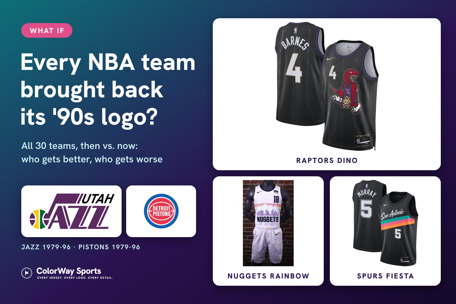
- Which '90s logos are still around? The Hawks' Pac-Man is the team's primary logo again. The Raptors' dinosaur and the Spurs' Fiesta colors come back on City Edition uniforms this season.
- Which one can't come back? The SuperSonics' Space Needle logo. It stayed in Seattle when the team moved to Oklahoma City in 2008.
10. Charlotte Hornets, 1988-2002: Hugo
Team logo, 1988-2002
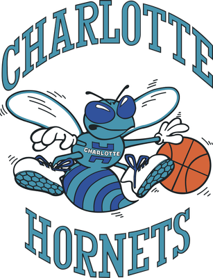
What it is: a cartoon hornet in white gloves and sneakers, dribbling an orange basketball, with CHARLOTTE arched over the top and HORNETS underneath in collegiate letters. The team's first season was 1988-89, and this was its logo until the franchise moved to New Orleans in 2002. Fashion designer Alexander Julian, who designed the original teal pinstripe uniforms, has said he worked on the logo with an outside graphic designer. The Hugo mascot costume was designed by Cheryl Henson, Jim Henson's daughter.
Why it ranks 10th: the teal and purple. Charlotte made teal and purple famous, and they are still the team's colors today. What holds it back is how much is going on. Two lines of type plus a full-body character with wings, gloves, shoes and a ball is a lot for one logo, and at small sizes Hugo turns into a blur.
Is it back? Partly. When the Bobcats took back the Hornets name for 2014-15, Charlotte also got the 1988-2002 history, and Hugo returned as the mascot. The team logo is now a forward-facing hornet, not Hugo. Hornets uniform schedule 2026-27
9. Seattle SuperSonics, 1995-2001: The Space Needle
Team logo, 1995-2001
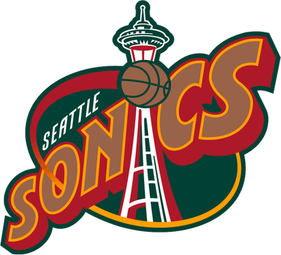
What it is: the Space Needle standing in for the I in SONICS, with a basketball at the top of the tower, on a deep green oval. The Sonics unveiled it in July 1995, their first logo change in 20 years, adding red and bronze to a darker green, the Seattle Times reported. It was replaced in 2001.
Why it ranks 9th: using the Space Needle as a letter is the smartest move on this list after the Pac-Man. You know the city before you read the word. The bronze and red were very '90s, and the wordmark tilts and stretches more than it needs to, which keeps it out of the top half.
Is it back? No, and it can't be for the team that owns the history. When the franchise moved to Oklahoma City in 2008, the settlement with Seattle left the SuperSonics name, logo and colors for a future Seattle NBA team, subject to league approval. Thunder uniform schedule 2026-27
8. Sacramento Kings, 1994-2016: The Black Crown
Team logo, 1994-2016
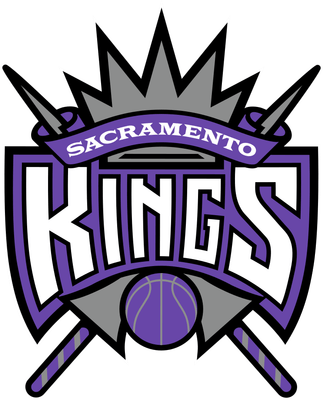
What it is: a shield with KINGS in sharp white letters, SACRAMENTO on a purple banner, a silver crown on top and two crossed scepters behind it, with a purple basketball at the bottom. It came with the 1994 switch to purple, silver, black and white, and it lasted 22 years, the longest run of any logo on this list. The Kings replaced it with a new crown and ball on April 26, 2016.
Why it ranks 8th: the KINGS lettering. The pointed, chiseled letters are the best part of the logo, and they were on the Chris Webber teams that made Sacramento must-watch TV in the early 2000s. The shield, crown and scepters behind it are a lot of pieces stacked together, which is why it sits behind the simpler logos above it.
Is it back? No. The 2016 logo went back toward the team's 1985 design, kept the purple and dropped the black. Kings uniform schedule 2026-27
7. Detroit Pistons, 1996-2001: The Teal Horse
Team logo, 1996-2001
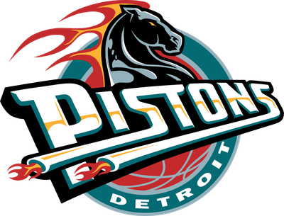
What it is: a black horse head with a flaming mane over a slanted PISTONS wordmark, with exhaust pipes shooting flames out of the letters, all on a teal circle with DETROIT along the bottom. It replaced the red, white and blue ball of the Bad Boys era for 1996-97. The teal version lasted five seasons. In 2001 the Pistons put the horse into red, white and blue, and it was gone completely by 2005.
Why it ranks 7th: it is the only logo here built around its city's industry. A horse for horsepower and flaming exhaust pipes for the Motor City is a real idea, not just a mascot. It is also the logo of the Grant Hill years, and the teal era still has a big following in Detroit. It ranks below the six ahead of it because the pipes and flames make it the busiest wordmark on the list.
Is it back? The colors are. The Pistons wore a teal Classic Edition replica of their 1996-2001 road uniform for 10 games in 2022-23, and teal is in the trim of the red Mixtape City Edition coming back this season. The team's logo is the modernized red, white and blue ball from 2017. Pistons uniform schedule 2026-27
6. Golden State Warriors, 1997-2010: The Lightning Bolt
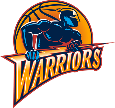
Team logo, 1997-2010
What it is: a muscular navy warrior figure gripping a lightning bolt in front of a basketball, over a WARRIORS wordmark in orange and gold that ends in a bolt. Fans called the figure "Thunder." It arrived for 1997-98, when Golden State dropped royal blue and gold for navy, orange and gold. In June 2010 the team unveiled the Bay Bridge logo and went back to royal blue and gold for 2010-11.
Why it ranks 6th: the wordmark. The sharp, slanted WARRIORS with the bolt coming off the end is one of the best pieces of '90s lettering in the league, and the orange-to-gold fade in it has aged better than most gradients from that decade. The muscle-man figure above it is the weak part. It could be a video game character, and it doesn't say anything about the Bay Area.
Is it back? Not as the logo. The Warriors wore their 2003-10 uniforms from the same era as throwbacks for their final regular-season game at Oracle Arena in April 2019, NBA.com reported, a nod to the 2007 "We Believe" team. Warriors uniform schedule 2026-27
5. Atlanta Hawks, 1972-1995: The Pac-Man
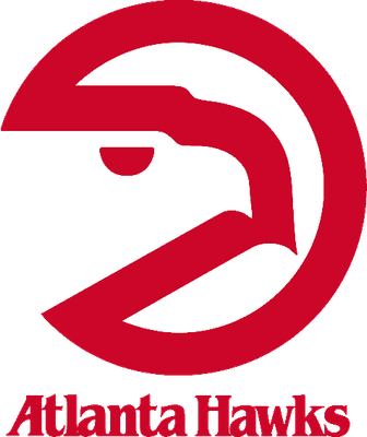
Team logo, 1972-1995
What it is: a red circle with a hawk's head cut into it, the beak and eye made from the empty space, which is why everyone calls it the Pac-Man. It was designed by Bob Wages of the Atlanta ad agency McDonald & Little in 1972, years before the video game existed, and Wages has said the resemblance was never intended. It was the Hawks' logo through the 1994-95 season.
Why it ranks 5th: it is the simplest logo on this list, and it works at every size, from a jersey patch to center court. One shape, one color, and you still see a hawk. It sits at No. 5 instead of higher because it is a '70s logo that the Hawks happened to keep through half of the '90s. The four ahead of it were designed in the decade.
Is it back? Yes. Atlanta brought back an updated Pac-Man as a secondary logo in May 2014, with a sharper hook on the beak and a new eye, and made it the primary logo in June 2015. It is still the team's logo today. Hawks uniform schedule 2026-27
4. San Antonio Spurs, 1989-2002: The Fiesta Logo
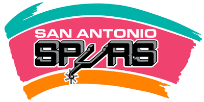
Team logo, 1989-2002
What it is: the classic black SPURS wordmark, with a cowboy spur standing in for the U, laid over brushstrokes of turquoise, pink and orange. Those are the colors of Fiesta, San Antonio's big spring celebration. The uniforms stayed black, silver and white. The Fiesta colors left the logo in 2002, and the wordmark changed from straight to arched.
Why it ranks 4th: the colors come from the city, not a marketing meeting. The Spurs kept their wordmark, the spur as the U, and simply put San Antonio behind it. It is the David Robinson logo, and fans still line up for the Spurs' Fiesta City Editions. It sits at No. 4 because the brushstrokes are really a background, and the logo underneath is the same one the team already had.
Is it back? Yes, on a City Edition. The black Fiesta "San Antonio" set, with pink, teal and orange stripes, returns for 2026-27. Spurs uniform schedule 2026-27
3. Utah Jazz, 1996-2004: The Mountain J-Note
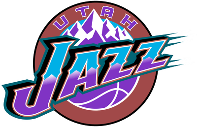
Team logo, 1996-2004
What it is: a JAZZ wordmark in purple, copper and turquoise, with snow-capped purple mountains rising behind it and UTAH arched across the top of a copper basketball. It replaced the original J-note for 1996-97. It was designed by Tom O'Grady, then the NBA's creative director, and based on his logo for the 1993 All-Star Game in Salt Lake City. The Jazz recolored it in 2004.
Why it ranks 3rd: the Jazz name came from New Orleans, and it never fit Utah. This logo fixed that. The mountains tell you exactly where the team plays, and the purple and copper fade is the best use of a gradient on this list. It is also the logo of the Stockton and Malone teams that reached the NBA Finals in 1997 and 1998.
Is it back? The color is. In June 2024 the Jazz announced a return to purple, ESPN reported, with the J-note, now in purple, as the logo. The mountain logo itself is not the primary. Jazz uniform schedule 2026-27
2. Washington Wizards, 1997-2007: The Moon Wizard
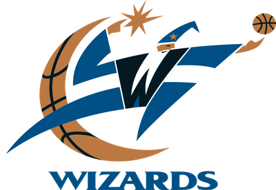
Team logo, 1997-2007
What it is: a blue wizard whose robe forms the letter W, flicking a basketball off his fingertips, next to a bronze crescent moon with a star above it. Look at the moon: it has basketball seams on it. The logo arrived in 1997, when owner Abe Pollin changed the name from Bullets to Wizards because he did not want the team associated with violence. The colors were blue, bronze and black. After the 2006-07 season the bronze was swapped for gold.
Why it ranks 2nd: three ideas fit into one mark. The wizard is the W, the moon is half of a basketball, and the arm is mid-shot. None of it is extra. Most '90s logos added detail on top of a mascot. This one made the mascot into the letter, and it still reads cleanly from far away.
Is it back? Only the colors, so far. The Wizards' 2022-23 Classic Edition uniforms paid homage to the white, blue and bronze scheme the team debuted in 1997-98, NBA.com reported. Washington is aiming for new uniforms in 2027-28, with a possible new logo on a longer timeline, as we covered in NBA new uniforms 2027-28. Wizards uniform schedule 2026-27
1. Toronto Raptors, 1995-2008: The Dinosaur
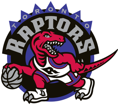
Team logo, 1995-2008
What it is: a red cartoon raptor in a jersey and sneakers, dribbling a basketball, inside a black circle with a purple ring, spikes around the edge, RAPTORS in silver and TORONTO above it. The team revealed it on May 24, 1994, a year after Jurassic Park came out, and the expansion Raptors started play in 1995-96. NBA creative director Tom O'Grady designed it with team founder John Bitove. In O'Grady's first version, the dinosaur was lime green. Toronto dropped purple from the logo for 2008-09, and the dinosaur was replaced by a clawed basketball in 2015-16.
Why it ranks 1st: it is the most Toronto logo possible, even though there are no dinosaurs in Toronto. The name came out of the Jurassic Park craze, the expansion era was sold on it, and by the end of 1994, before the Raptors had played a game, they were seventh in the league in merchandise sales. Design-wise, the red raptor on purple is a color combination nobody else has, and the dribbling pose makes it a basketball logo, not just a mascot. Thirty years later, it is still the Raptors logo people buy.
Is it back? On the court, yes. The "Dino Dunk" City Edition, a tribute to Vince Carter's 2000 Dunk Contest with the cartoon raptor across the chest, returns for 2026-27, and a purple Statement jersey has been reported for 2027-28. Raptors uniform schedule 2026-27
Honorable Mentions
The Milwaukee Bucks' purple and green deer (1993-2006), the Vancouver Grizzlies' bear holding a basketball (1995-2001), the Houston Rockets' cartoon rocket circling a ball (1995-2003) and the Denver Nuggets' rainbow skyline (1981-1993).
Frequently Asked Questions
What are the best NBA logos of the 90s?
Our top 10, from No. 10 to No. 1: Charlotte Hornets (Hugo), Seattle SuperSonics (Space Needle), Sacramento Kings (1994 crown), Detroit Pistons (teal horse), Golden State Warriors (lightning bolt), Atlanta Hawks (Pac-Man), San Antonio Spurs (Fiesta), Utah Jazz (mountains), Washington Wizards (1997) and the Toronto Raptors' dinosaur.
What was the Raptors' 90s logo?
A red cartoon raptor in a jersey and sneakers, dribbling a basketball inside a black and purple circle with RAPTORS in silver. It was revealed on May 24, 1994, used from the team's first season in 1995-96, and replaced by a clawed basketball in 2015-16, after purple was dropped from the logo in 2008-09.
Who designed the Raptors dinosaur logo?
Tom O'Grady, the NBA's creative director at the time, worked on it with Raptors founder John Bitove. The name and the dinosaur came out of the Jurassic Park craze of 1993.
Did the Wizards change their logo?
Yes, several times. The first Wizards logo in 1997 was a blue wizard forming a W next to a bronze moon. The bronze was swapped for gold after the 2006-07 season, the team went back to red, white and blue in 2011, and the monument ball has been the primary logo since 2015.
Why did the Bullets change their name to the Wizards?
Owner Abe Pollin changed the name in 1997 because he did not want the team associated with violence. The new name came with the wizard logo and blue, bronze and black colors.
What is the Hawks' Pac-Man logo?
A red circle with a hawk's head cut into it, used from 1972 to 1995. It was designed by Bob Wages of the Atlanta agency McDonald & Little, before the Pac-Man video game existed. An updated version became the Hawks' primary logo again in 2015.
What are the Spurs' Fiesta colors?
Turquoise, pink and orange, the colors of San Antonio's annual Fiesta celebration. They were part of the Spurs logo from 1989 to 2002 and now return on the team's Fiesta City Edition uniforms.
Who designed the Utah Jazz mountain logo?
Tom O'Grady, then the NBA's creative director. It was based on his logo for the 1993 All-Star Game in Salt Lake City and became the Jazz logo in 1996.
Can the Thunder use the SuperSonics logo?
No. When the franchise moved to Oklahoma City in 2008, the settlement left the SuperSonics name, logo and colors in Seattle for a future NBA team there.
When did the Pistons have a horse logo?
From 1996 to 2005. It was on a teal logo from 1996 to 2001, then in red, white and blue until 2005. The Pistons now use a modernized version of their 1979-96 ball logo.
What was the Warriors' logo in the 90s?
Two of them. The early-'90s logo had the outline of California. From 1997 to 2010 it was a navy warrior figure holding a lightning bolt in front of a basketball, with an orange and gold WARRIORS wordmark.
What was the Hornets' original logo?
Hugo, a teal and purple cartoon hornet in sneakers and gloves dribbling a basketball, used from 1988 to 2002. Hugo returned as the team mascot when the Hornets name came back to Charlotte in 2014.
The Bottom Line
The '90s logos that lasted did one thing well: they told you where the team played or what the name meant without any words. The Space Needle, the Fiesta colors, the Utah mountains and the wizard-shaped W all do that. The Raptors' dinosaur does it best. See every team's current look in our 2026-27 NBA uniforms guide, and every team's '90s logo in what if every NBA team brought back its '90s logo.
Logo years and details are from team and NBA releases, NBA.com, ESPN, the Seattle Times archive and newspaper coverage. Logos are shown for commentary and are the property of their teams. Rankings are ColorWay Sports' opinion. ColorWay Sports is an independent design site and is not affiliated with, endorsed by, or sponsored by the NBA or any of its teams.