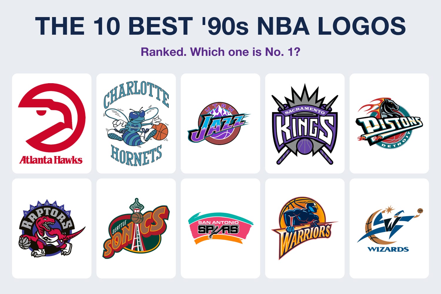
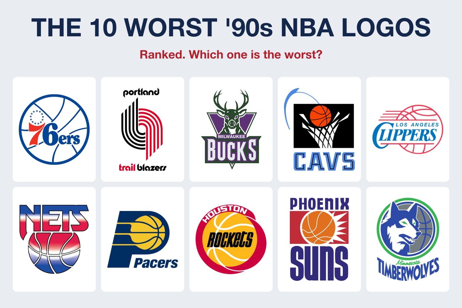
The 1990s gave the NBA a purple dinosaur, a dribbling hornet, a teal horse and a cartoon rocket. Some of those logos are still the most-loved marks the league has ever had. Some of them aged badly. So let's play it out: what if every NBA team threw out its current primary logo and went back to the one it used in the '90s?
We went through all 30 teams. For each one: what the '90s logo was, what the team uses now, and our verdict on whether the switch would make it look better or worse. The verdicts are our opinions. The years and details are checked against team histories, NBA releases and newspaper archives.
This is a hypothetical. No team is switching back full time. And a few teams couldn't do it even if they wanted to, for reasons we explain at the end.
Quick Answers
- Better with the '90s logo (5): Raptors, Spurs, Nuggets, Hornets, Mavericks.
- Worse with the '90s logo (9): Bucks, Hawks, Pistons, Cavaliers, Warriors, Rockets, Clippers, Nets, Kings.
- Barely changes, or already went back (12): Bulls, Celtics, Lakers, Heat, Knicks, Pacers, Suns, Trail Blazers, 76ers, Jazz, Magic, Timberwolves.
- Can't really do it (4): Thunder, Pelicans, Grizzlies, Wizards. Their '90s logos belong to a different city or a name the team dropped.
- Our most controversial call: the purple Bucks deer should stay retired.
Why Old Logos Don't Just Come Back
Teams can't swap logos on a whim. A new NBA identity takes three to four years, because merchandise makers need lead time, and the original uniforms are licensed to Mitchell & Ness for Hardwood Classics throwbacks. The Orlando Magic's chief marketing officer walked us through that in our Magic rebrand interview.
That's why the '90s mostly comes back through side doors: Classic Editions, City Editions, a stripe on the shorts. This story asks what would happen if the side door became the front door. For every team's current closet, see our 2026-27 NBA uniforms guide.
Better With the '90s Logo
Toronto Raptors: The Dinosaur. Better.

Now
Current logo. The 1995 dinosaur primary logo is described below.
The Raptors revealed their first logo on May 24, 1994, a red cartoon raptor with a basketball, with purple as a team color. It sold. By the end of 1994 the Raptors were seventh in the league in merchandise sales. Toronto dropped purple from the logo for the 2008-09 season and replaced the dinosaur entirely with a basketball torn by claw marks, introduced in December 2014 and used full time from 2015-16.
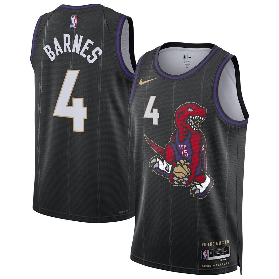
The cartoon raptor on the Dino Dunk City Edition, returning for 2026-27. Image via NBA Store.
The dinosaur hasn't gone anywhere in the fans' minds. The Dino Dunk City Edition, a Vince Carter tribute with the cartoon raptor on the chest, is reported to be back this season, and a purple Statement jersey is reported for 2027-28, as we covered in NBA new uniforms 2027-28.
Verdict: better. The claw ball is clean but generic. Swap the colors and it could belong to five other teams. The dinosaur could only be Toronto, and it's the logo people still buy. Raptors uniform schedule 2026-27
San Antonio Spurs: Fiesta Colors. Better.
Now
Current logo. The 1989-2002 Fiesta-color logo is described below.
The Spurs logo has always been the word SPURS with a cowboy spur standing in for the U. From 1989 to 2002, the team added streaks of pink, orange and turquoise, the colors of San Antonio's Fiesta celebration, while the uniforms themselves stayed black, silver and white. The Fiesta colors left the logo in 2002 and the wordmark went from straight to arched.
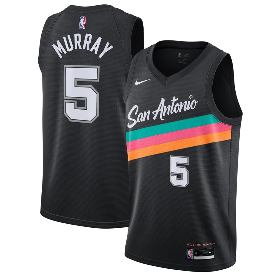
The Fiesta colors on the Spurs City Edition, reported to return for 2026-27. Image via Fanatics.
Verdict: better. Silver and black is classy, and five titles came in it. But it's also the quietest color story in the league. The Fiesta colors are what San Antonio actually looks like, and every time the Spurs bring them back on a City Edition, fans line up for it. Put them back on the main logo. Spurs uniform schedule 2026-27
Denver Nuggets: The Rainbow Skyline. Better.
Now
Current logo. The 1981-93 rainbow skyline and 1993 mountain logos are described below.
Denver actually had two '90s logos. The rainbow city skyline, used since 1981, lasted until 1993. Then came a navy snow-capped mountain over a big metallic gold "Nuggets" in western lettering, with a maroon "Denver" ribbon. That mountain logo, in three versions, stayed the primary until the pick-axe roundel took over in 2018-19.
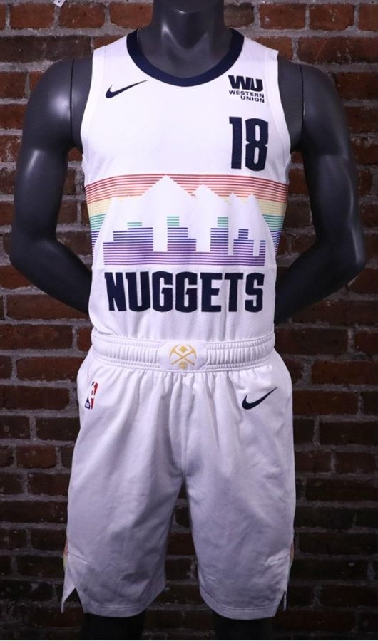
The rainbow skyline on the Nuggets City Edition, returning for 2026-27. Image: NBA.
Verdict: better, if it's the rainbow. The 1993 mountain would be a step down from the pick axes. But the rainbow skyline is one of the best logos the NBA has ever had, and the team keeps bringing it back on City Editions for a reason. Nuggets uniform schedule 2026-27
Charlotte Hornets: Hugo. Better.
Now
Current logo. The 1988-2002 Hugo logo is described below.
The original Hornets logo was a teal and purple cartoon hornet in white shoes and gloves, dribbling an orange basketball. It ran from the team's first season in 1988 until the franchise left for New Orleans in 2002. When the Bobcats took the Hornets name back for 2014-15, Charlotte also got the 1988-2002 history and records, and Hugo returned as the mascot. The logo went to a forward-facing hornet with wings and "Charlotte Hornets" on its body.
Verdict: better, but closer than you'd think. The current hornet is good. It's one of the better logos from the 2010s. But Hugo is the reason people outside North Carolina know the Hornets, and the team already wears the teal and purple pinstripes that go with him. Hornets uniform schedule 2026-27
Dallas Mavericks: The Cowboy Hat. Better.
Now
Current logo. The 1980-2001 cowboy hat logo is described below.
From 1980 to 2001 the Mavericks wore blue and green, and the logo was an "M" wearing a cowboy hat. For 2001-02 the team switched to the horse head and a midnight blue, royal blue and silver scheme close to the Dallas Cowboys'.
Verdict: better. This one will get pushback, because the horse head is the logo of the 2011 title team. But it's also very 2001, with a lot of navy and a lot of shading. The cowboy hat is simpler and more Texas, and green and blue would set Dallas apart in a league full of navy. Mavericks uniform schedule 2026-27
Worse With the '90s Logo
Milwaukee Bucks: The Purple Deer. Worse.
Now
Current logo. The 1993-2006 purple and green deer is described below.
The Bucks changed their logo and uniforms for the 1993-94 season, after the franchise's 25th anniversary, going to purple and green with a new deer. Former NBA creative director Tom O'Grady has said the colors came from a package he got in 1992 with a dark green cap and a purple shirt from Wimbledon. That look lasted until 2006. The current buck head and the cream and green colors arrived on April 13, 2015.
Verdict: worse. We know the purple deer has a cult following. But the 2015 buck is one of the best logos in the NBA right now: bold, simple and readable at any size, with an M for Milwaukee in the chest and a basketball hidden between the antlers. The '90s deer is fun for one night, not 82. Bucks uniform schedule 2026-27
Atlanta Hawks: The Full Hawk. Worse.
Now
Current logo. The 1995-2007 full-body hawk is described below.
The Hawks used the "Pac-Man" hawk head from 1972 to 1995. In 1995 they switched to a red hawk with its wings spread and a basketball in its talons, which stayed the primary logo until a 2007 update. In 2014 the Hawks brought the Pac-Man back as a modernized secondary logo, and it became the primary after the 2014-15 season.
Verdict: worse. Atlanta already made this choice once, and it chose right. The Pac-Man is one of the smartest logos in sports. The '95 hawk is busy and looks like a lot of other bird logos from that decade. Hawks uniform schedule 2026-27
Detroit Pistons: The Teal Horse. Worse.
1979-96
Now
1990s logo: Wikimedia Commons (public domain); current logo shown.
Detroit's '90s depends on the year. Through 1996 it was the red, white and blue ball from the "Bad Boys" era, shown above. Then came the teal era: a horse head with a flaming mane, which lasted until 2005. In 2017 the Pistons unveiled a modernized version of the 1979-96 ball, which is the logo they use now.
Verdict: worse, if it's the horse. The Grant Hill teal era has real fans, and teal works great as an accent, like on the red Mixtape City Edition. But the horse is a car-brand idea that never felt like Detroit basketball. The ball is the right logo, and the team already went back to it. Pistons uniform schedule 2026-27
Cleveland Cavaliers: The Hoop. Worse.
Now
Current logo. The 1994-2003 logo is described below.
When the Cavs moved into Gund Arena for 1994-95, they changed logos and uniforms and added black to blue, orange and white. The primary logo was a basketball dropping through a net, with the team name in blue. Cleveland went to wine and gold in 2003, and for 2022-23 it updated to wine and metallic gold.
Verdict: worse. The hoop logo is a fun piece of '90s design, and the Cavs smartly fold pieces of it into their current "V-net" alternate. But as a primary it says "basketball," not "Cleveland." Wine and gold is the identity that won the 2016 title. Cavaliers uniform schedule 2026-27
Golden State Warriors: The Lightning Bolt. Worse.
Now
Current logo. The 1997-2010 logo is described below.
The early-'90s Warriors used a logo with the outline of California. For 1997-98 the team changed everything: dark navy, gold and orange, with lightning bolts all over the uniform and a primary logo of a warrior figure holding a lightning bolt in front of a basketball. In 2010 the Warriors went back to the classic "The City" look with the Bay Bridge in the logo, and they refined it in 2019.
Verdict: worse, and not close. The lightning bolt era matched some of the worst years in franchise history, and it looked like it. The Bay Bridge logo is one of the cleanest in the league. If Golden State wanted something from the '90s, the California outline would be the one to borrow. Warriors uniform schedule 2026-27
Houston Rockets: The Cartoon Rocket. Worse.

Now: Nose Cone
Image: Houston Rockets. The 1995-2003 logo is described below.
Houston won its two titles in 1994 and 1995 wearing the red and yellow "ketchup and mustard" logo. That summer the Rockets switched to navy and silver with a cartoon-style rocket orbiting a red basketball. In 2003 came the "R," designed by Eiko Ishioka with Rafael Esquer. This summer Houston rebranded again, with a new Nose Cone badge, an updated R and Championship Yellow back for the first time in 30 years. We graded it in the Rockets rebrand review.
Verdict: worse. The 1995 rocket is pure nostalgia for a lot of fans, and the pinstripe jerseys it came with were great. But the Rockets just picked their '90s, and they picked the right half: the red and yellow of the title teams, not the navy that came after. Rockets uniform schedule 2026-27
LA Clippers: The Moving Ball. Worse.
'90s logo

Now
1990s logo: Wikimedia Commons (public domain); current logo shown.
From the 1980s into the 2010s, through the move from San Diego to Los Angeles in 1984, the Clippers used a moving basketball with red lines behind the full team name, with tweaks along the way. The current logo arrived in 2024: a ship's hull with basketball seams inside a C that doubles as a compass.
Verdict: worse. The old logo is a team name on a ball, which half the league had in the '80s and '90s. The new one is the first Clippers logo with a real idea behind it, the clipper ship the team was named for. Clippers uniform schedule 2026-27
Brooklyn Nets: The New Jersey Ball. Worse.
Now
Current logo. The 1990-97 logo is described below.
From 1990 to 1997 the New Jersey Nets' logo was the word "Nets" over a red, white and blue basketball. The black and white Brooklyn era started in 2012, and in 2024 the team made its "B" basketball the primary logo.
Verdict: worse. The Nets' red, white and blue past is genuinely good. Their ABA Classic Edition this year is one of our favorite throwbacks, which we graded in the Classic Edition rankings. But the 1990-97 logo is the weakest version of that look, and it belongs to New Jersey. The black and white B fits Brooklyn. Nets uniform schedule 2026-27
Sacramento Kings: The Black Crown. Worse.
Now
Current logo. The 1994-2016 logo is described below.
In 1994 the Kings went to purple, silver, black and white, with a crown over a basketball and a "Kings" script. In 2016 they changed to a logo closer to their 1971-94 design and dropped black.
Verdict: worse. The current logo kept the best part of the '90s look, the purple, and cut the black. The Chris Webber era jerseys are great. The logo is fine. Fine isn't better than what they have. Kings uniform schedule 2026-27
Barely Changes, or Already Went Back
Chicago Bulls, Boston Celtics, Los Angeles Lakers and Miami Heat
Bulls
Celtics
Current logos.
Lakers
Heat
Current logos.
Nothing happens here. The Bulls have used the same charging bull since 1966. The Celtics' leprechaun, Lucky, was green, white and black through 1995-96 and got full color for the 50th anniversary in 1996-97, and Lucky is still the logo. The Lakers' logo is still "Los Angeles Lakers" in purple on a gold basketball. The Heat's flaming ball going through a hoop has been the logo since 1988, with a modified version since 1999.
Verdict: no change. These four teams figured it out before the '90s and left it alone. Bulls, Celtics, Lakers and Heat uniform schedules.
New York Knicks
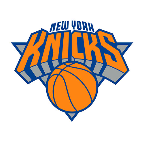
Now
Current logo.
Before the 1992-93 season the Knicks redrew their logo: "Knicks" in a futuristic font over a basketball, with a silver triangle and black accents. "New York" was added on top for 1995-96. The 2012 update mostly removed the black. Verdict: barely changes. Add some black back and you have the '90s logo. Knicks uniform schedule 2026-27
Indiana Pacers, Phoenix Suns and Portland Trail Blazers
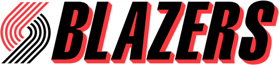
Blazers '90s
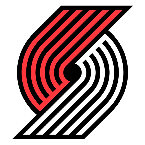
Blazers now
1990s logo: Wikimedia Commons (public domain); current logo shown.
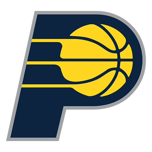
Pacers now
Suns now
Current logos.
The Pacers redesigned their logo for 1990-91 around a blue P and a gold basketball. It was refreshed in 2005 and again in 2017, and the idea never changed. The Suns introduced the "Streaking Sun" when they moved to America West Arena for 1992-93, and their 2013 rebrand brought back an updated version of it. The Blazers' pinwheel has been the logo since 1970; it went from vertical to slanted starting with the 1991 season, and the 2017 update kept the pinwheel with a new wordmark.
Verdict: barely changes. If anything, the Suns would gain a little: the '92 Streaking Sun used more purple, and today's version leans orange. Pacers, Suns and Trail Blazers uniform schedules.
Philadelphia 76ers
1977-97
Now
1990s logo: Wikimedia Commons (public domain); current logo shown.
The Sixers wore the 76ers-on-a-ball logo from 1977 to 1997, then changed their logo and colors for 1997-98, adding black and gold. They revived the 1977-97 logo in the 2008-09 season, and the current version from 2015-16 is the same idea with a slight tilt to the ball. Verdict: barely changes, as long as you mean the early '90s. The 1997 version would be worse. 76ers uniform schedule 2026-27
Utah Jazz
1979-96

Now
1990s logo: Wikimedia Commons (public domain); current logo shown.
The Jazz brought the J-note logo with them from New Orleans in 1979 and used it until 1996. For 1996-97 they went to the purple mountain logo, designed by Tom O'Grady and based on the 1993 All-Star Game logo, in purple, copper and turquoise. That's the Stockton and Malone Finals look. In June 2024 the Jazz announced a return to purple, and the J-note, now in purple, is the logo, ESPN reported.
Verdict: already back. Utah's two '90s logos are both basically in use: the J-note as the logo, the purple mountains on the uniforms. Jazz uniform schedule 2026-27
Orlando Magic and Minnesota Timberwolves
Magic now

Wolves now
Current logos. Timberwolves logo: Minnesota Timberwolves.
Two teams have already done this. Ahead of 2025-26, the Magic unveiled a modernized version of the "streaking ball with stars" logo they used from 1989 to 2000, along with a modern take on the original pinstripes. And this season the Timberwolves launched a new crest that modernizes their original 1989 wolf head, with the bright blue and green of the expansion years. Minnesota's other '90s logo, the snarling wolf over the trees from the Kevin Garnett era of 1996 to 2008, lives on in the tree pattern of the new black Statement jersey.
Verdict: already back, and both are better for it. We gave the Wolves rebrand an A+ in our review. Magic and Timberwolves uniform schedules.
The Teams That Can't Do It
Oklahoma City Thunder
Now
Current logo.
The Thunder's franchise spent the '90s in Seattle as the SuperSonics. In July 1995 the Sonics unveiled a new logo, their first change in 20 years, featuring the Space Needle and adding red and bronze to deeper green, the Seattle Times reported. But when the team moved in 2008, the settlement with Seattle left the SuperSonics name, logo and colors available to a future Seattle NBA team. Oklahoma City unveiled its own logo on September 3, 2008. Verdict: not theirs to bring back. Thunder uniform schedule 2026-27
New Orleans Pelicans
Now
Current logo.
The Pelicans franchise spent the '90s in Charlotte as the original Hornets, and its '90s logo was Hugo. It moved to New Orleans in 2002 and became the Pelicans in 2013. As part of that change, the history and records of the 1988-2002 Hornets went back to Charlotte. Verdict: no '90s logo of its own. The franchise's New Orleans story starts in 2002. Pelicans uniform schedule 2026-27
Memphis Grizzlies

Now
Current logo. The 1995-2001 Vancouver logo is described below.
The Grizzlies started in 1995 as the Vancouver Grizzlies, in turquoise, bronze and red. Their primary logo was a brown grizzly holding a red basketball under the word "Vancouver." The team moved to Memphis in 2001, kept those uniforms with the new city name until 2004, and then switched to navy, Beale Street blue and gold. Verdict: better-looking, but it says Vancouver. The turquoise and red are great, and a Memphis version of the full-body bear would beat the current bear head. The logo itself can't come back as is. Grizzlies uniform schedule 2026-27
Washington Wizards
Now
Current logo. The Bullets and 1997 Wizards logos are described below.
For most of the '90s the team was the Washington Bullets, and from 1987 to 1997 the logo was the word "Bullets" with the two L's drawn as hands reaching for a basketball. In 1997 owner Abe Pollin changed the name to Wizards because he did not want the team associated with violence. The first Wizards logo was a wizard conjuring a basketball with a quarter moon, in blue, bronze and black. Washington went back to red, white and blue in 2011 and has used the monument ball as its primary since 2015. Team executives told The Athletic this month they're aiming for new uniforms for 2027-28, with a possible new logo on a longer timeline.
Verdict: the Bullets logo can't come back, and the moon wizard shouldn't. The hands logo is good design tied to a name the team retired on purpose. The 1997 wizard is the worst '90s logo in this story. Wizards uniform schedule 2026-27
The Scoreboard
- 5 teams get better: Raptors, Spurs, Nuggets, Hornets, Mavericks.
- 9 teams get worse: Bucks, Hawks, Pistons, Cavaliers, Warriors, Rockets, Clippers, Nets, Kings.
- 12 teams barely change or already went back: Bulls, Celtics, Lakers, Heat, Knicks, Pacers, Suns, Trail Blazers, 76ers, Jazz, Magic, Timberwolves.
- 4 teams can't do it: Thunder, Pelicans, Grizzlies, Wizards.
The '90s logos that hold up have one thing in common: they're about the place. A Toronto dinosaur, Fiesta colors in San Antonio, a rainbow over Denver. The ones that don't hold up were about the decade: lightning bolts, cartoon rockets, a horse for a car town. That's the test we'd give any team thinking about a throwback. Bucks fans, we expect to hear from you.
Frequently Asked Questions
What was the Raptors' original logo?
A red cartoon raptor with a basketball, revealed on May 24, 1994, with purple as one of the team colors. Purple was dropped from the logo for 2008-09, and the clawed-basketball logo replaced the dinosaur starting with the 2015-16 season.
Why did the Raptors get rid of the dinosaur logo?
Toronto dropped purple in 2008 and then rebranded around a black, silver and red look and a clawed basketball logo, introduced in December 2014. The dinosaur still shows up on City Edition jerseys, including the Dino Dunk design returning for 2026-27.
When did the Spurs have the Fiesta-color logo?
From 1989 to 2002. The SPURS wordmark with the spur in place of the U picked up pink, orange and turquoise streaks for those years, while the uniforms stayed black, silver and white.
What was the Bucks' logo in the 1990s?
A purple and green deer, introduced for the 1993-94 season and used until 2006. The current buck head and cream, green and blue colors were unveiled on April 13, 2015.
What was the Hornets' original logo?
Hugo, a teal and purple cartoon hornet in white shoes and gloves dribbling a basketball, used from 1988 to 2002. Charlotte got the Hornets name and the 1988-2002 history back for the 2014-15 season.
Why don't the Pelicans have a '90s logo?
The franchise played in Charlotte as the Hornets until 2002. When it became the Pelicans in 2013, the history and records of the 1988-2002 Hornets went to the current Charlotte Hornets.
Can the Thunder use the SuperSonics logo?
No. When the team moved to Oklahoma City in 2008, the settlement with Seattle left the SuperSonics name, logo and colors available to a future Seattle NBA team, subject to league approval.
Why did the Washington Bullets change their name?
Owner Abe Pollin changed the name to Wizards in 1997 because he did not want the team associated with violence. The change came with a new logo, new colors and the move to the new downtown arena.
What was the Rockets' logo in 1995?
After winning titles in 1994 and 1995 in red and yellow, the Rockets switched to navy and silver with a cartoon-style rocket orbiting a basketball. It lasted until the 2003 "R." The 2026-27 rebrand brought back red with Championship Yellow.
Which NBA teams have already brought back their old logos?
The Magic unveiled a modernized version of their 1989-2000 "streaking ball with stars" logo ahead of 2025-26. The Timberwolves' 2026-27 crest modernizes their original 1989 wolf head. The Pistons (2017) and 76ers (2009, refreshed 2015) both went back to their 1970s-90s ball logos, and the Jazz's purple J-note is a return to the logo they used from 1979 to 1996.
Why can't NBA teams just bring back their old logos?
A new identity takes three to four years because merchandise makers need lead time, and the production rights to the original uniforms are licensed to Mitchell & Ness for Hardwood Classics. That's why old looks usually return as Classic or City Editions first.
What was the Nuggets' logo in the 1990s?
The rainbow city skyline, used from 1981 until 1993, and then a navy snow-capped mountain over a gold western-style "Nuggets" with a maroon "Denver" ribbon, which led the team's identity until the pick-axe logo became primary in 2018-19.
Logo years and details are from the teams' published histories, NBA and team releases, ESPN, the Seattle Times archive and, for dates only, Wikipedia. 1990s logos marked "public domain" are from Wikimedia Commons. Jersey images are credited under each image. Verdicts are ColorWay Sports' opinion. ColorWay Sports is an independent design site and is not affiliated with, endorsed by, or sponsored by the National Basketball Association or any team named here.