Not every '90s NBA logo was a cartoon dinosaur. For every Raptors dino and Hornets Hugo, there was a team still wearing a logo that was a word on a basketball, or a new one that tried too hard. These are my 10 worst NBA logos of the 1990s, counting down to the worst one.
Every logo here was a team's primary logo during the '90s. Some were created in the '70s or '80s and were still in use when the decade started, so each one is shown with its full years. For each: what it is, the years, and the design reason it ranks where it does. Several of these are fan favorites, and I say so where that's the case. Years and details are checked against team and league releases and newspaper coverage.
Quick Answers
- What were the worst NBA logos of the 1990s? Our 10, counting down: Minnesota Timberwolves (1989-96), Cleveland Cavaliers (1994-2003), Portland Trail Blazers (1970-91), Phoenix Suns (1968-92), Philadelphia 76ers (1977-97), Houston Rockets (1972-95), New Jersey Nets (1990-97), Milwaukee Bucks (1993-2006), Los Angeles Clippers (1984-2010) and the Indiana Pacers (1990-2005) at No. 1.
- Didn't the Clippers copy the Lakers? Pretty much. Both logos put LOS ANGELES over the team name in slanted letters across a basketball. More at No. 2.
- Where are the best ones? In our companion list, the 10 best '90s NBA logos.
10. Minnesota Timberwolves, 1989-1996: The First Wolf
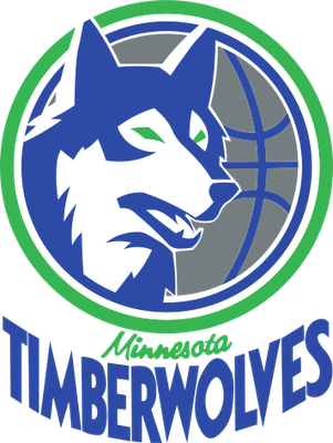
Team logo, 1989-1996
What it is: a blue and white wolf head with a green eye, set in front of half a basketball inside a green ring, with "Minnesota" in small script squeezed above a stretched TIMBERWOLVES wordmark. It was the logo of the expansion Wolves from their first season in 1989-90 through 1995-96, when the team switched to the snarling wolf over the trees.
Why it ranks 10th: the wolf is drawn like an illustration, not a logo. The fur detail, the green eye and the half ball behind it all fight for space inside a small circle, and "Minnesota" is so small it disappears. It's the least bad logo on this list, because the idea, a wolf and a ball in a ring, is sound.
Fans love it, and so did the team. This season Minnesota launched a new crest that modernizes this exact 1989 wolf head, with the bright blue and green of the expansion years. That's the best case for ranking it 10th and not higher on this list: cleaned up, it works. Timberwolves uniform schedule 2026-27
9. Cleveland Cavaliers, 1994-2003: The Hoop
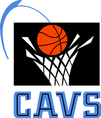
Team logo, 1994-2003
What it is: an orange basketball dropping through a white net on a black square, with a blue arc showing the ball's path and CAVS underneath in blue. The Cavs debuted it, along with black, blue and orange, when they opened Gund Arena in November 1994. In 2003 they went back to wine and gold.
Why it ranks 9th: there's nothing Cleveland or Cavalier about it. A ball going through a net could be the logo of a youth league, a sporting goods store or any team in the NBA. The black square makes it look like an icon cut out of something bigger, and the team name is shortened to CAVS.
Fans love it, especially the black uniforms that went with it, and the team brought back a version of its 1994-95 black uniform as a Classic Edition in 2019-20. But when Cleveland switched back to wine and gold in 2003, a team spokesman told the AP that fans had overwhelmingly wanted this logo scrapped. Cavaliers uniform schedule 2026-27
8. Portland Trail Blazers, 1970-1991: The Upright Pinwheel
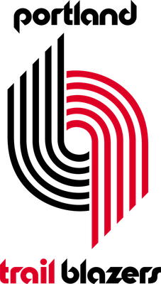
Team logo, 1970-1991
What it is: the pinwheel, five black stripes and five red stripes standing straight up, with "portland" above it and "trail blazers" below in rounded lowercase letters. Frank Glickman, a cousin of founder Harry Glickman, drew it in 1970: two sets of five lines for the two teams of five players on the court. It was the Blazers' logo until 1991, when the pinwheel was tilted.
Why it ranks 8th: the pinwheel isn't the problem. The lettering around it is. The bubbly lowercase type is pure 1970, and it was still on the logo in the 1990-91 season. Standing straight up, the stripes also look more like a road map or a paper clip than a pinwheel. Portland tilted the stripes in 1991, and the pinwheel has looked better ever since.
Fans love it. It's the logo of the 1977 title team and Bill Walton, and the pinwheel idea is one of the best in the league. That's why it's only 8th. Trail Blazers uniform schedule 2026-27
7. Phoenix Suns, 1968-1992: The Original Sun
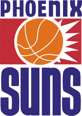
Team logo, 1968-1992
What it is: three stacked pieces: PHOENIX in purple on top, an orange basketball with white rays bursting out of a red block in the middle, and SUNS in tall, heavy purple letters on the bottom. It was the expansion team's first logo in 1968. Tucson printer Stan Fabe is credited with designing it. It lasted until the Suns introduced the "Streaking Sun" for 1992-93, when they moved into America West Arena.
Why it ranks 7th: it's three logos stacked on top of each other. The two words are in different typefaces, and the sun in the middle is a red rectangle with rays coming off one side, so the ball looks like it's sitting in a box instead of shining. Take away the words and you can't tell what it is.
Fans love it, and the color story is great. The orange and purple were picked to match an Arizona sunset, and they're still the Suns' colors. It ranks here because the colors are carrying the layout. Suns uniform schedule 2026-27
6. Philadelphia 76ers, 1977-1997: 76ers on a Ball
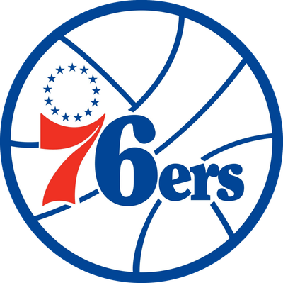
Team logo, 1977-1997
What it is: a white basketball outlined in blue, with a red 7 and a blue "6ers" across the middle and a circle of 13 stars, one for each original colony, tucked in the corner. It was the Sixers' logo from 1977 to 1997, when they switched to black, gold and the 1997 logo.
Why it ranks 6th: it's a word on a ball, and most of the ball is empty white space with lines through it. The 7 is in a different style and color than the "6ers," which makes the name read as two pieces. The 13 stars are a smart touch, but they're squeezed into the corner like an afterthought.
Fans love it, and the Sixers clearly agree. It's the logo of Dr. J, Moses Malone and the 1983 title. The team brought it back in 2009, and today's logo, from 2015-16, is the same idea with the ball tilted. So yes, this is a logo the team still wears in spirit. It still ranks here because the design is simple in the wrong way: it doesn't do much. 76ers uniform schedule 2026-27
5. Houston Rockets, 1972-1995: Ketchup and Mustard
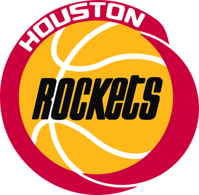
Team logo, 1972-1995
What it is: a yellow basketball with "Rockets" in black lettering, inside a thick red ring with HOUSTON in white across the top. Fans call the red and yellow "ketchup and mustard." It arrived in 1972, a year after the move from San Diego, and it was the Rockets' logo through the 1994 and 1995 titles, before the switch to navy and silver.
Why it ranks 5th: the team is called the Rockets, and there is no rocket. It's a word on a ball in a ring. Houston is Space City, home of NASA's Mission Control, and the logo doesn't use any of it. The red ring is also lopsided, thicker on one side, which makes the whole thing look like it's sliding off the ball.
Fans love it, and they have every reason to. It's Hakeem Olajuwon's logo and the logo of two championships, and Houston's 2026 rebrand brought Championship Yellow back for the first time in 30 years. We liked that move in the Rockets rebrand review. The colors are the winner. The logo itself is a placeholder that won two titles. Rockets uniform schedule 2026-27
4. New Jersey Nets, 1990-1997: The Gradient
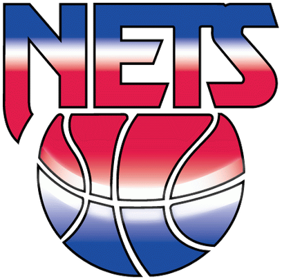
Team logo, 1990-1997
What it is: NETS in tall letters over a basketball, with both filled with a blue-to-white-to-red gradient. The Nets introduced it for the 1990-91 season and replaced it in 1997.
Why it ranks 4th: the gradient is the whole idea. Take it away and you have a word on top of a ball. The shine across the middle is the airbrushed chrome look of a 1990 T-shirt, and nothing in it says New Jersey. The team had a red, white and blue history going back to the ABA, and this is the most generic version of it.
Fans like the colors, not this logo. The Nets' red, white and blue past is genuinely good, and their ABA Classic Edition this season is one of our favorite throwbacks, which we graded in the Classic Edition rankings. This logo just isn't the best version of it. Nets uniform schedule 2026-27
3. Milwaukee Bucks, 1993-2006: The Purple Deer
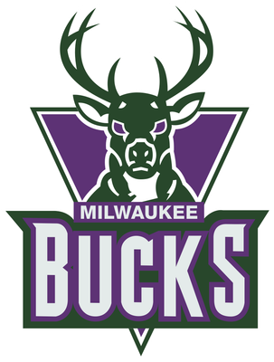
Team logo, 1993-2006
What it is: a realistic, front-facing deer head with antlers, over a purple triangle pointing down, above a green banner with MILWAUKEE and BUCKS in white. It arrived for 1993-94 with new purple, green and silver colors and lasted until 2006. Former NBA creative director Tom O'Grady has said the colors came from a package he got with a dark green cap and a purple shirt from Wimbledon. The deer was drawn by illustrator Dick Sakahara.
Why it ranks 3rd: the colors came from a tennis tournament in London, not from Milwaukee, and the deer looks like it's glaring at you from a hunting magazine. The detailed face, thin antlers, triangle, banner and lettering are five pieces that don't shrink well, and the deer has nothing to do with basketball.
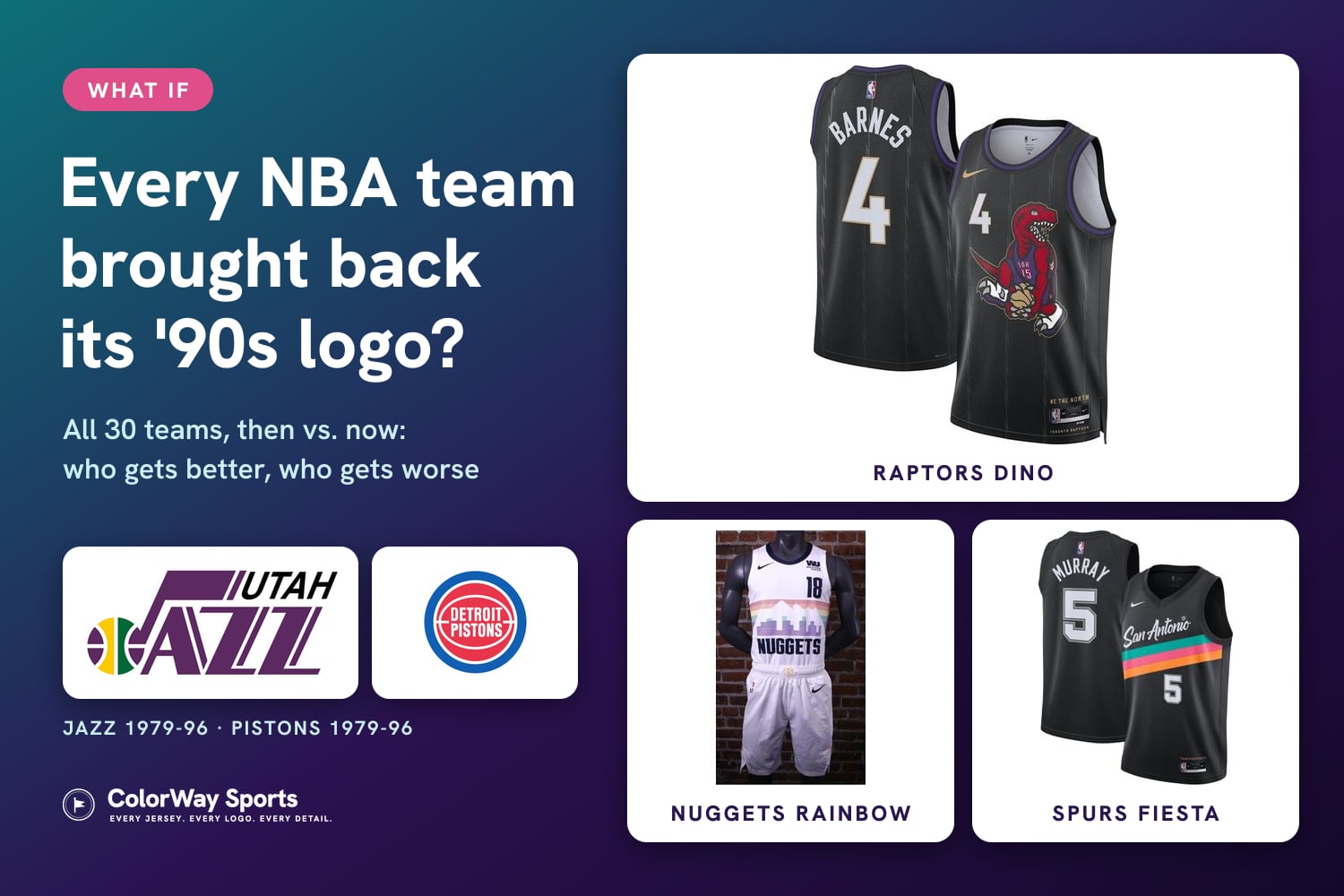
Fans love it. It has a real cult following, and the Bucks wore purple and green again on their "Light It Up" Classic Edition in 2022-23. It still ranks 3rd, because the 2015 buck head that replaced it is one of the best logos in the league, which we argued in what if every NBA team brought back its '90s logo. Bucks uniform schedule 2026-27
2. Los Angeles Clippers, 1984-2010: The Lakers Lookalike
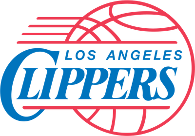
Team logo, 1984-2010
What it is: LOS ANGELES in small letters over CLIPPERS in big, slanted blue letters, across a basketball outlined in red, with red speed lines streaking off the side. The Clippers used it from their move from San Diego in 1984 until 2010, with small tweaks along the way.
Why it ranks 2nd: it's basically a copy of the Lakers logo. Put them next to each other:
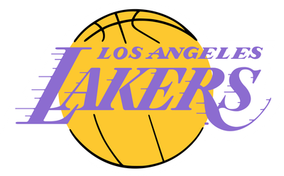
Lakers
Clippers
Team logos. Lakers logo from the late 1970s through the '90s.
The Lakers had been putting LOS ANGELES over their name in slanted letters across a basketball since the 1960s. The Clippers' logo has the same layout: small LOS ANGELES on top, the team name in big slanted letters across the middle of a ball, speed lines streaking off the side. The differences are the colors, blue and red instead of purple and gold, and the Clippers' ball being an outline instead of a solid circle. When you're the second team in a city, the last thing you want is a logo that reminds everyone of the first team, and this one did for 26 years.
Does anyone love it? It has nostalgia for longtime Clippers fans, and it was on the uniforms of the 2006 team that won a playoff series. But nobody calls it a classic. The current logo, from 2024, is a ship's hull inside a C that doubles as a compass, the first Clippers logo built around the clipper ship the team was named for. Clippers uniform schedule 2026-27 and Lakers uniform schedule 2026-27
1. Indiana Pacers, 1990-2005: The P
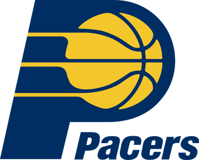
Team logo, 1990-2005
What it is: a navy blue P with a gold basketball in its loop and three gold speed lines running through it, with "Pacers" in heavy italic letters tucked under the loop. The Pacers redesigned their logo for 1990-91, dropping the white arm and the word Indiana from the previous version. It lasted until 2005.
Why it ranks 1st: it's the plainest logo of the decade. A letter with a ball in it and some speed lines is the first idea anyone would have for a team that starts with P, and it could just as easily be a parking sign, a bank or a pizza place. The name comes from the pace car at the Indianapolis 500 and harness racing, and the logo shows neither. Even the speed lines, the one nod to racing, are generic. And the 1990 update took things away, the arm and the state name, without adding anything.
Fans love it, because it's the Reggie Miller logo, and the Pacers still use the same idea today. It was refreshed in 2005 and again in 2017, and the P and the ball never changed. That's the case against it, too: for more than 35 years the team has kept a logo that started with the most basic idea available. Pacers uniform schedule 2026-27
Frequently Asked Questions
What is the worst NBA logo of the 90s?
In our ranking, the Indiana Pacers' 1990-2005 logo: a navy P with a gold basketball in its loop and three speed lines. It's the plainest logo of the decade, and it shows nothing about the pace car or Indianapolis behind the team's name.
What are the worst NBA logos of the 90s?
Our 10, from No. 10 to No. 1: Minnesota Timberwolves (1989-96), Cleveland Cavaliers (1994-2003), Portland Trail Blazers (1970-91), Phoenix Suns (1968-92), Philadelphia 76ers (1977-97), Houston Rockets (1972-95), New Jersey Nets (1990-97), Milwaukee Bucks (1993-2006), Los Angeles Clippers (1984-2010) and the Indiana Pacers (1990-2005).
Did the Clippers copy the Lakers logo?
The layout is nearly the same. The Lakers had used LOS ANGELES over their name in slanted letters across a basketball since the 1960s. The Clippers' 1984-2010 logo used the same layout in blue and red instead of purple and gold, with the ball drawn as an outline.
What was the Clippers' logo in the 90s?
LOS ANGELES and CLIPPERS in slanted blue letters across a basketball outlined in red, with red speed lines. It was the Clippers' logo from 1984 to 2010, with small tweaks. The current ship-and-compass logo arrived in 2024.
What was the Bucks' 90s logo?
A realistic green deer head over a purple triangle, above a green banner with MILWAUKEE and BUCKS. It was used from 1993 to 2006. Former NBA creative director Tom O'Grady has said the purple and green came from a Wimbledon cap and shirt.
Why were the Bucks purple?
From 1993 to 2006 the Bucks wore purple, green and silver. Tom O'Grady, who led the redesign, has said the colors came from a package with a dark green cap and a purple shirt from Wimbledon. The current cream and green colors arrived in 2015.
What was the Pacers' logo in the 90s?
A navy P with a gold basketball in its loop and three gold speed lines, with "Pacers" below. It was introduced for 1990-91 and used until 2005. The current Pacers logo is an updated version of the same idea.
What was the Nets' logo in the 90s?
From 1990 to 1997, the New Jersey Nets' logo was NETS in tall letters over a basketball, both filled with a red, white and blue gradient.
Why is the Rockets' old logo called ketchup and mustard?
Because of its red and yellow. The 1972-95 logo was a yellow basketball with "Rockets" in black inside a red ring. Houston brought Championship Yellow back in its 2026 rebrand, the first time in 30 years.
When did the Suns change their logo?
For the 1992-93 season, when they moved into America West Arena and introduced the "Streaking Sun." The original logo, used from 1968 to 1992, stacked PHOENIX, a basketball sun and SUNS.
What was the Cavs' logo in the 90s?
From 1994 to 2003, an orange basketball dropping through a net on a black square, with CAVS in blue. It arrived with the move to Gund Arena in 1994. Cleveland went back to wine and gold in 2003.
What was the Timberwolves' first logo?
A blue and white wolf head in front of half a basketball inside a green ring, used from 1989 to 1996. Minnesota's new 2026-27 crest is a modernized version of it.
When did the Trail Blazers' logo change?
The pinwheel has been the logo since 1970. It stood upright until 1991, when the stripes were tilted, and in 2017 the team reworked it with red on top and the lines set at 45 degrees.
What was the 76ers' logo in the 90s?
Until 1997, a white basketball with a red 7, a blue "6ers" and a circle of 13 stars, used since 1977. The team switched to black and gold in 1997 and brought the ball logo back in 2009.
The Bottom Line
The worst '90s logos weren't the loud ones. They were the ones with no idea: a word on a ball, a letter with a ball in it, a ball going through a net. The Pacers' P is the plainest of them all, and the Clippers spent 26 years with a logo that looked like their neighbors'. For the other side of the decade, see the 10 best '90s NBA logos, and for every team's '90s logo, read what if every NBA team brought back its '90s logo.
Logo years and details are from team and NBA releases, NBA.com, ESPN and newspaper coverage. Logos are shown for commentary and are the property of their teams. Rankings are ColorWay Sports' opinion. ColorWay Sports is an independent design site and is not affiliated with, endorsed by, or sponsored by the NBA or any of its teams.