Our first list of hidden details in sports logos covered the Brewers' glove, the Maple Leafs' veins and the Jerry West silhouette. We went back for more. Here are 28, across the NBA, NHL, MLB, the NFL, college sports and soccer.
Same rules as Part 1: every detail here is backed by the team, the designer or a major news outlet, museum or university. Where a popular story turns out to be wrong, we say so.
Quick Facts: More Hidden Logo Details
- Hidden letters: the Expos (an e and a b), the Grizzlies (an M in the claws), Inter Miami (an M in the herons' legs), the Islanders (a Y that's a hockey stick).
- Hidden numbers: 13 stars for 13 colonies (76ers), seven sun rays for Beckham's No. 7 (Inter Miami), five on five (Trail Blazers), five boroughs (NYCFC).
- Real places: Long Island (Islanders), El Palo Alto (Stanford), the Red Triangle (Sharks), Manchester's three rivers (Man City).
- Real objects: a 1953 subway token (NYCFC), a 101st Airborne patch (Panthers), a real Bengal tiger's paw (Clemson).
- Myths busted: the Packers' G doesn't mean greatness, and the Juventus J isn't a trophy.
NFL
Green Bay Packers: The G Stands for Green Bay, Not Greatness
You may have heard the G stands for "greatness." It doesn't. Packers team historian Cliff Christl traced that story to Tiki Barber, who said it during media day at Super Bowl XLV. The G means Green Bay. Vince Lombardi asked equipment manager Dad Braisher for a new helmet logo, and John Gordon drew the G for him. The Packers first wore it on August 5, 1961. Green Bay Packers uniform schedule
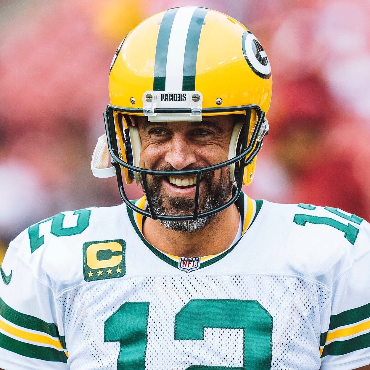
Photo: All-Pro Reels / CC BY-SA 2.0
MLB
Montreal Expos: The M Hides an e and a b
The 1969 Expos logo looks like a tricolor M for Montreal, and it is. But the left side of the M is also a lowercase e for Expos, and the right side is a lowercase b for baseball. Logo designer and historian Todd Radom has called it one of the great case studies in sports design. The twist is that the explanation came long after the logo. The club didn't spell out the e and the b until the late 1980s, about 20 years after the team started wearing it.
Seattle Mariners: The Compass Points the Wrong Way, on Purpose
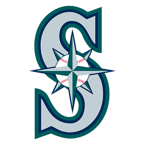
The compass rose the Mariners introduced in 1993 doesn't point north. It's turned so the main points run east and west, and a team spokesman told The Seattle Times in 1993 that it was done so the words "Seattle" and "Mariners" could read clearly around it. The Mariners' first logo, from 1977, had a trick of its own: the M was an upside-down trident. Seattle Mariners uniform schedule
NBA
Portland Trail Blazers: Five on Five
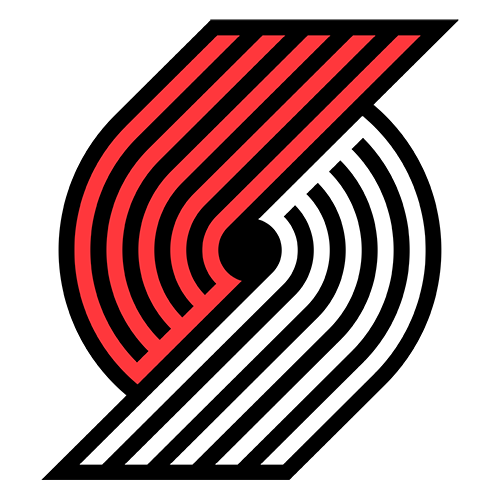
The pinwheel is a basketball game. Frank Glickman, a cousin of the team's founder, designed it in 1970, and the two sets of five lines, one black and one red, stand for the two teams of five players on the court. OPB reported that the logo has barely changed in more than 50 years. Portland Trail Blazers uniform schedule
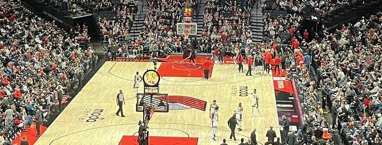
Photo: Another Believer / CC BY-SA 4.0
Memphis Grizzlies: The Claws Spell Memphis
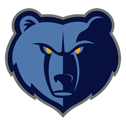
Look at the claw marks on the Grizzlies' 2018 marks. The team said when it unveiled the update that the middle three claws form an M for Memphis. Memphis Grizzlies uniform schedule
LA Clippers: A Ship, a Compass and True North

The Clippers' 2024 logo is a ship's hull with basketball seams, set inside a C that doubles as a compass. The team took the compass literally at its new arena: on the court at Intuit Dome, the N on the center-court compass points to true north, and the arena's coordinates are printed on the floor. Clipper ships are where the name came from in the first place, back in San Diego. LA Clippers uniform schedule
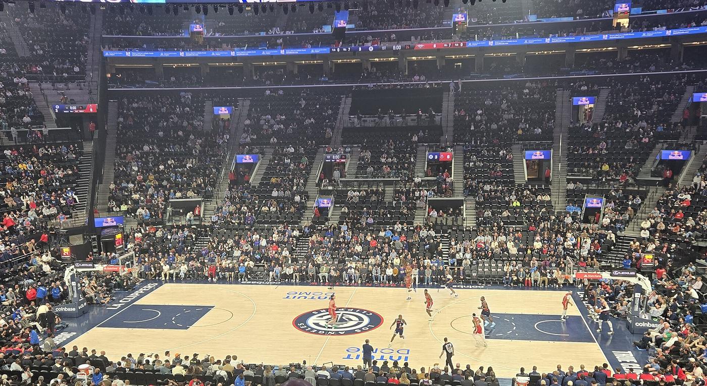
Photo: Spatms / CC BY-SA 4.0
Charlotte Hornets: The Body Is a Basketball
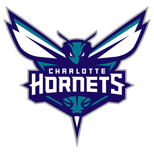
When the Hornets name came back in 2014, the new hornet's body was drawn as a basketball, and the side mark curls around into a C for Charlotte, Sports Illustrated reported at the unveiling. Charlotte Hornets uniform schedule
Minnesota Timberwolves: Pointed at True North
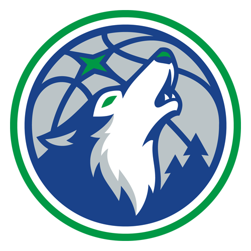
The 2017 Timberwolves logo, designed with RARE Design, puts the North Star behind the wolf, which the team called a nod to Minnesota's "North Star State" nickname and to true north. The team said the colors were taken from the Northern Lights. Minnesota Timberwolves uniform schedule
Philadelphia 76ers: Thirteen Stars
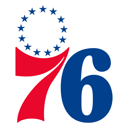
Count the stars above the 76ers' logo. There are 13, one for each of the original colonies, a detail the team called out when it updated its logos in 2015. Philadelphia 76ers uniform schedule
Brooklyn Nets: Black and White Like the Subway
The Nets' black and white identity, created with Jay-Z for the 2012 move to Brooklyn, was modeled on New York City subway signs from 1957, the last year the Dodgers played in Brooklyn, Designboom reported. Brooklyn Nets uniform schedule
New Orleans Pelicans: The Bird-de-Lis
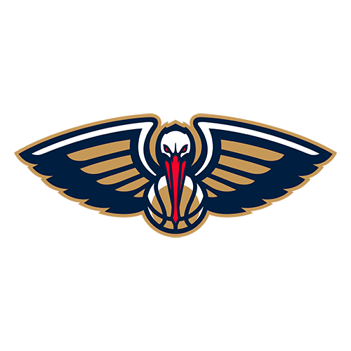
When the Pelicans name arrived in 2013, one of the new marks folded a pelican into the shape of a fleur-de-lis, the symbol of New Orleans. Fans nicknamed it the "bird-de-lis." New Orleans Pelicans uniform schedule
NHL
Winnipeg Jets: The Military Owns the Circle

The Jets' logo is a CF-18 fighter jet over a red maple leaf inside a Royal Canadian Air Force roundel. Canada's Department of National Defence owns that roundel, and The Globe and Mail reported in 2011 that the team signed a nine-page licensing contract to use it, which gives the military the final say on how it appears. Winnipeg Jets uniform schedule

Photo: All-Pro Reels / CC BY-SA 2.0
Philadelphia Flyers: The Dot Is a Puck
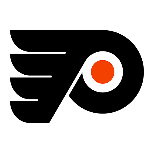
The orange dot in the middle of the Flyers' winged P is a puck. Sam Ciccone of the Mel Richmann agency designed the logo in 1967, and NHL.com says the dot was meant as a puck from the start. Philadelphia Flyers uniform schedule

Photo: All-Pro Reels / CC BY-SA 2.0
New York Islanders: The Y Is a Hockey Stick
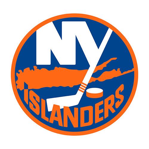
John Alogna designed the Islanders' logo in three days in 1972. The tail of the Y is a hockey stick, and the shape behind the letters is a map of Long Island. The Hockey News adds that the four stripes on the stick came to stand for the team's four straight Stanley Cups, though that was a meaning fans gave it later. New York Islanders uniform schedule
Photo: The Kip / CC BY-SA 4.0
Columbus Blue Jackets: A Flag and a Capital
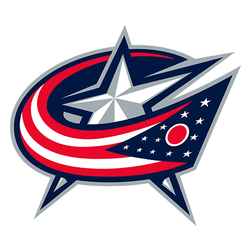
The Blue Jackets' logo is an Ohio flag curved into a C for Columbus, and the star marks the city as the state capital, The Hockey News explains. The team's Cannon third jersey, which it wore against the Rangers on October 17, has its own round cannon crest. Columbus Blue Jackets uniform schedule
Photo: Jenn G / CC BY-SA 2.0
Florida Panthers: A Shield From the 101st Airborne
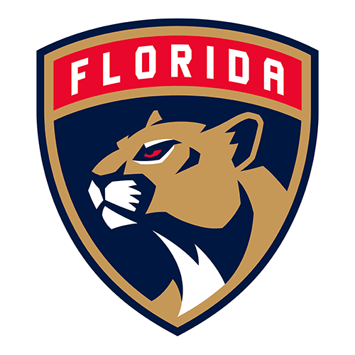
The shield behind the Panthers' 2016 logo comes from the patch of the U.S. Army's 101st Airborne Division. Owner Vincent Viola served in the 101st, and NHL.com says the shape is a tribute to it. Florida Panthers uniform schedule
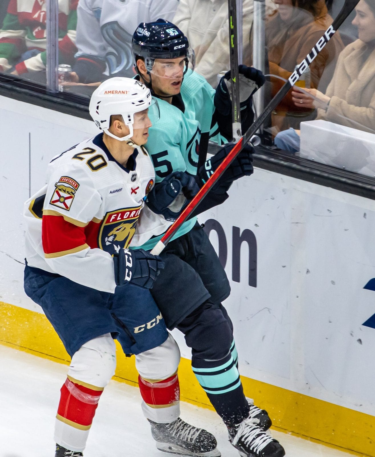
Photo: Jenn G / CC BY-SA 2.0
San Jose Sharks: The Triangle Is a Real Place
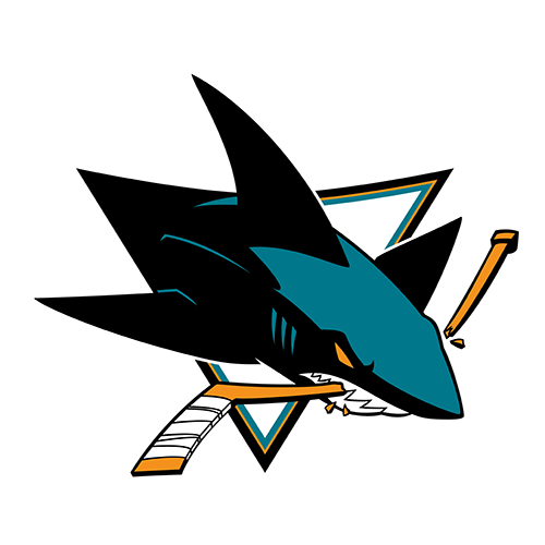
Terry Smith drew the original Sharks logo in 1991, a shark biting through a hockey stick. The triangle behind it is a nod to the "Red Triangle," the stretch of Northern California coast known for great white sharks, and its three points have also been read as the Bay Area's three big cities, KQED reported. San Jose Sharks uniform schedule
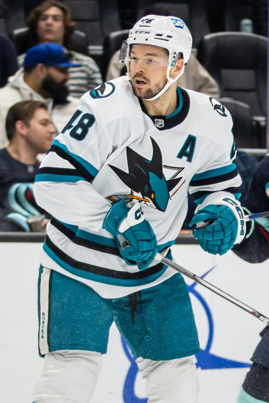
Photo: Jenn G / CC BY-SA 2.0
Anaheim Ducks: The Eyebrows Are Waves
The Ducks' 2024 logo updated the classic duck-mask design with a brighter orange. Los Angeles magazine reported that the curve of the duck's eyebrow is meant to suggest Pacific Ocean waves, and the lettering leans on art deco and Orange County's citrus history. Anaheim Ducks uniform schedule
College
Clemson Tigers: Cast From a Real Paw
John Antonio designed Clemson's Tiger Paw in 1970, and the school says it was made from a cast of a real Bengal tiger's paw provided by Chicago's Field Museum. The famous one o'clock tilt has a legend attached, but Clemson says the reason is simpler: a walking tiger's paw naturally turns out.
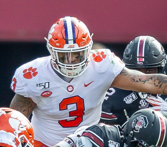
Photo: Gamecock Central / CC BY 2.0
Iowa Hawkeyes: Drawn on a Napkin
The Tigerhawk started as a sketch on a napkin. Bill Colbert drew it on a flight in 1979, according to the University of Iowa's licensing office. The logo is built from three pieces, and the gaps between them read as stripes.
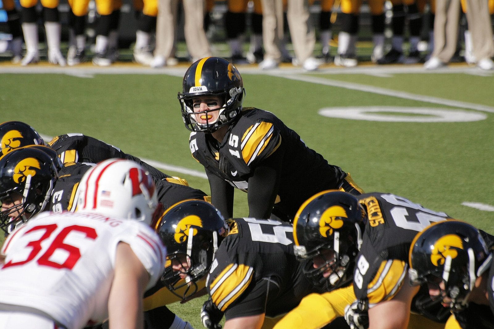
Photo: Phil Roeder / CC BY 2.0
Stanford: The Tree Is a Real Tree
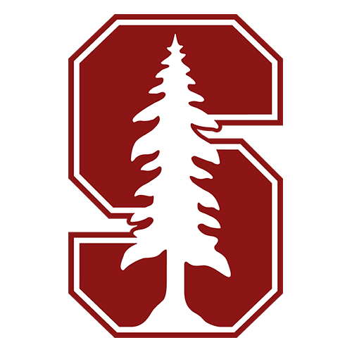
The tree inside Stanford's block S is El Palo Alto, the redwood that gave the city of Palo Alto its name, according to Stanford's identity guidelines. It still stands near the campus.
Soccer
Inter Miami: The Legs Make an M
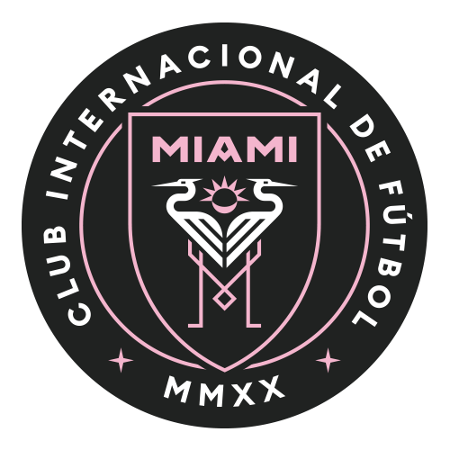
The two herons on Inter Miami's crest have legs that form an M, and the sun behind them has seven rays, a nod to co-owner David Beckham's No. 7, NBC Miami reported when the club launched.
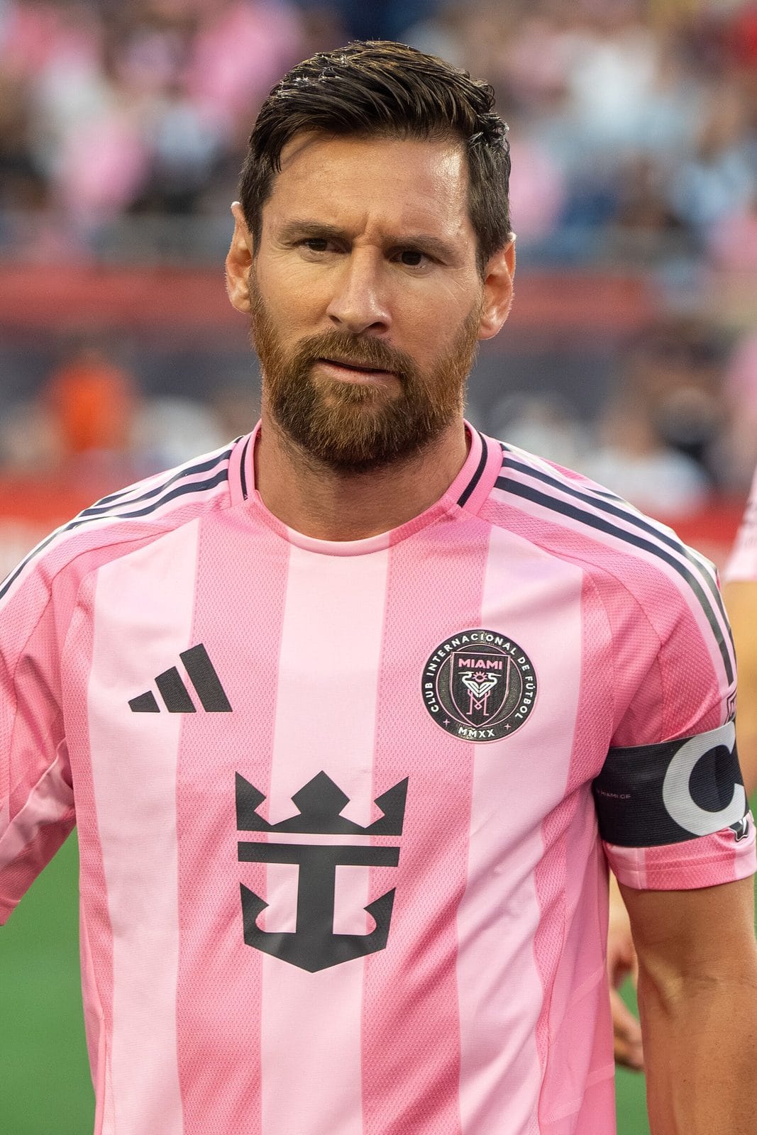
Photo: Bryan Berlin / CC BY-SA 4.0
New York City FC: A Subway Token
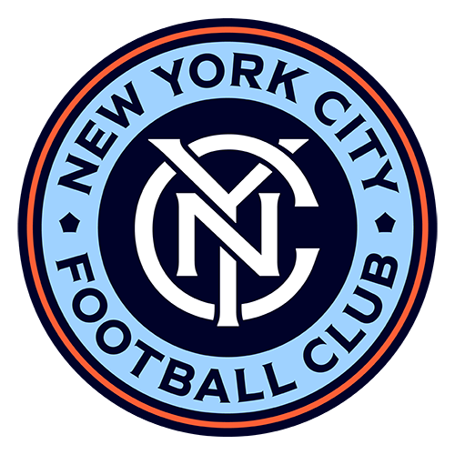
NYCFC's round crest is shaped like the 1953 New York City subway token, and the design firm behind it, Alfalfa Studio, says the five shapes in the center stand for the city's five boroughs.

Photo: Bryan Berlin / CC BY-SA 4.0
Atletico Madrid: Seven Stars in the Sky
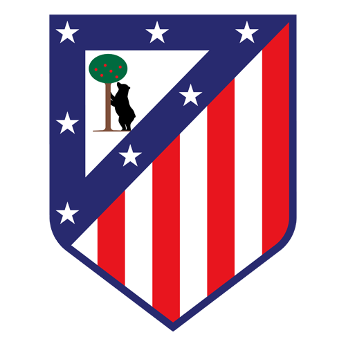
The seven stars on Atletico Madrid's crest come from the flag of the Community of Madrid, and LaLiga notes they're also linked to Ursa Major, the Great Bear constellation, which fits the bear and the strawberry tree below them.
Manchester City: Three Rivers
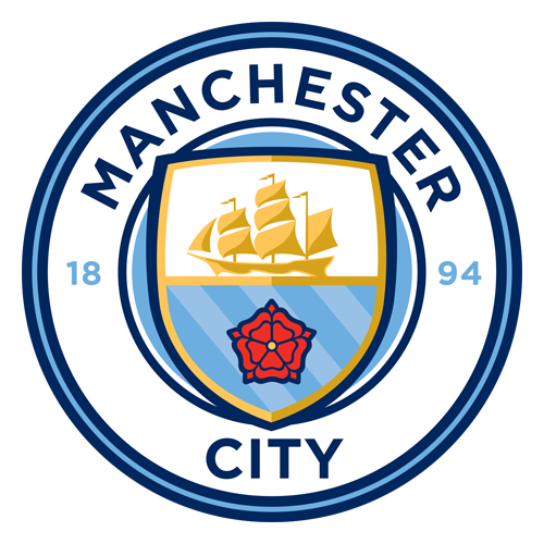
Manchester City's 2016 crest has three wavy lines for the city's three rivers, the Irwell, the Medlock and the Irk. City Football Group said 85% of fans backed keeping the ship, a symbol of Manchester's trading history.
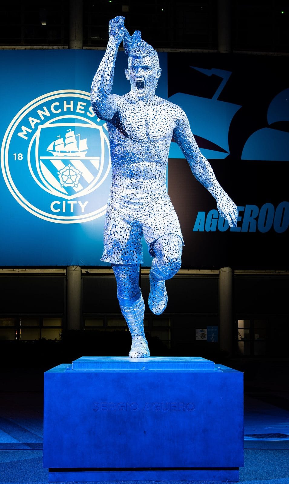
Photo: Christian David / CC BY-SA 4.0
Arsenal: The Cannon Kept Turning Around
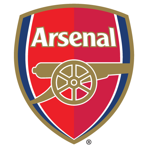
Arsenal's cannon has faced both ways. The club's own crest history says it pointed west in 1921-22, east in 1922-23 and west again from 1925-26, the direction it still faces today.
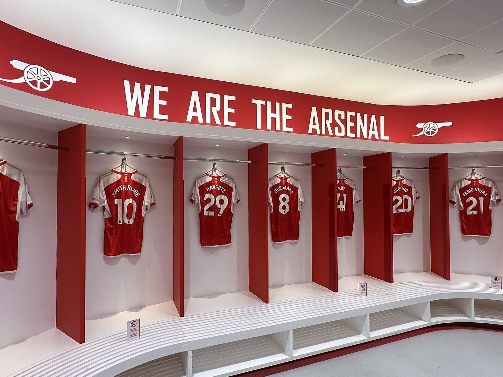
Photo: Matt Brown / CC BY 2.0
Juventus: The J Is Not a Trophy
A lot of fans read the 2017 Juventus crest as a trophy. The club says otherwise: the J is built from the black and white stripes, the shape of the Scudetto shield and the letter J. It was designed with Interbrand.
Barcelona: Who Really Drew the Crest
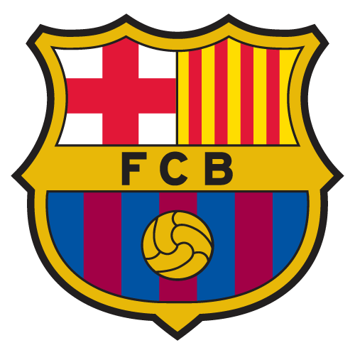
The story usually says player Carles Comamala drew Barcelona's crest. The club itself credits Santiago Femenia, who won a design contest in 1910. And when Barcelona tried a simplified crest in 2018 that dropped the letters FCB, it pulled the change back.
Photo: basquetcatala. Public domain.
Frequently Asked Questions
What does the G on the Packers helmet stand for?
Green Bay. The "greatness" story is a myth that team historian Cliff Christl traced to Tiki Barber at Super Bowl XLV media day. John Gordon drew the G in 1961.
What is hidden in the Expos logo?
The M for Montreal also contains a lowercase e for Expos and a lowercase b for baseball. The club didn't explain it until the late 1980s.
Why does the Mariners compass point east and west?
So the words "Seattle" and "Mariners" read clearly around it, a team spokesman said in 1993.
What does the Trail Blazers logo mean?
Two sets of five lines, one black and one red, for the two teams of five players on the court. Frank Glickman designed it in 1970.
What is hidden in the Grizzlies logo?
The middle three claw marks form an M for Memphis, the team said in 2018.
Why does the 76ers logo have 13 stars?
One for each of the 13 original colonies.
What does the orange dot in the Flyers logo mean?
It's a puck. Sam Ciccone designed the winged P in 1967.
What is hidden in the Islanders logo?
The tail of the Y is a hockey stick, and the shape behind it is a map of Long Island.
Who owns the roundel in the Winnipeg Jets logo?
Canada's Department of National Defence. The team signed a licensing contract in 2011 to use the Royal Canadian Air Force roundel.
What does the Blue Jackets logo mean?
It's an Ohio flag curved into a C for Columbus, with a star marking the state capital.
Where did the Florida Panthers shield come from?
The patch of the U.S. Army's 101st Airborne Division, where owner Vincent Viola served.
Why is the Clemson Tiger Paw tilted?
Clemson says a walking tiger's paw naturally turns out. The logo was made from a cast of a real Bengal tiger's paw.
What tree is in the Stanford logo?
El Palo Alto, the redwood that gave Palo Alto its name.
What is hidden in the Inter Miami crest?
The herons' legs form an M, and the sun has seven rays for David Beckham's No. 7.
Why is the NYCFC crest round?
It's shaped like the 1953 New York City subway token.
Is the Juventus logo a trophy?
No. The club says the J is made from the black and white stripes, the Scudetto shield and the letter J.
What do the three lines on the Manchester City crest mean?
Manchester's three rivers: the Irwell, the Medlock and the Irk.
Which way does the Arsenal cannon point?
West, as it has since 1925-26. It pointed east for the 1922-23 season.
The Bottom Line
Part 1 was about letters hiding in negative space. Part 2 is about where logos come from: a subway token, an army patch, a napkin on a plane, a real tiger's paw. The best ones still read as one simple shape from the upper deck, and the story is there for anyone who looks closer.
More Logo and Uniform Coverage
- Hidden details in sports logos, Part 1
- How every NFL team got its colors
- How every NBA team got its name
- How every NHL team got its name
- Who designs sports logos? Todd Radom on the Nationals, the Angels and peak uniform
Logo details via the teams and clubs (Packers.com, NBA.com, NHL.com, Arsenal.com, Juventus.com, FCBarcelona.com, LaLiga, City Football Group), Clemson University, the University of Iowa, Stanford University, The Seattle Times, The Globe and Mail, OPB, KQED, Sports Illustrated, The Hockey News, Los Angeles magazine, NBC Miami, Designboom, Alfalfa Studio and Todd Radom. Team logos are trademarks of their teams, shown for identification.