Once you see the M and the b inside the Brewers' glove, you can't unsee it. A lot of sports logos work like that. Designers hide letters in negative space, count championships in leaf veins and draw real places into animal heads, and most fans walk past them for years without noticing.
So we went looking for the real ones. Every detail on this list is confirmed by the team, the designer or a major newspaper, museum or university. Fan theories that nobody official has backed up did not make the cut, and where the story is disputed, we say so.
This follows our team-name history series. If you liked How Every NFL Team Got Its Name, start here.
Quick Facts: Hidden Logo Details
- Hidden letters: Brewers (m and b), Whalers (H), Golden Knights (V), Bucks (M), Mammoth (M and U), Kraken (a tentacle inside the S).
- Hidden numbers: the Maple Leafs' leaf has 31 points, 17 veins and 13 more veins at the top, and each one means something.
- Real places inside logos: the Mets' skyline, the Warriors' Bay Bridge, the Wild's Minnesota forest, Oregon's two stadiums and Utah's Wasatch Mountains.
- Real objects behind logos: a saber-toothed cat fang (Predators), a steel industry symbol (Steelers) and a carved cedar mask (Seahawks).
- A secret the league never confirmed: the NBA logo is Jerry West, according to the man who designed it.
- Oldest detail on the list: the Canadiens' CH, from 1917.
- Newest: the Titans' three stars, on a logo introduced in March 2026.
NFL
Pittsburgh Steelers: The Stars Are a Recipe
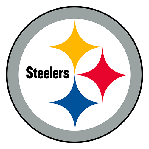
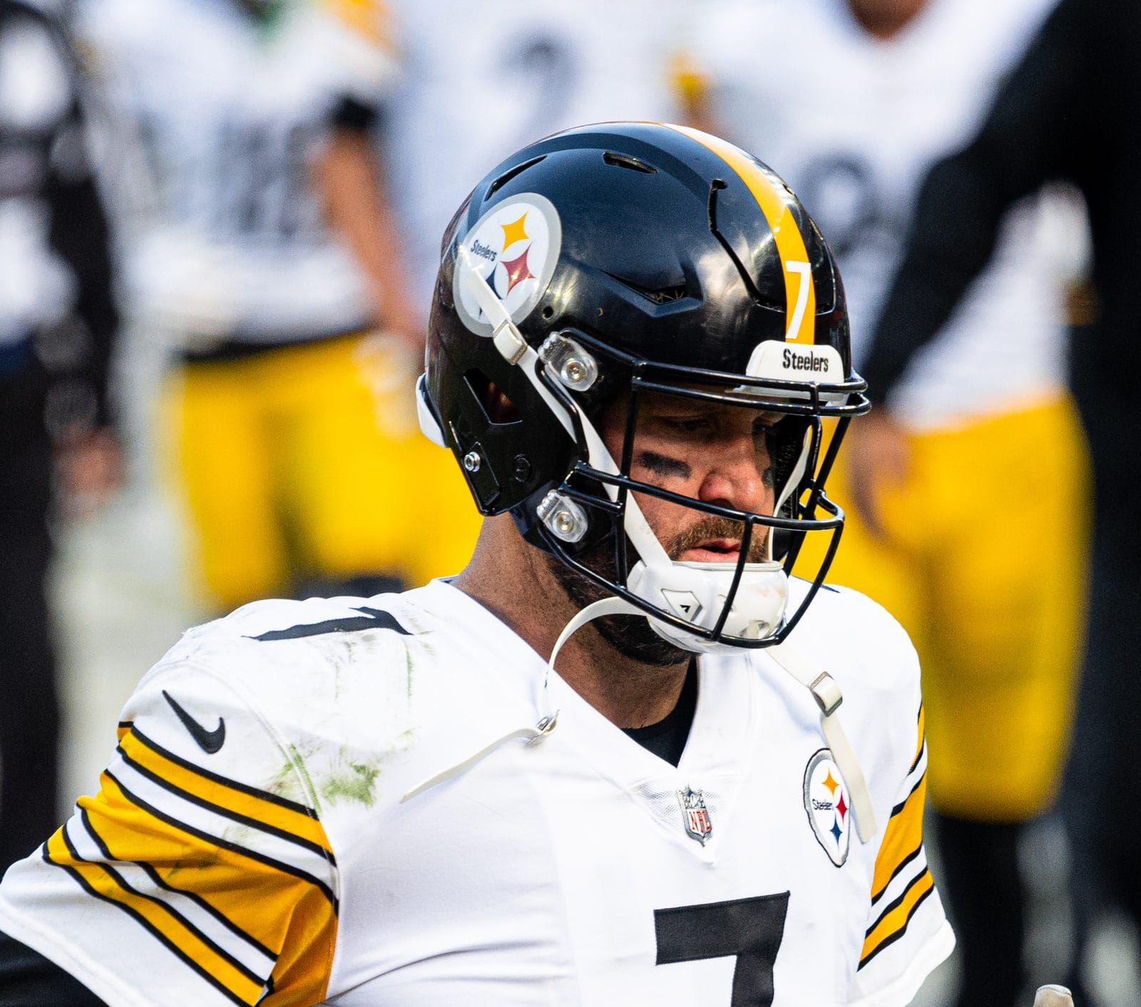
Photo: Erik Drost / CC BY 2.0
Those aren't diamonds or stars. They're hypocycloids, and they come from the Steelmark, a symbol the American Iron and Steel Institute made for the steel industry. The Steelers say each color stands for something used to make steel: yellow for coal, orange for iron ore and blue for steel scrap. Republic Steel suggested the team wear it in 1962. Art Rooney Sr. then asked permission to change the word "Steel" to "Steelers."
It's also why the logo sits on just one side of the helmet. The team says equipment manager Jackie Hart put the first batch on one side as a test. The 1962 team went 9-5, the best record in franchise history at the time, and the Steelers never added the second side. Pittsburgh Steelers uniform schedule 2026
Houston Texans: The Bull Is the Texas Flag
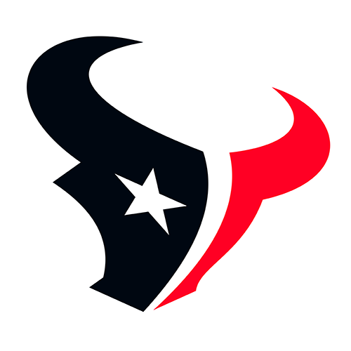
When Bob McNair revealed the Texans' logo on September 6, 2000, it was a bull's head split down the middle to echo the Texas flag, with a lone star for the eye. That star does a job, too. The team says its five points stand for pride, courage, strength, tradition and independence. The Texans updated the logo's colors in 2024 and kept the bull and the star eye. Houston Texans uniform schedule 2026
Seattle Seahawks: Inspired by a Kwakwaka'wakw Mask
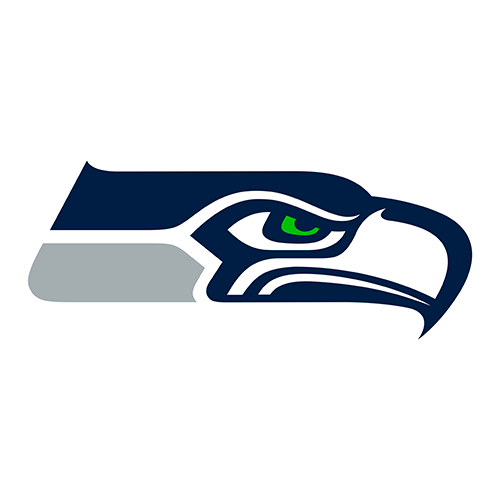
The original 1976 Seahawks logo was drawn from Northwest Coast Indigenous art, and in 2014 researchers found the likely source. Burke Museum curator emeritus Bill Holm linked it to a Kwakwaka'wakw transformation mask carved from red cedar in British Columbia in the late 1800s or early 1900s. The mask had been in a 1950 book the NFL's designers used for reference. When the mask is closed it shows a bird, and that's the shape that matches the logo. When it's open it shows a human face. Museums had always displayed it open, which is part of why nobody made the connection for almost 40 years.
The mask now lives at the University of Maine's Hudson Museum, which loaned it to the Burke Museum in Seattle in 2014. Seattle Seahawks uniform schedule 2026
Los Angeles Rams: The First Helmet Logo Was Hand Painted

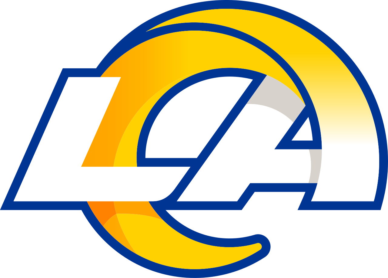
The horns on the Rams' helmet are the oldest helmet logo in the NFL. In 1948 halfback Fred Gehrke, who had studied art, painted horns on an old college helmet and showed it to owner Dan Reeves. Reeves had him paint 75 helmets for $1 apiece, and Gehrke spent the summer doing it. In 1972 Gehrke's idea earned him the Pro Football Hall of Fame's first Daniel F. Reeves Pioneer Award, and the horns are still on the helmet today. Los Angeles Rams uniform schedule 2026
Tennessee Titans: Three Stars, Three Tennessees
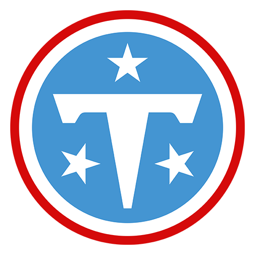
The Titans' new logo, revealed March 12, 2026, puts three white stars around the T. They come from the Tennessee state flag and stand for the state's three grand divisions: East, Middle and West Tennessee. The team repeats the idea with three navy stars on the back of the jersey neckline and under the arms. Tennessee Titans uniform schedule 2026
MLB
Milwaukee Brewers: The Glove Is Two Letters
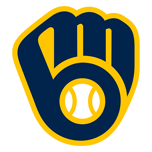
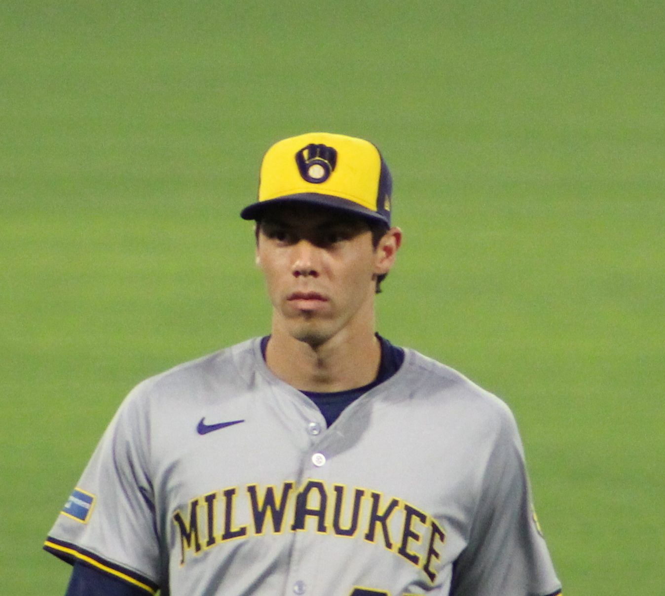
Photo: Sewageboy / CC BY-SA 4.0
The most famous hidden detail in baseball. The fingers are a lowercase m and the thumb and pocket are a lowercase b: m for Milwaukee, b for Brewers. Tom Meindel, a 30-year-old art student at the University of Wisconsin-Eau Claire, drew it for a team contest in fall 1977 that drew 1,932 entries. He was paid $2,000. The logo was used from 1978 to 1993 and came back as the primary logo in 2020, just in time for this year's World Series run. Milwaukee Brewers uniform schedule 2026
New York Mets: Every Building Has a Job
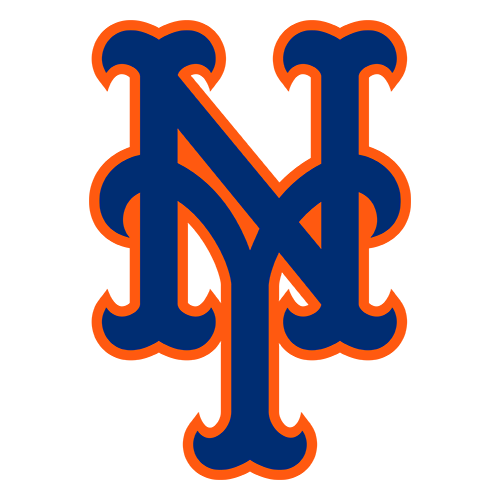
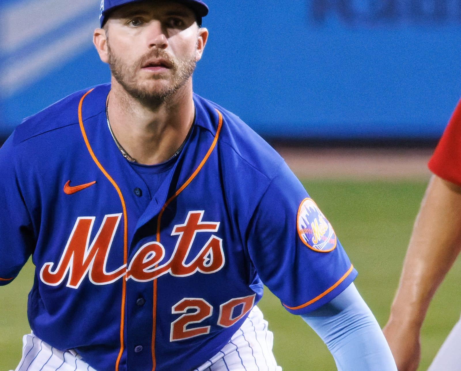
Photo: D. Benjamin Miller / CC0
The Mets' round logo, by sports cartoonist Ray Gotto, was unveiled November 16, 1961, and the skyline isn't random. From left: a church spire for Brooklyn, the "borough of churches," then the Williamsburgh Savings Bank, Brooklyn's tallest building at the time, then the Woolworth Building, midtown, the Empire State Building and the United Nations. The bridge in front stands for the Mets bringing the National League back to all five boroughs.
Designer Todd Radom has documented a twist: when the logo was redrawn for the digital age in the early 1990s, the Williamsburgh tower turned into a different-looking building. One of Gotto's original details has been missing ever since. New York Mets uniform schedule 2026
Minnesota Twins: No M, On Purpose

The TC stands for Twin Cities, and the reason it exists is a local rivalry. When the Senators moved to Minnesota in 1961, the Griffith family didn't want an M on the cap because they thought St. Paul would read it as a Minneapolis team. Twins president Dave St. Peter told MLB.com they "didn't want to upset the city of St. Paul." The club swapped to an M in 1987, then brought TC back, and it became the primary logo again in 2010. Minnesota Twins uniform schedule 2026
NBA
The NBA Logo: It's Jerry West, Says the Designer
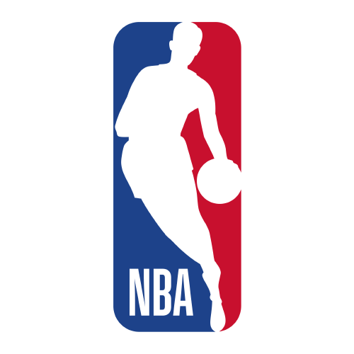
Brand consultant Alan Siegel designed the NBA logo in 1969, working from a photo of Lakers guard Jerry West taken by photographer Wen Roberts. Siegel confirmed it to the Los Angeles Times in 2010: "It's Jerry West." The league has never officially said so. Siegel said the NBA wanted to "institutionalize it rather than individualize it," since it didn't want the league's identity tied to one player.
Milwaukee Bucks: An M and a Basketball
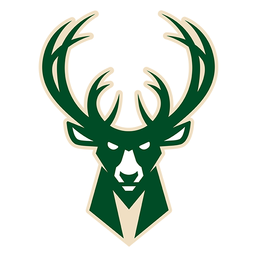
The Bucks' logo, unveiled April 13, 2015, hides two things. The buck's chest is shaped like an M for Milwaukee, and the gap between the smaller antlers forms a basketball. The rack also grew from eight points to 12, which the team said was meant to show a more mature animal. Brooklyn design firm Doubleday & Cartwright worked on it with the team and the NBA for nine months. Milwaukee Bucks uniform schedule 2026-27
San Antonio Spurs: The U Has Always Been a Spur
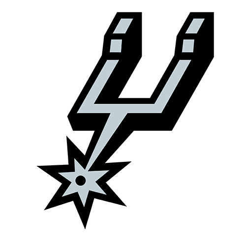
When the franchise moved from Dallas in 1973, Red McCombs asked a local ad agency, the Pitluk Group, for a logo. Artist Finis Collins was told management wanted "some way to show the spur as part of the symbol," so he made the U in SPURS a spur. The lettering, colors and points have changed many times since, but the spur has always stayed in the middle of the name. San Antonio Spurs uniform schedule 2026-27
Golden State Warriors: That's Not the Golden Gate
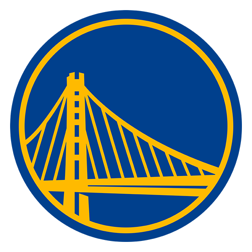
Plenty of people assume it's the Golden Gate. It isn't. The Warriors' logo has shown the Bay Bridge since 2010. The old "The City" look from the San Francisco years used the Golden Gate, but the team picked the Bay Bridge because it actually connects the East Bay and San Francisco. When the Warriors moved back to San Francisco in 2019 they kept it, and the updated logo drew the Bay Bridge more accurately. Golden State Warriors uniform schedule 2026-27
NHL
Toronto Maple Leafs: The Leaf Is a History Lesson
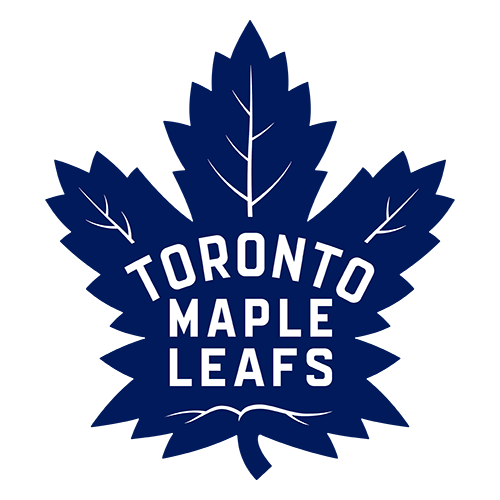
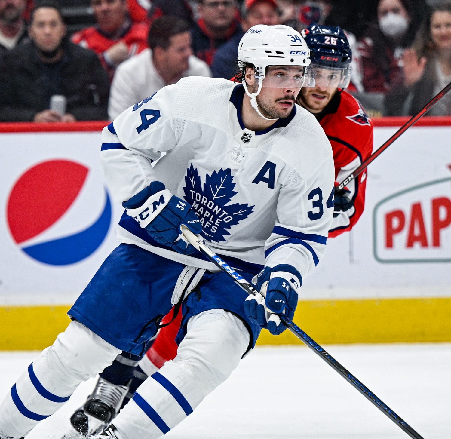
Photo: All-Pro Reels / CC BY-SA 2.0
Count them. The leaf the Maple Leafs introduced in 2016 has 31 points for 1931, the year Maple Leaf Gardens opened. It has 17 veins for 1917, the year the franchise was founded. And there are 13 veins at the top, one for each of the team's 13 Stanley Cups. If Toronto ever wins a 14th, the leaf will be out of date. Toronto Maple Leafs uniform schedule 2026-27
Hartford Whalers: The H Was a Bonus
The best hidden letter in sports belongs to a team that doesn't exist anymore. Peter Good designed the Whalers' logo in 1979: a W, a whale's tail on top, and an H for Hartford in the space between them. Good said in an interview that the H wasn't on the team's wish list. Owner Howard Baldwin liked an early version because it had an H, and Good said that "was not a requirement. That was just one that I tried." The Whalers became the Carolina Hurricanes in 1997, and Good died in 2023. Carolina Hurricanes uniform schedule 2026-27
Nashville Predators: The Fang Was Found Downtown
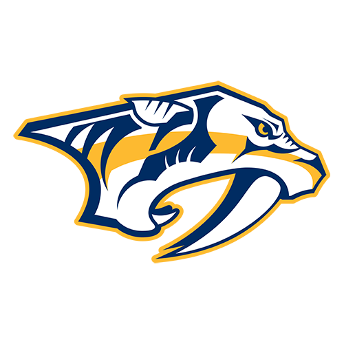
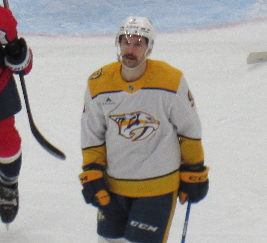
Photo: The Kip / CC BY-SA 4.0
The Predators' saber-toothed cat is based on a real one. In 1971, workers digging the foundation of the First American National Bank building in downtown Nashville found a cave with a nine-inch fang and a foreleg bone of a saber-toothed cat, extinct for at least 10,000 years. The team unveiled its logo in that same building on September 25, 1997, 26 years later. Nashville Predators uniform schedule 2026-27
Minnesota Wild: A Forest, or an Animal
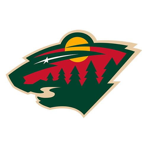
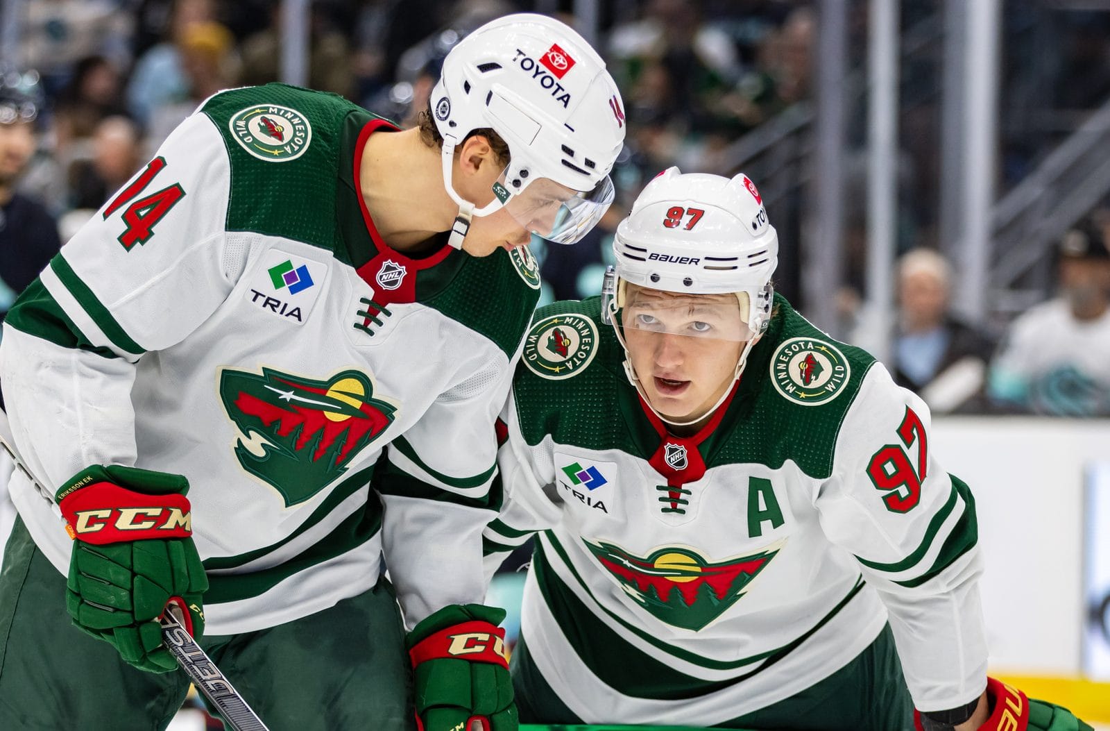
Photo: Jenn G / CC BY-SA 2.0
Look at it one way and the Wild logo is a Minnesota landscape: pine trees, a winding river, a shooting star and a sun setting in a red sky. Look again and it's an animal's head, with an eye, a nose, a mouth and an ear all drawn from the scene. NHL.com says the animal isn't a bear, as many people think. It's meant to be a generic wild animal. Minnesota Wild uniform schedule 2026-27
Vegas Golden Knights: The V Is in the Visor
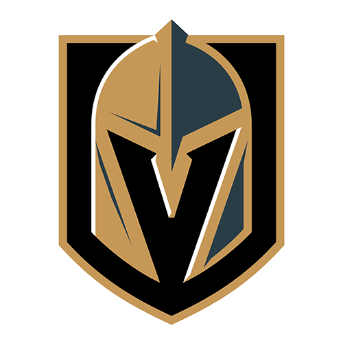
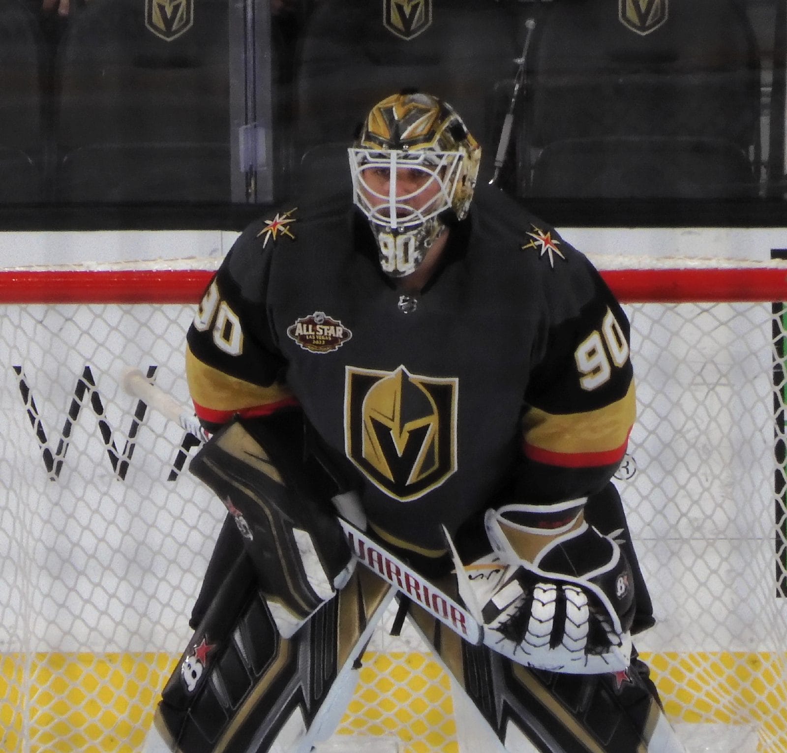
Look at the dark space in the middle of the helmet. The eye slits and the gap below them form a V for Vegas. The team revealed it in November 2016, and The Hockey News pointed out it was the same negative-space trick that made the Whalers' H famous. Vegas Golden Knights uniform schedule 2026-27
Montreal Canadiens: The H Isn't for Habitants
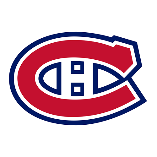
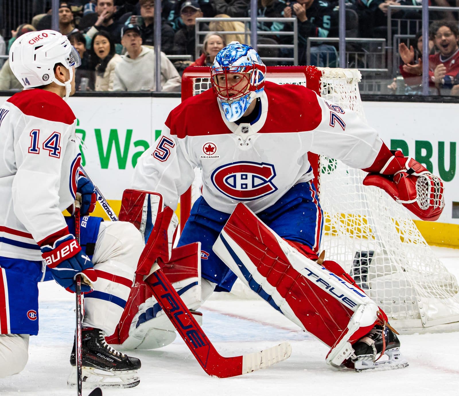
Photo: Jenn G / CC BY-SA 2.0
The CH stands for Club de hockey Canadien, the team's official name, and it has been on the sweater since 1917. The H means hockey. The "Habitants" story is a myth that The Canadian Encyclopedia traces to Madison Square Garden owner Tex Rickard, who told a reporter in 1924 that the H stood for habitant. The nickname "Habs" stuck anyway. Montreal Canadiens uniform schedule 2026-27
Seattle Kraken: Something Is Hiding in the S

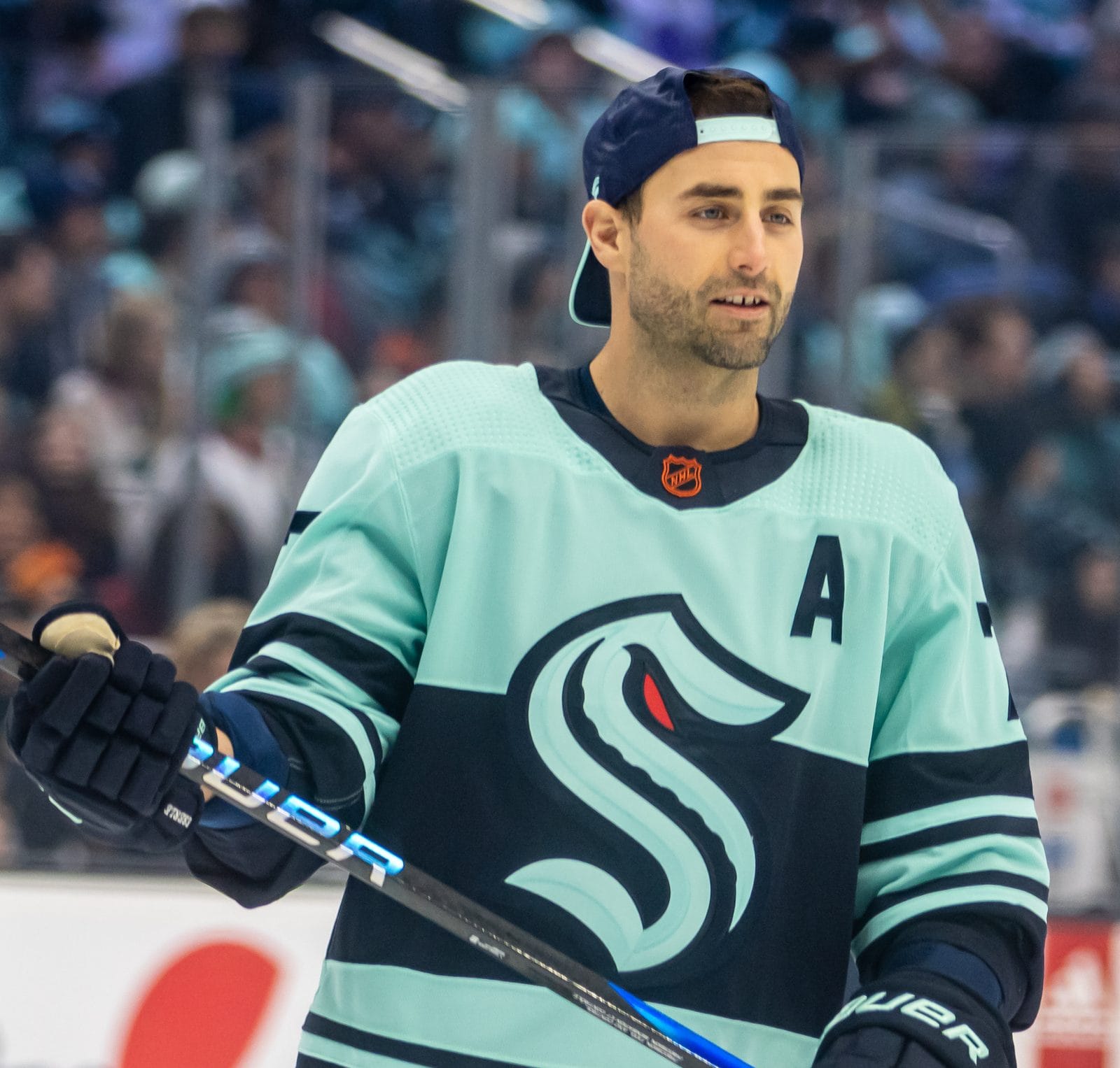
Photo: Jenn G / CC BY-SA 2.0
The Kraken's S borrows its shape from the Seattle Metropolitans, who in 1917 became the first American team to win the Stanley Cup. Look closer and the S isn't just a letter. NHL.com described it at the reveal as an S like the Metropolitans' logo, "but with a tentacle and red eye." The tentacle curls through the middle of the letter, and the single red spot is the Kraken's eye. The team revealed it July 23, 2020, with adidas. Seattle Kraken uniform schedule 2026-27
Washington Capitals: A Stick, a Puck and Three Stars
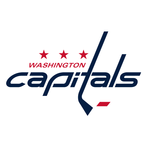
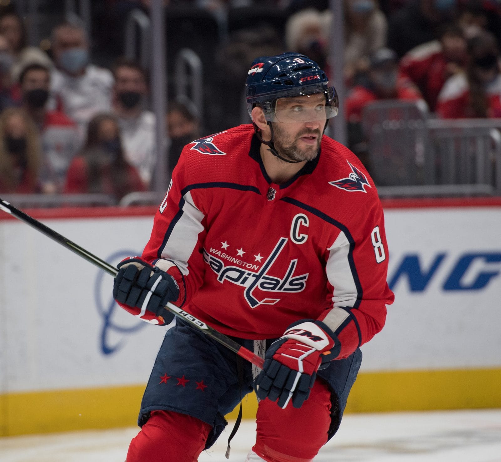
Photo: All-Pro Reels / CC BY-SA 2.0
Check the t in the Capitals' script logo, which came back in 2007. The team says it's a hockey stick, with a puck at the end, just like on the original 1970s jerseys. The three stars above it stand for Maryland, Virginia and Washington, D.C., the three parts of the Capitals' market. They're also a nod to hockey's three stars of the game. Washington Capitals uniform schedule 2026-27
Utah Mammoth: A Mountain, a State and Two Letters

The newest NHL logo has the most going on. The snowy peaks on top of the mammoth's head are the Wasatch Mountains, so it looks, as the team's designer Ben Barnes put it, "forged right out of the mountain." An outline of the state of Utah and an M for Mammoth are hidden inside, and the curved tusk is shaped like a U, which the team spells out in its secondary logo. The Mammoth name and logo were unveiled in May 2025. Utah Mammoth uniform schedule 2026-27
College
Oregon Ducks: The O Is Two Stadiums

Oregon's O isn't just an oval. The university says the inside is shaped like the track at Hayward Field and the outside follows the rim of Autzen Stadium. Nike unveiled it December 23, 1998, and the football team first wore it in 1999. Oregon credits Nike designer Tinker Hatfield, a 1977 Oregon architecture graduate. In the school's own oral history, though, former Nike designer Rick Bakas says the two-stadium idea was his, so who drew it first is still disputed. Oregon uniform schedule 2026 and Oregon's Origin of Speed uniforms, inspired by Hayward Field
Georgia Bulldogs: They Asked the Packers First
Georgia's G and Green Bay's G look related, and they are. When Vince Dooley redesigned Georgia's uniform for the 1964 season, Anne Donaldson, the wife of assistant coach John Donaldson and a UGA commercial art graduate, drew the G. Georgia's own history says Dooley knew it looked like the Packers' G, so athletic director Joel Eaves called Green Bay for permission. The Packers said yes. Georgia uniform schedule 2026 and Green Bay Packers uniform schedule 2026
Frequently Asked Questions
What is the hidden letter in the Brewers logo?
There are two. The glove's fingers form a lowercase m and the thumb and pocket form a lowercase b, for Milwaukee Brewers. Art student Tom Meindel designed it in 1977 and won $2,000.
Is the NBA logo really Jerry West?
The designer says yes. Alan Siegel told the Los Angeles Times in 2010 that he traced it from a photo of Jerry West. The NBA has never officially confirmed it.
What does the H in the Whalers logo stand for?
Hartford. It's formed by the negative space between the W and the whale's tail. Designer Peter Good drew it in 1979.
What do the numbers in the Maple Leafs logo mean?
The leaf has 31 points for 1931, when Maple Leaf Gardens opened, 17 veins for the team's founding in 1917, and 13 veins at the top for its 13 Stanley Cups.
What do the colors in the Steelers logo mean?
Yellow is coal, orange is iron ore and blue is steel scrap, the three ingredients of steel. The logo is the steel industry's Steelmark, which the team adopted in 1962.
What does CH stand for on the Canadiens jersey?
Club de hockey Canadien. The H means hockey, not "habitants," which is a myth that dates to 1924.
What is hidden in the Golden Knights logo?
A V for Vegas, formed by the negative space in the helmet's visor.
Is that the Golden Gate Bridge in the Warriors logo?
No. It's the Bay Bridge, which connects Oakland and San Francisco. It has been in the logo since 2010.
What animal is in the Minnesota Wild logo?
No specific animal. NHL.com says it's meant to be a generic wild animal, drawn from a Minnesota forest scene of pine trees, a river, a shooting star and a red sky.
Where did the Predators' saber-toothed cat come from?
A real fossil. Workers found a saber-toothed cat's fang and leg bone in a cave under downtown Nashville in 1971, and the team unveiled its logo in the same building in 1997.
The Bottom Line
The best logos do two jobs. From the upper deck they read as one simple shape, and up close they tell you where the team is from. That's why the ones on this list last. The Brewers brought their glove back after 26 years, the Whalers' tail is still on hats a generation after the team left, and the Leafs built their own history into a leaf. If your favorite team's logo has a secret we missed, tell us. If it's documented, we'll add it.
More Logo and Uniform Coverage
- How every NFL team got its name
- How every MLB team got its name
- How every NBA team got its name
- Who designs sports logos? Todd Radom on the Nationals, the Angels and peak uniform
- 2026 World Series uniforms and patch
Logo details via each team's official site (Steelers.com, HoustonTexans.com, TennesseeTitans.com, MLB.com, NHL.com), the University of Washington's Burke Museum and the University of Maine's Hudson Museum, the University of Oregon, the University of Georgia, The Canadian Encyclopedia, Connecticut Public, The Hockey News, ESPN, CBS Sports, SFGATE, KSAT, FOX 13 Salt Lake City, the Pro Football Researchers Association and designer Todd Radom. Logos are the property of their teams.