The Houston Comets have a logo again. The team unveiled its new identity on Thursday, October 29, 2026, at an event at POST Houston in downtown Houston, ahead of its return to the WNBA in 2027. The colors are red, navy and silver, the same family the original Comets wore when they won the league's first four championships from 1997 to 2000.
The new primary logo is a slanted navy H with a red basketball comet shooting through the middle of it. Four stars inside the H stand for the four titles, and the one white star is a nod to Texas, the Lone Star State. The set also includes a round HOUSTON COMETS badge and two wordmarks. Here is every new mark, how it compares to the original Comets logos, and a grade for each.
Quick Answers
- When did the Comets reveal their new logo? Thursday, October 29, 2026, at POST Houston.
- What is the new logo? A navy H, tilted upward, with a red basketball comet forming the crossbar and four four-pointed stars inside the letters.
- What do the stars mean? The team says the four stars honor the four straight WNBA championships (1997, 1998, 1999, 2000). Three are silver. The white star pays tribute to Texas, the Lone Star State. It is one of the four, not a fifth.
- What are the colors? Red, navy and silver.
- When do the Comets play again? In the 2027 WNBA season, at Toyota Center.
- Have the uniforms been revealed? No. The team says more brand elements are coming in the coming months.
- Our overall grade: B. A smart, faithful update of the old Comets H, with a comet tail that looks more like a lightning bolt than it should.
The Reveal
The Comets posted the new look on X the night of the event with the line "Inspired by legacy. Created for our future." The thread walks through the badge, the H, the comet, the four stars and the white star in the team's own words.
Gretchen Sheirr, president of business operations for the Rockets and Comets, called it "a landmark moment for the Comets, for Houston, and for the continued growth of women's sports." Comets legend Cynthia Cooper, who won all four titles with the team, told the Houston Chronicle: "The logo's amazing."
The New Primary Logo: The H
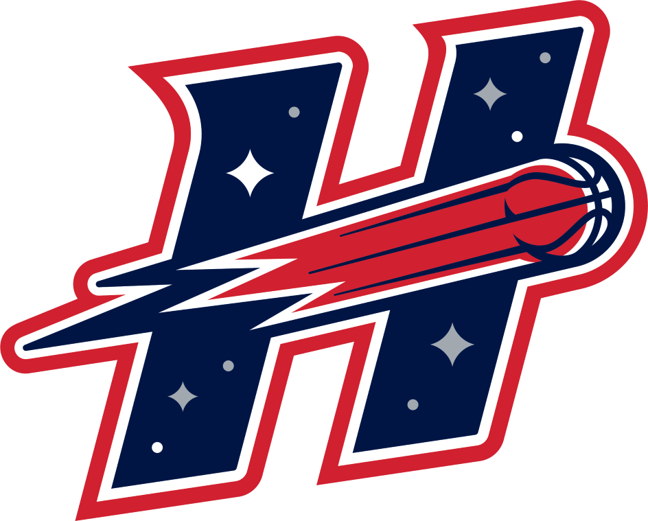
The new primary logo, via the Houston Comets
Here is what is in it, piece by piece:
- The H. A navy H, leaning forward and tilted upward. The team calls it the "ascending H" and says it stands for ambition and progress. Sheirr told the Chronicle the upward angle represents the team's upward trajectory.
- The comet. A red basketball with a long tail streaks left to right through the middle of the H and becomes the crossbar. The team describes it as the comet traveling "through the bridge of the H."
- The stars. Four four-pointed stars sit inside the H: one in the upper left (white), one in the upper right, one in the lower left and one in the lower right (all silver). Small dots fill in the rest of the night sky.
- The outlines. The whole logo is wrapped in a white outline and then a red one.
Where it comes from
This H is not new to Houston. The original Comets had an alternate logo of a basketball comet shooting through an H on a field of stars. The Chronicle reported the new H draws on that original secondary logo. What changed is that the H has been promoted to primary, redrawn with sharper, slanted letters, and given a cleaner set of stars.
The original Comets primary logo was different: a red basketball comet flying over the word "Comets" in script, on a starfield. Bleacher Report reported the team could not bring that design back as its primary logo because of WNBA rules. So the comet and the stars carried over, and the script did not.
Grade: B+
This is the right idea. A one-letter mark is easy to put on a hat, a court and a jersey, and it carries real history, since Comets fans already know the H with the comet through it. The stars are the best part: four titles are the whole reason the name means something, and putting them inside the logo is a clear, honest way to say so.
Two things keep it short of an A. First, the comet's tail is drawn as a jagged zig-zag, and from a distance it reads as a lightning bolt, not a comet. Second, the white-star story is a little confusing. The team says four stars equal four titles and the white star is for Texas, which means one star is doing two jobs. Most fans will count four stars and stop there, which is fine, but the symbolism is cleaner on paper than it is on a T-shirt.
The New Global Logo: The Round Badge
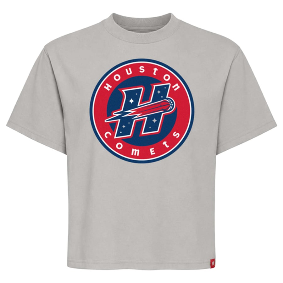
The new round badge on a Comets T-shirt, via the Comets Shop
The badge puts the H on a navy circle inside a red ring, with HOUSTON curved around the top and COMETS around the bottom in white. A thin white line runs inside the ring, and a navy line wraps the outside.
It also matches the Rockets. In June the Rockets launched a new global logo shaped like a space mission patch as part of their own rebrand (our grades here). The Comets' round badge is a mission patch in spirit too, which makes sense for two teams in a city with NASA's Johnson Space Center.
Grade: B
Clean, readable and useful. It will look good on a hat patch and at center court. It is also the most expected part of the set. Round badges with the city on top and the nickname on the bottom are everywhere right now, and nothing here would surprise you.
The New Wordmarks: HOUSTON and COMETS
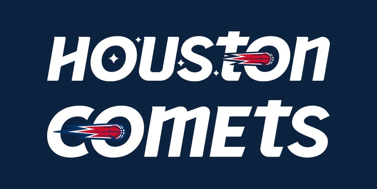
HOUSTON via the Houston Comets; COMETS from the Comets Shop logo
There are two wordmarks, one for each word. In HOUSTON, the second O is a red basketball comet with its tail streaking in from the left, and small four-pointed stars float around the first few letters. In COMETS, the O is the comet. Both use rounded, heavy letters with a lowercase-style t (and in COMETS, a lowercase-style m), mixed in with capitals.
That lowercase t is a Houston thing. The Rockets brought back their signature lowercase t in their June rebrand, and the Comets now share it.
Grade: B-
The comet-as-O idea is fun, works well in COMETS, and ties every piece of the set together. The mixed lowercase and capital letters are the weak spot. They look friendly and modern up close, but at a glance HOUSTON reads a little uneven, with the tall t sticking up out of the line. It will look better on a jersey chest than it does in a press graphic.
Old vs. New
| Piece | Original Comets (1997-2008) | New Comets (2027) |
|---|---|---|
| Primary logo | Red basketball comet over "Comets" script on a starfield | Slanted navy H with a basketball comet through it |
| The H | Alternate logo: comet through an H with stars | Promoted to primary and redrawn |
| Stars | A starfield background | Four stars with a meaning: the four titles, plus the white star for Texas |
| Colors | Red, navy and silver family | Red, navy and silver |
| Script | "Comets" in script | Gone; heavy rounded wordmarks instead |
The honest summary: this is a modern version of the old Comets, not a new idea. Sheirr put it simply to the Chronicle: "We modernized it." Comets senior creative director Jose Lopez told reporters, per Bleacher Report, that "the logos, they're a memory," and that people would gravitate to the color scheme.
We think that was the right call. When a team brings back a name with four championships behind it, fans want to recognize it, and they will. The cost is the script. The old "Comets" script on the starfield was the most 1990s, most personal part of the original look, and losing it makes the new set feel more like a corporate system and less like the team Cooper, Sheryl Swoopes and Tina Thompson played for.
The Comet Problem
Look closely at the tail on the H. It is a set of sharp zig-zags in navy, white and red, with straight red streaks closer to the ball. A real comet tail is soft and fans out. This one is angular, and from across a room the whole crossbar reads as a lightning bolt with a basketball on the end.
That matters because the comet is the name. On the old alternate logo the tail was a clear streak. Here it looks electric, closer to the Houston Rockets' energy than to something drifting across the night sky. It is a small thing on a big logo and a bigger thing on a small one, like a hat side patch, where the zig-zags will turn to noise.
What Comes Next
The Comets have not revealed their uniforms. The team says more brand elements are coming in the coming months, and Rockets Wire reported the same. Every WNBA team's uniforms are made by Nike, so expect the usual set of editions when they arrive. The team will play at Toyota Center, the Rockets' arena, which is being renovated with upgrades for the WNBA team, according to the Chronicle.
Fans got their first chance to buy the new look at a pop-up shop at the George R. Brown Convention Center, open October 30 through November 1, and on the Comets Shop online.
How the Comets Came Back
The original Comets were one of the WNBA's eight original teams. They won the first four championships in league history, 1997 through 2000, and the league folded the team in December 2008 when no new owner could be found.
In 2026, Rockets owner Tilman Fertitta bought the Connecticut Sun and moved the franchise to Houston to revive the Comets for 2027. Team president Jennifer Rizzotti and general manager Morgan Tuck came over from Connecticut. The name has not been simple: a company tied to rapper Travis Scott filed for the "Houston Comets" trademark, and Front Office Sports reported the team expects to keep the name as that dispute plays out.
The Grades
| Mark | Grade | Why |
|---|---|---|
| Primary H | B+ | Real history, four title stars; the tail looks like a lightning bolt |
| Round badge | B | Clean and useful, but expected |
| Wordmarks | B- | Comet-as-O works; mixed lowercase letters look uneven |
| Colors | A- | Red, navy and silver are the Comets; no reason to change them |
| Overall | B | Faithful, tidy, a little safe |
The Bottom Line
The Comets did the most important thing right: the new logo looks like the Comets. The slanted H with the comet through it comes straight from the original set, the colors are back, and the four stars put the four titles right in the mark. The comet tail should look more like a comet, the wordmarks are a bit busy, and we will miss the old script. Tell us what you think: is the H the right primary logo, or should the Comets have fought to bring back the original?
Frequently Asked Questions
What is the new Houston Comets logo?
The new primary logo is a slanted navy H with a red basketball comet streaking through the middle as the crossbar. Four four-pointed stars sit inside the H, three silver and one white, and the logo is outlined in white and red.
When did the Houston Comets unveil their new logo?
Thursday, October 29, 2026, at an event at POST Houston in downtown Houston. The team posted the logos on X the same night.
What do the four stars on the Comets logo mean?
The team says the four stars honor the original Comets' four straight WNBA championships in 1997, 1998, 1999 and 2000.
What does the white star on the Comets logo mean?
It is a tribute to Texas, the Lone Star State. The white star is one of the four title stars, not a fifth star. The other three are silver.
What are the Houston Comets' colors?
Red, navy and silver, the same color family the original Comets used from 1997 to 2008.
When do the Houston Comets return to the WNBA?
The Comets return for the 2027 WNBA season. The franchise is the former Connecticut Sun, bought by Rockets owner Tilman Fertitta and moved to Houston.
Where will the Houston Comets play?
At Toyota Center, home of the Houston Rockets, which is being renovated with upgrades for the WNBA team.
Is the new Comets logo the same as the old one?
No. The original Comets primary logo was a red basketball comet over the word "Comets" in script on a starfield. The new primary logo is based on the original alternate logo, which had a comet shooting through an H with stars, redrawn and promoted to primary.
Why didn't the Comets bring back their original logo?
Bleacher Report reported the team could not use the old design as its primary logo because of WNBA rules. The new logos keep its comet and stars instead.
Have the new Houston Comets uniforms been revealed?
Not yet. The team says more brand elements will be revealed in the coming months. Like every WNBA team, the Comets' uniforms will be made by Nike.
How many championships did the Houston Comets win?
Four, the first four in WNBA history: 1997, 1998, 1999 and 2000. Cynthia Cooper, Sheryl Swoopes and Tina Thompson were the core of those teams.
When did the original Houston Comets fold?
In December 2008. The WNBA disbanded the team after no new owner could be found.
Where can I buy new Houston Comets gear?
The team's Comets Shop online, and a pop-up shop at the George R. Brown Convention Center in Houston that ran October 30 through November 1, 2026.
Sources: Houston Comets on X (reveal and logo meanings), Houston Comets (primary logo and HOUSTON wordmark files), Comets Shop (badge product image and COMETS wordmark), Houston Chronicle via Yahoo Sports, Rockets Wire via Yahoo Sports, ABC13, Bleacher Report, Front Office Sports (trademark).