NFL Stories
 Arizona Cardinals
 Atlanta Falcons
 Baltimore Ravens
 Buffalo Bills
 Carolina Panthers
 Chicago Bears
 Cincinnati Bengals
 Cleveland Browns
 Dallas Cowboys
 Denver Broncos
 Detroit Lions
 Green Bay Packers
 Houston Texans
 Indianapolis Colts
 Jacksonville Jaguars
 Kansas City Chiefs
 Las Vegas Raiders
 Los Angeles Chargers
 Los Angeles Rams
 Miami Dolphins
 Minnesota Vikings
 New England Patriots
 New Orleans Saints
 New York Giants
 New York Jets
 Philadelphia Eagles
 Pittsburgh Steelers
 San Francisco 49ers
 Seattle Seahawks
 Tampa Bay Buccaneers
 Tennessee Titans
 Washington Commanders
 College Football Stories
 SEC
SEC Big Ten
 ACC
ACC Big 12
 Pac-12
 American Conference
 Mountain West
 Sun Belt
 MAC
MAC Conference USA
 FBS Independents
 NBA Stories
 Atlanta Hawks
 Boston Celtics
 Brooklyn Nets
 Charlotte Hornets
 Chicago Bulls
 Cleveland Cavaliers
 Dallas Mavericks
 Denver Nuggets
 Detroit Pistons
 Golden State Warriors
 Houston Rockets
 Indiana Pacers
 LA Clippers
 Los Angeles Lakers
 Memphis Grizzlies
 Miami Heat
 Milwaukee Bucks
 Minnesota Timberwolves
 New Orleans Pelicans
 New York Knicks
 Oklahoma City Thunder
 Orlando Magic
 Philadelphia 76ers
 Phoenix Suns
 Portland Trail Blazers
 Sacramento Kings
 San Antonio Spurs
 Toronto Raptors
 Utah Jazz
 Washington Wizards
 MLB Stories
 Arizona Diamondbacks
 Atlanta Braves
 Baltimore Orioles
 Boston Red Sox
 Chicago Cubs
 Chicago White Sox
 Cincinnati Reds
 Cleveland Guardians
 Colorado Rockies
 Detroit Tigers
 Houston Astros
 Kansas City Royals
 Los Angeles Angels
 Los Angeles Dodgers
 Miami Marlins
 Milwaukee Brewers
 Minnesota Twins
 New York Mets
 New York Yankees
 Philadelphia Phillies
 Pittsburgh Pirates
 San Diego Padres
 San Francisco Giants
 Seattle Mariners
 St. Louis Cardinals
 Tampa Bay Rays
 Texas Rangers
 Toronto Blue Jays
 Washington Nationals
 NHL Stories
 Anaheim Ducks
 Boston Bruins
 Buffalo Sabres
 Calgary Flames
 Carolina Hurricanes
 Chicago Blackhawks
 Colorado Avalanche
 Columbus Blue Jackets
 Dallas Stars
 Detroit Red Wings
 Edmonton Oilers
 Florida Panthers
 Los Angeles Kings
 Minnesota Wild
 Montreal Canadiens
 Nashville Predators
 New Jersey Devils
 New York Islanders
 New York Rangers
 Ottawa Senators
 Philadelphia Flyers
 Pittsburgh Penguins
 San Jose Sharks
 Seattle Kraken
 St. Louis Blues
 Tampa Bay Lightning
 Toronto Maple Leafs
 Utah Mammoth
 Vancouver Canucks
 Vegas Golden Knights
 Washington Capitals
 Winnipeg Jets
 All Soccer Stories
 International Competitions
 UEFA Champions League
 Premier League
 La Liga
 Serie A
 Bundesliga
 Ligue 1
 MLS
MLS College Basketball Stories
 All F1 Stories
 Alpine
 Aston Martin
 Audi
Audi Cadillac
 Ferrari
 Haas
Haas McLaren
 Mercedes
 Racing Bulls
 Red Bull Racing
 Williams
 NASCAR
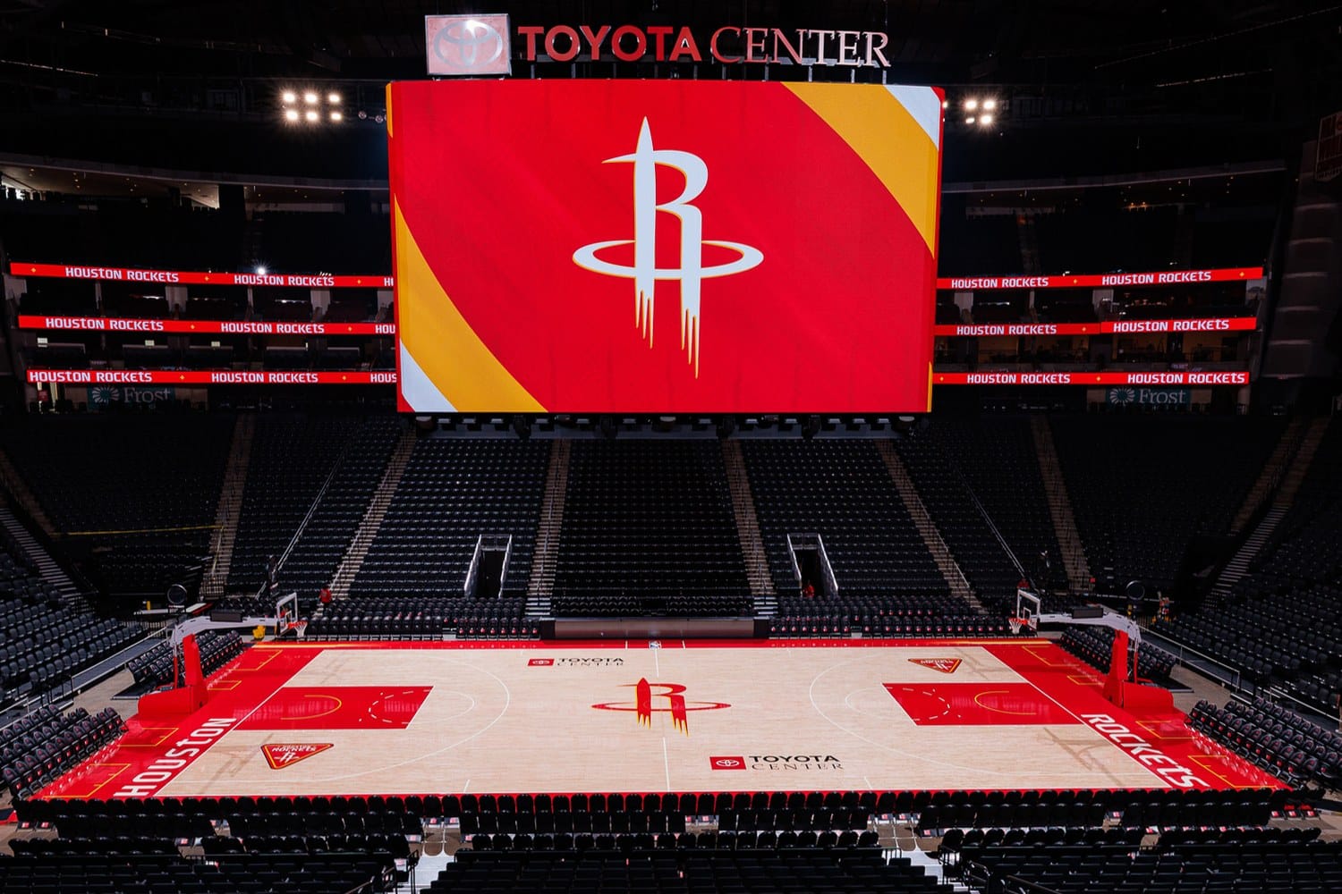
The Rockets finished the job. After rebranding the uniforms and logos in June, Houston revealed the floors that go with them: a Core Court and a Statement Court, both at Toyota Center for 2026-27. Neither quite lands, and the one carrying the better logo is the one that grades lower.
The Core Court
via the Houston Rockets
The color is the good part. Red lanes, red baselines, and real Championship Yellow doing structural work rather than sitting there as a pinstripe. Bright courts are better than beige ones, and after years of NBA floors drifting toward tasteful nothing, Houston committing to saturated red and mustard is the correct instinct. More yellow is the right call and they should push it further.
Then there is the logo, and the logo is the problem.
The R rocket mark takes up an enormous share of the center circle, and blown up to floor scale it stops working. The trail of exhaust lines under the rocket reads as clean at jersey size and reads as clutter at forty feet across. The yellow outline around the whole thing softens the edge exactly where the mark needed to stay sharp against pale hardwood. What should be the most confident object in the building instead looks like a decal that got scaled past its comfort zone.
That is the trouble with putting a mark this detailed at center court. A floor logo gets seen from the 400 level, on a broadcast wide shot, and upside down from the opposite bench. It has to survive all three. This one only really works in the overhead press photo.
C+. The palette is genuinely good and the yellow is a real improvement. The centerpiece holds it back rather than sinking it. A loud floor in the right colors with a busy logo still does more of a floor's job than a well-drawn logo nobody can pick out.
The Statement Court
via the Houston Rockets
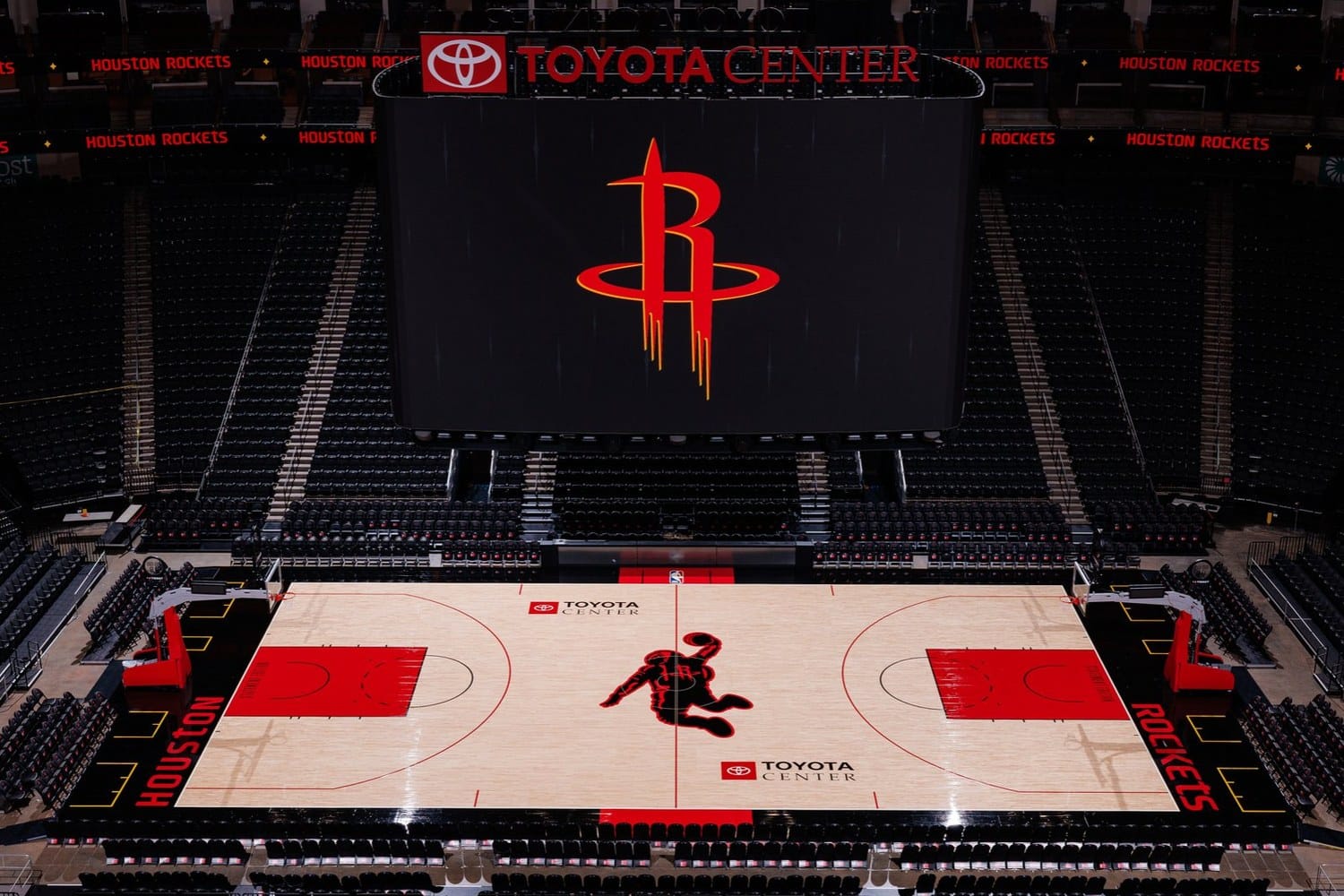
The Dunkstronaut at center court is the best idea in this entire rebrand. A dunking astronaut, rendered as a single bold silhouette, is exactly what a floor logo should be: one shape, readable instantly, impossible to confuse with any other team in the league. It is the rare mascot mark that gets better the larger you print it, which is the opposite of the R.
The execution is where it slips. The astronaut is rendered almost entirely in black, and that much black on pale hardwood turns the middle of the floor into a hole. From a broadcast camera the center circle reads as an absence rather than a graphic. Houston's identity is red and yellow, and this is the one surface in the building where neither of them shows up in the element everyone is looking at.
Swap that black fill for red with a black outline, or even keep the silhouette black but let Championship Yellow carry the detailing, and this is comfortably the best floor in the conference. As delivered it is a great mark in a palette that fights it.
C. The idea earns a much higher grade than the execution does, and the execution is what people look at for 41 nights.
Why the Better Logo Ends Up on the Weaker Floor
Here is the odd part. The Dunkstronaut is comfortably the better mark, and the Statement Court is the floor that grades lower. Two different problems are at work, and only one of them is about the drawing.
The R is a badge mark. It was designed to be understood at the size of a chest logo, where the exhaust trails and the yellow keyline read as craft. Enlarged to center court, that craft becomes visual noise, and the mark loses the clarity it had at three inches tall.
The Dunkstronaut is a silhouette. Silhouettes scale, which is why leagues build logos out of them, and why the astronaut still lands from the upper bowl. Houston already owns a mark built for this job, and on the Core Court they used the other one.
But a floor is not judged on its center circle alone, and that is where the Statement Court gives its lead back. The Core Court is at least loud in the right colors, which is most of what a floor has to do across a season. The Statement Court takes the best mark in the rebrand and renders it in a black that flattens the middle of the room. A busy logo on a bright floor turns out to be the smaller mistake.
The Bottom Line
Houston did the hard part right. The rebrand gave them a genuine color story, mustard yellow is back after thirty years, and the Dunkstronaut is a legitimately great piece of design. The floors do not fully cash that in. The Core Court pairs a good palette with a center logo that does not survive the scale, and the Statement Court pairs a great center logo with a fill color that drains the floor of everything the rebrand was about. Core Court C+, Statement Court C, and both problems are fixable without touching the color scheme.
Frequently Asked Questions
Did the Houston Rockets get a new court for 2026-27? Yes. The Rockets revealed two new Toyota Center floors in August 2026, a Core Court and a Statement Court, completing the rebrand they started with new uniforms and logos in June.
What is the Dunkstronaut? The Dunkstronaut is Houston's astronaut-dunking secondary mark, made a permanent part of the identity in the 2026 rebrand. It appears at center court on the Statement Court floor.
What is on the Rockets Core Court? Light hardwood with the primary red R rocket logo outlined in Championship Yellow at center, red painted lanes, and red baselines with yellow accents.
How many courts do the Rockets have? Two for 2026-27: the Core Court for most home games, and the Statement Court that pairs with the Statement Edition uniform.
What grades did the new Rockets courts get? The Core Court gets a C+ and the Statement Court gets a C. The color direction is strong on both. The Core Court's center logo is too detailed to work at floor scale, and the Statement Court, despite carrying the better mark, is pulled lower by a black Dunkstronaut that reads as a hole in the middle of the floor.
More NBA coverage
The Full 2026-27 NBA Uniform Guideevery jersey, court and rebrand we have gradedThe Rockets' Full 2026 Rebrand, Gradedthe Nose Cone logo, three new uniforms, and mustard yellow back after 30 yearsThe Lakers' New Courtthe LA mark, a lot more black, and what it signalsCourt images via the Houston Rockets. ColorWay Sports is an independent design site and is not affiliated with, endorsed by, or sponsored by the Houston Rockets or the National Basketball Association.