NFL Stories
 Arizona Cardinals
 Atlanta Falcons
 Baltimore Ravens
 Buffalo Bills
 Carolina Panthers
 Chicago Bears
 Cincinnati Bengals
 Cleveland Browns
 Dallas Cowboys
 Denver Broncos
 Detroit Lions
 Green Bay Packers
 Houston Texans
 Indianapolis Colts
 Jacksonville Jaguars
 Kansas City Chiefs
 Las Vegas Raiders
 Los Angeles Chargers
 Los Angeles Rams
 Miami Dolphins
 Minnesota Vikings
 New England Patriots
 New Orleans Saints
 New York Giants
 New York Jets
 Philadelphia Eagles
 Pittsburgh Steelers
 San Francisco 49ers
 Seattle Seahawks
 Tampa Bay Buccaneers
 Tennessee Titans
 Washington Commanders
 College Football Stories
 SEC
SEC Big Ten
 ACC
ACC Big 12
 Pac-12
 American Conference
 Mountain West
 Sun Belt
 MAC
MAC Conference USA
 FBS Independents
 NBA Stories
 Atlanta Hawks
 Boston Celtics
 Brooklyn Nets
 Charlotte Hornets
 Chicago Bulls
 Cleveland Cavaliers
 Dallas Mavericks
 Denver Nuggets
 Detroit Pistons
 Golden State Warriors
 Houston Rockets
 Indiana Pacers
 LA Clippers
 Los Angeles Lakers
 Memphis Grizzlies
 Miami Heat
 Milwaukee Bucks
 Minnesota Timberwolves
 New Orleans Pelicans
 New York Knicks
 Oklahoma City Thunder
 Orlando Magic
 Philadelphia 76ers
 Phoenix Suns
 Portland Trail Blazers
 Sacramento Kings
 San Antonio Spurs
 Toronto Raptors
 Utah Jazz
 Washington Wizards
 MLB Stories
 Arizona Diamondbacks
 Atlanta Braves
 Baltimore Orioles
 Boston Red Sox
 Chicago Cubs
 Chicago White Sox
 Cincinnati Reds
 Cleveland Guardians
 Colorado Rockies
 Detroit Tigers
 Houston Astros
 Kansas City Royals
 Los Angeles Angels
 Los Angeles Dodgers
 Miami Marlins
 Milwaukee Brewers
 Minnesota Twins
 New York Mets
 New York Yankees
 Philadelphia Phillies
 Pittsburgh Pirates
 San Diego Padres
 San Francisco Giants
 Seattle Mariners
 St. Louis Cardinals
 Tampa Bay Rays
 Texas Rangers
 Toronto Blue Jays
 Washington Nationals
 NHL Stories
 Anaheim Ducks
 Boston Bruins
 Buffalo Sabres
 Calgary Flames
 Carolina Hurricanes
 Chicago Blackhawks
 Colorado Avalanche
 Columbus Blue Jackets
 Dallas Stars
 Detroit Red Wings
 Edmonton Oilers
 Florida Panthers
 Los Angeles Kings
 Minnesota Wild
 Montreal Canadiens
 Nashville Predators
 New Jersey Devils
 New York Islanders
 New York Rangers
 Ottawa Senators
 Philadelphia Flyers
 Pittsburgh Penguins
 San Jose Sharks
 Seattle Kraken
 St. Louis Blues
 Tampa Bay Lightning
 Toronto Maple Leafs
 Utah Mammoth
 Vancouver Canucks
 Vegas Golden Knights
 Washington Capitals
 Winnipeg Jets
 All Soccer Stories
 International Competitions
 UEFA Champions League
 Premier League
 La Liga
 Serie A
 Bundesliga
 Ligue 1
 MLS
MLS College Basketball Stories
 All F1 Stories
 Alpine
 Aston Martin
 Audi
Audi Cadillac
 Ferrari
 Haas
Haas McLaren
 Mercedes
 Racing Bulls
 Red Bull Racing
 Williams
 NASCAR
The helmets are the story of the 2026 Rivalries class. Six of the eight teams changed their shell for this program, and in several cases the helmet is carrying the entire uniform on its back. So we pulled the shells out and ranked them on their own, separately from the uniforms they are attached to.
This is a different exercise from our grades on the full uniforms, and the two lists do not match. One team here built a top-five helmet and still failed the assignment, because a helmet cannot save a uniform that has nothing to say. Counting down from eight.
8. Minnesota Vikings
via the Minnesota Vikings
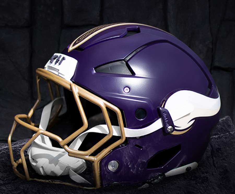
The gold facemask is the reason this finishes last, and it is not close.
Minnesota's helmet works in its normal form because the white horn wraps a deep purple shell and a light cage keeps the front of it sharp. Swapping in gold does the opposite of everything that helmet does well. It closes the face down, it drags the whole thing toward costume, and it turns the crispest front-of-helmet in the division into something muddy. Add the gold knot stripe over the crown and the rune inscription on the bumper, and you have three separate ideas competing for the same square inches.
The rune bumper is the clearest symptom. It is the most prominent type on the helmet and it communicates nothing to anyone in the stadium, because it is an alphabet essentially nobody reads. Interesting on a detail card, invisible in a game.
7. Green Bay Packers
via the Green Bay Packers
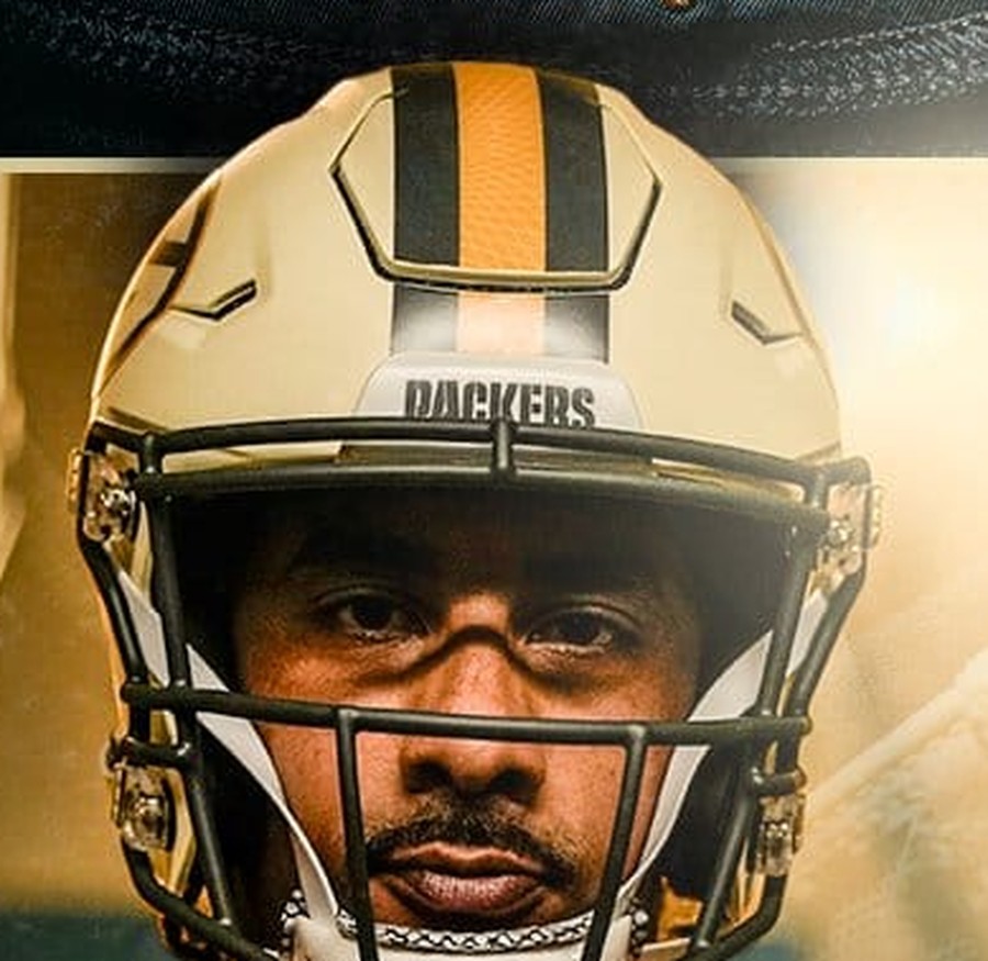
The cream matte shell is genuinely handsome, and it still lands seventh, because of what it costs.
The gold helmet with the G is the most recognizable helmet in football and arguably the most recognizable object in American sport. It is a piece of equipment people can identify from a single frame at any distance. Green Bay took it off for this game and replaced it with a cream shell carrying an interlocking GB the audience has never been taught to read.
The mark itself is lovely. We said in our Packers writeup that it deserves a longer life than one afternoon. But a helmet's first job is instant recognition, and this one trades away the best recognition asset in the sport for something that needs a caption.
6. Houston Texans
via the Houston Texans
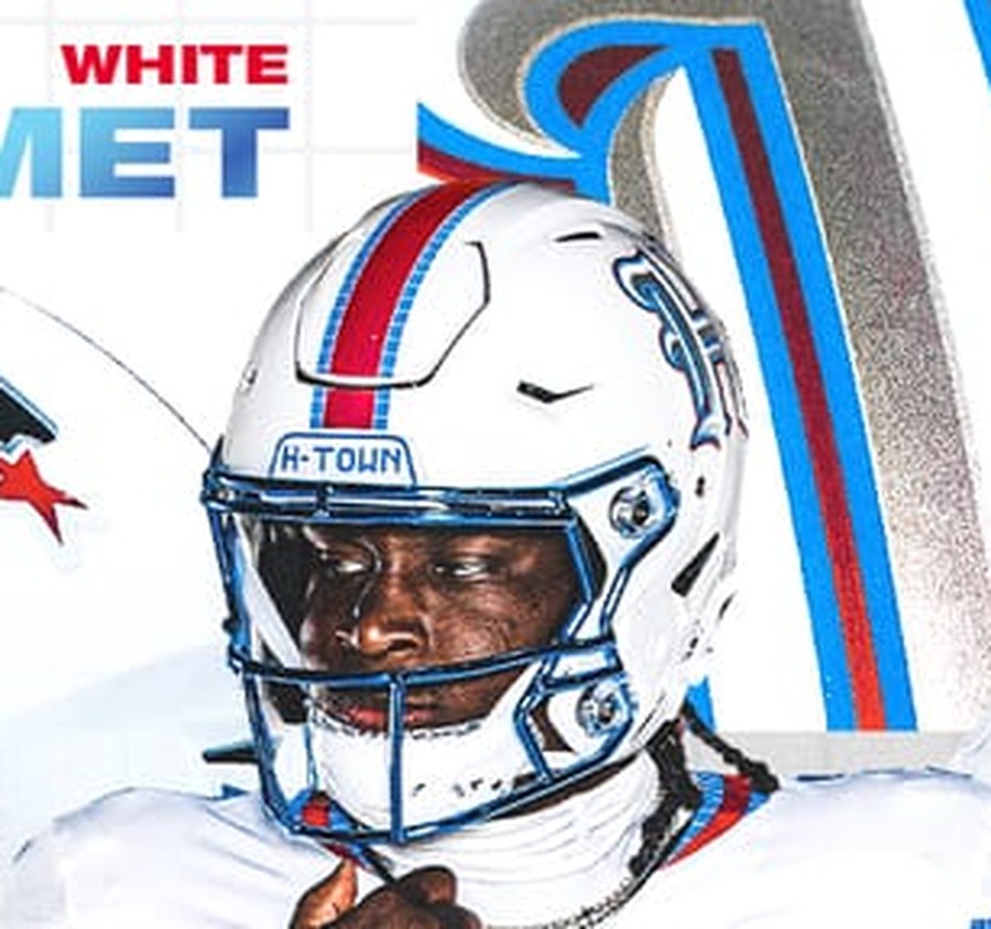
Houston built the best facemask in the entire class and bolted it to the shell that gets the least out of it.
That chrome blue cage is superb, a genuine piece of hardware design, and the white shell behind it is a real occasion: the first white helmet in Texans history and a direct tribute to the prototype Robert McNair held up in 1999. Everything about the setup is right except the decision in the middle of it.
The gothic H-Town H is a nice mark that belongs on a hat. The bullhead is one of the strongest primary logos in the league and it has never appeared on a white shell. Houston had a once-in-franchise-history canvas and put its secondary logo on it. Sixth is the price of that call, and the facemask is the only reason it is not lower.
5. Indianapolis Colts
via the Indianapolis Colts
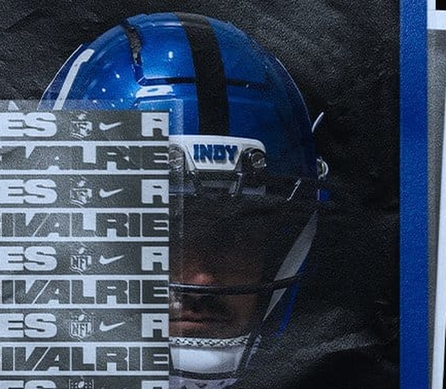
A beautiful helmet in a vacuum, and a top-two helmet if you judge it with your eyes closed to the rest of the uniform.
The metallic royal blue is a high-gloss version of the cleanest shell in football, the horseshoe still reads instantly, and the INDY bumper is a tidy touch. On pure craft this competes with anything in the class.
It lands fifth because a helmet is not judged in a vacuum. Underneath it is an anthracite jersey in a color Indianapolis has never worn, and the finished silhouette, bright blue lid over a grey body, is Detroit's silhouette, not Indianapolis's. We graded the full Anvil Strike uniform an F, and the helmet is the single thing worth keeping out of it. Indianapolis should promote this shell to the regular rotation and leave the rest in the box.
4. Jacksonville Jaguars
via the Jacksonville Jaguars
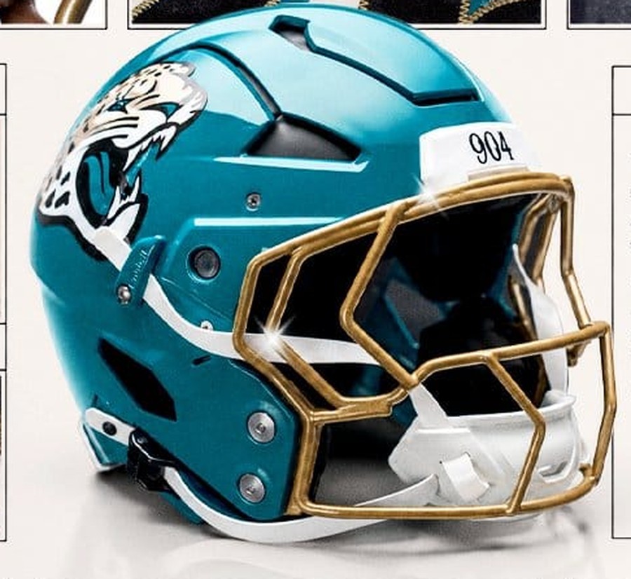
The gloss teal shell with the metallic gold cage is one of the best-looking individual pieces of the year, and it makes an argument Jacksonville should have made a decade ago.
Teal is the one thing in this franchise's identity that nobody else in football owns, and putting it on the helmet instead of burying it under a black shell is the correct instinct. The gold facemask is the right partner for it, warm against the cool teal, and the sun-washed logo sits well on the gloss.
What keeps it out of the top three is the bumper. The 904 is the third area-code reference we have graded this year, and the trend has gone from local to lazy. A helmet this good deserved something with more thought on the front of it.
3. Detroit Lions
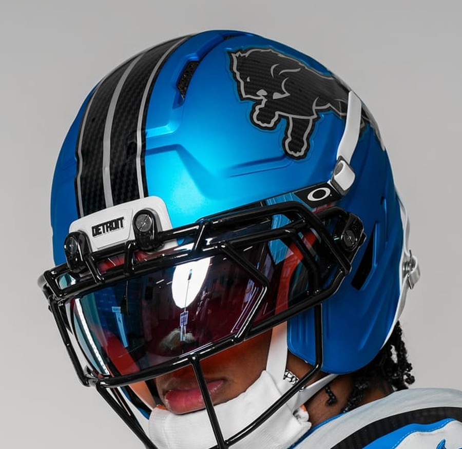
via the Detroit Lions
The most improved helmet in the class, and by a distance.
Detroit has run flat blue alternate shells before and they have always looked like a placeholder next to the silver primary. This one does not. The metallic electric blue has real depth, the glossy carbon-fiber racing stripes are the rare texture treatment that reads at distance instead of dissolving into noise, and the carbon-fiber lion is a genuine reinterpretation rather than a recolor.
It finishes third rather than higher for one honest reason: the classic silver Lions helmet is still better. This is the best alternate lid Detroit has ever put on the field, and it is not displacing the real one.
2. Tennessee Titans
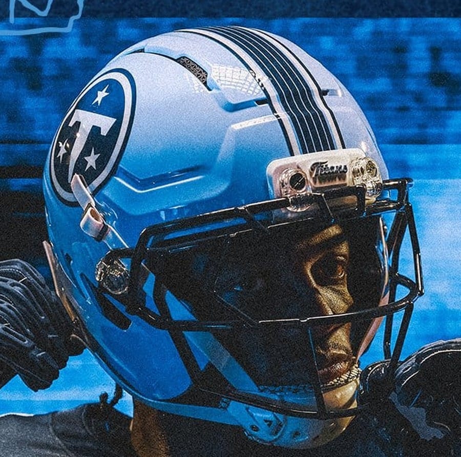
via the Tennessee Titans
The best thing Tennessee has made since the rebrand, and the only helmet here we would happily see promoted past one game a season.
The Titans Blue shell is the headline, because the new base set runs a white helmet and this is the first time the light blue has appeared on the crown of anything. The circular navy T with the three stars sits perfectly on it, the navy crown stripes give it a spine, and the black facemask keeps the whole thing anchored instead of letting the light blue float.
It is also the rare Rivalries helmet that improves the uniform it comes with. We were lukewarm on the Music City jersey underneath, but the helmet is doing so much work that the whole look survives on it. Second only because the team above it built something with more history behind it.
1. Chicago Bears
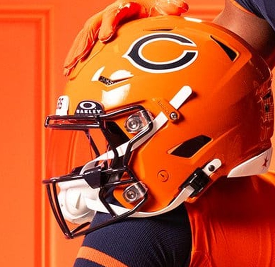
via the Chicago Bears
The orange shell was always going to be the best helmet in this class. What earns the top spot is everything Chicago put on it.
The revamped classic BEARS wordmark on the bumper is the kind of detail that separates a good throwback from a costume, a real piece of type rather than a modern font pretending to be old. The four stars of the Chicago flag on the rear stripe are the best single decision anyone made on a helmet this year: a civic mark, rendered small, that rewards you for looking. And the orange itself is the burnt shade the franchise has used since the 1930s rather than a brightened-up modern version.
It works because it is not decoration. Every element on this shell points at something real, which is the entire premise of the program and the reason the Bears uniform is the only one in the class we graded above a B.
The Bottom Line
Two things separate the top of this list from the bottom. The best helmets here, Chicago's and Tennessee's, put one clear idea on the shell and let it breathe. The worst, Minnesota's, put four ideas on the shell and let them fight.
The other lesson belongs to Indianapolis and Houston. Both built genuinely excellent hardware and both finish in the bottom half, because a helmet is worn with a uniform and judged against a franchise's own history. A great shell on the wrong body is still the wrong look.
Frequently Asked Questions
Which 2026 Rivalries helmet is the best?
Chicago's. The orange shell carries a revamped classic BEARS wordmark on the bumper and the four stars of the Chicago flag on the rear stripe, and every element on it points at something real in the franchise's history.
Did every 2026 Rivalries team change its helmet?
Six of the eight changed the shell itself. Chicago went orange, Tennessee introduced a Titans Blue shell, Detroit ran a metallic electric blue, Jacksonville used gloss teal, Green Bay debuted the first matte helmet in team history in cream, and Houston wore the first white helmet in franchise history. Indianapolis used a metallic version of its royal blue, and Minnesota kept purple with a new gold facemask.
What is the Texans' Rivalries helmet?
The first white helmet in Houston history, a tribute to the white prototype the late founder Robert C. McNair held up in 1999 before the team chose Deep Steel Blue. It carries a gothic H-Town "H", a tiled center stripe, an H-TOWN front bumper, and a chrome blue facemask.
Why is the Colts helmet ranked below the Jaguars and Lions?
On craft alone it would rank higher, and we say so above. It drops to fifth because it sits on an anthracite uniform in a color Indianapolis has never worn, and the finished look reads as another team's. We graded the full Anvil Strike set an F.
Do these helmet rankings match your uniform grades?
No, deliberately. The full-uniform grades judge the complete package, and several teams here built a strong helmet on a weak uniform. Houston finishes second on uniforms and sixth on helmets; Indianapolis has a top-tier shell on a set we failed.
More Rivalries coverage
Every NFL Rivalries Uniform, All 16, RankedAll Eight Rivalries Uniforms, GradedChicago Bears 2026 Uniform ScheduleTennessee Titans 2026 Uniform ScheduleAll 32 teams · the 2026 NFL Uniform Schedule →Uniform and helmet details via the NFL, Nike, and the eight participating clubs. ColorWay Sports is an independent design site and is not affiliated with, endorsed by, or sponsored by any NFL club or the National Football League.