NFL Stories
 Arizona Cardinals
 Atlanta Falcons
 Baltimore Ravens
 Buffalo Bills
 Carolina Panthers
 Chicago Bears
 Cincinnati Bengals
 Cleveland Browns
 Dallas Cowboys
 Denver Broncos
 Detroit Lions
 Green Bay Packers
 Houston Texans
 Indianapolis Colts
 Jacksonville Jaguars
 Kansas City Chiefs
 Las Vegas Raiders
 Los Angeles Chargers
 Los Angeles Rams
 Miami Dolphins
 Minnesota Vikings
 New England Patriots
 New Orleans Saints
 New York Giants
 New York Jets
 Philadelphia Eagles
 Pittsburgh Steelers
 San Francisco 49ers
 Seattle Seahawks
 Tampa Bay Buccaneers
 Tennessee Titans
 Washington Commanders
 College Football Stories
 SEC
SEC Big Ten
 ACC
ACC Big 12
 Pac-12
 American Conference
 Mountain West
 Sun Belt
 MAC
MAC Conference USA
 FBS Independents
 NBA Stories
 Atlanta Hawks
 Boston Celtics
 Brooklyn Nets
 Charlotte Hornets
 Chicago Bulls
 Cleveland Cavaliers
 Dallas Mavericks
 Denver Nuggets
 Detroit Pistons
 Golden State Warriors
 Houston Rockets
 Indiana Pacers
 LA Clippers
 Los Angeles Lakers
 Memphis Grizzlies
 Miami Heat
 Milwaukee Bucks
 Minnesota Timberwolves
 New Orleans Pelicans
 New York Knicks
 Oklahoma City Thunder
 Orlando Magic
 Philadelphia 76ers
 Phoenix Suns
 Portland Trail Blazers
 Sacramento Kings
 San Antonio Spurs
 Toronto Raptors
 Utah Jazz
 Washington Wizards
 MLB Stories
 Arizona Diamondbacks
 Atlanta Braves
 Baltimore Orioles
 Boston Red Sox
 Chicago Cubs
 Chicago White Sox
 Cincinnati Reds
 Cleveland Guardians
 Colorado Rockies
 Detroit Tigers
 Houston Astros
 Kansas City Royals
 Los Angeles Angels
 Los Angeles Dodgers
 Miami Marlins
 Milwaukee Brewers
 Minnesota Twins
 New York Mets
 New York Yankees
 Philadelphia Phillies
 Pittsburgh Pirates
 San Diego Padres
 San Francisco Giants
 Seattle Mariners
 St. Louis Cardinals
 Tampa Bay Rays
 Texas Rangers
 Toronto Blue Jays
 Washington Nationals
 NHL Stories
 Anaheim Ducks
 Boston Bruins
 Buffalo Sabres
 Calgary Flames
 Carolina Hurricanes
 Chicago Blackhawks
 Colorado Avalanche
 Columbus Blue Jackets
 Dallas Stars
 Detroit Red Wings
 Edmonton Oilers
 Florida Panthers
 Los Angeles Kings
 Minnesota Wild
 Montreal Canadiens
 Nashville Predators
 New Jersey Devils
 New York Islanders
 New York Rangers
 Ottawa Senators
 Philadelphia Flyers
 Pittsburgh Penguins
 San Jose Sharks
 Seattle Kraken
 St. Louis Blues
 Tampa Bay Lightning
 Toronto Maple Leafs
 Utah Mammoth
 Vancouver Canucks
 Vegas Golden Knights
 Washington Capitals
 Winnipeg Jets
 All Soccer Stories
 International Competitions
 UEFA Champions League
 Premier League
 La Liga
 Serie A
 Bundesliga
 Ligue 1
 MLS
MLS College Basketball Stories
 All F1 Stories
 Alpine
 Aston Martin
 Audi
Audi Cadillac
 Ferrari
 Haas
Haas McLaren
 Mercedes
 Racing Bulls
 Red Bull Racing
 Williams
 NASCAR
Sixteen NFL teams now own a Rivalries uniform, and every one of them will wear it in 2026. The AFC East and the NFC West got theirs in 2025, the AFC South and the NFC North were revealed together on August 25, and the league's full wearing calendar puts all sixteen on the field between Week 2 and the first weekend of January. So we ranked all sixteen against each other, both classes in one list, graded worst to best.
The pattern that decided this list held across both years: the clubs that dug into their own history, or dressed like the place they play, finished at the top, and the clubs that decorated over a strong identity finished at the bottom. Four sets failed. One belongs in a regular rotation. Counting down from sixteen.
16. Minnesota Vikings — F
via the Minnesota Vikings
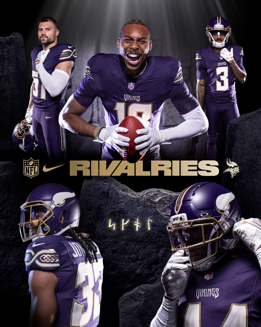
Four ideas fighting each other on top of the best base uniform in the division. The "Purple Dynasty" shade is deeper and duller than Minnesota's regular purple and drifts toward a flat plum under stadium light, which takes the team's single greatest asset and turns the contrast down. The gold facemask closes down the front of a helmet that works because of its light cage. Then the Nordic knots run the shoulders and the pants, the numbers are rune-carved, the wordmark is new, and the bumper is an inscription almost nobody in the building can read.
The rune numbers are genuinely good and worth saving. Everything around them is noise. Full breakdown in the Vikings schedule post.
15. Green Bay Packers — F
via the Green Bay Packers
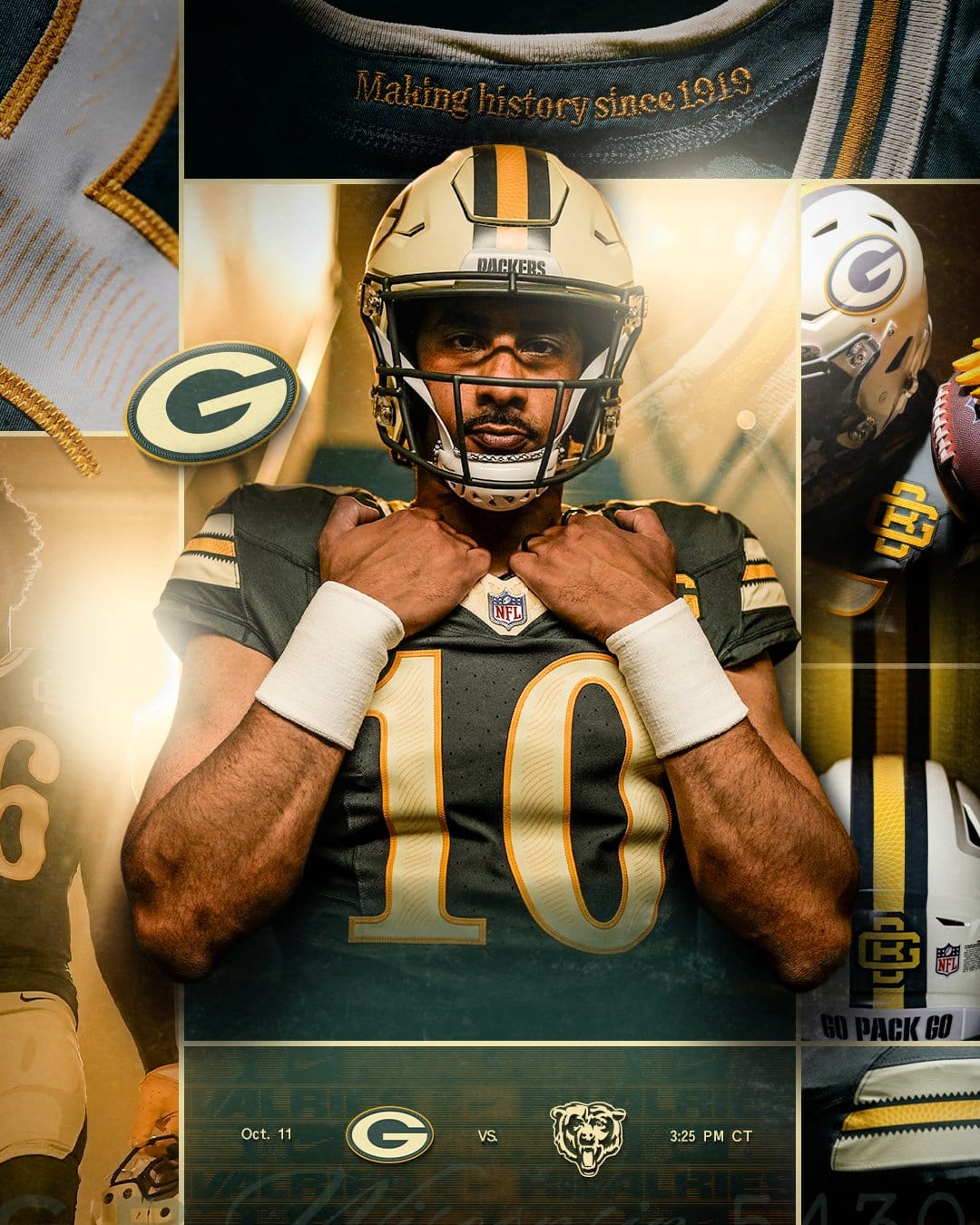
The smartest concept in either class, rendered so quietly you cannot see it from your seat. Green Bay is the only fan-owned franchise in American professional sport, and the design turns that into currency-engraved numerals and hairline borders lifted from real stock certificates. On a detail card it is superb. At broadcast distance it disappears, and what is left is a green jersey slightly darker than the one they already wear.
Then there is the cost. This set benches the gold helmet with the G, the most recognizable helmet in football, for a cream shell carrying a mark the audience has never been taught. That trade has to buy something enormous. It buys a quieter version of the normal uniform. More in the Packers schedule post.
14. Indianapolis Colts, Anvil Strike — F
via the Indianapolis Colts
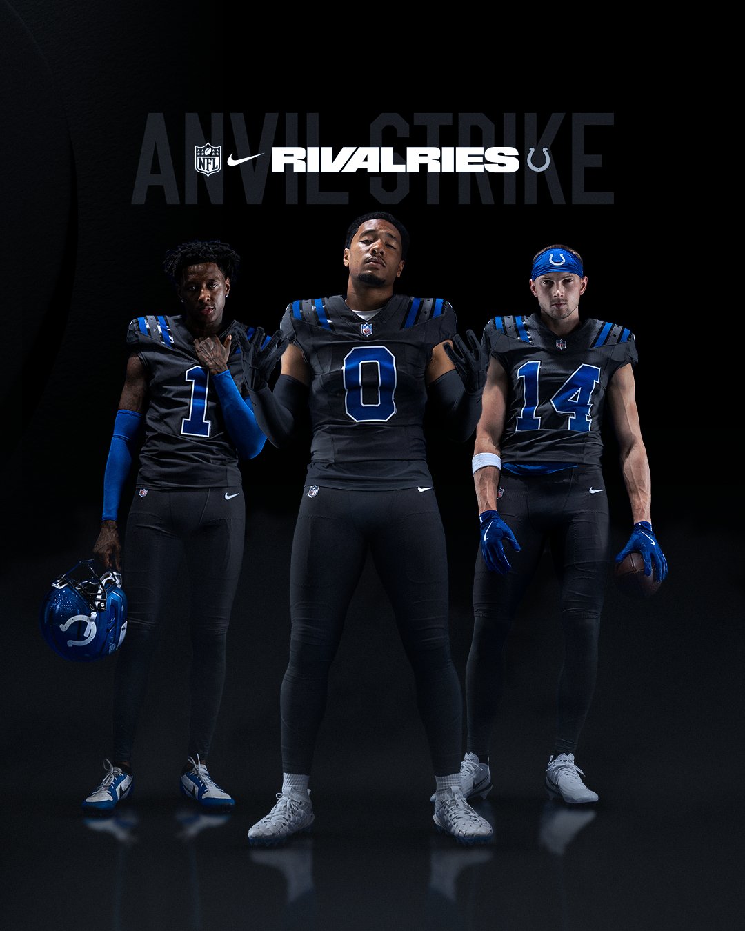
A gorgeous helmet marooned on someone else's uniform. Take the metallic blue shell off and what remains is anthracite in a color Indianapolis has never worn, tied to an anvil that appears nowhere in the club's history. This is a franchise whose entire visual power is subtraction: royal blue, white, a horseshoe, and the discipline to stop. A dark neutral is the one direction that identity cannot absorb.
The details make it worse rather than better. Putting the horseshoe on a Colts jersey for the first time ever should be a landmark, and it arrives as a silver mark on a grey shirt where it barely separates from the fabric. The finished silhouette, bright lid over grey body, belongs to Detroit. More in the Colts schedule post.
13. Los Angeles Rams, Midnight Mode — C-
via the Los Angeles Rams
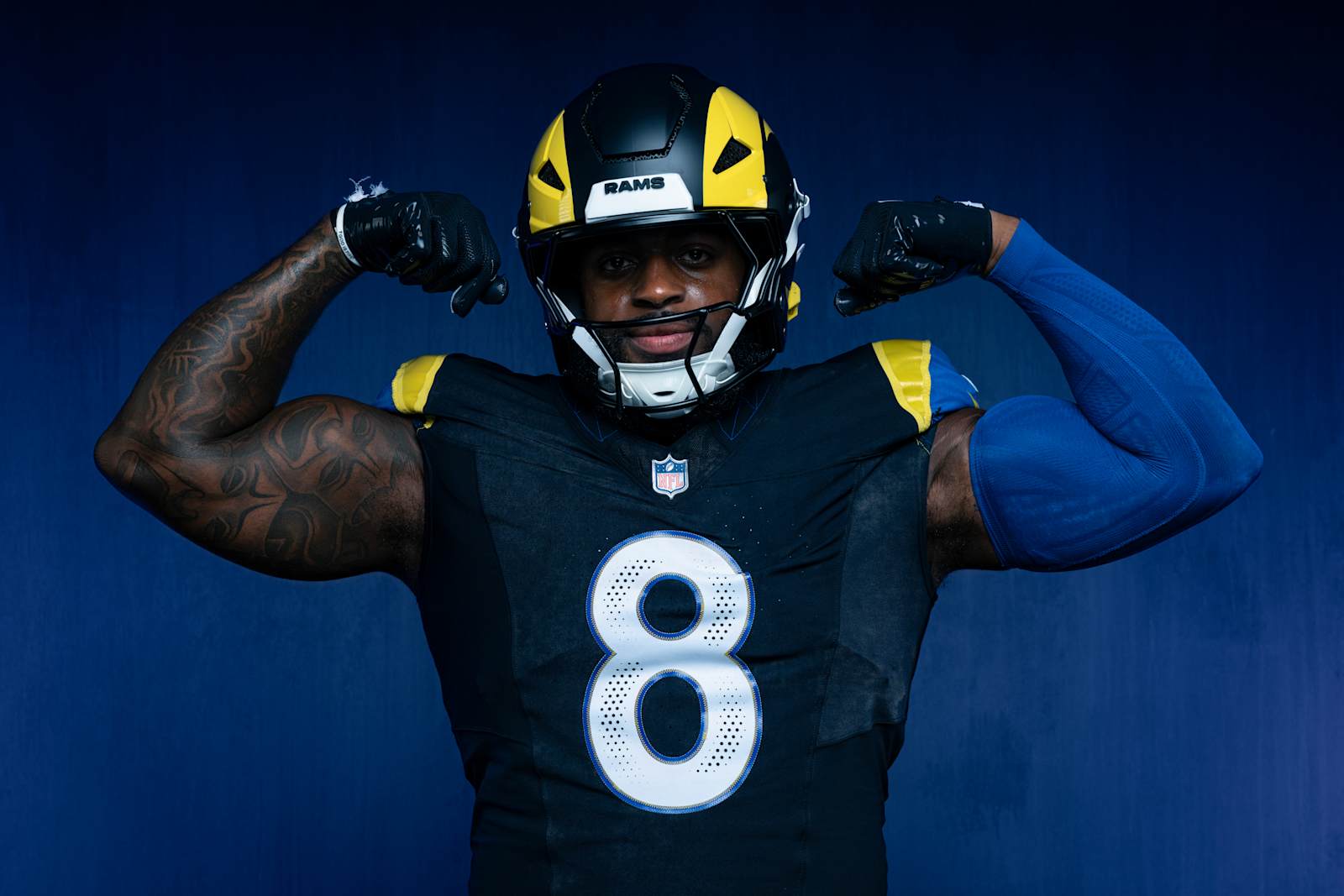
Midnight Mode is built on SoFi Stadium at night, a matte near-black base with a hint of royal, the sol yellow horn on a black shell, and the shoulder horns rendered in yellow and blue over a halftone fade. The helmet is the good part. A black shell with a single bright yellow horn is clean, and the RAMS bumper in white finishes it properly.
The rest is a dark alternate for a team whose best asset is royal blue and sol yellow in Southern California daylight, and the Rams already carry more uniforms than any club in the league. The dotted gradient under the shoulder horns is the modern treatment most people wanted gone, the white numbers with a thin blue outline sit flat on the black body, and the whole thing lands closer to a Color Rush leftover than a rivalry uniform. It gets its one date on Christmas Day at Seattle, across from the set ranked second on this list, which will not help it. More in the Rams schedule post.
12. New England Patriots, Nor'easter — C
via the New England Patriots
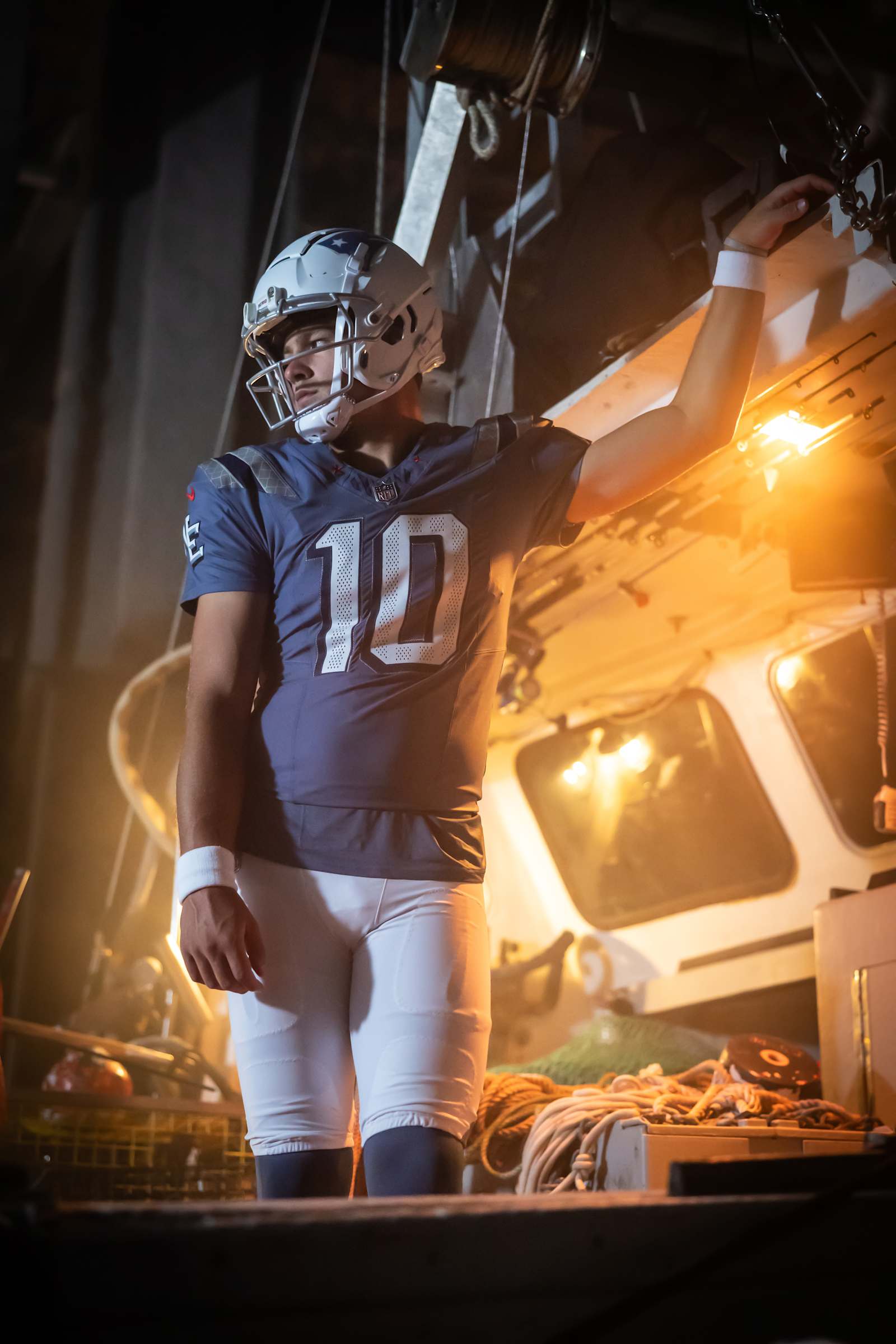
Storm Blue is a real colour, not just a darker navy, and the weathered finish on the jersey gives it a texture the regular set has never had. The regional idea is honest: a nor'easter is the one weather event every New Englander has a story about, and the six stars stand for six states. The white helmet with the single navy stripe and the star is the best-looking Patriots lid since the Pat Patriot shell.
What holds it at a C is that it solves a problem New England does not have. The club already wears a blue jersey with white numbers and white pants at home, and from the stands this is that uniform with the contrast turned down and a texture you cannot see. The details you can see, the NE on the sleeve and the shoulder pattern, are the sort of thing you need to be told about. It comes out in Week 13 against Buffalo. More in the Patriots schedule post.
11. Detroit Lions — C
via the Detroit Lions
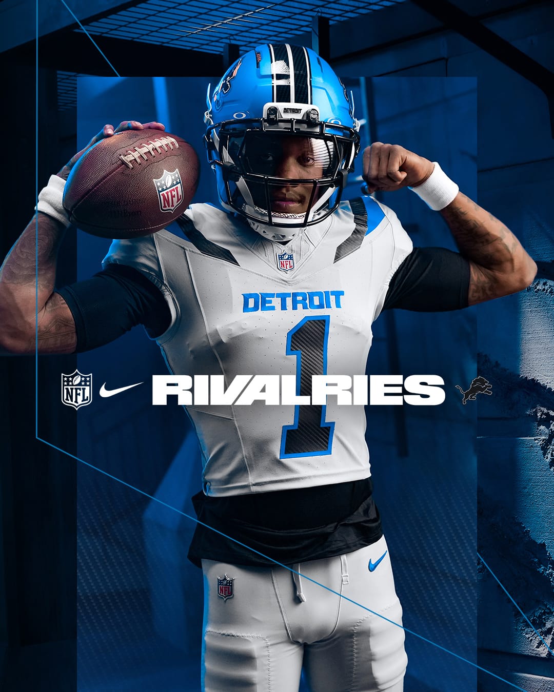
The first set on this list with real ideas that survive contact with a football field. The silver shade is a richer base than a standard white and gives the whole thing texture, and filling italicized numerals with a carbon-fiber weave is a clever way to say Motor City without writing it out. The electric blue helmet is the best alternate lid Detroit has ever worn.
What holds it at a C is the jersey underneath. Strip out the carbon fill and you have a white shirt with black shoulder wedges and blue trim, a silhouette Carolina already owns, and none of the Detroit-specific thinking lives above the waist where the camera sits. More in the Lions schedule post.
10. Miami Dolphins, Dark Water — C+
via the Miami Dolphins
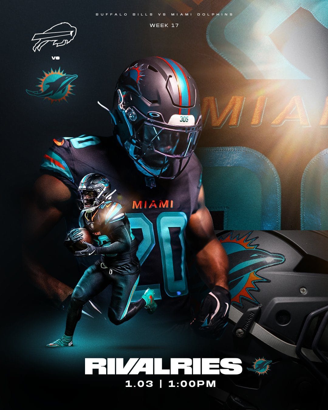
The one franchise in football whose colors need no help went dark. Miami's entire visual identity is aqua and orange in sunlight, and Dark Water takes both of those and shrinks them to trim on a near-black base: aqua numbers, an orange MIAMI wordmark, a thin aqua-and-orange stripe on a matte dark shell. Aqua numerals on a black body is a look Jacksonville wore for years and abandoned, and it reads that way from any distance.
The detail work is the reason it lands at a C+ rather than lower. The 305 bumper, the sunburst dolphin on the helmet and the aqua-and-orange trim are all cleanly executed. What holds it back is the premise, that a South Florida team is improved by trading sunlight colors for a near-black base. It closes the home schedule against Buffalo on January 3, and we have said our piece on it at length.
9. San Francisco 49ers, For the Faithful — C+
via Nike
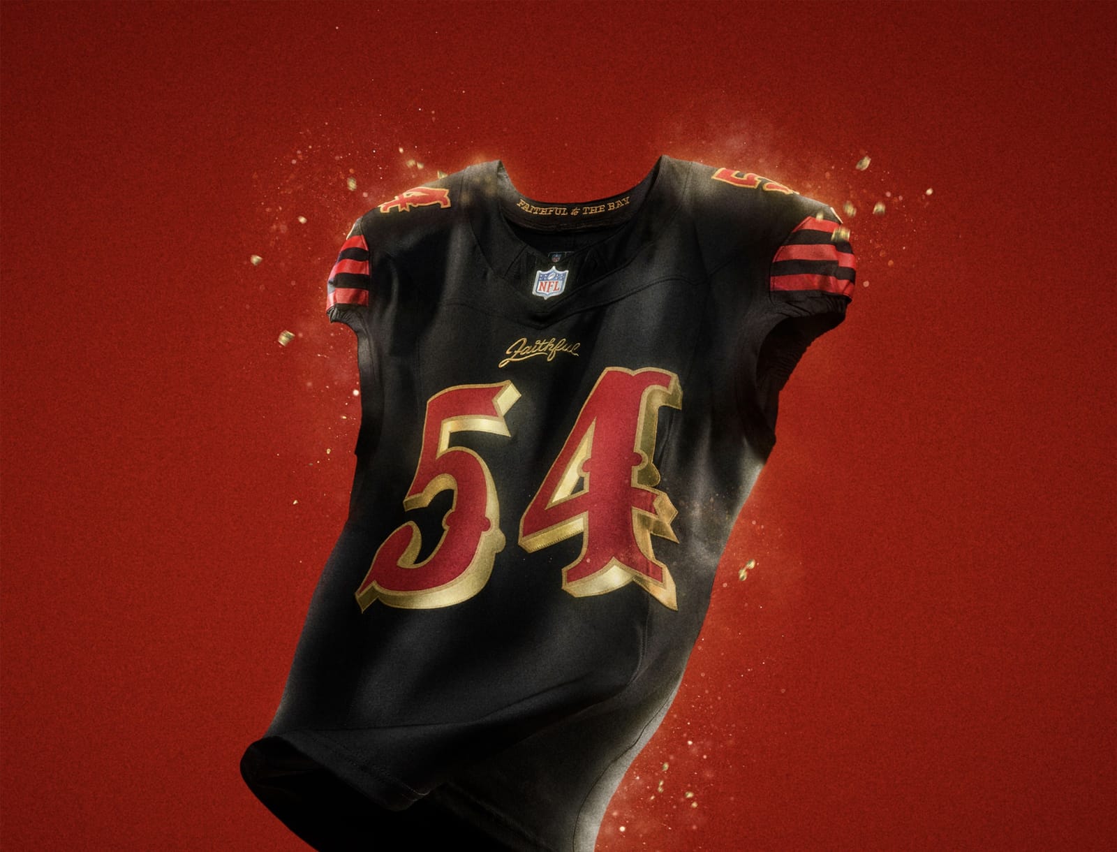
The players designed this one, and it shows in the two things they got right and the one thing they got wrong. The saloon numerals, red with a gold outline in a letterform pulled from the club's Gold Rush wordmark, are the best numbers in the 2025 class, and the gold-coated facemask is a genuinely good piece of hardware. The Faithful script above the number is a nice sentiment and a small one.
What holds it back is how much of it is black. San Francisco's identity is scarlet and gold, one of the three or four most valuable color pairings in American sport, and this set reduces it to stripes on a black jersey, black pants and a black helmet. From the upper deck it is a dark uniform with red numbers, which describes Atlanta and Arizona as easily as it describes the 49ers. The details are strong enough to carry it to a C+, the top of the middle tier, but the base color keeps it out of the B range. It returns in Week 14 against the Rams. More in the 49ers schedule post.
8. New York Jets, Gotham City Football — C+
via the New York Jets
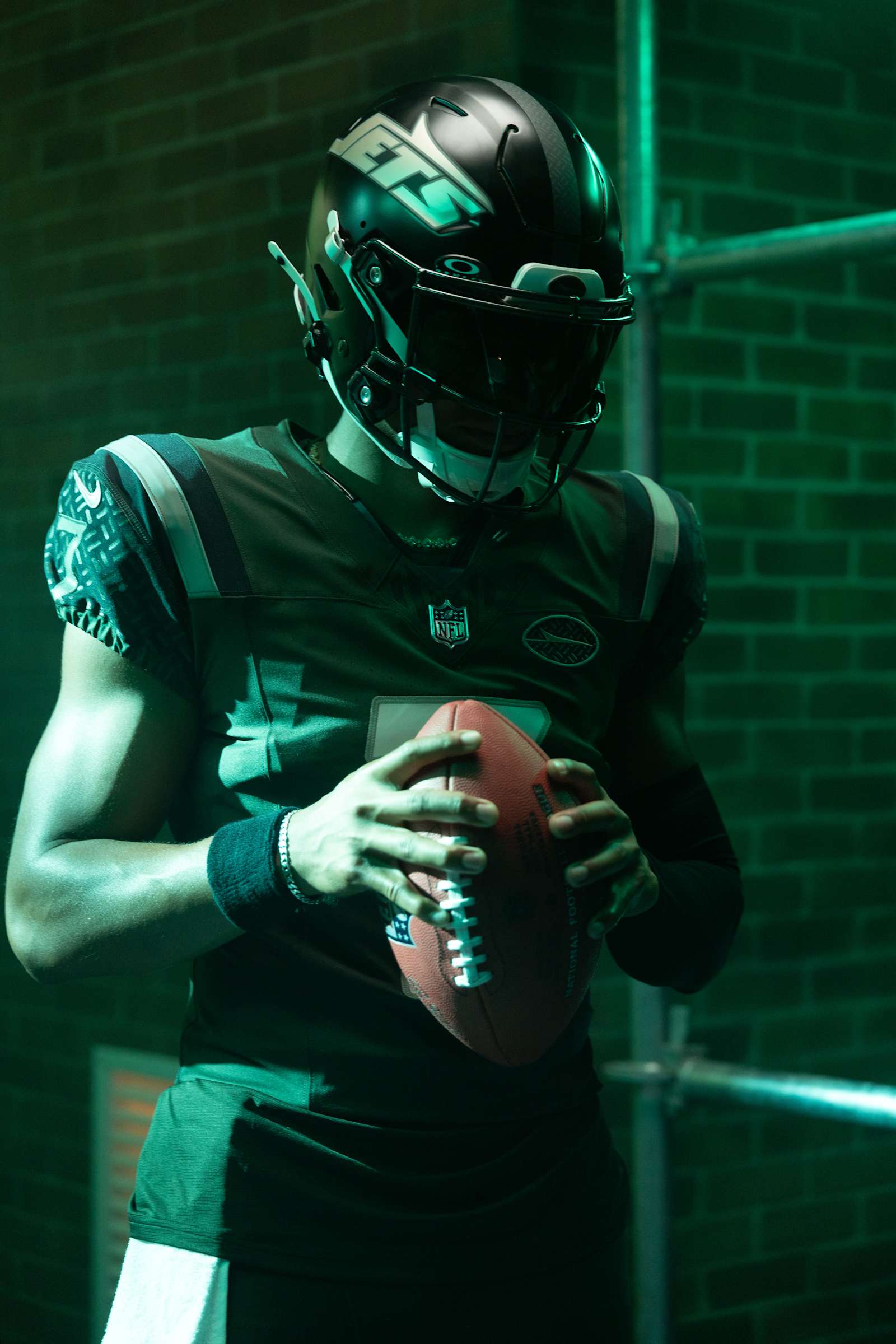
The best Jets shoulder stripes in decades on a jersey that keeps getting darker. The UCLA stripes are the detail that carries this set, a real piece of the franchise's 1960s and 1970s look brought back with confidence, and the black gloss helmet with the italic JETS wordmark is a legitimate idea rather than a colour swap. The gothic numbers fit the theme without tipping into costume.
The theme is the trouble. Gotham City Football leans on a comic book for a franchise that already has a perfectly good nickname, and the green is pushed so dark that under stadium lights it reads swamp rather than Jets green. Put the stripes and the helmet on the standard Gotham Green body and this is a B. As it stands it is a good uniform buried in its own lighting. It closes the home schedule against New England in Week 16. More in the Jets schedule post.
7. Arizona Cardinals — C+
via the Arizona Cardinals
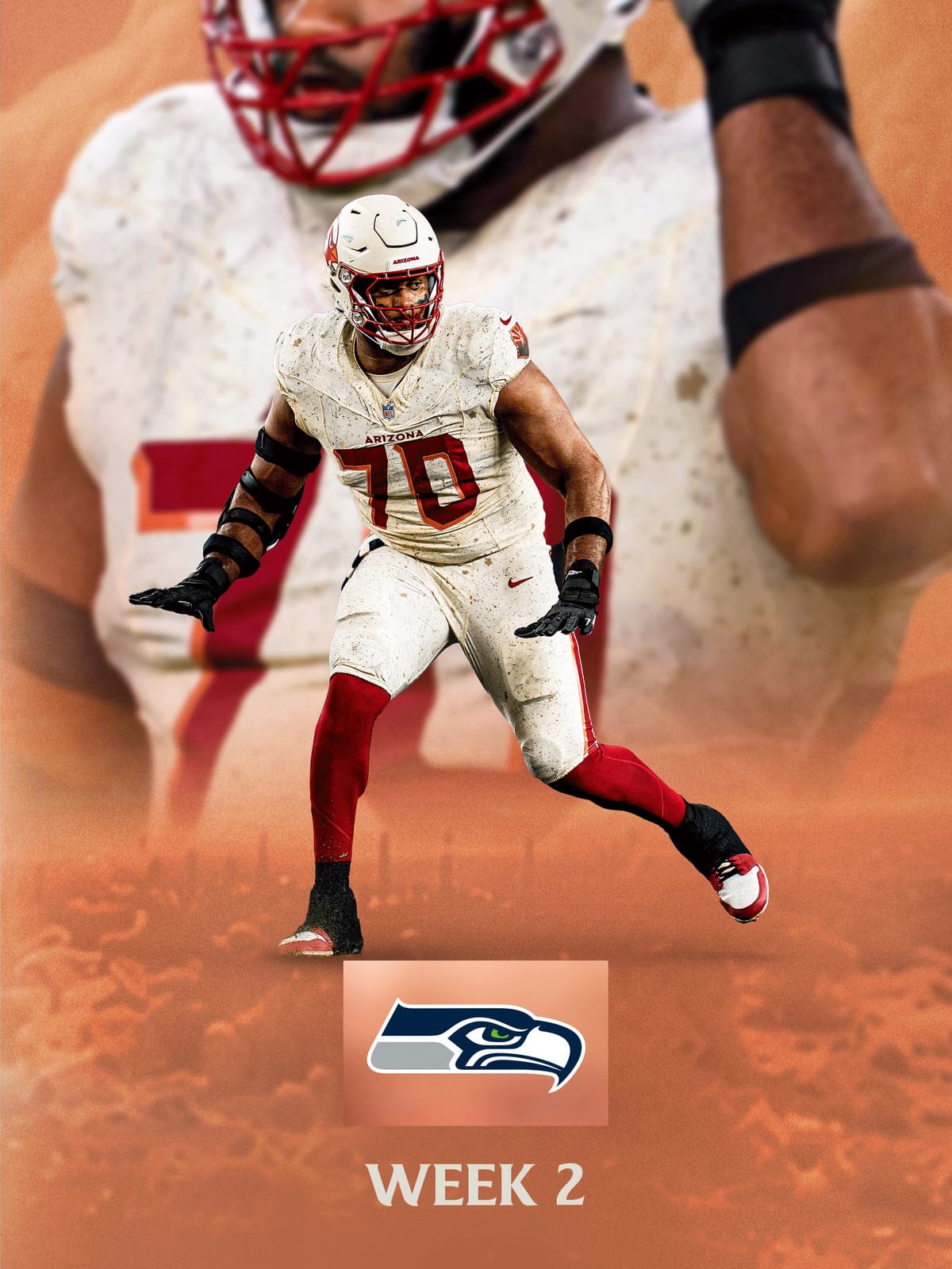
The right palette for the place. A sun-baked cream base with cardinal red numbers, red pants, and a cream helmet with a red cage is specific to Arizona in a way nothing else in the closet is, and the red pants give the set legs where an all-cream version would have gone flat. This is the first Rivalries uniform built on a colour the club had not worn before that actually looks like it belongs to the club.
The dust speckle is where it slips. The texture is meant to read as desert and at distance it reads as a dirty jersey, which is a strange effect to design in on purpose. Take the speckle off and the cream-over-red combination is essentially a warmer version of the road look the Cardinals wore for decades, which is fine, and fine is what a C+ is. It opens the whole 2026 Rivalries calendar in Week 2 against Seattle. More in the Cardinals schedule post.
6. Jacksonville Jaguars, Bold City — C+
via the Jacksonville Jaguars
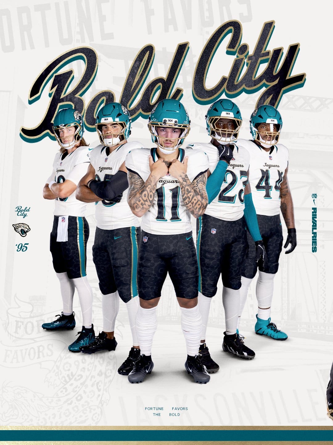
A well-researched uniform that keeps reaching for references instead of leaning on the one asset nobody else in football owns. The gloss teal helmet with the gold cage is one of the best individual pieces of the year and it carries this ranking almost by itself.
Below it the reasoning gets thinner. Alabaster and gold together read closer to New Orleans than Jacksonville. The 904 bumper is the third area-code reference we have graded this year and the trend has gone from local to lazy. The jaguar-spot pants look sharp in a studio and turn to noise from the upper deck. Teal is why this franchise looks like nobody else, and Bold City spends most of its ideas somewhere else. More in the Jaguars schedule post.
5. Buffalo Bills, Cold Front — B-
via the Buffalo Bills
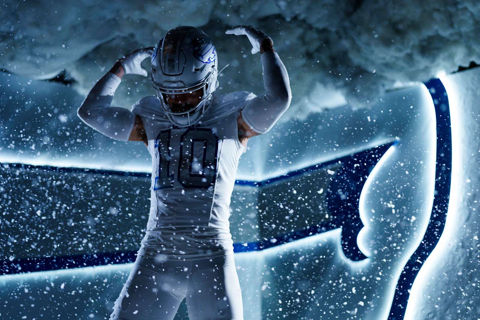
The best-received set of the 2025 wave, and the reason is simple: Buffalo dressed like the weather. All white with silver and frost-blue accents, a cracked-ice texture across the shoulders, and a white metal-flake helmet with an ice stripe down the middle and a silver charging buffalo on the side. Put it on the field in late November with snow coming down and the concept explains itself from the top row, which is more than most of the sets on this list can say.
It stops at B- because of what happens without the snow. Silver and pale blue numbers on white have almost no contrast, and on a bright afternoon the numerals fade into the jersey. The cracked-ice texture is a photography idea before it is a uniform idea. It is a Color Rush all-white with an excellent story attached, and the story does a lot of the work. It gets Salute to Service against Miami in Week 11. More in the Bills schedule post.
4. Tennessee Titans, Music City — B-
via the Tennessee Titans
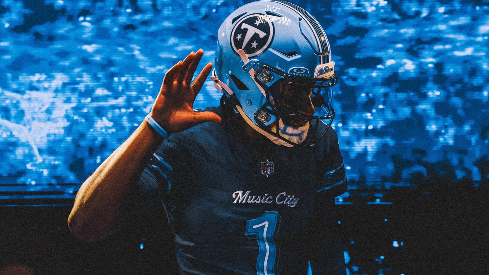
An A-grade helmet bolted to a B-grade jersey. Dropping red entirely and letting two blues carry the uniform was the correct instinct, and it gives the set a clear identity instead of a costume. The Titans Blue shell with the circled T is the best thing Tennessee has produced since the rebrand and the only helmet in the 2026 class we would happily see promoted beyond one game a year.
The jersey never catches up. The navy body is quiet, the neon numbers carry more weight than they should have to, and the guitar-string pant striping reads better on a detail card than at field distance. It edges Buffalo because its best piece is a helmet you can see from anywhere, and Buffalo's best piece is a texture you cannot. More in the Titans schedule post.
3. Houston Texans, HOUSTON/US — B
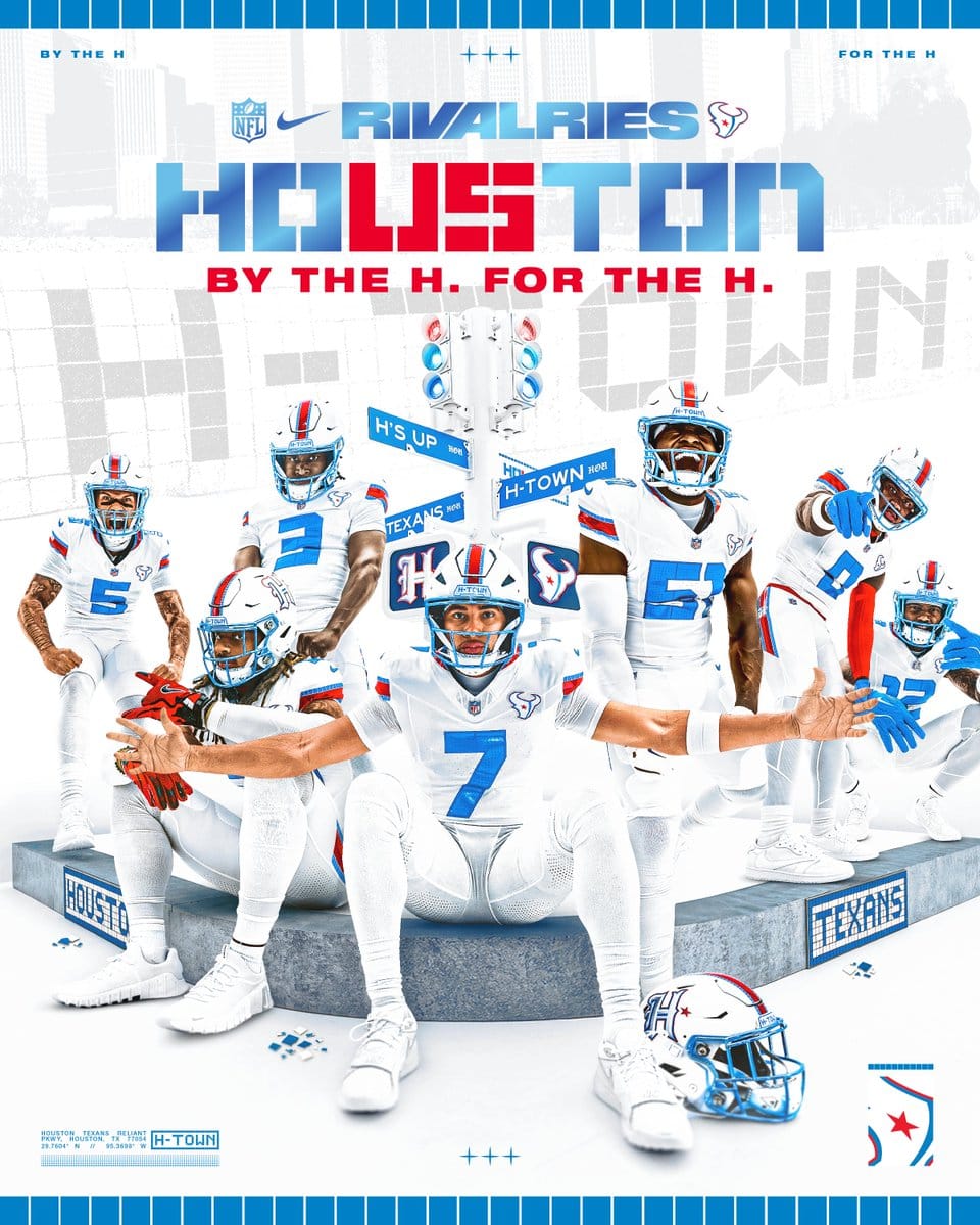
via the Houston Texans
The best palette in the 2026 class and the most complete piece of city-specific design work in either year. Liberty White with H-Town Blue and Battle Red is light, bright and nothing like the navy-heavy base set. The street-tile mosaics running the stripes and the nameplate are real Houston rather than a generic nod, the "Be Someone" numerals come from an actual bridge, and the chrome blue facemask is the single best facemask anyone made this year.
One decision keeps it off the top two. The first white helmet in franchise history, a tribute to the prototype Robert McNair held up in 1999, is a once-ever canvas, and Houston put a secondary gothic H on it instead of the bullhead. That mark on that shell would have been instantly iconic. More in the Texans schedule post.
2. Seattle Seahawks — B+
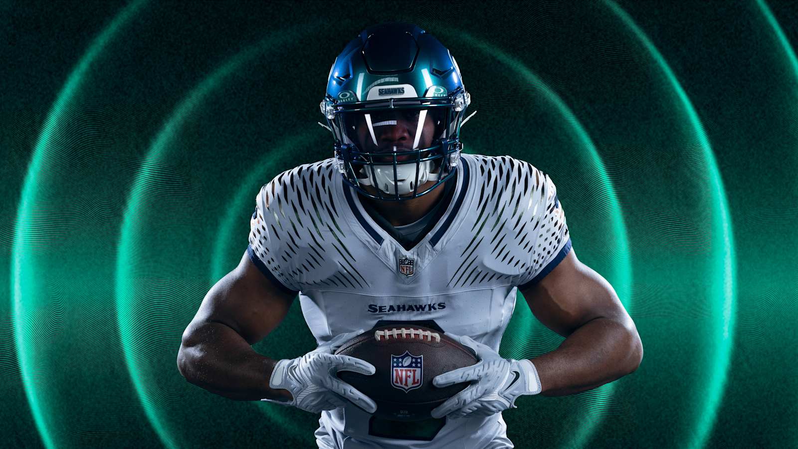
via the Seattle Seahawks
The best set of the 2025 class and the best helmet the whole program has produced. The iridescent green shell with the chrome hawk shifts colour as the light moves, which sounds like a gimmick and turns out to be the one finish that makes Seattle's action green look expensive instead of loud. The uniform is built around the 12s: a soundwave pattern radiating out from the ears and across the shoulders for the noise at Lumen Field, and a 12 worked into the number fill and the back of the neck.
The reason it works where so many concept uniforms on this list fail is that the concept is visible. The soundwave reads from the upper deck as movement across the shoulders, and the white-and-wolf-grey base gives the helmet a clean stage. What keeps it under Chicago is the body: strip the shoulders and it is a white jersey, and an iridescent helmet can drift toward oil slick under certain lights. It gets Christmas Day against the Rams, both teams in their Rivalries sets, and it will be the best-dressed team on the field by a distance. More in the Seahawks schedule post.
1. Chicago Bears, Return of the Monsters — A-
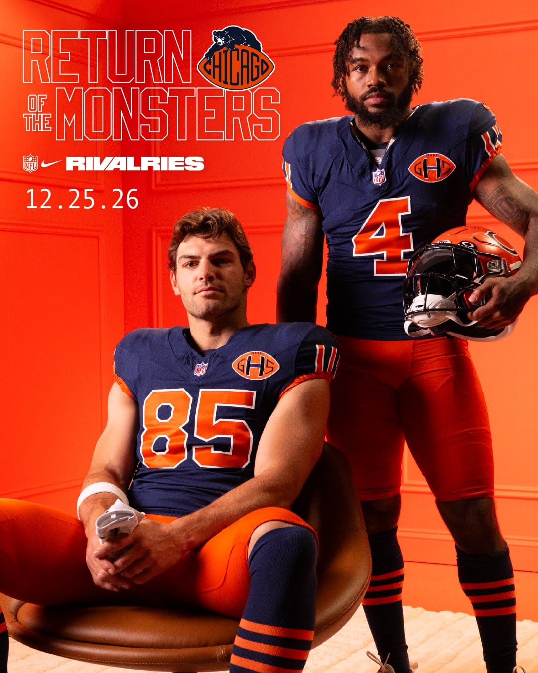
via the Chicago Bears
The best set in either class and it is not particularly close. Everything the concept promises actually shows up on the field: burnt orange numbers drawn from 1948, three-stripe sleeve trim from the 1930s, orange pants, navy-and-orange striped socks, and an orange helmet carrying a revamped classic BEARS wordmark plus the four stars of the Chicago flag.
The GSH patch is the detail of the entire program. It is a faithful replica of the memorial patch Chicago wore in 1983 for George Halas, put back exactly where it lived, and it is the clearest example of the difference between honoring history and decorating with it. "Monsters of the Midway" stitched inside the collar is the kind of touch nobody sees and everybody appreciates.
What keeps it from an A is the ceiling the brief sets: this is a heritage uniform executed almost perfectly, so Chicago was never going to surprise anyone, and the orange pants will divide a room. Small price. More in the Bears schedule post.
The Bottom Line
Three failing grades out of sixteen, and the three clubs that earned them have something in common: Indianapolis, Green Bay and Minnesota all walked in holding elite, long-established identities and traded them for set dressing that only works in close-up. Every one of those uniforms has a good idea in it. None of the good ideas are visible from row 40.
The two classes came out with the same shape. Each produced one set we would wear every week, a couple of honest B's, a run of C's, and failures at the bottom, and the 2026 group is a little more extreme at both ends. Chicago won the whole thing by going into its own archive and pulling out a patch from 1983 and a number font from 1948. Seattle came second by building a uniform around a real thing that happens in its own stadium. Neither needed a nickname to explain itself, and that is the entire premise of this program.
The helmets tell a different story from the uniforms. Two of the 2026 clubs at the bottom of this list built genuinely excellent shells, and we ranked all eight 2026 Rivalries helmets separately.
Frequently Asked Questions
Which NFL Rivalries uniform is the best?
Chicago's "Return of the Monsters" set, which we grade an A-. Navy with burnt orange 1948-inspired numbers, the 1983 GSH patch for George Halas, orange pants, striped socks, and an orange helmet with the four stars of the Chicago flag. Seattle's 2025 set is second at a B+.
Which NFL Rivalries uniforms are the worst?
Three sets failed for us, all from 2026: Minnesota's, Green Bay's and Indianapolis's. In each case a club with a strong existing identity replaced it with a dark base or detail work that does not read at broadcast distance.
How many NFL teams have Rivalries uniforms?
Sixteen. The AFC East and NFC West (Bills, Dolphins, Jets, Patriots, 49ers, Cardinals, Rams, Seahawks) got theirs in 2025, and the AFC South and NFC North (Texans, Colts, Jaguars, Titans, Bears, Lions, Packers, Vikings) were revealed on August 25, 2026. The NFC East and AFC West are next, in 2027. Each set stays in its team's rotation for three seasons.
Which 2025 Rivalries uniform is the best?
Seattle's, at a B+. Buffalo's Cold Front is next at a B-, then the Cardinals, Jets, 49ers and Miami's Dark Water at C+, the Patriots at C, and the Rams at C-.
When does each team wear its Rivalries uniform?
Once a season, at a home game against a division rival. The full 2026 calendar for all sixteen Rivalries teams is in our Rivalries program explainer.
Do the helmet rankings match these uniform grades?
No, deliberately. Houston finishes third here and sixth on helmets; Indianapolis has a top-five helmet on a uniform we failed. The helmet ranking covers the eight 2026 shells on their own.
More Rivalries coverage
Every 2026 Rivalries Helmet, RankedWhat Is the NFL Rivalries Program, and Every 2026 Game DateMiami's Dark Water Uniform, and Why It Divides OpinionAll 32 teams · the 2026 NFL Uniform Schedule →Uniform imagery via the sixteen participating clubs, the NFL, and Nike. ColorWay Sports is an independent design site and is not affiliated with, endorsed by, or sponsored by any NFL club or the National Football League.