Most bad NFL logos aren't ugly. They're empty. A letter with nothing behind it, a word with a plane stuck to it, a helmet standing in for a logo. These are my 10 worst NFL logos ever, counting down to the worst one.
Every logo here was a team's primary logo at some point, and each one is shown with its years. For each: what it is, when it was used, and the design reason it ranks where it does. A few of these are fan favorites, and I say so where that's the case. Years and details are checked against team and league announcements and news coverage from the time.
Quick Answers
- What are the worst NFL logos ever? Our 10, counting down: St. Louis/Arizona Cardinals (1970-2004), Tennessee Titans (2026-present), Jacksonville Jaguars (2013-present), Green Bay Packers (1951-55), Cleveland Browns (1970-present), Miami Dolphins (2013-present), Los Angeles Chargers' LA logo (2017), New York Jets (1978-97), Washington Commanders (2022-present) and the Washington Football Team (2020-21) at No. 1.
- Why did the Chargers drop their LA logo? Fans said it looked like the Dodgers' LA. The team pulled it within days. More at No. 4.
- Want more logo rankings? See the 10 worst '90s NBA logos and the 10 best '90s NBA logos.
10. St. Louis/Arizona Cardinals, 1970-2004: The Original Bird
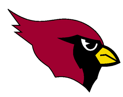
Team logo, 1970-2004
What it is: a red cardinal head in profile, with a black mask around the eye and a short yellow beak. The Cardinals first put a cardinal head on their helmets in 1960, their first season in St. Louis, and this version was their logo from 1970 to 2004. It moved with the team to Phoenix in 1988 and stayed when the club became the Arizona Cardinals in 1994. In 2005 the bird was redrawn sharper and meaner.
Why it ranks 10th: it's a songbird. The round head, the small beak and the calm eye look like they came out of a bird-watching guide, not off the side of a football helmet. It never looks like it's about to do anything. And the team kept it, nearly unchanged, for 35 years and three cities.
Fans like it, and plenty prefer it to the angrier 2005 bird. It's simple and it's easy to draw, and that's why it's only 10th. Cardinals uniform schedule 2026
9. Tennessee Titans, 2026-Present: The Shield
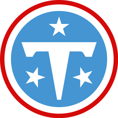
Team primary logo ("The Shield"), 2026-present
What it is: the Titans' new primary logo, which the team calls "The Shield": a white T on a light blue circle, with three white stars around it and a red outer ring. The three stars come from the Tennessee flag, one for each of the state's three divisions. Tennessee unveiled it on March 12, 2026, as part of a full rebrand with new uniforms, replacing the flaming T logo it had used since 1999. The new secondary logo, "The Football," puts a T and an N inside a football.
Why it ranks 9th: it's a letter in a circle. When a team rebuilds its whole identity from scratch, the primary logo is the chance to say something, and this one says "T." The stars are borrowed straight from the state flag, so the only idea that belongs to the Titans is the color. When it was unveiled, fans online compared the T to Tesla's logo, and it's easy to see why: a flared T is the car company's whole identity.
It isn't all bad. It's clean, it will look good small, and the light blue is excellent. We gave the uniforms an A- and this logo a B- when the rebrand came out, and we said then that the secondary Football mark and the script wordmark have more personality than the primary. Titans uniform schedule 2026
8. Jacksonville Jaguars, 2013-Present: The Realistic Jaguar
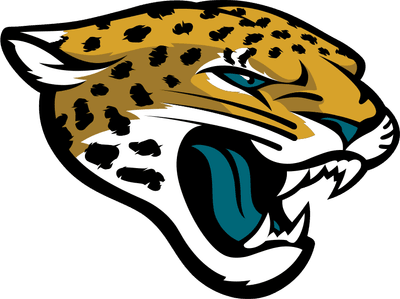
Team logo, 2013-present
What it is: a snarling gold jaguar head with black spots, a teal eye and a teal tongue, outlined in black. The Jaguars unveiled it on February 5, 2013, as a more realistic, fiercer redraw of their original 1995 jaguar head, ahead of the Nike uniforms that came that April.
Why it ranks 8th: it has too much going on. Dozens of spots, whiskers, fangs, wrinkles and a teal tongue get packed into one head, and from a distance the spots turn into noise. The 1995 head had the same idea with fewer pieces, and it was a stronger shape. The redraw made the cat look more like a real jaguar and less like a logo.
The original is the fan favorite, and the team seems to know it. The 1995-era uniforms are back as the Prowler throwback, which Jacksonville wore in Week 3 against New England this season. Jaguars uniform schedule 2026
7. Green Bay Packers, 1951-1955: Packers Between the Goalposts
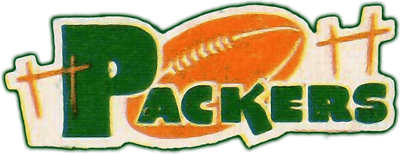
Team logo, 1951-1955
What it is: "Packers" in green letters with an oversized P, an orange football sitting in the middle of the word, and thin goalposts on each side. It was the team's logo from 1951 to 1955. In 1956 it was replaced by a player over a map of Wisconsin inside a football, and the "G" arrived in 1961.
Why it ranks 7th: it looks hand-painted on a sign outside a high school field. The letters don't line up, the football is jammed into the word, and the thin goalposts on either side read more like fence posts or grave markers than goalposts. There's no shape you'd remember. Compare it to the G that came six years later, one of the best logos in sports, and it's hard to believe it's the same franchise.
Nobody's asking for this one back, but it has some charm as an artifact of a time when team logos were drawn by hand for programs and pennants. Packers uniform schedule 2026
6. Cleveland Browns, 1970-Present: The Helmet
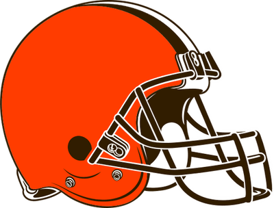
Team logo, 2015 version
What it is: a picture of the Browns' orange helmet, which has no logo on it. In 1970 the team replaced Brownie the Elf with a drawing of the helmet as its main logo, and it has been the logo, redrawn a few times, ever since. The 2015 version shown here brought a brighter orange and a brown facemask. On the field, the Browns are the only NFL team with no logo on the helmet.
Why it ranks 6th: a helmet is equipment, not a logo. Every NFL team has a helmet, so a drawing of one doesn't tell you anything about Cleveland. Put it on a hat or a phone screen and it's an orange shape with a cage. It's a logo of a missing logo.
Fans love it, and I get it. The plain orange helmet is one of the great traditions in the sport, and it's on the field because of eighty years of history, not because of a design meeting. The tradition is great. As a logo, it's the team drawing a picture of its own hat. Browns uniform schedule 2026
5. Miami Dolphins, 2013-Present: The Dolphin Without a Helmet
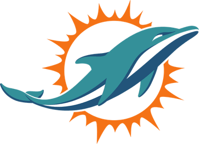
Team logo, 2013 (shown in its original colors; the orange was adjusted in 2018)
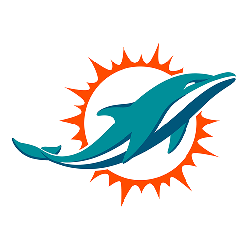
What it is: an aqua dolphin leaping in front of a stylized orange sunburst. Miami introduced it in 2013, its first major logo change since 1997, and adjusted the shade of orange in 2018. It's still the primary logo. Every Dolphins logo before it, from 1966 to 2012, showed the dolphin wearing a football helmet with an M on it.
Why it ranks 5th: they took the helmet off. The helmet was the one thing that made a dolphin a football team. Without it, this is a dolphin jumping in front of the sun, which could be the sign for a Miami aquarium, a beach resort or a cruise line. It's smooth and it's well drawn, but it's generic.
The old one is the fan favorite. Miami's white 1966 throwback with the leaping, helmeted dolphin is on the schedule this season for Week 14 against the Bears, and it's a better logo than the current one. Dolphins uniform schedule 2026
4. Los Angeles Chargers, 2017: The LA Logo
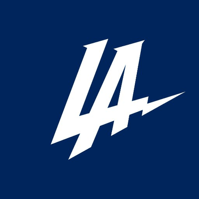
Team logo, January 2017
What it is: a white L and A on navy, with a lightning bolt shooting off the A. The Chargers unveiled it on January 12, 2017, the day they announced their move from San Diego to Los Angeles. Fans immediately said it looked like the Dodgers' interlocking LA. The team switched it to powder blue and gold within about a day, and that didn't stop the jokes either. Within days, team president of business operations A.G. Spanos said in a statement that the team had "miscalculated" and had taken the logo out of the rotation. The lightning bolt stayed the Chargers' main logo.
Why it ranks 4th: in a city where LA already belongs to the Dodgers, the Chargers' first move was to put out an LA that looked like theirs. The bolt off the A is the only Chargers idea in it.
It only lasted a few days, which is the only reason it isn't higher. Nobody defended it, the team included. Chargers uniform schedule 2026
3. New York Jets, 1978-1997: JETS With a Plane

Team logo, 1978-1997
What it is: JETS in green, slanted letters, with the silhouette of a jet airplane extending off the top of the J. It arrived in 1978 with green helmets, replacing the oval logo the team had used since 1965. It's the logo of the "New York Sack Exchange" defensive line of the early 1980s. In 1998, under Bill Parcells, the Jets went back to an oval logo based on the 1960s design.
Why it ranks 3rd: it's a word with a plane glued on. The jet is a generic silhouette that could be on an airline or a defense contractor's logo, and it sits on top of the J like a separate sticker. The slanted letters are fast in a 1978 way, and there's no New York anywhere in it.
Fans love it, and so do the Jets. In 2024 the team made a modernized version of this exact wordmark its primary logo again, so the franchise disagrees with me. That's fair. The nostalgia is real. The logo is still the team name with an airplane on top. Jets uniform schedule 2026
2. Washington Commanders, 2022-Present: The W
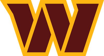
Team logo, 2022-present
What it is: a burgundy W with angled serifs and a gold outline. Washington unveiled it with the Commanders name on February 2, 2022, after two seasons as the Washington Football Team. The name had leaked the night before, when a news helicopter spotted it inside FedEx Field. Reaction was lukewarm, and much of it was jokes about the name.
Why it ranks 2nd: when Washington started its search in 2020, coach Ron Rivera called it a 16-to-18-month process to get right. About 18 months later, the answer was another W. This one has serifs and an outline, but it's the same idea as the placeholder it replaced, and it says nothing about commanders, the military or the capital. The team had a blank page and one of the most-watched rebrands in sports history, and it came back with a letter.
The colors aren't the problem. The burgundy and gold are as good as ever. The logo just doesn't do anything with them. Commanders uniform schedule 2026
1. Washington Football Team, 2020-2021: The Placeholder W

Team logo, 2020-2021
What it is: a plain gold block W. After retiring its previous name and logo in July 2020, Washington announced on July 23, 2020, that it would play as the "Washington Football Team" until it picked a permanent name, and a temporary W became the logo. It stayed for two full seasons, 2020 and 2021, until the Commanders reveal in February 2022.
Why it ranks 1st: it was designed to be nothing. It's one letter in a block typeface, with no outline, no detail and no idea, used by a team whose name was the word "Football." I understand why it existed: the team needed something on short notice. But it was an NFL team's logo for two seasons, and it's the closest the league has come to having no logo at all.
The best thing about it is that Washington won the NFC East in 2020 with it on the sideline. The logo had nothing to do with that. Commanders uniform schedule 2026
Frequently Asked Questions
What is the worst NFL logo ever?
In our ranking, the Washington Football Team's 2020-21 logo: a plain gold block W used as a placeholder after Washington retired its previous name. It was one letter with no other idea, and it stayed for two full seasons.
What are the worst NFL logos ever?
Our 10, from No. 10 to No. 1: St. Louis/Arizona Cardinals (1970-2004), Tennessee Titans (2026-present), Jacksonville Jaguars (2013-present), Green Bay Packers (1951-55), Cleveland Browns (1970-present), Miami Dolphins (2013-present), Los Angeles Chargers' LA logo (2017), New York Jets (1978-97), Washington Commanders (2022-present) and the Washington Football Team (2020-21).
What was the Washington Football Team logo?
A plain gold block W. Washington announced the "Washington Football Team" name on July 23, 2020, as a placeholder until it chose a permanent name, and used the W as its logo for the 2020 and 2021 seasons.
When did the Washington Football Team become the Commanders?
On February 2, 2022, when the team unveiled the Commanders name and its new logo, a burgundy W with angled serifs and a gold outline.
What is the Commanders logo?
A burgundy W with angled serifs and a gold outline, introduced on February 2, 2022. The team's black Hail Raiser alternate uses a separate spear-W logo on its helmet.
Why did the Chargers change their logo back?
The LA logo the Chargers unveiled on January 12, 2017, when they announced their move to Los Angeles, was widely mocked for looking like the Dodgers' LA. The team recolored it in powder blue and gold within about a day, then pulled it within days. Team executive A.G. Spanos said in a statement that the team had "miscalculated" how it would be received. The lightning bolt remained the main logo.
What is the new Titans logo?
The Titans' new primary logo, unveiled March 12, 2026, is called "The Shield": a white T and three white stars on a light blue circle with a red ring. The three stars come from the Tennessee flag. The secondary logo, "The Football," puts a T and an N inside a football.
Why does the new Titans logo look like Tesla?
Because both are built around a flared T. After the March 2026 unveiling, fans online compared the Titans' new T to the Tesla logo. The team didn't design it as a reference to the car brand.
What was the old Titans logo?
From 1999 to 2025, a circle with a T and three stars with a flaming tail streaking off it. The 2026 Shield replaced it.
Why don't the Browns have a logo on their helmet?
The Browns have never put a logo on their helmet, which has been orange full time since 1952, and they're the only NFL team without a helmet logo. In 1970 the team made a drawing of that helmet its main logo, replacing Brownie the Elf.
Why did the Dolphins change their logo in 2013?
Miami introduced a new logo in 2013, its first major change since 1997, with a sleeker dolphin leaping in front of an orange sunburst. The new dolphin dropped the football helmet that every earlier Dolphins logo had. The shade of orange was adjusted in 2018.
Did the Jets bring back their old logo?
Yes. The JETS wordmark with a jet plane, used from 1978 to 1997, returned in a modernized form as the Jets' primary logo in 2024. From 1998 to 2023 the team used oval and football-shaped logos instead.
When did the Jaguars change their logo?
The Jaguars unveiled their current logo, a more realistic jaguar head, on February 5, 2013. It replaced the original jaguar head the team used from its first season in 1995.
What was the Packers' logo before the G?
From 1951 to 1955, "Packers" in green letters with a football in the middle of the word and goalposts on each side. From 1956, a player over a map of Wisconsin inside a football. The G arrived in 1961.
When did the Cardinals change their logo?
In 2005. The cardinal head the team used from 1970 to 2004, through St. Louis, Phoenix and Arizona, was redrawn sharper and more aggressive for 2005.
The Bottom Line
The worst NFL logos aren't the loud ones. They're the ones with no idea: a letter, a word with a plane on it, a helmet, a dolphin with the football taken out. Washington holds the top two spots, and the gap between them is serifs and an outline. Agree, or would you have put the Browns helmet or the Jets wordmark at No. 1? For more logo rankings, see the 10 worst '90s NBA logos and the 10 best '90s NBA logos.
Logo years and details are from team and NFL announcements, the Associated Press and news coverage from the time. Logos are shown for commentary and are the property of their teams. Rankings are ColorWay Sports' opinion. ColorWay Sports is an independent design site and is not affiliated with, endorsed by, or sponsored by the NFL or any of its teams.