We grade every uniform in the NFL, NBA, MLB and NHL, every jersey in every closet. Most of sports looks better than it ever has. These ten do not.
The rules: uniforms teams are actually wearing in 2026, across all four leagues, ranked by the grades we have already given them. No grudges, no throwbacks, no retired sets. Three get an F. A team playing in the World Series is on here. So is a two-time Stanley Cup champion. And we are Lakers fans, and the Lakers are on here too.
We are counting down from 10 to the single worst uniform in sports. Tell us who we got wrong.
10. Dallas Mavericks C
The core template has barely moved in two decades, and the City Edition reported for this season is the white and gold Legacy set. Gold is not a Mavericks color. A franchise this big, with a logo this recognizable, should not be dressing like it is still waiting on a redesign. Every Mavericks uniform this season.
9. Los Angeles Lakers Specter Edition C
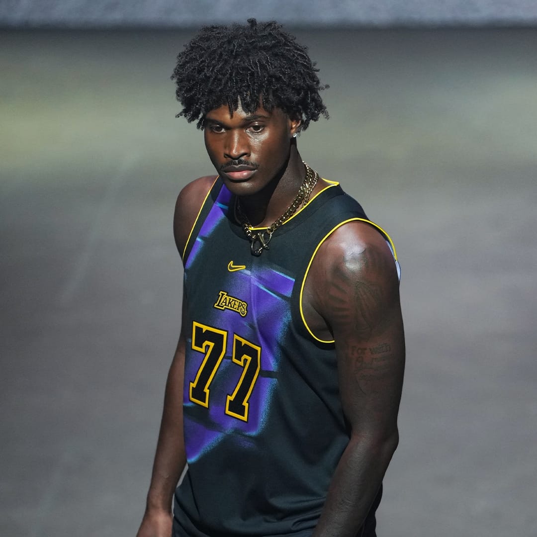
The Lakers Specter Edition at its Nike reveal. Image: NBA
Full disclosure: we are Lakers fans, and this one still makes the list. Purple streaks on a black base, with the gold pushed down to the numbers and trim, bury the most famous color pair in basketball. Purple and gold is supposed to be loud. This is Showtime with the lights off. It is on the floor three times at Crypto.com Arena: December 14, 21 and 23. Lakers home jerseys this season.
8. Florida Panthers Home and Road C-
Two Stanley Cups in three seasons, and still our least favorite primary set in the NHL. The military dress-uniform idea turns into too many parts on one sweater: a shield crest, a chest band, sleeve bands, a sleeve patch and gold trim so flat it reads as tan on TV. Florida proved at the Winter Classic it can do clean and classic. It just does not wear it on a normal night. Every Panthers game this season.
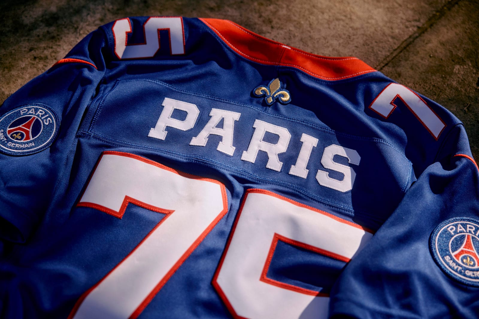
7. New Orleans Saints Black D+
An oversized contrasting collar cuts the jersey in half at the chest, and this is the jersey New Orleans wears the most. It is also the one the whole world will see on Sunday, when the Saints wear it in Paris for the NFL's first game in France. Black and gold is a great color pair. The Brees-era sets popped. This does not. The Paris game uniforms.
6. Cincinnati Reds City Connect 2.0 D
Head-to-toe red: red jersey, red pants, red cap. A monochrome uniform removes the break at the waist that makes a baseball player look like a baseball player, and the whole roster turns into traffic cones moving across a green field. A plain white wishbone "C" floating on red is the least interesting way to use one of baseball's best marks. It is the Saturday home look in Cincinnati. Every Reds jersey, ranked.
5. Washington Nationals District Blueprint City Connect D-
The sin is what it replaced. The Cherry Blossom City Connect was one of the best things the whole program ever produced. Washington traded it for an "American denim" shirt with the D.C. street grid printed across it. A city map is not a visual identity, it is a diagram. The Capitol Dome cap and the interlocking "DC" deserve a better shirt. Every Nationals jersey, ranked.
4. Milwaukee Brewers Wisco City Connect D-
Yes, the Brewers are in the World Series, and yes, this is still a D-. A sunset gradient, a custom "Wisco" script, a wheat braid, a Barrelman patch and a fishing-bobber jock tag are five different stories fighting on one jersey, and it drops navy and gold entirely, so none of it reads as Milwaukee from the stands. It would make a great poster. On the field it is a mess. Every Brewers jersey, ranked.
3. Indianapolis Colts Anvil Strike F
A beautiful metallic helmet, stranded on an anthracite uniform Indianapolis has never worn in its history. The horseshoe disappears, and the gray-under-blue silhouette belongs to Detroit. The Colts beat Houston 19-17 in it in Week 3. The uniform still lost. Every Colts jersey, ranked.
2. Green Bay Packers Rivalries Uniform F
The best story of the whole Rivalries class, on a uniform you cannot read from your seat. The currency numerals vanish on TV, the jersey is just a darker green, and it benches the gold G helmet, one of the best marks in sports, for something worse. Every Packers jersey, ranked.
1. Minnesota Vikings Rivalries Uniform F
Four ideas fighting each other: a duller purple, a gold facemask, rune numbers, knots and a rune bumper, all piled onto the best base uniform in the NFC North. It finished last in our ranking of all 16 Rivalries uniforms, and it gets the biggest stage possible: Sunday Night Football against Detroit on December 20, in front of the whole country. The worst uniform in sports right now. Every Vikings jersey, ranked.
Why the NFL Owns the Bottom of This List
The three F grades all come from the NFL, and two of them come from one place: the new Rivalries program, which lets teams add a one-game uniform against a division rival. It was supposed to be the most fun uniform idea of the year. Instead, teams with some of the best base looks in sports (Green Bay, Minnesota) used it to bury their own identities under texture, runes and numbers you cannot read. Baseball's version of the problem is the City Connect program, where Milwaukee, Washington and Cincinnati all traded what makes them recognizable for a concept. The NBA's is the Specter Edition, eight black-based alternates that mute the league's best color schemes.
Frequently Asked Questions
What is the worst uniform in sports right now?
The Minnesota Vikings Rivalries uniform, which we grade an F. It stacks a duller purple, a gold facemask, rune numbers and knot details on top of one of the best base uniforms in the NFL. It debuts December 20 on Sunday Night Football against Detroit.
What is the worst uniform in the NBA?
On this list, the Lakers Specter Edition and the Mavericks' closet are the two lowest NBA entries, both a C. The Kings have our lowest-ranked closet overall. See our full NBA uniform closets ranking.
What is the worst uniform in the NHL?
The Florida Panthers have our lowest-graded primary set in the NHL, a C-, despite back-to-back Stanley Cups. Full list: every NHL team's jerseys, ranked.
What is the worst uniform in the NFL?
The Vikings Rivalries uniform. The ten worst in the NFL alone are in our worst NFL uniforms of 2026 ranking.
Why are the Lakers on this list?
Because the Specter Edition buries purple and gold under dark satin on black. We are Lakers fans, and we still gave it a C. The Lakers' regular closet is fine; this is about one alternate worn three times in December.
How did you grade these uniforms?
Every uniform here was graded in its own review or team ranking on ColorWay Sports, on design, color, fit with the team's identity and how it reads from the stands and on TV. This list pulls the lowest grades across the three leagues.
What is the worst uniform in MLB?
The Washington Nationals' District Blueprint City Connect and the Milwaukee Brewers' Wisco City Connect share our lowest grade among the baseball uniforms on this list, a D-. Both are City Connect jerseys, and the Brewers will not be wearing theirs in the World Series. See our best MLB uniforms ranking for the other end of the scale.
Are the Brewers wearing the Wisco City Connect in the World Series?
We do not expect it. In the postseason the Brewers have worn the cream home and the navy alternate. Every game is in our World Series uniforms guide.
The Bottom Line
The worst uniforms in sports right now are not ugly by accident. They are good franchises trying too hard: too many ideas on one jersey, too little of the colors fans love. The Vikings Rivalries uniform is the worst of all of them. Think we are wrong about your team? That is the point. Tell us.